You walk into a meeting room and have exactly seven seconds. It's during this time that first impressions are formed, and, as practice shows, the human brain processes 80% of information through silhouette and color. Your interviewer hasn't yet had time to appreciate the impeccable cut of your jacket or notice the logo on your bag, but their subconscious has already drawn conclusions based on the shade of your outfit. As a practicing personal stylist, I constantly see the same mistake: women spend huge budgets on brands, ignoring how psychology of color in clothing It works in practice. We've already discussed the basic rules for combining shades in more detail in our The complete guide to color combinations and the Itten circle , and today we’ll talk about color as a tool of influence.
Why the psychology of color in clothing is more powerful than branding
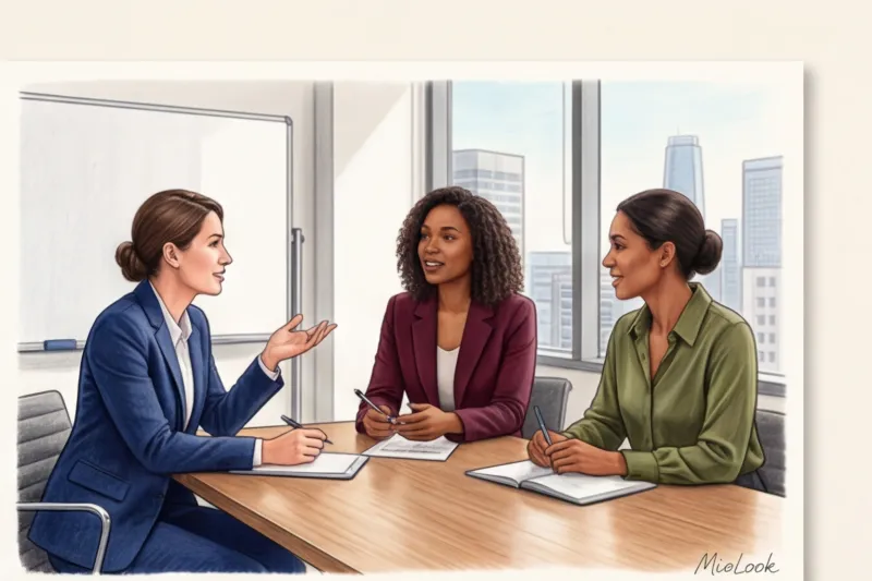
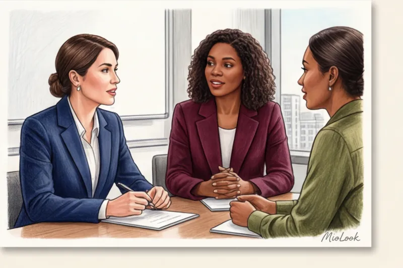
Over 12 years of sorting through wardrobes, I've learned a strict rule: color always comes before texture. This is pure physiology and the mechanism of "emotional contagion." The eye reads the wavelength of light (color) in a split second, and this information instantly travels to the hypothalamus, influencing the heart rate and blood pressure of the person you're talking to.
"Quiet luxury" and all-over beige are trending right now. But in corporate environments, this trend often backfires. One of my clients, an IT project manager, complained that her ideas were being interrupted by colleagues during meetings. When we analyzed her wardrobe, it turned out she was wearing a flawless, expensive nude that blended perfectly with the walls. She was literally making herself invisible. We added deep cobalt and graphite to her wardrobe, and after a month, she noticed that the interruptions had stopped.
Color influences not only those who look at you, but also you. In psychology, this is called "enclothed cognition." By wearing a color you associate with power, you physically begin to act more confident.
The "Safe Black" Myth: When It's Harming Your Image
The most common excuse I hear from new clients is: "I wear black because it's elegant, safe, and slimming." Let's face it. Black doesn't automatically make you stylish or authoritative. In 80% of cases, it works against the wearer of a European (Slavic) low-contrast appearance.
Psychologically, total black is often perceived not as authority, but as a blank wall. You unconsciously build a barrier between yourself and the person you're talking to. If your goal is look expensive and prestigious Mass-market black is your worst enemy. Cheap black knitwear (especially cotton and acrylic) fades after the third wash, becomes covered in pills, and instantly cheapens the look.
Moreover, physiologically, black skin tone acts as a harsh reflector: it highlights every wrinkle, nasolabial fold, and under-eye shadow. If you've slept five hours, a black jacket will tell everyone.
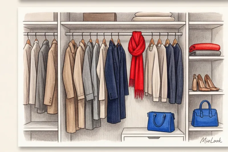
What to Replace Black With: High-Street Status Alternatives
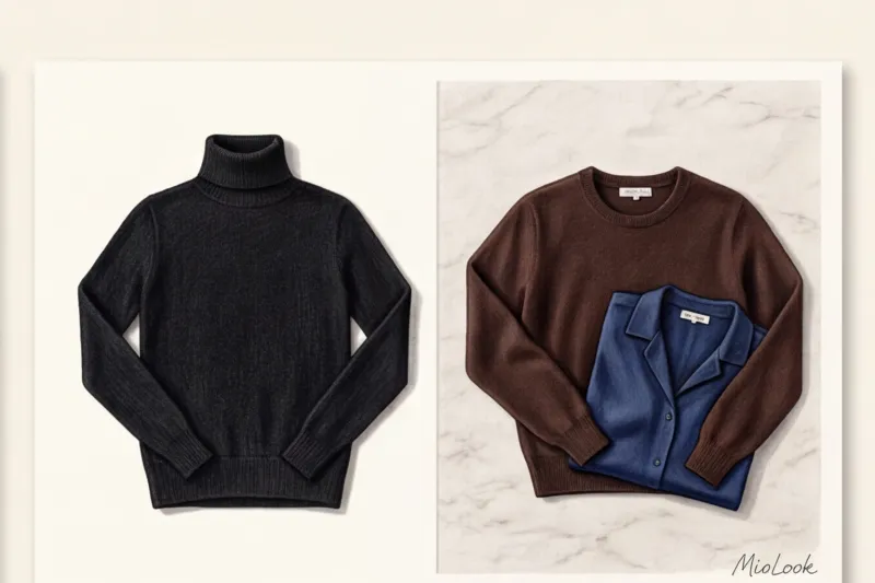
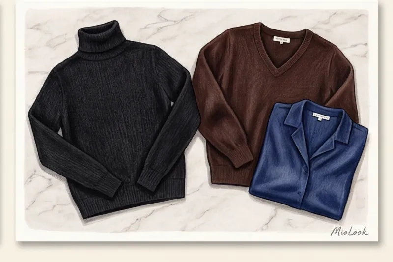
- Deep Chocolate: My favorite for creating a warm yet stern distance. The perfect pieces in this shade are best found at Massimo Dutti—they know how to work with rich brown undertones.
- Navy (dark blue): The color of trust without aggression. An absolute staple, flawlessly crafted at COS.
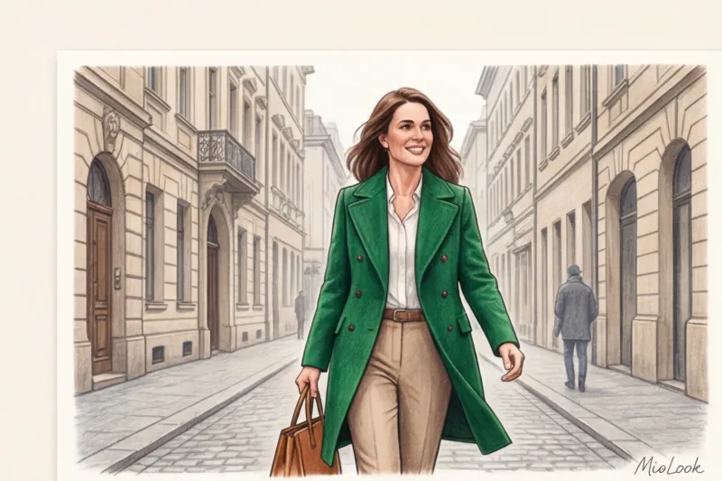
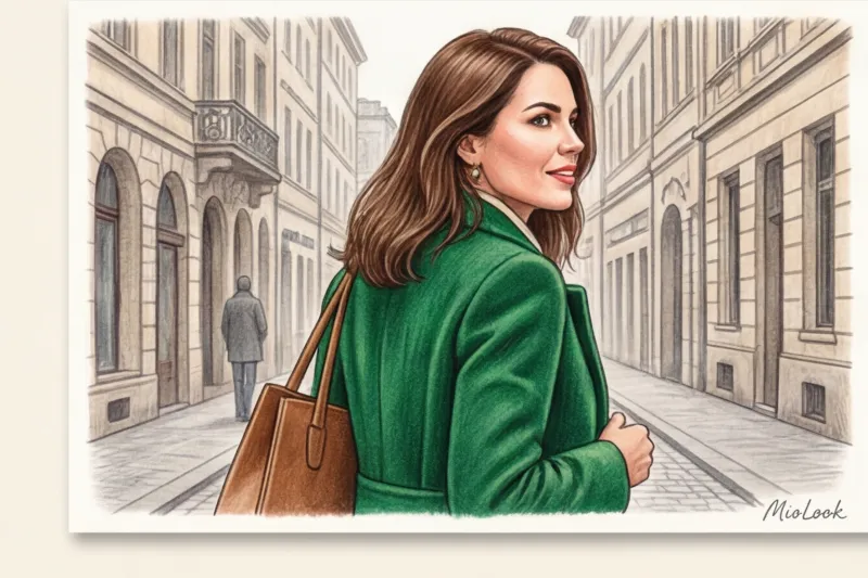
- Graphite grey and deep emerald: A great alternative to pantsuits that looks more sophisticated and sophisticated than stark black.
Try MioLook for free
A smart AI stylist will select the perfect look based on your individual characteristics and goals.
Start for freeColor Codes of Trust and Influence: How to Manage Impressions
The Pantone Color Institute (2024) notes a global shift in office palettes: we're moving away from aggressive contrasts toward hues that inspire trust. Let's examine the main color groups not through abstract emotions, but through specific communication objectives.
Blue and light blue - calm expertise
Have you noticed that the logos of most banks and insurance companies are blue? It's no coincidence. Dark blue physiologically reduces anxiety in interviewers and slows their heart rate. If you're a lawyer, a financier, or going to a crucial interview, this is your bulletproof vest.
But texture is key here: a sharp Navy suit communicates competence, while relaxed blue denim works differently—it closes the gap and makes you feel like "one of the guys." For a Friday dress code at an IT company, dark blue straight-leg jeans with a white shirt are the perfect balance between relaxed and put-together.
Red and burgundy - energy and dominance
According to a classic study from the University of Rochester (2010), the color red is subconsciously associated with high status and dominance, but is also perceived as threatening. Wearing a scarlet suit to difficult negotiations where you need to compromise is a strategic mistake. You'll provoke your interlocutor into aggressive defense.
If you need to show strength without starting a war, choose Burgundy/Wine It's a status-conscious, noble alternative—a classic "old money color" that shows you have power without having to shout about it.
Green and brown - grounding and empathy
If your work involves consulting, training, or HR, consider this range. image of a psychologist As a coach or a therapist, I always recommend introducing olive, pine, and camel tones to my clients. Brown is associated with earthiness, stability, and predictability (in a good way). Unlike the "slippery" black, being around someone in beige and brown tones makes you want to breathe and relax.
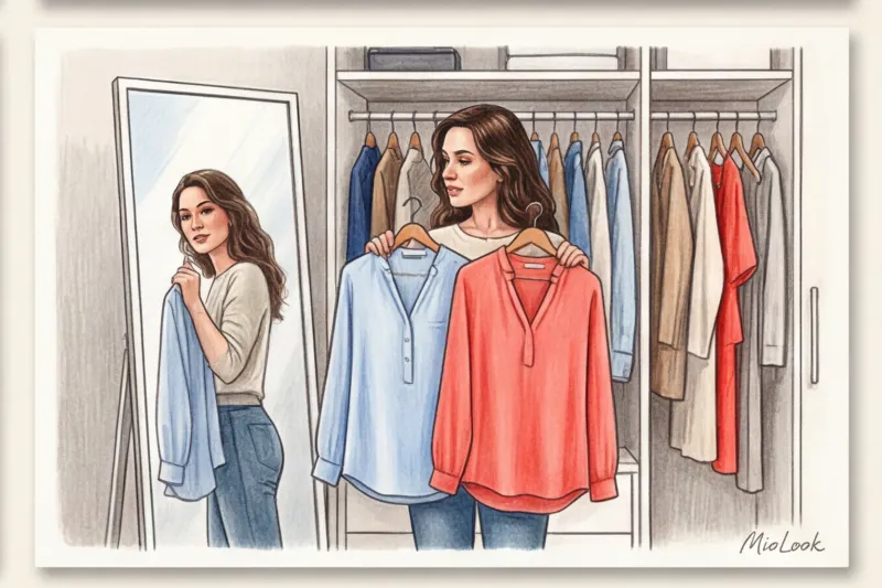
How to incorporate color into your wardrobe without breaking the bank: the 70/30 rule
I'm not suggesting you buy neon jackets tomorrow. As a proponent of a rational wardrobe, I always consider Cost per wear Statistics are merciless: ultra-bright accent colors are worn three times less often than neutral ones. If you bought an acid green jacket for €150 and wore it twice, each time you wore it, you'd have spent €75. That's not a good deal.
My signature budget hack: we buy basic, sophisticated neutral shades (that same navy, graphite, chocolate) from the mid-up segment (COS, & Other Stories, Massimo Dutti), where the cotton weight starts at 180 g/m² and includes high-quality wool. As for ultra-fashionable, bright colors for a single season, we confidently buy them at Zara or H&M. Cheap red often looks vulgar, but bright fuchsia or electric blue in inexpensive viscose look quite decent.
Use 70/30 rule 70% of your look is a calm base, and 30% is a color accent. For beginners, the "color anchor" method works great. You wear a familiar gray suit, but add a deep wine-colored bag or emerald loafers.
Your perfect look starts here
Join thousands of users who intelligently combine colors and look flawless every day with MioLook.
Start for freeChecklist: How to choose the right color for today's task
In my consultations, I teach my clients to open their closets not with the thought of "what should I wear?" but with the question, "What is my goal today?" Here's a quick cheat sheet:
- Difficult negotiations or potential conflict: Navy. You'll look as competent as possible without provoking aggression.
- Creative storming or performance in front of a loyal audience: Add a yellow or orange accent (like a silk scarf or a top under the jacket). These colors stimulate brain activity and show your openness. Perfect color for stage performance , if you need to charge the room with energy.
- Need to win someone over or first date: Warm pastel tones—peach, dusty rose, light camel—soften facial features and subconsciously convey a sense of gentleness.
- Request for a salary increase: A graphite pantsuit with an emerald or burgundy accent. The graphite will convey your professionalism, while the deep gemstone color will convey your elevated status.
Connection to color type: when the psychologically correct color doesn't suit you
Now for an important caveat. Color psychology works great, but it won't work if the chosen shade clashes with your natural color palette. What if you absolutely need a bold blue or cool graphite for a negotiation, but it makes your face look sallow and emphasizes fatigue? Don't blindly follow psychological patterns to the detriment of a fresh complexion.
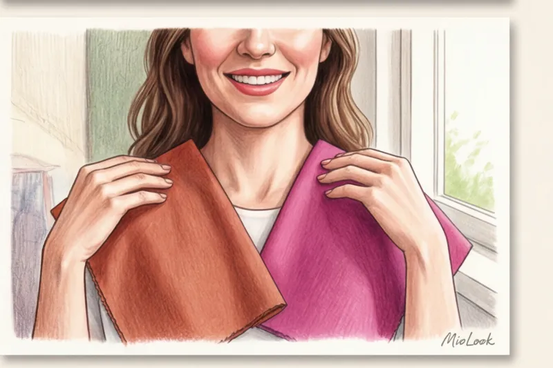
This is where the "portrait zone" rule (the area from the chest line to the face) comes into play. The colors that suit you your color type of appearance (They refresh, brighten the eyes, and even out skin tone)—we place them near the face—these can be blouses, turtlenecks, or scarves. And those colors that are psychologically important for status but don't suit you are relegated to the lower part of the silhouette (trousers, skirts) or accessories (bags, shoes).
For example, if cool blue makes you look pale, wear dark blue wide-leg trousers and leave a milky or warm beige silk top near your face, which will highlight your skin.
Tomorrow morning, when you open your closet, don't reach for your go-to black sweater out of habit. Ask yourself one question: "What impression do I want to make today?" Color is your free tool of influence, requiring no luxury brand-level investment. By learning to control it, you'll begin speaking to the world even before you utter your first word.
Ready to get started?
Try the free plan—no commitments. Organize your wardrobe and find the perfect color combinations with AI.
Start for free


