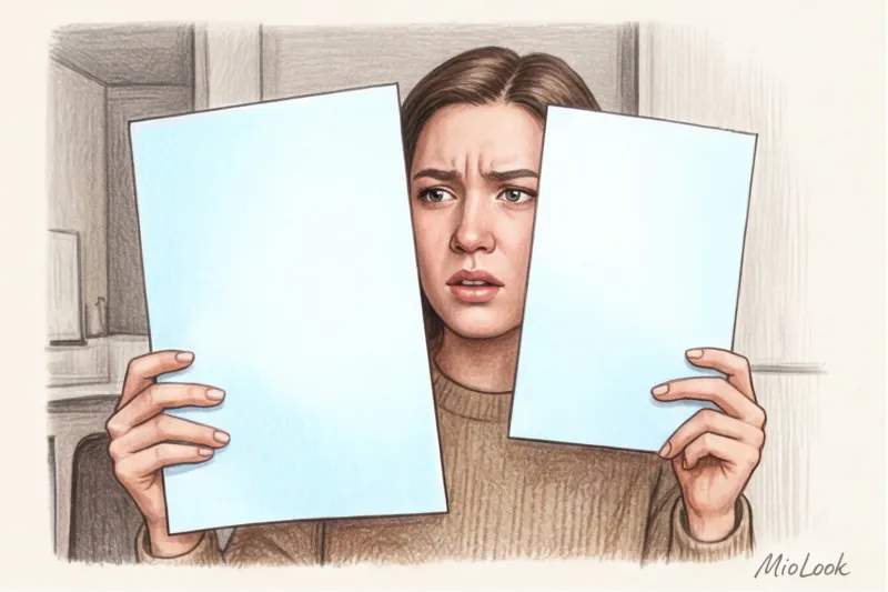
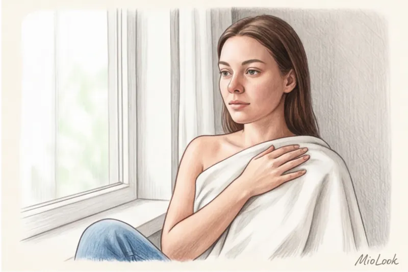
In 2019, at a fitting before a show in Paris, I witnessed a typical, yet no less sad, scene. A novice makeup artist pressed a regular sheet of printer paper to a model's face to determine her skin temperature. Against the crisp white A4 sheet, her skin instantly took on a sallow, yellow hue. The diagnosis was lightning fast: "warm spring." She was matched with a peach foundation, which oxidized on her face within an hour into a dirty orange mask. Why? Because the model had a classic olive undertone with slight rosacea on her cheeks, and the notorious white sheet test to determine undertone , carried out with office paper, distorted reality beyond recognition.
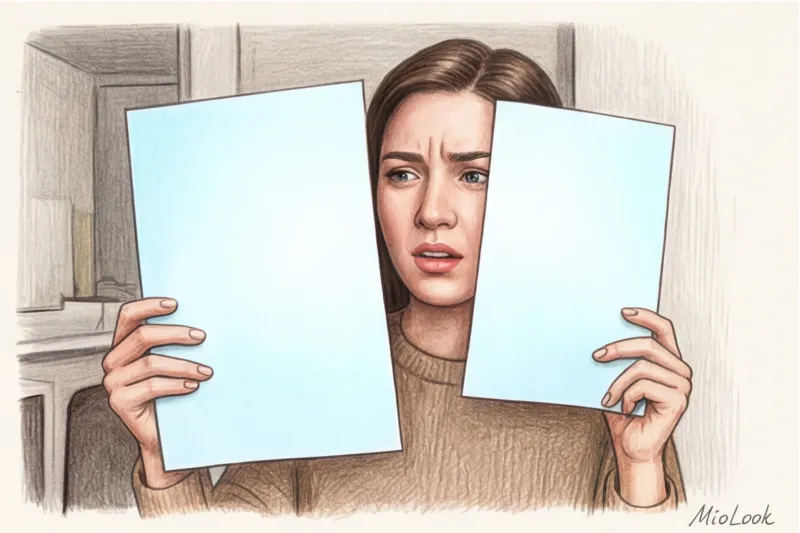
In the glossy magazines of the 2000s, we were taught: hold a sheet of paper to your face—if you look yellow, you're "warm," if you look pink, you're "cold." We discussed this outdated approach in more detail in our The complete guide to determining your skin undertone Today I'll show you how professional colorists conduct this test, why office paper is your worst enemy, and how the physics of light influences the shades we buy.
Why the classic white sheet test for determining undertones often lies
Using regular office printer paper is the worst thing you can do for a color test. It's a matter of chemistry and physics. Modern A4 paper (like the one in your printer tray) is impregnated with OBA (Optical Brightening Agents)—luminescent optical brighteners. They absorb ultraviolet light and emit it in the blue spectrum. This is why such paper appears "dazzlingly white" to us.
When you hold this chemical rectangle, which reflects up to 104% blue light, up to your face, the phenomenon of simultaneous contrast (a theory first described by Michel-Eugène Chevreul) occurs. The blue glow of the paper visually draws out the yellow pigment from any object near it. Your skin will appear duller and more yellowish than it actually is.
According to the analytical agency WGSN (2023), about 40% of women are mistaken about their color type precisely because of confusion between overtone and undertone during home tests.
Another fundamental problem with the old test is the reaction to overtone (superficial tone). Superficial tone is freckles, a fresh tan, traces of post-acne, or rosacea. Undertone (true undertone) is the shade formed beneath the skin due to the levels of melanin, carotene, and hemoglobin. A white sheet of paper from the printer acts like a spotlight, highlighting the superficial redness of your cheeks, tricking you into believing you have a cool undertone, when in fact, you simply have sensitive skin.
Try MioLook for free
A smart AI stylist will select the perfect look based on your true skin tone.
Start for freePreparing for the test: How stylists set up a "laboratory" at home
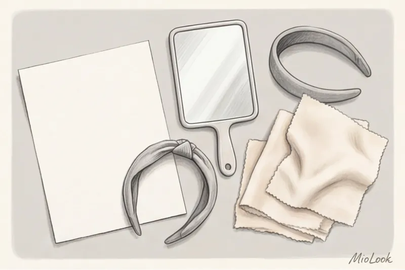
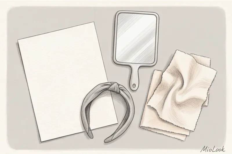
To achieve an accurate result, you need to create a "blank canvas." Backstage at fashion shows, my team of makeup artists and I often determine a model's undertone in 10-15 seconds, but only because the background is so carefully controlled. You can recreate these conditions at home.
- Washing with a pause: Remove all makeup. Don't test immediately! Your face will become red after washing. Wait at least 15 minutes for the redness to subside.
- Background neutralization: Pull your hair away from your face (especially if it's dyed) with a gray or white headband. Wear a neutral top.
- Color Isolation: Remove all jewelry—earrings and chains cast color reflections on your neck.
Fair Limit: This test won't work (and shouldn't be performed) if you've just returned from a vacation with a deep tan or are recovering from a chemical peel. In these cases, the superficial pigment is too active.
What paper should I use instead of A4 office paper?
If OBA bleaches distort the results, what should you use? You need a natural white (soft white or eggshell).
The ideal choice is a sheet of professional watercolor paper (cotton or cellulose, free of acids and bleaches). It costs between €3 and €5 at an art store, but this investment will save you hundreds of euros in wasted foundations. A piece of unbleached cotton, linen, or even the matte back of a piece of thick, light-colored wallpaper makes an excellent alternative.
The Right Light: Avoiding Fatal Mistakes
Lighting is 80% of the success of a color analysis. Direct sunlight will add a non-existent gold, while office fluorescent lamps will create a corpse-like green.
The ideal time for the test is between 10:00 a.m. and 2:00 p.m. Stand facing a north- or east-facing window (so the light is diffused, without harsh sun spots on your face). Turn off all artificial light in the room.
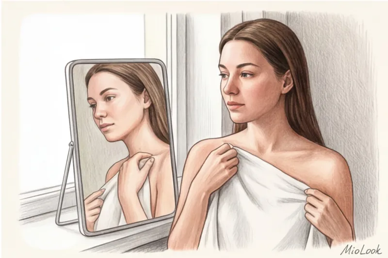
Step-by-step instructions: professional white sheet test to determine your undertone
So, you've washed off your makeup, put on a gray T-shirt, and picked up a sheet of natural watercolor paper. What do you do next?
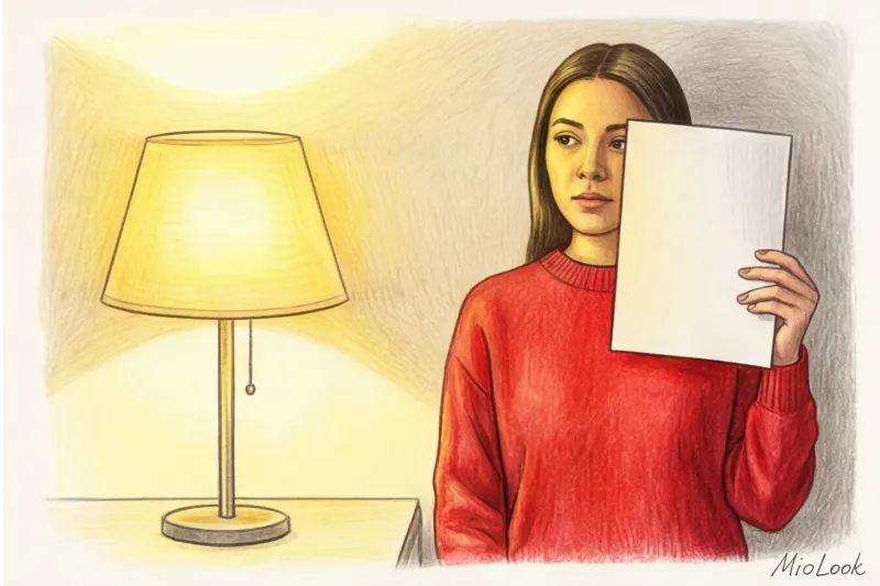
- Correct position of the sheet. Don't press the sheet against your nose or forehead! Place it horizontally at chest and collarbone level, creating a screen that reflects soft daylight upward onto your face.
- Where to look. The vast majority of women make the mistake of looking at their cheeks. The cheeks are the area with the highest concentration of capillaries. You need to look at three points: the shadow under the chin, the center of the neck, and the décolleté. This is where the skin is least susceptible to photoaging, rosacea, and hormonal pigmentation.
- Squint method. This is a favorite trick of stylists. Squint slightly when looking in the mirror. This will blur fine details (pores, veins, individual freckles) and allow you to see your face as a single patch of color against a white background.
Now, take a closer look at the shadows. What hue appears in them when placed next to the natural white sheet?
Deciphering the results: going beyond "warm" and "cold"
Modern styling has long since moved beyond the rigid binaries of the '90s. The aesthetics of brands like The Row and Jil Sander are built on complex, muted shades that require a precise understanding of their undertones.
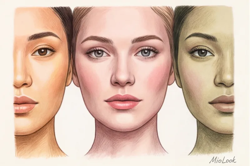
If, against the background of the leaf, icy pink, light bluish or crimson nuances appear in your shadows (on the neck), you have cool undertone The skin appears fresher and clearer.
If the shadows have a peach, golden or soft yellow-orange glow, you are the owner warm undertone.
How to recognize neutral and olive undertones
According to the Pantone Color Institute (2024), over 30% of people worldwide have complex, mixed undertones that don't fit into the classic four seasons. What if you don't see either a clear pink or a clear gold?
If your face appears slightly grayish or greenish next to a white sheet of paper, congratulations, you have a trendy olive undertone Green is formed by a mixture of surface yellow pigment and a blue undertone. Olive skin often appears pale and "sickly" in winter, but is instantly transformed by sophisticated clothing in deep shades.
If your skin tone simply blends with the leaf, without giving off sharp contrasts in either warmth or cold, then that’s your undertone. neutral You can wear almost anything, but your main metric when choosing clothes is not color temperature, but its saturation and contrast.
Your perfect look starts here
Join thousands of users who look flawless every day with MioLook. AI-powered appearance analysis in just a few clicks.
Start for freeHow to use the test results in wardrobe management
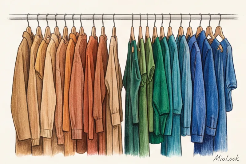
Why did we do all this? Knowing your true undertone is the key to wardrobe literacy. Once you've identified your base, you'll stop buying things that flatter you.
Let's look at basic T-shirts and trench coats (the price range for good basics is currently €50-€150). If you have a warm undertone, your "white" is ecru, cream, and baked milk. Your beige is a classic camel with a yellow base. If you have a cool undertone, your white is an optically bright or icy gray, and your beige should have a grayish-pink base (taupe).
About that, How to choose the color of jewelry metal (gold or silver) Depending on the undertone, we discussed this in detail in a separate article, but the basic rule is this: a neutral undertone looks incredibly good when mixed with both metals in one look.
To avoid having to keep this entire palette in your head, I recommend digitizing your colors. You can use the "smart wardrobe" feature in MioLook — the app analyzes your appearance and automatically filters shopping recommendations, eliminating shades that will make your face look tired.
Checklist: 5 Mistakes Guaranteed to Ruin Your Homework Test
In my practice, hundreds of women have come to me with a pre-defined color type that turned out to be completely wrong. Check to see if you're making these mistakes:
- Mistake 1: Test in the bathroom. The light above your bathroom mirror has a low color rendering index (CRI). You'll only see the spectrum your bulb emits.
- Mistake 2: Bright clothes. If you're wearing a red T-shirt, it will cast a warm glow on your chin. It will appear as if you have a warm undertone, even though it's simply the reflection of the fabric.
- Mistake 3: Wrist veins. Please forget this 2010s myth! The thickness of your wrist skin, the depth of your veins, and your tan level make this method a guessing game. Vein color doesn't determine your facial temperature.
- Mistake 4: Rosacea instead of undertone. We've already established that superficial redness (overtone) is a skin condition, not an undertone. Look for the truth on your neck.
- Error 5: Photo on phone. Modern camera algorithms automatically adjust white balance, "improving" the image. Only examine yourself in a real mirror. Neural network analysis, of course, able to determine color type from a photo , but this requires special machine vision algorithms without the distorting filters of a smartphone.
Determining your undertone isn't about trying to force yourself into a rigid "winter" or "spring" framework. It's about getting to know your physiology. A properly performed white sheet test (or rather, a sheet of watercolor paper) is your personal key to a wardrobe where every piece complements your appearance, highlighting it from within rather than challenging it.


