Have you ever wondered why, after a morning meeting, colleagues sometimes ask if you're feeling well, even though you got the required eight hours of sleep? Or why, in one jacket, you look like a confident professional, while in another, you look like a tired student about to take an exam? It's not the cut or the brand. It's the physics of color and how it interacts with your skin.
Collecting yours business wardrobe by color type , we often make the same mistake: blindly copying mannequins from shop windows, forgetting that office lighting (those same cold fluorescent lamps) mercilessly distorts shades. We discussed the unconscious influence of tones on interlocutors in more detail in our complete guide. The Psychology of Color in Clothing: How to Manage Impressions.
Today, I propose a different approach to color analysis. We'll combine classic appearance analysis with textile expertise and explore how fabric texture alters color perception in a strict business environment.
Why the standard "black and white" dress code is hurting your career
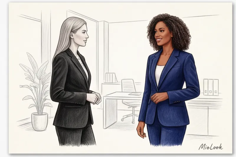
Let's face it: the "black bottom, white top" rule isn't a universal classic, but an outdated stereotype that ruins the appearance of most women. According to research from the Institute for Color Research, we only have 90 seconds to make a first impression. And harsh, graphic contrast often works against us, creating an unconscious barrier in negotiations.
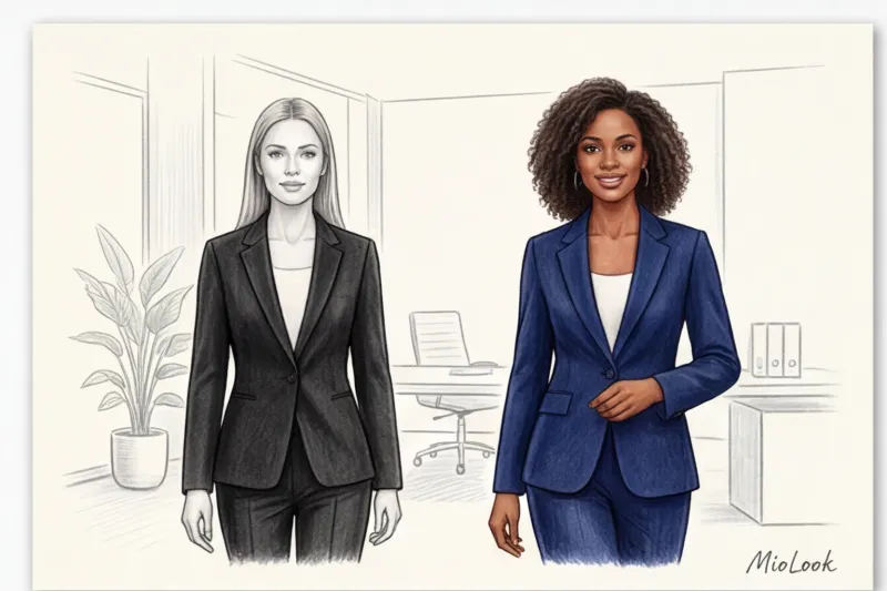
I had a revealing case in my practice. Anna, the CFO of a large IT company, came to me. Her problem was, "My subordinates find me too rigid and closed, even though I'm a democratic leader." We opened her closet, and I saw rows of solid black suits made of blended fabrics. Statistics are grim: pure black is flattering for only 25% of European women—primarily those with a contrasting "winter" complexion. For the remaining 75%, it acts as an age marker, highlighting nasolabial folds, under-eye shadows, and even the slightest unevenness in skin tone.
We swapped her black jackets for shades of dark chocolate (espresso) and deep sapphire. The effect was immediate: her face looked rested, and her look became more inviting without losing her statuesque presence.
The same goes for pure white. The wrong light shade (especially with a bluish undertone, typical of cheap polyester) makes the complexion look dull and unhealthy. Switching to eco-friendly fabrics in natural, complex shades is not only a nod to sustainable fashion but also a direct investment in your personal brand. Natural wool and organic cotton retain dye differently, creating a refined depth unmatched by synthetics.
Your perfect look starts here
Join thousands of users who look flawless every day with MioLook. The smart algorithm will select the colors that suit you best.
Start for freeBusiness wardrobe by color type: the architecture of basic shades
In the context of color, "basic colors" aren't synonymous with gray and black. They're the neutral, calm shades of your personal palette that occupy the largest space in your look (coats, suits, trousers, bags). A smart business capsule wardrobe follows the 70/30 rule: 70% basic neutrals and 30% accent colors.
Forget the outdated "spring-summer-fall-winter" system in its purest form. Modern stylists use a directional method of color analysis. Before buying an expensive suit (for example, from the premium Massimo Dutti or COS lines), identify three vectors of your appearance:
- Temperature: Are you a warm (golden skin tone) or cool (pinkish/olive undertone) skin type?
- Depth: Do light, pastel colors or dark, saturated colors suit you?
- Purity: Does your appearance require clean, vibrant colors or muted, dusty ones?
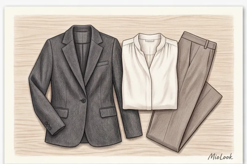
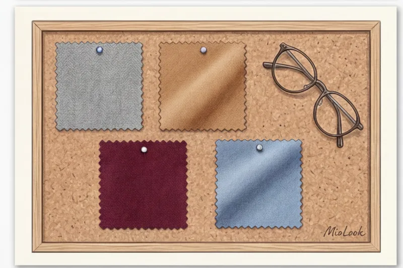
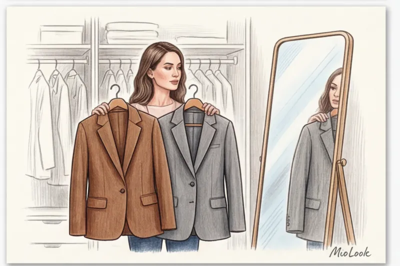
Dark Base: Status Alternatives to Black
If you're accustomed to dark suits, try finding your own alternative to black. Graphite, marengo, and deep navy are ideal for cool color schemes. They maintain the necessary distance for business without creating a mournful effect.
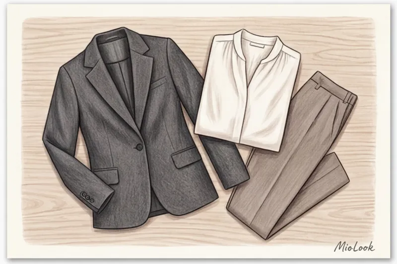
For warm colorings, the best investment would be shades of dark chocolate, dark emerald, or deep burgundy (oxblood). These colors look incredibly expensive, especially in dense textures like Super 120s suiting wool.
Light Base: How to Find Your Perfect White
A white shirt is the foundation of office style, but its shade should complement the whites of your eyes and the enamel of your teeth. Cool-toned individuals should look for icy blue, pearl, or alabaster shades. Warm-toned individuals should avoid stark white—swap it for ecru, cream, oatmeal, or champagne.
Fabric texture changes color: a secret stylists are keeping quiet about
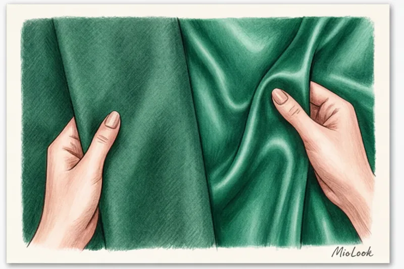
As a fabric quality specialist, I often see women disappointed with "their" color after buying an item in the wrong texture. The physics of light reflection in fibers is what distinguishes an expensive look from a mediocre one.
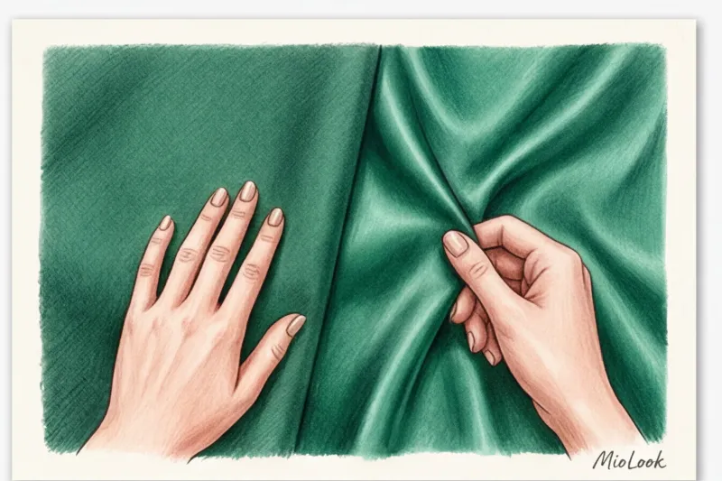
The weave of a fabric dramatically influences how we see color. Matte fabrics (wool, cashmere, linen, and heavy cotton over 180 g/m²) absorb light. They make even the brightest colors muted, deep, and more appropriate for a strict dress code. For example, fuchsia on smooth silk is bold and outrageous, while fuchsia on textured tweed is an elegant accent, appropriate for a Friday.
Smooth fabrics (silk with a density of 19 momme, high-quality viscose, cupra) act like mirrors. Research shows that natural silk reflects up to 30% more light than matte wool. This means a silk blouse will illuminate your face, making your skin appear smoother. However, if the color is too bright, the smooth texture will make it appear "garish."
"Cheap polyester doesn't just harm the planet—it makes you cheaper when negotiating. Synthetic fiber reflects light unnaturally, creating a cheap, glassy sheen that distorts even the most beautiful natural shade."
From a sustainability perspective, natural dyes on organic fabrics age much more gracefully. Cotton develops a beautiful vintage fade over time, while polyester simply pills and loses pigment in patches.
Try MioLook for free
A smart AI stylist will select the perfect look, taking into account not only your color type but also the textures of the fabrics in your wardrobe.
Start for freePalettes for the 4 Basic Colors in the Office Environment
In a business environment, we don't use our color type palette at full volume. The office demands muted, calm versions of your best colors. If your company has a business casual or smart casual style, you can take more liberties, but the basics must remain impeccable. We wrote about each color type in more detail in the article. 12 Color Types of Appearance: A Guide to Choosing a Palette.
Cold Types (Summer and Winter): From Graphite to Ice
The Winter Girl is the only one who truly suits crisp white and jet black. Contrast is your strong point. Icy shades (blue, pink) paired with dark bottoms work great in the office. Accents: emerald, sapphire, ruby.
Summer coloring calls for subtlety. Your colors seem veiled in a morning haze. Dusty, muted tones: blue-gray, dusty rose, complex taupe. Avoid sharp contrasts in favor of monochrome or a soft gradient.
Warm Color Types (Spring and Autumn): From Camel to Terracotta
The autumn type looks luxurious in complex, natural shades. Your business base colors are mustard, khaki, copper, and deep brown. Swap your white shirt for a creamy brown, and your black jacket for a dark olive.
Spring is all about crisp, clean, yet warm tones. For a formal dress code, stick with light beige, camel, and peach. Save bright colors (warm coral, leaf green) for accessories or silk blouses worn under a buttoned jacket.
How to integrate "forbidden" colors into a business look
What should you do if your favorite color absolutely doesn't suit your skin tone? Spoiler: don't throw it away. As a stylist, I always advocate for sensible consumption and adaptation.
The main rule of coloristics is that color only affects the face when it's in the "portrait zone" (from the chest to the crown). If you adore terracotta but have a cool complexion, simply buy terracotta pants or a skirt. This color is completely safe underneath.
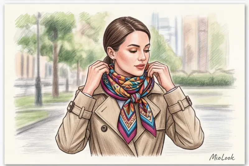
Another professional trick is layering. If you have an expensive jacket in the wrong shade, separate it from your face with the right color. A blouse in your ideal shade with a statement collar or a well-tied silk scarf underneath will create the necessary barrier.
Let's be honest: this trick has its limitations. It absolutely doesn't work with turtlenecks, turtlenecks, or turtleneck dresses. If the item is tight around the neck and the color isn't your thing, no amount of trickery will save the situation.
By the way, it is for such controversial cases that I recommend using MioLook — Upload your items to the virtual wardrobe, and the app will show you which scarves or blouses from your collection will pair this "complex" jacket safely and stylishly.
Checklist: An Eco-Friendly Audit of Your Work Wardrobe
According to a McKinsey report (2024), extending the life of clothing by just nine months reduces its carbon footprint by 20-30%. Let's audit your wardrobe right now without throwing away unnecessary items.
- Step 1: Daylight test. Gather all your office jackets and blouses. Go to a window during the day (no makeup!). Apply each item to your chest one at a time. If the color is "your" color, your face will look fresher, your contours will be firmer, and your eyes will be brighter. If not, bruises will appear and your skin will appear gray.
- Step 2: Sorting. Divide things into two piles: “my portrait colors” (worn near the face) and “questionable” (require adaptation).
- Step 3: Ecological adaptation. What to do with the second pile? We'll use a sustainable approach (upcycling). High-quality items made from natural fabrics (cotton, linen) can be dry-dyed to a darker, more comfortable color. Wear jackets only with the right scarves or contrasting collars.
Color is a powerful tool for your personal brand. It speaks for you before you even utter a word in a meeting. Find your strongest shades, invest in quality textures, and you'll notice how not only your reflection in the mirror changes, but also how you're perceived in your professional environment.