Open your closet right now. I bet you'll find a whole army of black bags, black belts, and maybe a couple of black scarves to go with everything waiting for you on your accessories shelf? Asking me, How to choose the color of accessories to match your clothes 9 out of 10 new clients admit during wardrobe review that they're afraid to buy color accents. They sincerely believe that black is the safest investment.
Let's be honest: this is the main fashion misconception that daily robs your looks of individuality. We discussed the basic principles in more detail in our a complete guide to choosing the right accessories , but today I want to dig deeper. As a certified colorist, I'll show you the mechanics of color. We won't be memorizing boring schemes—we'll explore the concept of "color bridges" and learn how to pull off even those pieces that are completely unsuitable for your color type using just a belt or scarf.
The Myth of Universal Black: Why It Cheapens and Cuts Down Your Look
In cognitive psychology, there's a concept called the "Restorff Effect" (or isolation effect). It states that an object that stands out from a uniform background is most memorable. In styling, it works like this: accessories take up no more than 10-15% of an outfit's surface area, but they can command up to 80% of a person's visual attention. This is why shoes and bags are the first things people scan.
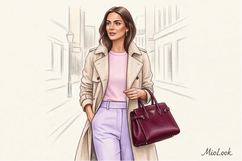
Now imagine: you put on a luxurious beige trench coat, cream trousers, a white shirt... and grab a harsh, graphic black bag. Your brain interprets this black square not as an elegant addition, but as a visual axe, roughly cutting through the light pastel harmony.
Over 12 years of practice, I've developed an ironclad rule: black creates too much contrast for 80% of everyday looks. The exception is if you're consciously pursuing an all-black or grunge aesthetic.
What to use instead of black? Meet the "new neutrals" palette:
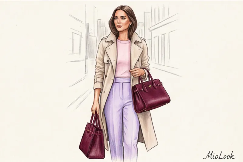
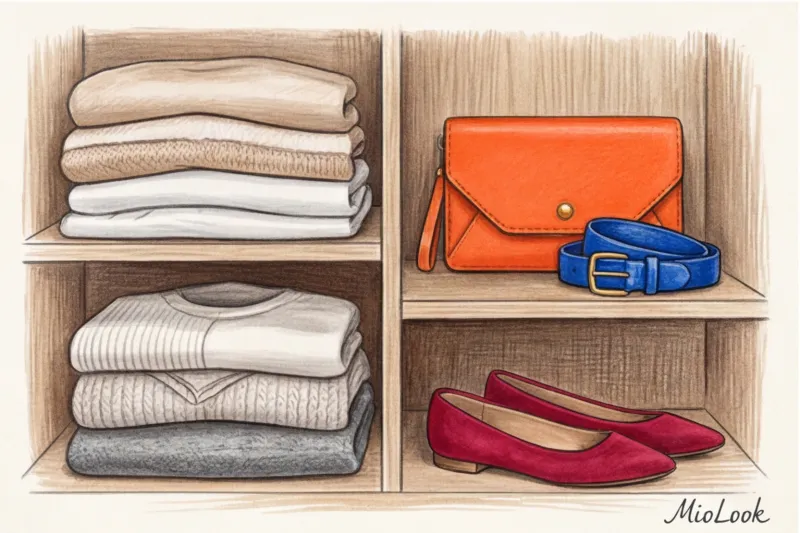
- Deep wine (Burgundy): Works great with grey, beige and denim.
- Dark chocolate: looks three times more expensive than black, especially in smooth leather.
- Dark taupe (grey-brown): the perfect base for a summer wardrobe.
- Deep Olive: A noble alternative for lovers of safari and casual styles.
"Swapping out a plain black belt for a dark chocolate-colored one is the quickest and cheapest way to increase the visual value of an outfit by several orders of magnitude."
Try MioLook for free
A smart AI stylist will create the perfect everyday look and suggest accessories to complement your basics.
Start for freeThe Color Bridge Theory: How to Match Accessories to Printed Outfits
A floral dress, a leopard skirt, or a classic tartan—prints often cause panic. Most women simply give in and reach for... yes, that same black or beige bag. And that's a huge missed opportunity.
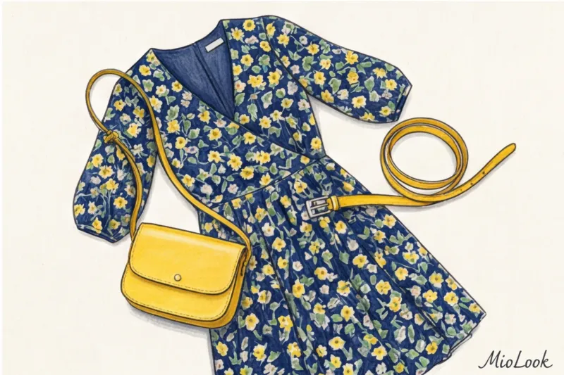
Here, Johannes Itten's color theory and the "color extraction" rule come to our aid. The essence of the method is as follows: we carefully examine the clothing print, finding the color that occupies least area (the least noticeable), and make it the main color of our accessory.
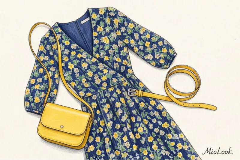
Let's say you have a dress with the right slimming print A dark blue background, large green leaves, and tiny, barely noticeable yellow accents. If you choose a blue bag, it will blend into the background (a blending mistake). If you choose a green one, the look will become too theatrical. But a small yellow shoulder bag or a thin yellow belt will create that perfect "color bridge." They will pick up those tiny pigments on the dress and give the entire print a new feel without overpowering the look with too much color.
Color Architecture: The 60-30-10 Rule in Wardrobe
If you've ever been interested in interior design, you've probably heard of the golden rule of 60-30-10. We stylists successfully stole it from architects long ago. It's a flawless mathematical formula for proportions that saves you from the "putting on all your best things at once" effect.
In the wardrobe it is distributed like this:
- 60% - base color: This is your "canvas." For example, a gray pantsuit, a basic dress, or jeans and a turtleneck.
- 30% - additional color: a blouse under a jacket, a cardigan over a dress or shoes.
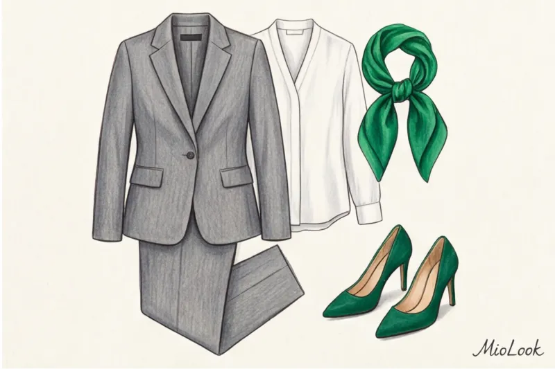
- 10% - accent color: This is our accessories' territory. Bags, scarves, glasses frames, large jewelry.
The mathematics of style are extremely pragmatic here. Investing in these 10% yields a phenomenal return on investment (ROI) for your wardrobe. You can buy a new, trendy fuchsia coat for €300–€500 and wear it maybe five times a season because it's too eye-catching. Or you can take your basic gray outfit and pair it with a fuchsia silk scarf for €50. The effect is the same, but you can wear the scarf in dozens of different configurations.
Bag and shoes in the same color: outdated pattern or classic?
Just 15 years ago, going out with a bag and shoes of different colors was considered a fashion crime. Why? Historically, the perfect "matching set" was a sign of status—it demonstrated that a woman had the money and time to match her skin tone.
Today, strictly matching your bag and shoes often comes across as overdressed. This still works in a strict formal dress code, at protocol events, or if you're Kate Middleton. In all other casual settings, this technique is outdated.
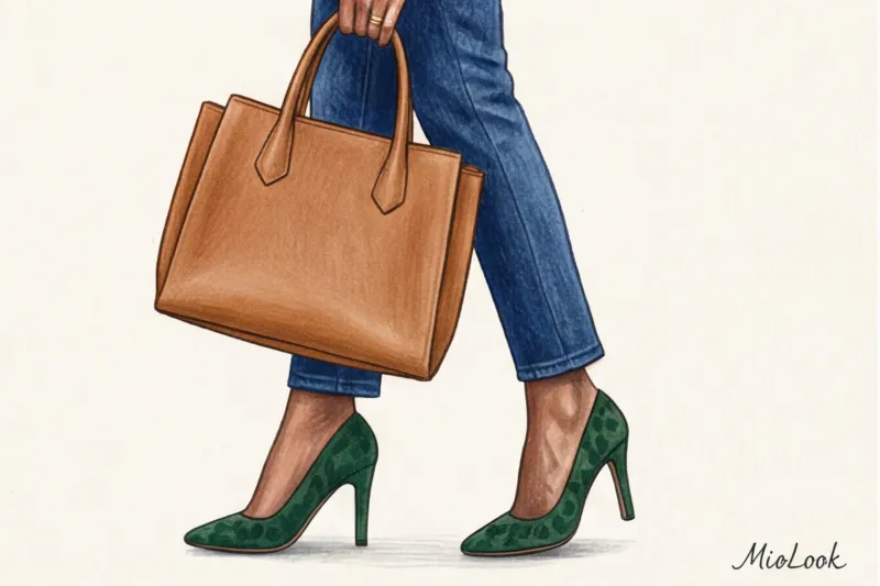
A modern alternative: match your shoes and bag not by color, but by saturation or temperature For example, dark green suede loafers pair beautifully with a muted caramel bag. They're both warm and have a soft, autumnal richness.
Temperature and Metals: The Golden Rule of Portrait Zone
Many people forget that the hardware on bags, belt buckles, and metal on eyeglass frames aren't just functional details. They're full-fledged colors that sit right next to your skin. And here we enter the realm of temperature conflicts.
If you have a distinctly cool skin tone, wearing too many bright yellow-gold accessories near your face (earrings, necklaces, details on a shoulder bag strap) will highlight redness and make your face look more tired. To determine your skin temperature at home, try a simple stylist test: place a sheet of silver foil (or matte gray fabric) and then gold foil on your clean, makeup-free face. Notice which metal makes your eyes appear brighter and your under-eye circles less noticeable. Learn more about... How to choose jewelry metal , I already wrote earlier.
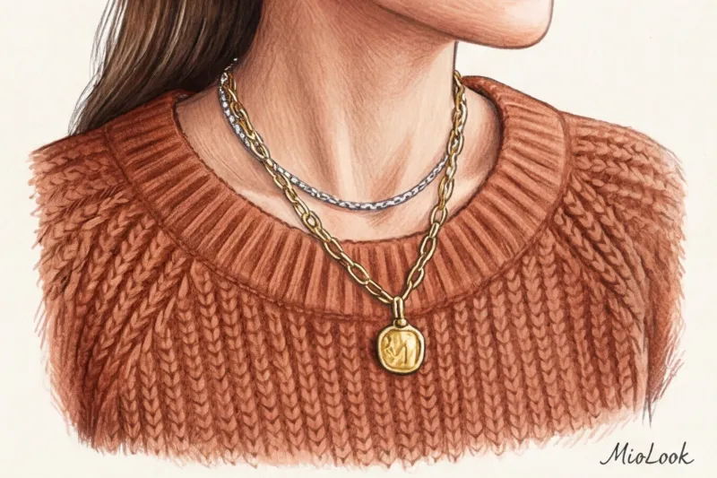
What if you have a warm undertone but love silver? Embrace the modern trend. mixed metals (mixing metals). The secret to a successful mix is the presence of a transitional element. If you're wearing gold earrings and a silver chain, add a bicolor ring or watch (where steel and gold are intertwined). This element legitimizes your choice, showing that this is a deliberate styling choice, not an accident.
By the way, if you're unsure of your color type and contrast, you don't have to rack your brains over foil tests. In the app MioLook Built-in AI-powered color type detection from photos will select your ideal palette of metals and shades with pinpoint accuracy.
Stylist's life hack: How accessories can save clothes that aren't your color
And now for my favorite secret, which proves that color types aren't a prison, but a management tool. What should you do if you bought a stunning, expensive sweater, but it's not the right temperature for you?
I had a case in my practice: a client (a pronounced "Warm Autumn" type with copper hair) bought a luxurious cashmere and wool pantsuit in a cool, icy gray. The suit cost around €800 and fit perfectly, but it cast a sallow cast around her face and made her look five years older. She refused to return the suit.
We used the concept "Buffer zone" If a color clashes with your skin tone, we need to physically move it away from the face by creating a layer of the right color. We paired this gray suit with a chunky, warm matte gold necklace and a voluminous terracotta scarf.
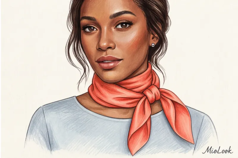
The scarf, tied close to the face, created the perfect temperature boundary. The face was illuminated by a warm terracotta reflection, and the gray suit became simply an elegant background (the same 60% from our rule). If you are "Summer," but you were given a basic, but too warm mustard-colored sweater - just wear a cool white or dusty blue shirt underneath, with the collar hanging out.
Your perfect look starts here
Join thousands of users who look flawless every day with MioLook. Digitize your wardrobe and get ready-made looks in one click.
Start for freeChecklist: 5 Steps to Creating the Perfect Accessory Palette
To make sure knowledge doesn't just remain text on a screen, let's turn it into an action plan. If you're in the process forming your capsule wardrobe , follow these 5 steps:
- Start rating: Look at your base. What shades are there more of—warm (beige, brown, khaki) or cool (gray, black, pure white, blue)?
- Select base: Buy two everyday bags and two belts in shades of the "new neutrals." For a warm base, choose cognac and olive. For a cool base, choose burgundy and graphite.
- Accent punch: Choose 1-2 bright colors that are on the opposite side of the color wheel from your base (the rule of complementarity). For blue denim, go with orange-tangerine. For khaki, go with a rich berry.
- Metal inspection: Match the hardware on your basic bags with your favorite watch or sunglasses. Or buy one bicolor piece of jewelry so you can wear it with everything.
- We build bridges: Invest in two or three scarves or twillies (thin ribbon for bag handles) in a print that includes both your base and accent colors. They'll tie your wardrobe together.
Knowing how to work with accessory color is a skill that requires careful observation. Don't try to buy every brightly colored bag in the high-street stores (Zara, Mango, and H&M offer excellent statement bags for €30–€60, which are a great place to start experimenting). Start small: swap out the black belt for a burgundy one in your typical office look. I guarantee you'll immediately notice the difference your colleagues make in your appearance. Accessories aren't just an addition to your style. They're your style.


