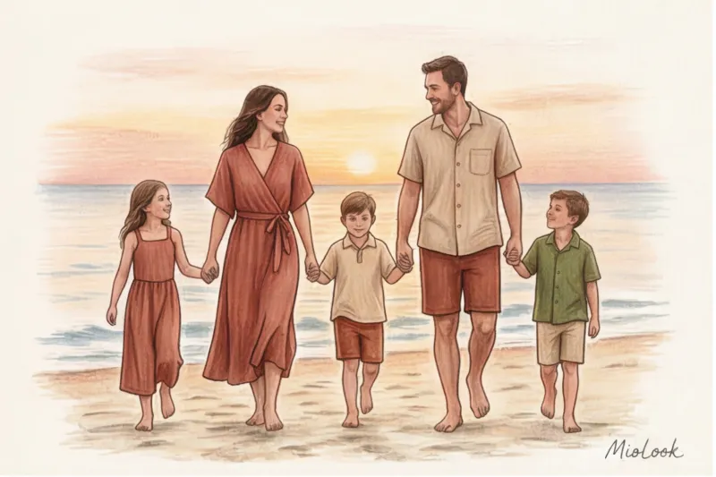
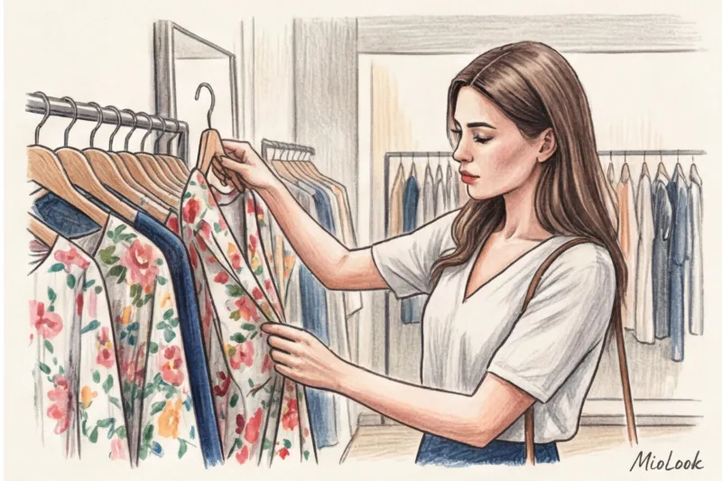
Last week, I was sorting through a new client's wardrobe. We pulled out fifteen dresses, and twelve of them had one thing in common: they were floral prints, bought on a whim and worn exactly once. When I asked why they were gathering dust on hangers, the client sighed, "In the fitting room, I felt like a romantic fairy, but on the street, I feel like a simpleton who's been given an extra ten years."
Sound familiar? You're not alone. According to wardrobe analysis statistics in the MioLook app, dresses with small floral prints made of viscose or polyester are the most common "dead weight" category. We've covered more general rules for styling patterns in our The complete guide to fashionable clothing prints: how to wear leopard and plaid , but today we are dissecting the most insidious of them.
As a textile expert, I want to shift the focus from tired body type advice to the physics of fabric and print features. After all, they are what determine whether your floral print in clothing look like part of a well-thought-out look or like a dressing gown for the countryside.
The psychology and physics of fabric: why does floral print clothing make you look more grown-up?
We're often afraid to wear flowers after 30, intuitively sensing a catch. And it's not the age of the passport, but the quality of the source material. Cheap polyester with its characteristic glassy sheen instantly cheapens any design, even the most ingenious one. The glare on synthetics distorts the perspective of the pattern, turning the flowers into a flat, blurry blob.
According to the principles of creating optical illusions in fashion design (this discipline is studied in detail, for example, at the Marangoni Institute), the human eye unconsciously reads printing technology.
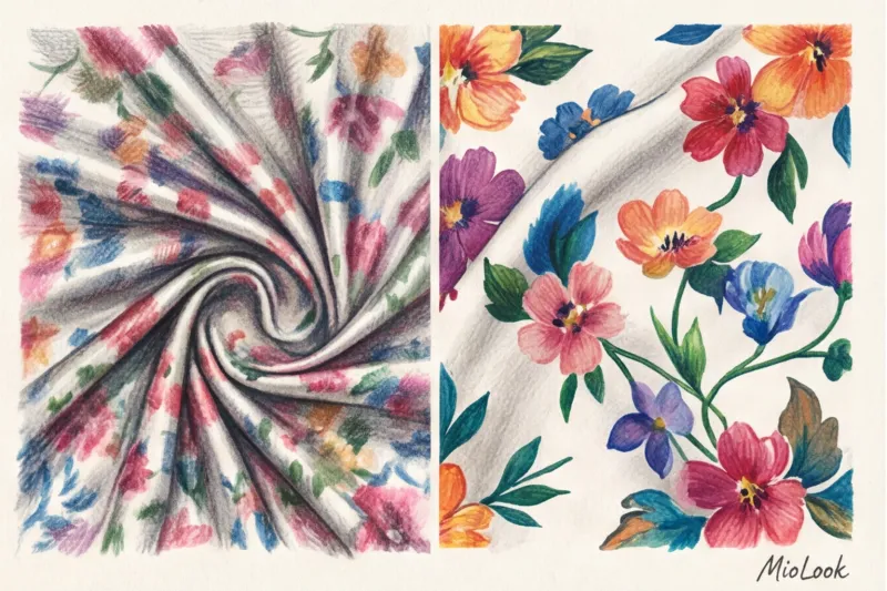
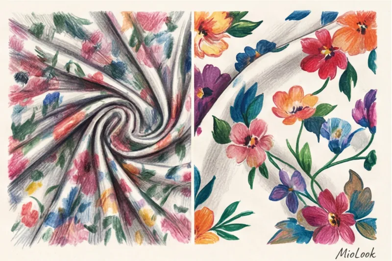
- Cheap rotary printing: The edges of the buds are slightly blurred, the colors are “dirty”, and the fabric is completely white on the inside.
- Expensive digital or screen printing: The contours are graphic, the pigment penetrates deep into the fabric fibers, the colors are pure and rich.
"It's better to invest €150 in one blouse made of thick matte silk with a perfect graphic print than to buy five fast-fashion day dresses for €30 each that will lose their shape after the first wash."
Conscious consumption begins with the ability to read fabric with your fingertips. If the material creaks, becomes staticky, or wrinkles too much in your fist, no floral pattern will save it.
The main trap: the small flower (millefleur) and the myth of the "Frenchwoman"
Perhaps the most dangerous myth in the fashion industry is: "Buy a dress with small calico flowers, add a wicker bag, and you're a young Parisian." In practice, millefleur (from the French mille-fleurs — a thousand flowers) after 30 years works like a time machine, sending you straight to your grandmother's wardrobe.
Why does this happen? The human brain is associative. A small, tightly set pattern on a thin fabric was historically used for home and workwear (robes, aprons). To pull off such a garment without makeup or styling, you need a high level of natural contrast in your appearance. If your facial features are soft and your coloring is muted, a millefleur will immediately make your face look tired.
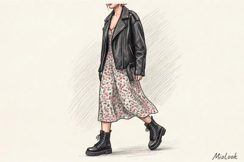
How to Save a Small Print: The Rule of Contrasting Textures
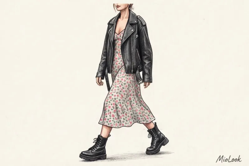
Does this mean you should burn all your floral dresses? No. But they should definitely not be worn with ballet flats, thin cardigans, or straw hats. This style requires a firm grounding.
- Use rough textures: Layer a chunky, vintage leather jacket or a denim jacket that's at least 14 oz. over your dress.
- Shoes as an anchor: A lightweight midi dress requires a heavy base: chunky Chelsea boots, rough suede Cossack boots, or lace-up combat boots.
- Geometry in accessories: Choose bags with a rigid shape (baguette, tote with sharp corners) to counteract the excessive softness and relaxation of the floral pattern.
Try MioLook for free
A smart AI stylist will select the perfect look based on your wardrobe and suggest how to pair complex prints.
Start for freeLarge buds and abstraction: how they work with the proportions of the figure
Size matters, especially when it comes to proportionality. A basic rule of styling is that the scale of the print should be in harmony with your bone structure and facial features. On a petite woman 155 cm tall, giant poppies will look as if the dress is about to swallow her. Conversely, on a statuesque figure, a print that's too small will visually add volume.
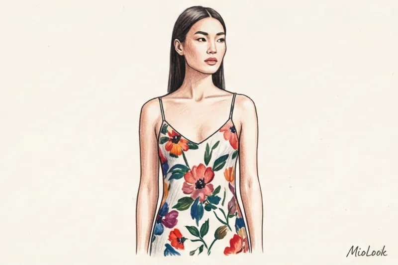
But there is one secret that I constantly use in my work. Abstract floral print in clothing — this is the safest and most prestigious alternative to realistic plants. When flowers resemble careless watercolor brushstrokes or graphic geometric shapes, they lose their "provincial" naivety.
Interesting fact: A 2024 study of consumer behavior by WGSN found that items with large, abstract prints are perceived by consumers as being more expensive (on average, 40% more expensive than their actual price) than items with detailed, realistic colors.
The "Air" Rule: Negative space is more important than the colors themselves.
If you take just one rule from this article, let it be the concept of "air" or negative space. This is what fundamentally distinguishes luxury fabrics from mass-market ones.
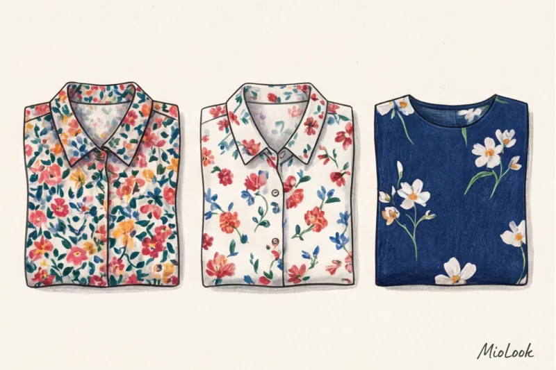
Negative space is the empty background between the elements of a design. When a manufacturer wants to save money on developing a complex pattern, they take a single small flower and mindlessly replicate it so densely that the background is almost invisible. This type of print creates visual noise. The eye has nothing to focus on, and the silhouette merges into a single, motley mass.
Gold standard: The background should take up at least 40–50% of the fabric. When there's space between the colors, the print begins to breathe. Compare a densely packed chintz from a budget store with a silk blouse from COS or Massimo Dutti—in the latter case, you'll always see a pure, deep background color (for example, navy blue, emerald, or chocolate), against which the sparse buds look like works of art.
Style Matters: Why Floral Prints Don't Tolerate Complex Cuts
Remember my client from the beginning of this article? One of her biggest mistakes (and a common cause of "wardrobe ghosts") was the formula: complex print + complex cut. She had a dress that featured vibrant red roses, puff sleeves, an asymmetrical hem, ruffles on the chest, and a bow belt.
This is a surefire way to achieve the "actress from a burnt-out theater" look. The floral pattern itself is a powerful accent, without the need for complex architecture.
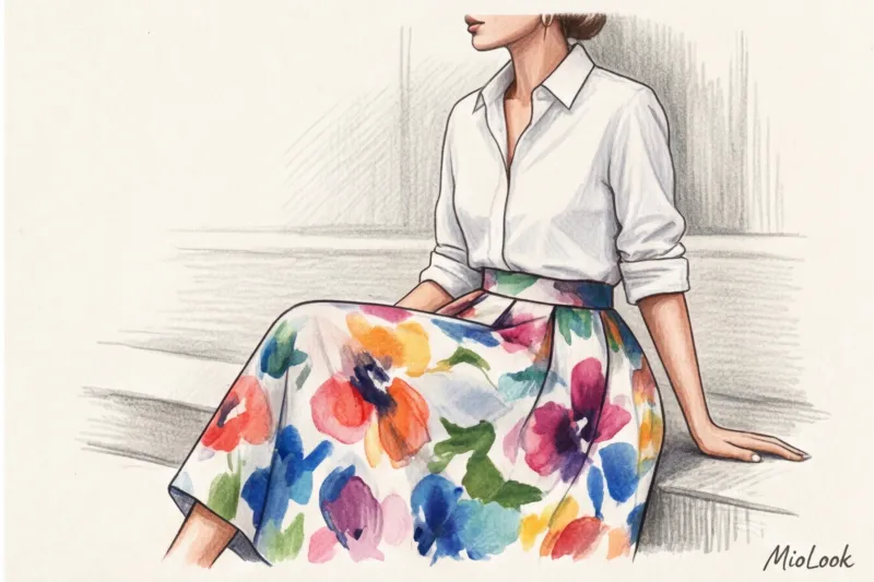
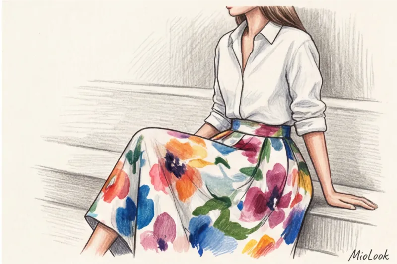
Ideal, time-tested styles for floral print:
- Midi length slip dress (straight cut, thin straps).
- A slip skirt cut on the bias.
- A classic men's shirt (worn unbuttoned over a white tank top).
- A straight or slightly fitted shirt dress without unnecessary details.
If you're unsure how a particular item will fit into your wardrobe, I recommend digitizing your items. By uploading photos of your clothes to MioLook wardrobe , you can visually try on a new floral dress with your favorite jackets and shoes before you even go to the checkout.
Your perfect look starts here
Join thousands of users who look flawless every day by managing their wardrobe with MioLook.
Start for freeA stylist's checklist: how to choose and integrate floral prints
To never again make impulse purchases that end up in vain, save this step-by-step algorithm. Apply it every time you reach for another floral item in the €50 to €300 price range:
- Tactile test: Squeeze the edge of the fabric in your fist for 5 seconds. If it's covered in small creases that won't straighten out, leave it at the store. A wrinkled floral print always looks untidy.
- Graphics test: Look closely at the contours of the buds. They should be clear, with no "paint runoff" or pixelated effect.
- Checking the "air": Evaluate the negative space. Can you see the background color as clearly as the flowers themselves? If not, the print is too busy.
- Style analysis: Mentally remove the print and imagine the item in black. If the style remains stylish and modern, go for it. If without the print the item looks like a ridiculous ruffled construction, pass.
- One thing rule: Use a floral print as a functional accent. Don't go for a total look (unless it's a ready-to-wear pantsuit); let one piece stand out.
Wearing floral prints stylishly isn't an innate gift, but a skill in analyzing fabric, proportions, and a keen eye. Forget the idea that flowers are exclusively for summer and frivolity. Choose dense textures, abstract shapes, and leave plenty of air in the fabric, and floral motifs will become the most sophisticated part of your wardrobe, emphasizing your status and impeccable taste.