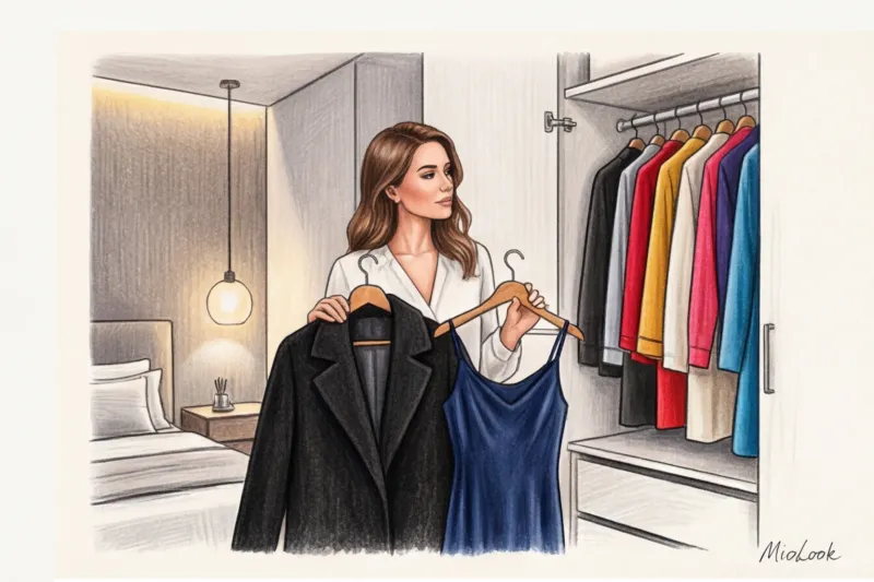
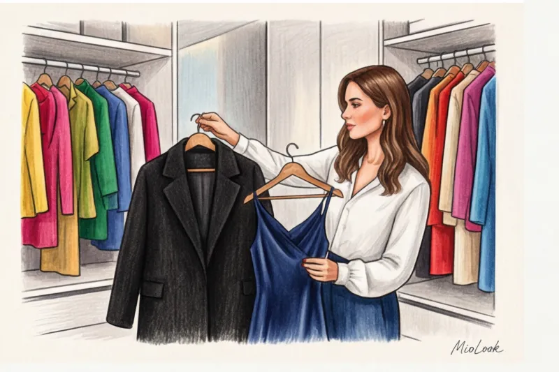
One day, a client came to see me—a top manager at an IT company. She stood in front of the mirror in a luxurious dark blue silk dress and flatly refused to wear her perfect black cashmere coat over it. "Olena, I look like I got dressed in the dark and mixed up the hangers!" she said. Sound familiar? In 14 years of working as a stylist, I've heard this hundreds of times. We all grew up on magazines from the 2000s, which ingrained rigid lists of taboos into our heads. But the truth is, so-called clashing colors in clothing aren't a law of physics, but simply an outdated stereotype.
We have already talked in more detail about the basics of coloristics and working with the Itten circle in our a complete guide to color combinations in clothing Today, I want to debunk the most persistent myths and show you how to wear what was once considered a fashion crime.
The myth that there are absolutely incompatible colors in clothing
Where did these strict color rules come from? Most of them stem from the banal quality of the textile industry of the last century. In the mid-20th century, dyes were often dull and faded quickly, and combining two complex shades actually created a "dirty" effect. Furthermore, there were strict class dress codes, where color literally determined a person's status.
Today, technology has changed. According to the Pantone Color Institute's 2024 data, the boundaries between traditionally conflicting shades have been completely erased in global trend books. However, statistics are stubborn: about 78% of my new clients wear only 3-4 basic colors for fear of looking ridiculous. We've been discussing this for years. color blocking in clothing , but in practice women continue to buy a fifth beige sweater.
The biggest misconception beginners have is that color works on its own. There are no incompatible colors. There are only awkward proportions, clashing temperatures, and identical, clashing matte textures.
Try MioLook for free
A smart AI stylist will select the perfect look for every day and help you introduce new colors into your wardrobe.
Start for freeBlack and dark blue: from the strictest taboo to "quiet luxury"
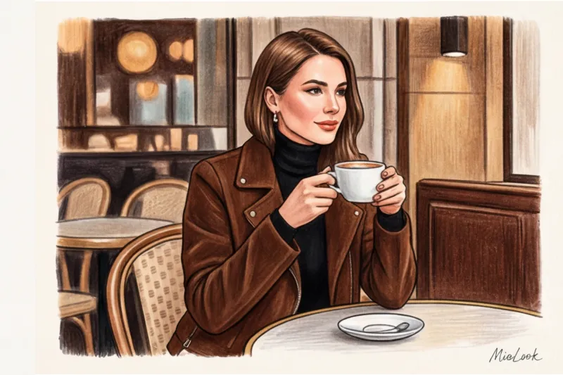
"Never mix black and blue" is perhaps the most famous fashion taboo. It used to be considered a mistake, as if you were trying to match the colors and missed the mark. But let's look at it from a modern stylist's perspective.
When that same executive client and I finally took a chance and replaced the harsh, hackneyed black and white contrast with a deep duet of black wool and navy blue silk, her look instantly became more sophisticated. The secret to this duet's elegance lies in its minimal contrast. It doesn't cut the figure in half, as a white top and black bottom does, but creates visual depth and beautifully elongates the silhouette.
How to wear it without looking gloomy
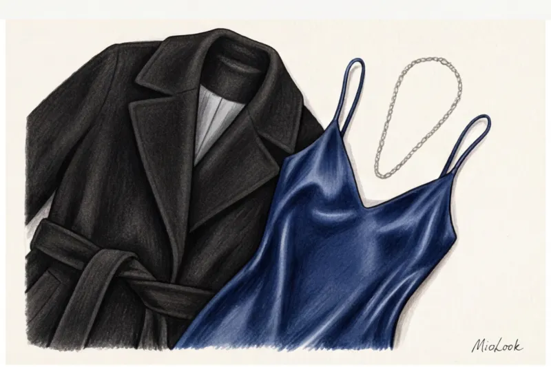
This combination has one hard limitation. This does NOT work If you combine two dull, matte fabrics (for example, a black cotton sweatshirt and dark blue cotton jeans without any fading), you'll end up with a dark stain.
- Tone Difference Rule: Blue should be clearly blue in daylight (sapphire, indigo, cobalt), and not merge with black into a single mass.
- Mandatory contrast of textures: combine matte black (wool, thick cashmere) and glossy blue (silk, satin, smooth leather), or vice versa.
- Add some air: Roll up your sleeves to reveal your wrists, show off your ankles, or add light-colored shoes.
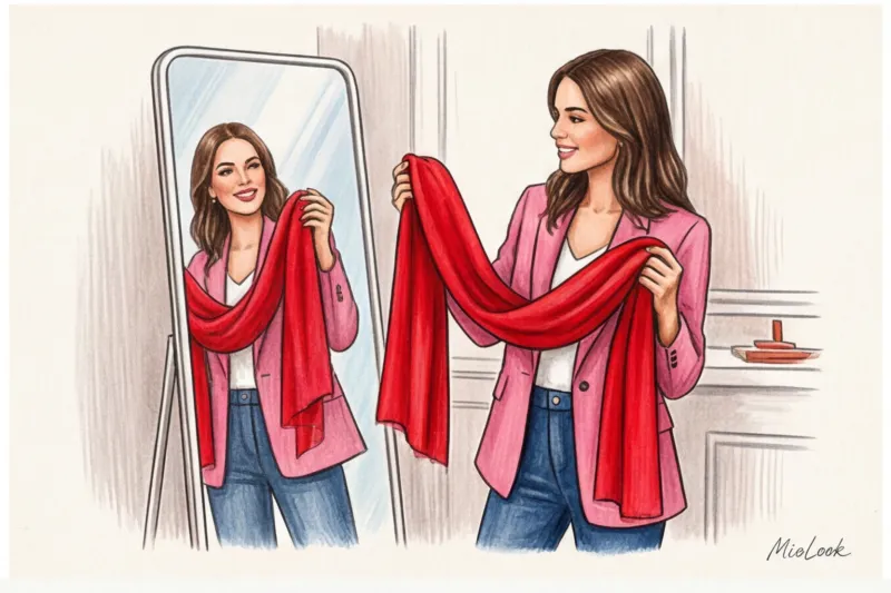
Pink and red: the main color phobia of yesteryear
Ask any woman over forty if she can wear pink and red, and she'll categorically refuse. But it was precisely this combination that the great Yves Saint Laurent codified on the catwalk back in the late 1970s. He was the first to prove that these related shades can create incredible dynamism.
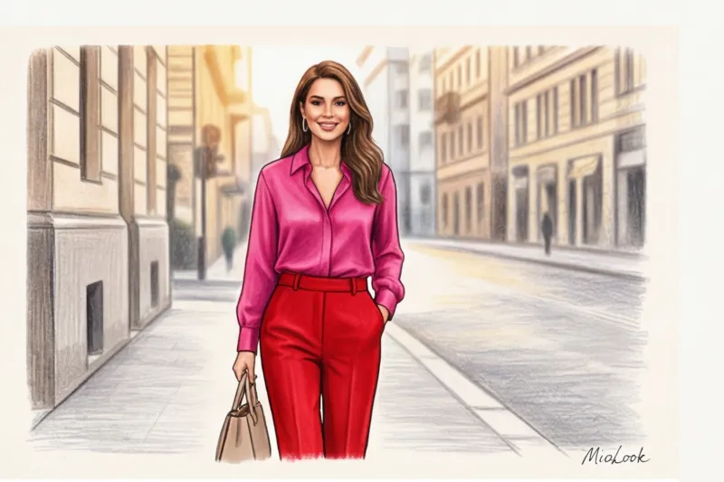
There's a technical subtlety here that's often overlooked. The secret to success is a precise temperature match. Cool neon fuchsia will look gorgeous with cool ruby or raspberry red. And warm peachy pink will pair well with tomato red (with an orange undertone).
Another nuance is proportions. Forget the 50/50 split. Red pants and a pink sweater of the same volume can visually overwhelm your figure. Use the 80/20 formula. For example, a flawless red pantsuit with a pink silk top peeking out from under the jacket, or a raspberry dress with an accent red bag.
Your ideal image begins Here
Join thousands of users who look flawless every day with MioLook. Digitize your wardrobe and experiment with color without risk.
Start for freeBrown and black: why it was once considered bad manners
The historical rule of English gentlemen was "No brown in town." Brown was considered the color of country clothes for hunting and walking, while in businesslike London, only black, gray, and dark blue were acceptable. Over time, this rule migrated to women's wardrobes and gave rise to the myth that black and brown look "dirty."
A contrasting insight: many women are still afraid to wear a brown bag with a black coat, even though this combination is synonymous with luxury today. Check out The Row or Bottega Veneta's 2024 lookbooks—you'll see this pairing in almost half the looks.
To make this combination work, choose the right, "delicious" shades of brown: rich caramel, dark chocolate, cognac, or tawny camel. Avoid dull, dusty taupe paired with black cotton—it will really make the look look tired and unkempt.
Metals: gold and silver in one look
We've reached my favorite myth. "If a bag has silver hardware, then the earrings, watch, and belt buckle should be silver too." Ladies, let's be honest: today, strictly color-coordinated hardware often betrays over-effort and adds age to an outfit.
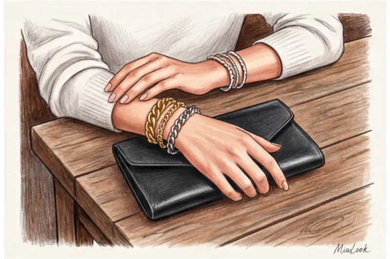
The modern approach to eclecticism calls for a touch of casualness. Studying the main trends in costume jewelry , you'll notice leading jewelry houses intentionally mixing metals. To ensure a harmonious mix, use the "rule of the nexus." Wear a bicolor piece—for example, a watch with a steel and yellow gold strap, or a Cartier Trinity ring (and similar ones). This will immediately give you the green light. multi-layered use of gold and silver chains.
Green and blue: a rule that nature itself abolished
Another English proverb is "Blue and green should never be seen." And this is the most absurd rule of all.
Just look out the window or recall your last vacation. The sky and tree foliage, the deep blue sea and emerald seaweed on the rocks—these are the most natural, basic combinations created by nature itself. Our eyes perceive them as absolutely harmonious.
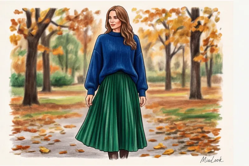
How to adapt this to an urban wardrobe? If you love drama and brightness, go for a jewelry palette: emerald and sapphire. If you prefer casual, olive or khaki (which is technically a shade of green) paired with classic blue denim is the perfect starting point. A khaki trench coat and straight-leg blue jeans are a street style uniform that will never go out of style.
The stylist's top secret: how to pair any incompatible colors in clothing
If you've read this far, you've already realized: color doesn't exist in a vacuum. I've conducted hundreds of wardrobe analyses and come up with three ironclad rules that help my clients wear any shade, even the most challenging.
- Texture decides everything. I've mentioned this before, but I'll repeat it: never combine clashing colors in identical, cheap, matte fabrics. Red cotton and green cotton will make you look like a Christmas elf. But red fluffy mohair and smooth, matte green leather look like something out of Fashion Week.
- The rule of the third neutral. If the duo seems too bold, add white, off-white, or light gray. A white shirt worn under a bright sweater, with the collar and cuffs visible, will instantly calm down any loud color block.
- Distance from the face. Worried that a complex shade will highlight dark circles under your eyes? Move it downwards. Keep your tried-and-true base color close to your face and experiment with your pants, skirts, or shoes.
By the way, in my practice I constantly use smart wardrobe feature in MioLook This app allows you to digitize all your items. You simply add texture tags to the uploaded clothes and, in a virtual fitting room, you can see how red silk will look with pink wool. This saves a ton of time in the morning and prevents your closet from becoming a cluttered mess.
Checklist: 3 Steps to Bold Color Combinations in Your Wardrobe
Theory is great, but fashion requires practice. To avoid reaching for black pants and a gray sweater tomorrow morning out of habit, do the following:
- Step 1: Conduct a micro-audit. Choose one of your favorite neutral-colored items (let it be a navy blue jacket) and find one item in your closet that is a bright, “incompatible” color according to the old rules (for example, a black or burgundy turtleneck).
- Step 2: Check the contrast of textures. Make sure items feel different to the touch. Combine smooth with fluffy, matte with shiny, and dense with translucent.
- Step 3: Start small. If wearing two large, colorful pieces feels intimidating, incorporate the controversial color through micro-accents. Pair a navy suit with black leather loafers and a black bag, or add a red-pink scarf to a basic trench coat.
Ladies, your personal, recognizable style begins exactly where the fear of making a mistake ends. Clothes aren't a strict test, but a tool you can and should play with. Forget the old rules, trust your mirror, mix textures, and finally allow yourself to wear the colors that make you happy.


