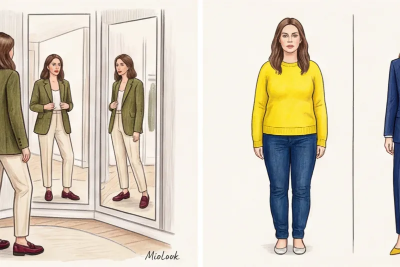
You're standing in front of the mirror. You're wearing immaculate black trousers, a white heavy cotton shirt, and a classic beige trench coat. You're holding your favorite burgundy bag. It seems basic and tried and true, but your reflection screams, "Something's wrong!" You know what the problem is? You think you're wearing a neutral base with one bold accent, but in reality, you've transformed yourself into a walking palette of four equally compelling shades, all vying for attention.
In my 12 years as a personal stylist in Europe, I've seen this scenario hundreds of times. We buy great pieces from Massimo Dutti or COS, but we put them together in such a way that they lose all their luster. To understand why some combinations look like street style from Fashion Week, while others look like a random assortment of clothes, you need to remember the mathematics of color. We've already covered basic color schemes in more detail in our a complete guide to color combinations in clothing and the Itten circle But today we won't delve into contrast theory. We'll focus on visual space.
This is where it comes into play the rule of three colors in clothing — that same 60-30-10 formula that brings the look together and makes the mass market look like a million dollars.
What is the three-color rule in clothing and why does it work so well?
Stylists have shamelessly stolen the 60-30-10 formula from interior designers and architects. When you walk into a beautifully furnished room, your brain instantly perceives harmony. Why? Because the space is subject to a strict hierarchy of visual masses. The same laws of ergonomic perception apply to clothing.
Research in cognitive psychology proves that the human eye adores mathematics and predictability. The 60-30-10 formula is a simplified, fashionable reflection of the golden ratio (which ideally tends toward a ratio of 62/38). When we disrupt this balance, visual discomfort occurs.
"Johannes Itten's theory of visual weight states that bright, warm colors appear heavier than cool, muted ones. The 60-30-10 formula helps tame this weight by distributing it across the body so the look doesn't feel overwhelmed."
This rule is absolutely universal. According to WGSN's 2024 reports, the global trend toward "quiet luxury" aesthetics is maintained not by cashmere price tags, but by a strict discipline of proportions. The formula works flawlessly: whether you're putting together a bold color blocking of fuchsia, orange, and green, or wrapping yourself in three shades of gray melange.
Try MioLook for free
A smart AI stylist will select the perfect look based on your preferences and color type.
Start for freeThe Anatomy of the 60-30-10 Formula: Putting the Proportions into Practice
The main mistake I notice when I'm shopping with someone is that women think number of things , not theirs visual area A midi coat isn't 30% of your look; it's a solid 60%, and sometimes even 70% if it's buttoned up.
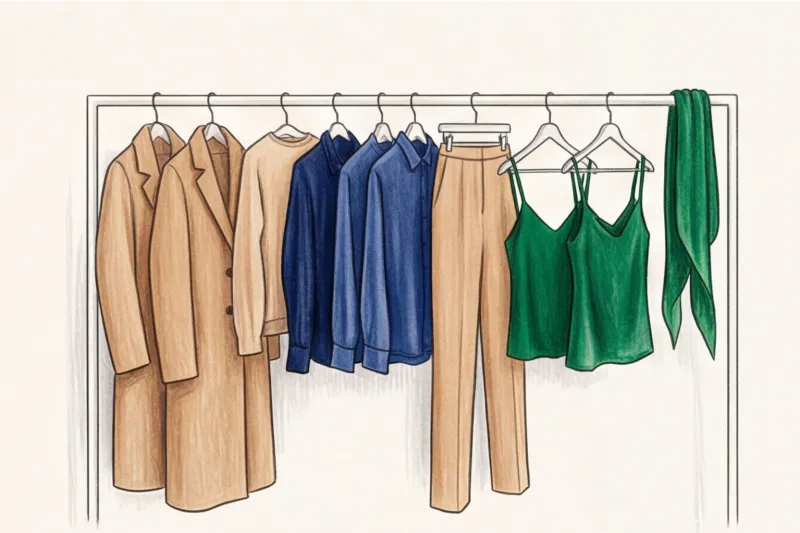
60% — Base (Your canvas)
This is the foundation. The largest pieces in your ensemble: outerwear, a tailored two-piece pantsuit, or a long knit dress. This color takes up the lion's share of your body surface.
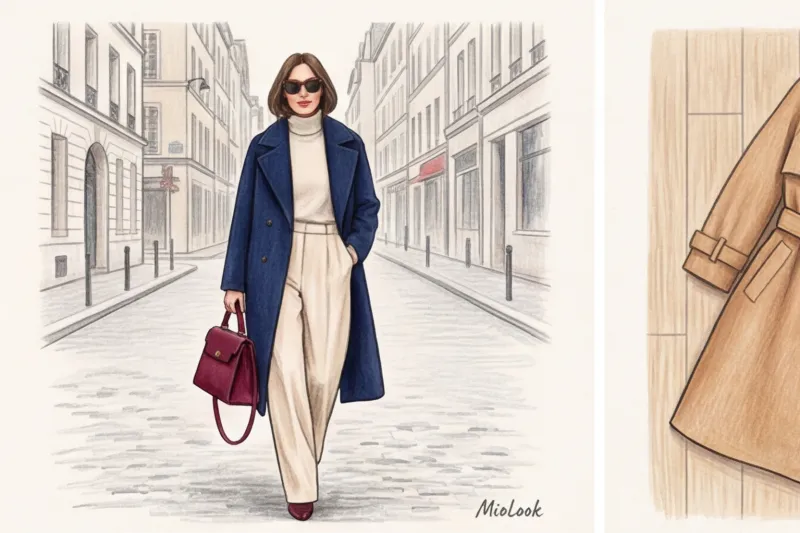
Since 60% of the color will be near the face, it should be a shade that perfectly complements your portrait area. Avoid using a base color that highlights under-eye circles, even if it's the trendiest shade according to PANTONE. Ideal base colors include: elegant camel, deep navy, graphite gray, or rich emerald.
30% - Additional color (Your character)
These are mid-sized pieces that support the basics. For example, trousers or a skirt (if the outerwear is unbuttoned), an oversized sweater, or a classic shirt. The purpose of this 30% is to create depth. If your 60% is a heavy dark blue jacket, then the 30% in the form of flowing off-white trousers will create the desired dynamic and contrasting textures.
10% - Accent (Spark)
What makes the look pop. Shoes, a bag, a textured scarf, a statement belt. You know the saying, "The devil is in the details"? In style, the devil is in those 10%. If you perfectly match the base (60) and accessories (30), just one well-chosen bag in embossed burgundy leather can elevate even the most boring everyday outfit to street style.
The biggest myth: "Black, white, and beige don't count."
It's time to say it straight out: achromats are also colors. Period.
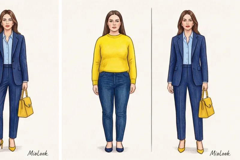
The biggest misconception that turns stylish women into "Christmas trees" is the use of black, white, and gray as if they were invisible. Many people think, "Well, black jeans and a white T-shirt don't count; I'll just add a green cardigan, a yellow bag, and red sneakers." Nope. You've just worn five colors.
Neutrals mercilessly eat into your color quota. Let's look at a typical office outfit. You're wearing black pants (1), a white blouse (2), and a blue blazer (3). Your quota is gone! If you add a red bag (4), the balance will be ruined. The look will become fragmented and heavy.
Stylist trick: How to overcome this limitation? Combine achromatic colors into a single 60% base through a print. For example, wear a black and white houndstooth jacket. The eye perceives this pattern as a single unit, a single block. This frees up space for a pure 30% (say, black trousers that continue the print color) and 10% (bright shoes).
Metals, Makeup, and Hair Color: The Hidden 10% That Ruin Your Look
When I first start working with a client's wardrobe, I always say: your first color ALREADY suits you. It's your natural features.
The three-color rule in clothing is inextricably linked to your color type. If you're a contrasting brunette with jet-black hair and porcelain skin, your hairstyle already works as a powerful dark color block. If you wear an all-pastel look, your head will appear visually separated from your body. You need to "drop" the dark color down—at least through your shoes or bag—to create a seamless look.
And now about what 80% of women forget: fittings.
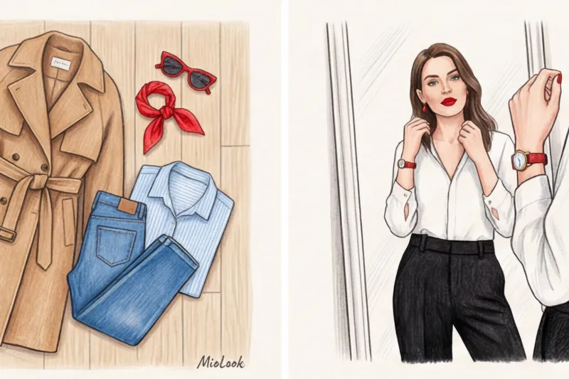
- A belt buckle, a chain on a bag, shoe hardware—these are metallic shades, and they count! If you're in doubt, Can you wear gold with silver? , remember that it is safer to choose one metal and give it the role of an accent.
- Glasses. Horn-rimmed or bright plastic frames provide a vibrant pop of color near the face.
- Makeup. A rich red lipstick isn't just cosmetics; it's a full 10% accent in your 60-30-10 formula.
Your perfect look starts here
Join thousands of users who look flawless every day with the MioLook AI assistant.
Start for freeHow to use prints in the 60-30-10 rule?
Prints often intimidate those accustomed to a basic wardrobe. But in reality, a good pattern is a designer's ready-made cheat sheet. Merchandisers at brands like COS, Zara, and & Other Stories constantly use this checklist for window dressing.
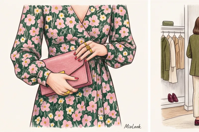
Let's say you bought a flowy midi dress. The background color of the dress (for example, a deep pine green) is your 60%. The large dusty pink peonies on it are your 30%. And the small yellow centers of the flowers are your 10%.
How to "unpack" this? It's simple: draw out the colors from the print into your accessories. Dusty pink shoes (maintain 30%) and a miniature yellow clutch (increase 10%) would pair perfectly with this dress. No need to reinvent the wheel—the fabric designer has already calculated the harmony for you.
Step-by-step algorithm: putting together a look from the European mass market
Let's get practical and put together an expensive look using the three-color rule without going beyond the mass-market options. If you have trouble keeping everything in mind, use smart wardrobe feature in the MioLook app for pre-assembly of the bow.
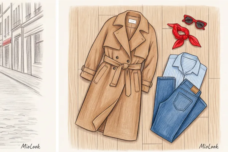
Step 1: Select an anchor.
Let's start with the main piece of the season - the perfect structured wool jacket from Massimo Dutti in a rich olive (khaki) color.
Step 2: Assign roles.
The jacket is thick and long, and we'll wear it buttoned. It takes up 60% of the space. The remaining space is 30% and 10%.
Step 3: Add 30%.
To prevent the olive color from making the face look sallow, we need to add some light. We'll choose wide, flowing, high-waisted palazzo pants in a creamy shade (Zara). Only the long legs will be visible under the jacket—that's exactly one-third of the visual space.
Step 4: Integrate 10%.
Now we need a spark. Olive and creamy green are warm and calming. Let's add depth: choose leather loafers and a structured baguette bag in deep burgundy (dark cherry) from COS.
Check out the result: three colors, perfect proportions, a combination of textures (wool, viscose, smooth leather). This look looks 10 times more expensive than its actual price on the receipt precisely because it's free of visual noise.
Stylist Checklist: 5 Mistakes That Ruin Color Balance
Even knowing the formula, it's easy to slip up. Here are the top 5 mistakes I regularly combat during wardrobe reviews.
- Mistake 1: 50/50 ratio.
One of my clients bought a stunning double-breasted COS coat, but wore it unbuttoned with contrasting trousers split 50/50. The result? Her figure was "cut" horizontally. This proportion visually reduces height by 10-15% and creates a squat silhouette. Rule: one color should always dominate. - Mistake 2: Three colors of the same saturation (traffic light effect).
If you take pure red (60), pure blue (30), and pure yellow (10), you'll look like a child's Lego set. One important limitation of the 3-color rule is to vary the brightness. Keep 60% muted, 30% light, and only 10% truly neon or bright. - Mistake 3: Scattering 10% all over the body.
Red shoes + red belt + red bag + red earrings. This looks old-fashioned, like a relic of 2010s fashion. The accent should be concentrated. If it's shoes and a bag, keep them close together, like the bag in your hand. Or use microdoses: How to wear multiple rings with colored stones as a single accent set, we talked about earlier. - Mistake 4: Forgotten outerwear.
You've put together a perfect office look: a gray suit, a light blue shirt, and burgundy shoes. And on top, you've thrown on a green puffer jacket, "the warmest one you could find." By the time you get to work, you'll be a color mess to everyone around you. Outerwear is your 60% outside. - Mistake 5: Ignoring color temperature.
A cold, icy-gray jacket will clash fiercely with a warm, yellow-beige sweater, even if the 60/30 ratio is perfectly maintained.
Ready to get started?
Try MioLook's free plan—no commitments required. Upload your items and let the AI assemble your bow using the 60-30-10 formula.
Start for freeSummary: How to Make the 3-Color Rule Your Fashion Habit
There's no need to rush to the store and throw out half your closet. Start by taking stock of what's already hanging. The three-color rule isn't a prison guard for your style; it's a handy navigation tool.
Of course, there are exceptions. Monochrome looks (total black, total beige), created using a variety of textures—from silk to coarse wool—look luxurious even without the accent 10%. A complex eclectic mix of five shades works if you're a stylist like Anna Dello Russo. But for real life, work, dates, and quick morning get-reads, the 60-30-10 formula is unmatched.
Open your closet right now. Take out your favorite basic piece (let's say that's 60%). Choose a neutral complement (30%). Now find that 10% accent you've been saving for a special occasion. Wear it. And you will see how the mathematics of style works for you.


