
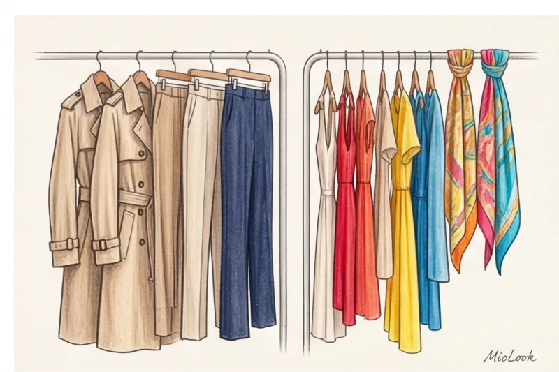
Every April, the fast fashion industry conducts the same merciless experiment on us. Store windows are suddenly painted aggressive magenta, acid green, or blinding orange. And every time, thousands of women obediently buy an item they'll wear exactly twice before it settles forever at the bottom of their closet. Sound familiar?
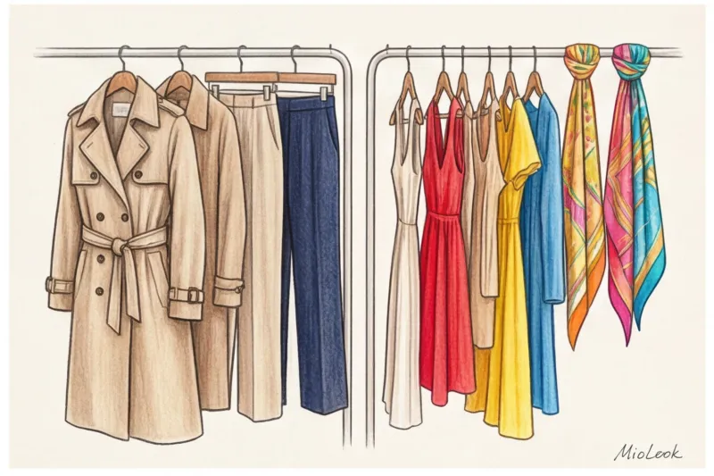
We have already discussed in more detail how to filter global changes and not succumb to marketing tricks in our The complete guide to spring/summer fashion trends: what to invest in Today I want to talk about marketers' most insidious tool—color.
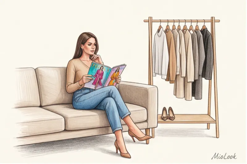
Implementing fashionable colors for spring and summer When it comes to adding a color to your wardrobe, it's easy to give in to impulse. But true premium style isn't built on buying every trendy shade of the season. Over 12 years of consulting clients and working with buyers in Milan, I've discovered a golden rule: status isn't found in the color itself, but in how skillfully you integrate it into your wardrobe through the right textures and accessories.
Spring/Summer Fashion Colors: Invest or Ignore?
The fast fashion industry relies on aggressive, garish colors for one simple reason: it's the cheapest way to make you feel like your old wardrobe is hopelessly outdated. Changing a cut or pattern requires design costs, but buying fabric in a new, shocking color doesn't.
Consider how "quiet luxury" brands like The Row, Loro Piana, or Brunello Cucinelli operate. They never resort to shock color therapy. Instead, they offer an evolution of undertones. The key principle of a high-status wardrobe is this: color should serve you, highlighting the freshness of your complexion and the status of your texture, rather than serving as a walking mannequin to demonstrate a trend.
"A fashionable color in itself is irrelevant if it's made from cheap fabric. Fast fashion sells color, while premium fashion sells texture."
If you want to look expensive, stop chasing microtrends. Consider macrotrends: changing shade temperatures, the transition from pure spectral colors to complex, dusty nuances.
The 70/30 Rule: The Mathematics of Color in the Wardrobes of Successful Women
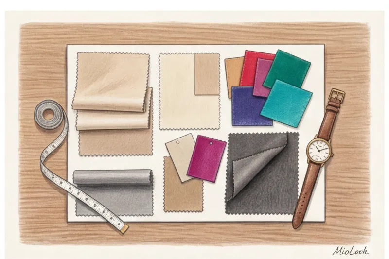
In my experience, when buyers at top Milanese boutiques make their seasonal purchases, they're never guided by emotion. Their choices are based on strict mathematics: the 70/30 rule. Exactly 70% of the budget goes toward a commercial, flawless base in neutral shades. And only 30% is allocated to the "color of the season"—those trendy spring-summer colors that set the mood.
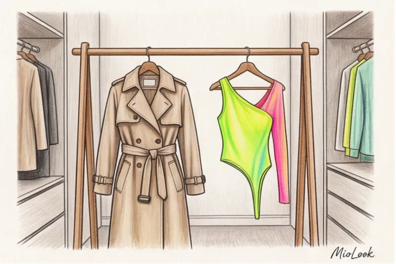
Let's calculate Cost-Per-Wear (Cost-Per-Wear). Let's say you bought the perfect beige trench coat made of heavy gabardine for €1,000 and wore it 100 times per season. The cost per wear is €10. Now imagine buying a trendy neon pink dress for €150. You wear it to one party and once on vacation. The cost per wear is €75. The paradox: a cheap, bright item costs you 7 times more than a luxury staple!
That's why buying an expensive basic suit and a premium accent silk scarf is always more cost-effective than a cheap suit in a dubious, bright color. Your warm-season color palette should consist of shades of ivory, graphite, cool beige, and deep navy. This is true "quiet luxury."
Your perfect look starts here
Join thousands of users who look flawless every day with MioLook. This smart wardrobe app will help you calculate your cost per outing.
Get access — €0.99 onceThe main fashionable colors of spring and summer and their premium interpretations
According to the Pantone Color Institute's 2024 global color report and analysis by trend bureau WGSN, we're seeing an interesting bifurcation this season. On the one hand, there's a demand for calm, on the other, a thirst for rich, sensual shades.
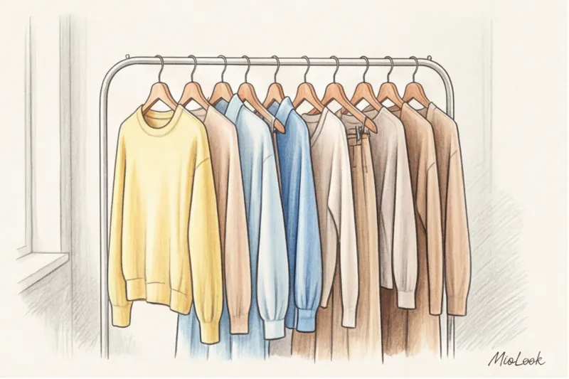
Take the yellow trend, for example. Mass-market stores will flood their shelves with canary-yellow neon. But top-tier brands are offering Butter Yellow (Creamy Yellow). This luxurious, enveloping shade of churned butter works as a fresh, fresh alternative to traditional white or beige. It perfectly highlights a light tan and looks luxurious in linen.
Another key trend is heavy shades in summer. Deep cherry (a legacy of the Gucci Rosso Ancora phenomenon) and cobalt blue are here to stay. Wearing them in summer is a sign of high style. The main rule: if the color is dark or rich, the fabric should be as light and breathable as possible. A cherry silk top with thin straps or cobalt suede sandals are a perfect match.
The New Neutrals: Undertones That Look Expensive
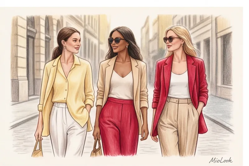
Dusty pastel shades—sage, dusty rose, and taupe—have taken over the runways. Their beauty is that they're easy to mix and match with your usual base (like accessories in the style of quiet luxury ), without creating sharp contrasts.
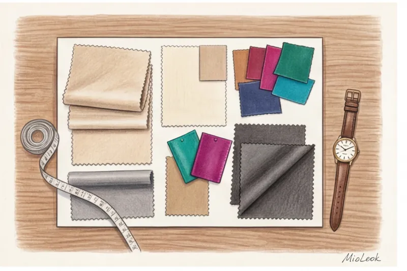
However, there is an honest limitation here that stylists often keep silent about. This pastel technique is categorically It doesn't work For contrasting color types (for example, the classic "winter"). If you have porcelain skin and dark hair, pale sage near the face will make you look tired. In this case, shift these undertones to the lower part of the silhouette (pants, skirts) or choose more saturated versions of trendy colors.
A stylist's secret: why texture is more important than the shade itself
Here's a counterintuitive insight that will change your approach to shopping forever: color is simply the reflection of light off the surface of a fabric. You can choose the season's hottest shade according to Pantone, but if the garment is made of thin, shiny polyester, it will look cheap. Polyester reflects light flatly and harshly, creating a "plastic" sheen.
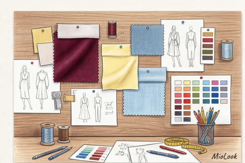
Natural fibers absorb dye in a completely different way. The trendy cobalt blue in mulberry silk (19 momme count and above) or cupre takes on depth and a refined inner glow. The same color in fine cotton often appears flat. This is why bright, accent colors fashionable colors for spring and summer It is safer and more profitable to buy in noble fabrics: silk, fine wool, viscose or cashmere.
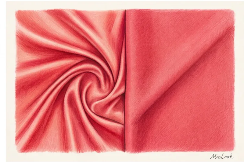
If you're looking to buy a colored item from a mass-market retailer (which is perfectly fine), choose matte textures. Cotton with a weight of 180 g/m² or thick matte linen will hide the imperfections of cheap dyes much better than any glossy synthetic.
Smart Integration: 3 Safe Ways to Wear Trends
I once had a client, a top bank manager, come to see me. She'd succumbed to the trend for rich, grassy green and bought an expensive pantsuit in that color. It looked stunning on the mannequin. But on her, the color reflected off her face, highlighting the circles under her eyes and giving her skin a sickly gray undertone. How did we fix this? We reserved the suit for special evening outings with heavy makeup, and for daytime looks, we bought a cream-colored suit and accessorized it with a green bag and shoes.
Here are 3 foolproof ways to incorporate any tricky color:
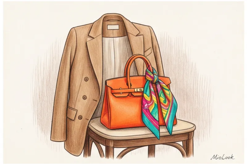
- Accessory group. Bags, belts, shoes, eyeglass frames or bright details in office style — the best investment. Bright pumps or a structured colorful bag instantly elevate a basic beige trench coat to Milan street style levels.
- Moving away from the portrait zone. If a color is fashionable but objectively "eats" your appearance, wear it in the form of trousers, skirts, or shoes. Always stick to your tried-and-true complementary shades (white, cream, pearl) near your face.
- The 20% rule in prints. Not ready for the vibrant monochromatic look? Choose prints where the trendy color takes up no more than 20% of the design, with a neutral base serving as the background.
Access to MioLook for €0.99 — one-time payment
A smart AI stylist will select the perfect look based on your base and suggest accents.
Get access — €0.99 onceChecklist: Checking Your Wardrobe Before Incorporating Color
Before you hit the shops and buy something in the summer's key shade, do a quick inventory. I use this checklist when reviewing my clients' wardrobes:
- Base Rating: Do you have enough "calming" pieces? A bright accent skirt requires a flawless white chunky knit T-shirt, a perfect gray jacket, or a beige cashmere sweater. Without the right basics, the bright piece will hang with the tag.
- Rule of 3 combinations: Ask yourself right in the fitting room: "Can I wear this bright item with the three different items already hanging in my closet?" If the answer is "no" or "I think I'll have to buy another top," return the item to the hanger.
- Relevance and personal branding: Does this color fit into your lifestyle? A neon pink jacket might not be suitable for a board meeting at a conservative company, but it will perfectly complement image in the style of the rebel archetype on weekends.
- Quality control: Carefully inspect the seams. Cheap brands often have brightly colored threads that bleed onto light-colored linings, and hardware (buttons, zippers) that don't match the fabric.
Your next step to a status summer wardrobe
Color trends are cyclical, but personal style and texture are timeless. Don't let trend analysts and fast-fashion marketers dictate what you wear. A smart approach to wardrobe requires a cool head and an understanding of what truly enhances your beauty.
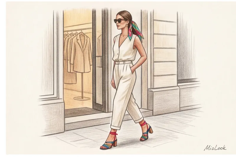
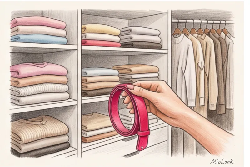
Instead of buying a dozen questionable summer pieces in garish colors, take one calculated step. Conduct an audit of your summer capsule wardrobe. Find your perfect neutrals and invest in just one premium accessory—a hand-stitched silk scarf, a leather belt, or impeccable shoes in the season's most luxurious hue. This touch will show others that you're not chasing fashion, but rather leading it.