In my 14 years as a personal stylist, I've seen this scene dozens of times: a client sits in front of an open closet, staring at a mountain of perfectly good clothes, and despairingly says, "I've been told I'm a 'Soft Summer,' so all this black, fuchsia, and emerald will have to go." Spoiler: it won't. Around 80% of items in a major image makeover are discarded precisely because they're the "wrong" shade, even though 60% of them are easily salvageable.
When we decide to start a new life, the question of How to choose clothing colors based on your color type , is one of the first to emerge. And here, many make a fatal mistake: they try to squeeze themselves into the rigid confines of seasonal palettes, ruthlessly shedding the past. We've already discussed the psychology of such radical cleansing in more detail in the complete guide to changing your style.
Today, I want to offer you a different approach. One that's both environmentally friendly and sensible. Color type isn't a high-security prison cell, but simply a tool for managing focus. Let's figure out how to update your palette without spending a fortune or losing your individuality.
The Psychology of Color: Why You Want to Burn Your Old Wardrobe When Changing Your Look
The desire to wear completely different colors rarely comes out of nowhere. More often than not, it's tied to life transitions. Coming back from maternity leave with its "non-marking" tones to the office, exchanging a strict corporate dress code for freelancing, getting a divorce, or, conversely, falling in love again. We confuse the psychological fatigue of a certain stage of life with fatigue from the color of our sweaters and dresses.
One of my clients, after moving to a management position, decided to get rid of all the pastel items in her wardrobe, considering them "too soft." It's a classic "blank slate illusion." We think that along with the old clothes, we'll also be throwing out old problems.
"Impulsive disposal of clothing isn't just a bummer; it's also a global problem. According to a 2023 report by the Ellen MacArthur Foundation, every second, the equivalent of a garbage truck's worth of clothing is sent to landfills or incinerated worldwide, and a significant portion of these items are in perfect condition."
Don't rush into things. Your old wardrobe is a resource, not an enemy. A new palette should be layered on top of it gradually, like a fresh coat of paint on a well-primed canvas.
How to choose clothing colors based on your color type: a guide without stereotypes
Forget the rigid divisions into "Winter," "Spring," "Summer," and "Fall." This purely seasonal approach is hopelessly outdated. Modern colorists work with individual contrasts in appearance and three key characteristics: temperature (warm/cool), saturation (bright/muted), and value (light/dark).
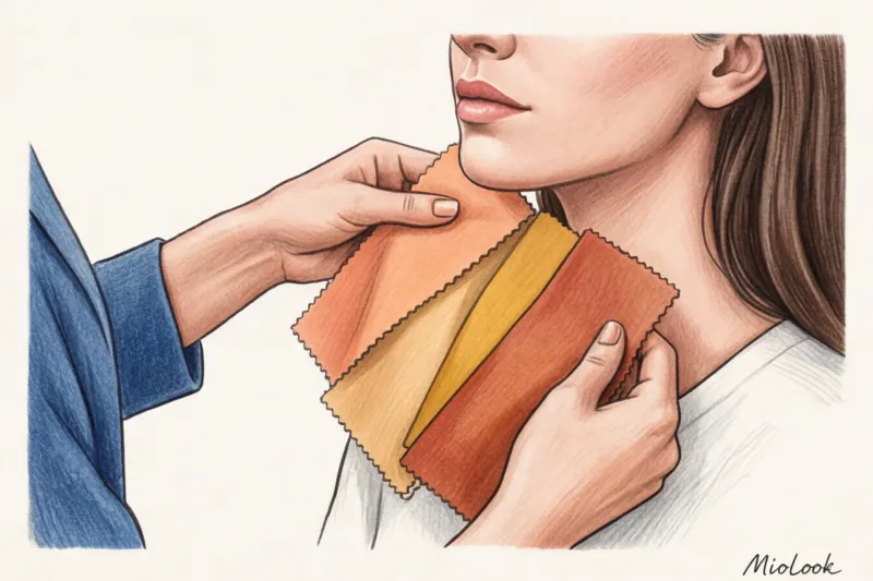
During my consultations, I conduct a simple test that you can repeat at home. I take pieces of fabric of different temperatures—for example, cool silver and warm gold, as well as bright fuchsia and muted dusty rose. We sit by a window in natural daylight, and I place the fabrics on the client's chin, one at a time.
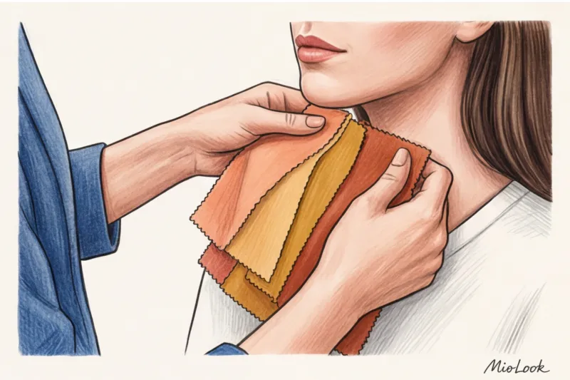
- What are we looking for? We're not looking for a "pretty color." We're looking at what happens to our skin. The right shade blurs nasolabial folds and makes under-eye circles less noticeable.
- How does this work? In my experience, using just 3 of your “own” shades in the portrait area increases the visual freshness of the face by 40% (you simply stop looking tired without makeup).
- When does this NOT work? If you've applied a heavy foundation, you should only test your natural color on a clean, makeup-free face. Otherwise, you'll end up choosing a palette that's tailored to your foundation, not to you.
Knowing your ideal stats is important, but it's only a foundation for playing well, not a set of taboos.
The Biggest Myth of Coloristics: Why You Shouldn't Throw Away the "Wrong" Things
The most harmful myth propagated by many online articles is: "If a color isn't in your palette, you should immediately donate or throw it away." This is a surefire way to huge expenses and boring, uniform looks.
One day, a girl came to me almost in tears. Her previous stylist had labeled her a "Soft Summer" and categorically forbade her from wearing black, forcing her to remove her favorite architectural black dress from her closet. But style is about joy, not suffering! We returned the dress. All we needed was to deepen the contrast on her face with makeup and add large matte earrings in the perfect pearl gray shade.
You don't have to wear ONLY the colors in your palette. Johannes Itten's color theory teaches us that colors influence each other. "Unsuitable" shades can and should be left in—the secret is to mix them correctly with "buffers."
Portrait Zone Rule and Buffer Shades
If you adore a mustard sweater, but it makes your face look sickly yellow, don't rush to recycle it. Apply the following compensation rules:
- We take it down. Pants, skirts, shorts, and shoes can be absolutely any color. Anything below the waist doesn't highlight your face.
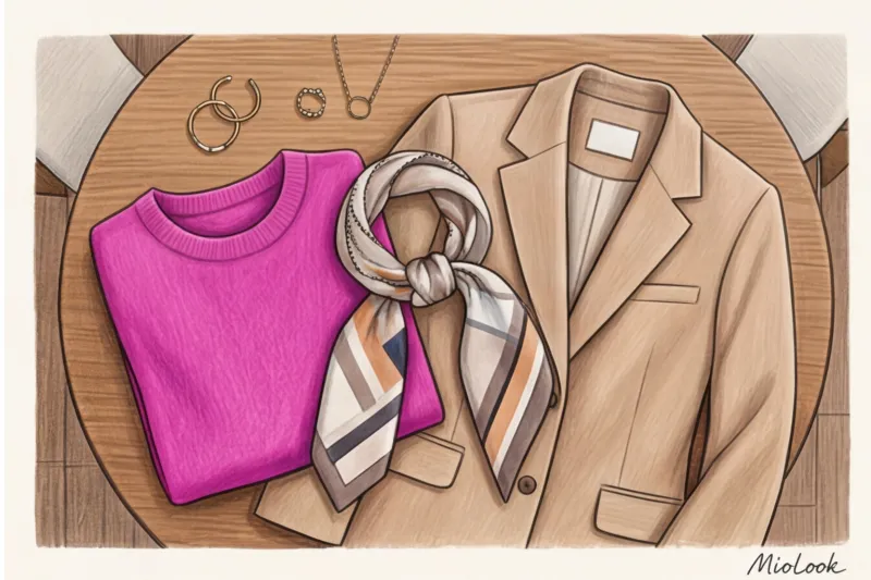
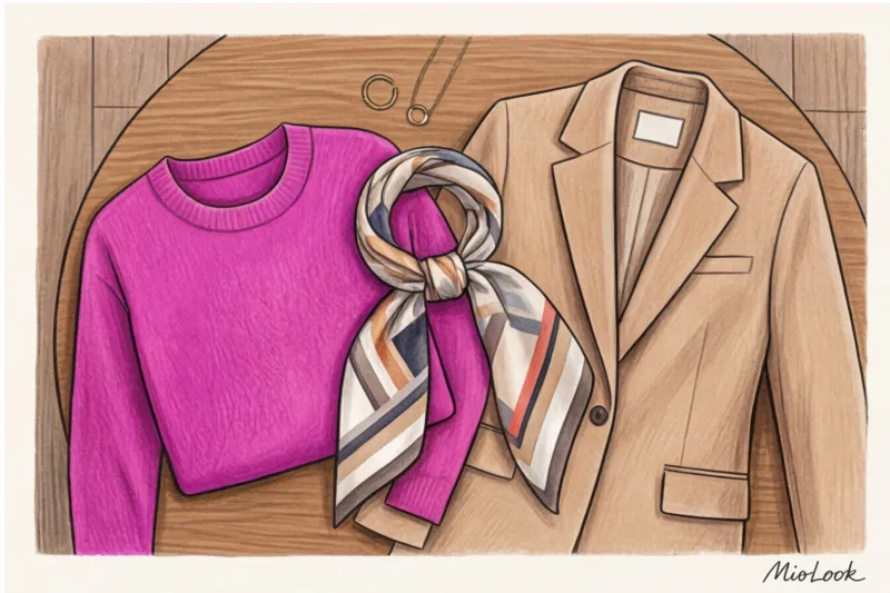
- Create a buffer. Wear a shirt of the "right" shade under the "wrong" sweater, allowing the collar to show. Or tie a scarf of the appropriate temperature around your neck. This small barrier will block the light from hitting your face.
- Area control. A color that makes you look older in a solid dress will be perfectly safe in the form of a small print (like polka dots) or an accent bag.
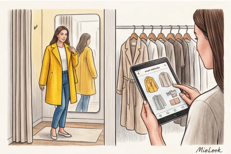
Your perfect look starts here
Join thousands of users who look flawless every day with the smart MioLook algorithm.
Start for freePalette Evolution: A Step-by-Step Guide to Introducing New Shades
A change of image shouldn't break the bank. To integrate a new palette without shock, use the principle of smooth evolution. The formula I recommend to my clients when assembling a new wardrobe is: 60% base, 30% complementary colors, 10% accents.
Step 1: Choose 2-3 anchor neutral colors.
This is your base (coats, trousers, jackets). If black was previously your base, try switching it out for deep graphite, navy, or dark chocolate. This will cost around €150–€300 for a pair of quality pieces (for example, from Massimo Dutti or COS), but it will immediately change the mood of your look.
Step 2: Choose 2-3 accent colors.
They should be easy to mix and match with new basics and old pieces. Let's say you bought gray wool trousers. An emerald or burgundy color would be the perfect accent. Start small—buy a turtleneck or silk top in a new color on a budget (€30–€60).
Mistakes that cost us money when changing our image
Even if you know your color type, you can end up buying things that will just sit on your shelves like dead weight. Here are three common traps:
- Parrot effect. You're so inspired by your new "Spring" palette that you bought a coral jacket, a lime green blouse, and a peach skirt. Individually, they're beautiful, but together, they're overwhelming. The vibrant colors need a little air in the form of a neutral base.
- Blind faith in the right color when the style is bad. I often see women buy a cardigan that's clearly out of style and ill-fitting simply because "it's my perfect dusty pink!" Color won't save a bad fit.
- Ignoring the texture. The same shade (for example, classic red) on smooth silk looks cooler and more expensive, but on a loose synthetic knit it can look flat and cheap.
Practical advice: Always check the shade of an item not only in the fitting room but also by going outside to a window. Store spotlights with yellow or blue undertones greatly distort color temperature. What seemed like a neutral beige in the fitting room often turns out to be a dirty yellow outside.
Checklist: Audit your current wardrobe with a new palette
Before heading to the store for new flowers, we should conduct an honest audit of what's already hanging in the closet. I give my clients this action plan to avoid impulse purchases in the first month after the consultation.
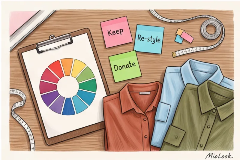
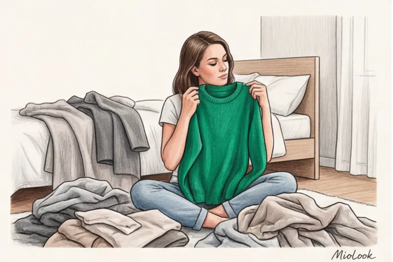
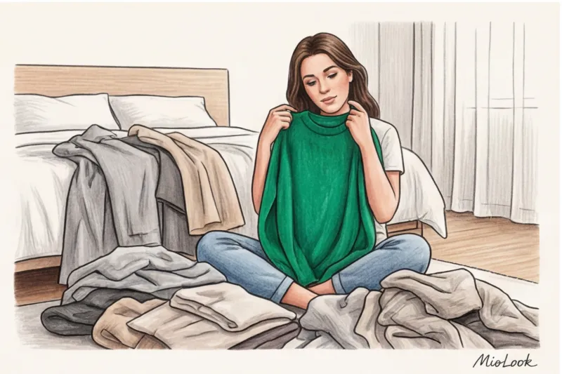
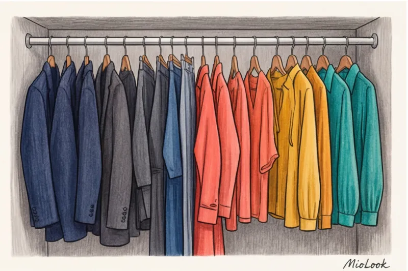
Lay things out on the bed and sort them into three piles:
- Stack 1: "My palette is on my face." These are tops, blouses, scarves, and dresses that perfectly complement your natural beauty. These are your gold standard.
- Stack 2: “Not my palette – take it down.” Skirts, trousers, and shoes in shades that make you look tired. Since they're away from your face, feel free to leave them on.
- Stack 3: "To be saved through the buffer." Favorite sweaters and jackets are the wrong colors. We keep them, but make a note on the shopping list: buy a light shirt or the right scarf for layering. The "smart wardrobe" feature in MioLook — You can take a photo of your “complex” items and the program will suggest what to combine them with.
Create a shopping list of only those shades that will bridge the gap between your old wardrobe and your new style direction.
And remember the most important rule: style is an exciting game, not a school exam in color theory. A perfectly chosen palette is meant to serve you, highlight your beauty, and inspire confidence, not make you feel guilty for accidentally wearing the "wrong" scarf. Allow yourself to experiment, break the rules wisely, and enjoy the transformation!


