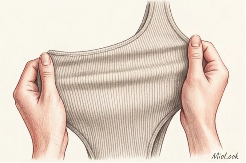
Over 12 years of reviewing wardrobes, I've uncovered a sad but revealing statistic. Approximately 80% of the items in my clients' closets with tags still attached are impulse buys in ultra-fashionable shades. We see a luxurious fuchsia total look at the Valentino show, buy a similar jacket for €80, and then it hangs on the hanger for years because it seems "too bright for the morning meeting." Sound familiar?
The problem isn't you or the color. The problem is that runway styling and real life operate by different laws. We've covered in more detail why we buy one thing and wear another in our the complete guide to adapting catwalk trends Today we'll look at the mathematically precise formula: How to wear fashionable colors , incorporating any, even the craziest palette, into your everyday capsule without the risk of looking like a city madwoman.
The Catwalk Illusion: Why We're Afraid of Bold Trends
Let's be honest: runway looks are pure marketing. When a designer sends out a model dressed head-to-toe in neon green, the goal is to create a viral image for social media and get the press talking about the collection. It's a show, not a how-to for your Tuesday trip to the office.
According to a 2024 report by analytical agency WGSN, most commercially successful brands (from COS to Massimo Dutti) only feature trendy colors in 15-20% of their collections. The remaining 80% is dedicated to a neutral base. The Lyst index confirms the same trend: even in seasons when critics clamor for the "return of bright colors," black, gray, beige, and navy blue drive global sales.
"Buying a total look in the color of the year is like trying to eat only spices. Delicious in microdoses, but unbearable as a main course."
The difference between runway styling and a real wardrobe is adapting to the rhythm of life. You don't have to copy the maximalism of the runway. Your task is to take the idea and filter it through your own routine.
Your perfect look starts here
Join thousands of users who look flawless every day with MioLook.
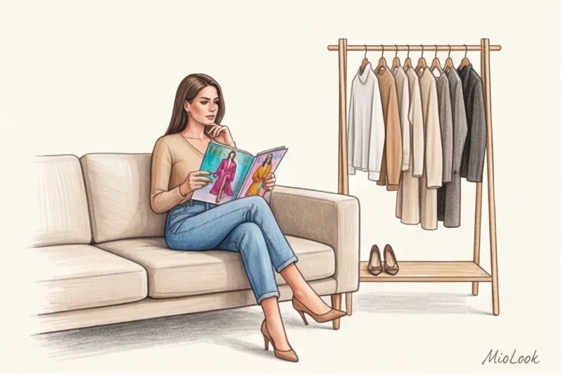
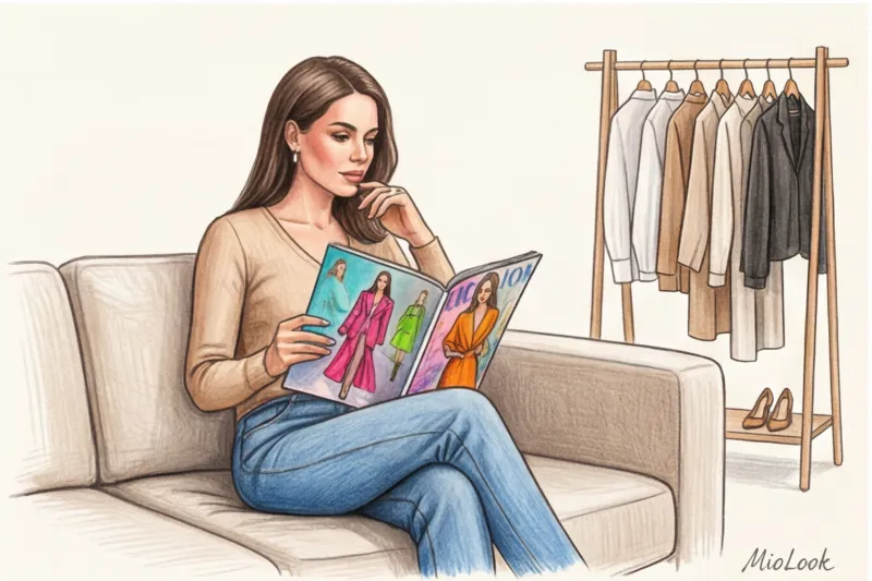
Start for freeHow to Wear Fashionable Colors: Style Architecture Based on the 60-30-10 Rule
If you're unsure how to approach a vibrant hue, I suggest stealing a brilliant rule from interior designers. The architecture of a harmonious space is built on the 60-30-10 ratio. I've adapted this formula for styling, and it works flawlessly for any dress code.
I personally tracked clothing wear statistics in the app for six months. The data showed that ultra-fashionable colors are worn 70% less often than basic ones if they take up more than 20% of an outfit. Our brains get tired of visual noise. But if we maintain the right proportions, an outfit looks fresh, expensive, and doesn't create a "Christmas tree" effect.
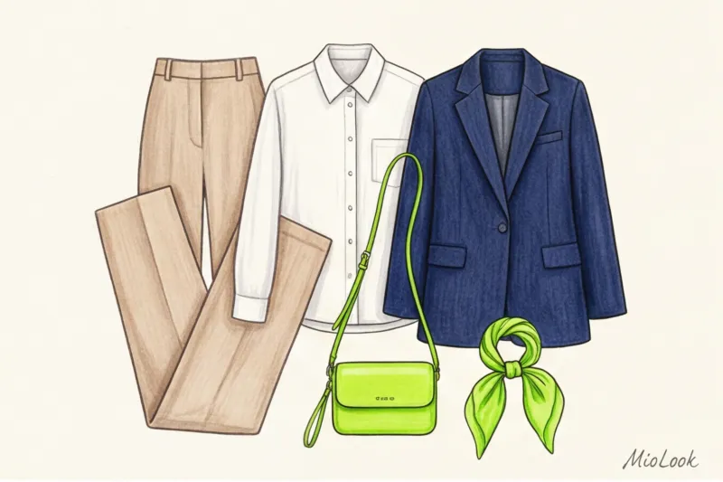
60% - Your base canvas
This is the foundation of your look. Neutral colors that perfectly complement your natural contrasts: graphite, cool beige, deep navy, dark chocolate, or classic black. It's the foundation that calms down any crazy catwalk trend. For example, this could be a pantsuit made of a high-quality wool blend or a combination of classic wide-leg jeans and a basic jumper.
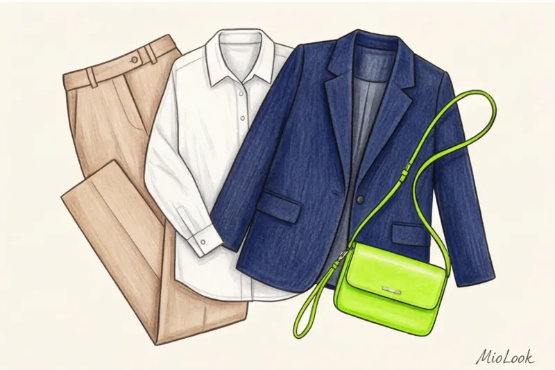
30% - Additional shade
A color that supports the base and creates visual depth. This is usually a related neutral or pastel. For example, a light blue cotton shirt with a graphite suit or a cream top with a chocolate cardigan. An interesting styling trick: in this block, you can use not a color, but texture Swap out your regular top for a thick silk one or add a textured leather belt.
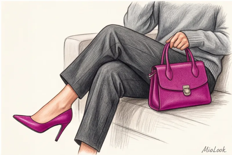
10% - Trendy accent
And here's that perfect dose of runway color. It's just 10% of your outfit. A buttery bag, neon green pumps, a fuchsia scarf, or a bright belt. Ten percent is enough to show others you're on-trend and trend-conscious, without sacrificing elegance and appropriateness.
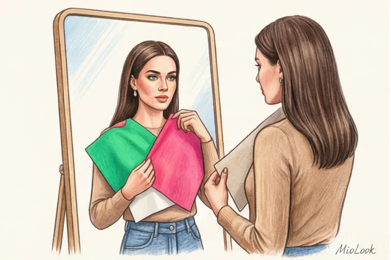
The Biggest Mistake: When a Trendy Color Kills Your Color Type
Now I'm going to say something that many fashion magazines will argue with: You don't have to wear the main color of the year at all Ignoring a trendy shade if it clashes with your skin tone is a sign of high style, not being out of fashion.
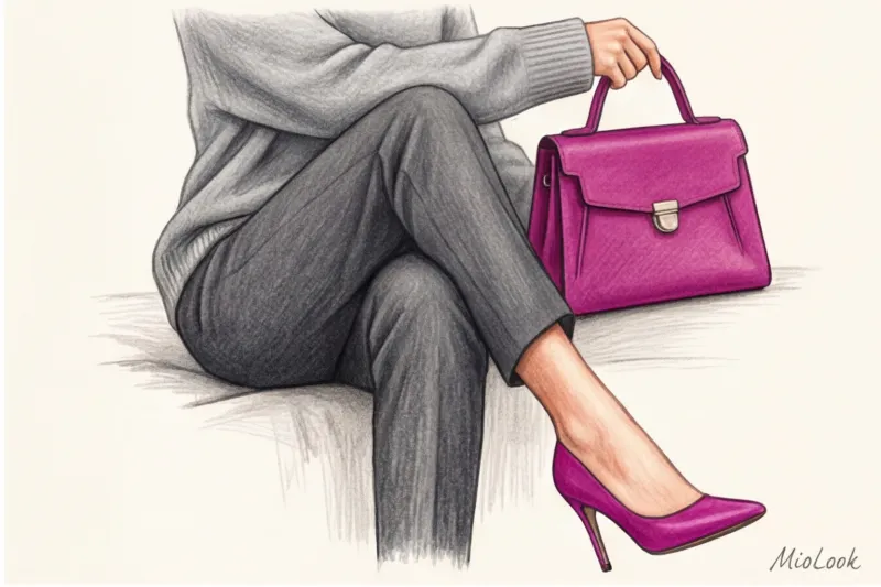
I had a telling case in my practice. The Pantone Color Institute declared "Peach Fuzz" the color of the year. My client, a woman with a cool, contrasting complexion, succumbed to the hype and bought a luxurious cashmere sweater in this shade for €300. When we tried it on, we both saw a disaster: the warm, washed-out peach instantly emphasized the dark circles under her eyes, made her complexion look sallow, and made her look five years older.
This happens because the color in the "portrait zone" (from the chest to the crown) acts as a reflector. It casts highlights on your face. What did we do? We returned the sweater to the store and bought a crossbody bag in the exact same peach shade. The client got the trend she wanted, but we protected her face.
Golden rule: If a trendy color absolutely doesn't suit you, simply move it down. Pants, skirts, shoes, bags—anything far from your face won't affect the freshness of your skin.
Try MioLook for free
A smart AI stylist will select the perfect look based on your individual characteristics.
Start for freeMicrodosing Trends: Safe Ways to Incorporate Runway Palettes
If you work in a conservative field (such as a bank or law firm), you might think runway colors are off-limits. This isn't true. There's a concept called microdosing trends—introducing color in such precise doses that no HR manager will find fault.
- Prints instead of solid colors. Choose pieces where the trendy color is just part of the pattern, not the main background. A silk blouse with a small floral print, featuring petals in the trendy "Brat Green" shade, will look appropriate even at a formal meeting.
- Hidden accessory group. Bright socks peeking out from under tailored trousers, colorful tights (a trend that's been going strong for three seasons now), eyeglass frames with colored edges, or a replaceable smartwatch strap.
- Beauty integration. The cheapest and safest way to try on a runway look. A bottle of nail polish in a trendy shade will cost you €10-€15, while a coat of the same color will cost you upwards of €300. Colored eyeliner or bright lipstick work on the same principle.
Technology Guards Style: Test Color Before Buying
The life cycle of a runway color is usually only 1-2 seasons (that's 3-6 months). After that, the shade becomes boring, mass-market stores overstock it, and the color becomes a non-trend. How can you stop wasting your budget on ephemeral items?
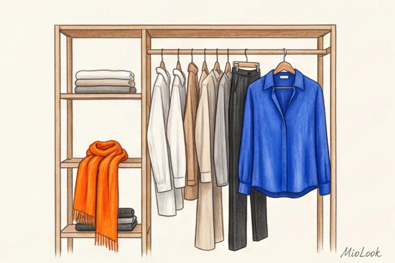
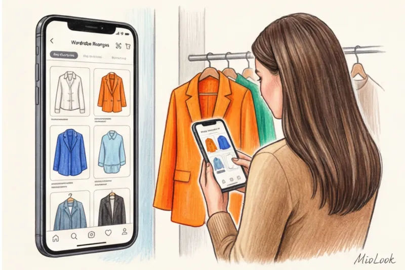
The answer is simple: digitize your closet. I highly recommend using the "smart wardrobe" feature in MioLook to virtually try on shades for your digital capsule collection. When you're standing in the fitting room with a bright orange top, the magical lighting of the store makes you believe it's the most beautiful thing in the world.
But before you go to the checkout, open the app. Try pairing this top virtually with your actual pants, skirts, and jackets. My ironclad rule for clients: If the new bright item doesn't go with at least 3 outfits from your current wardrobe, the purchase is cancelled. Technologies relieve emotional tension and turn on rationality.
Checklist: Is it worth investing in an ultra-fashionable color?
To solidify your skill of mindfully consuming trends, run through this checklist before purchasing any item in a flashy runway color:
- Does the color match your natural contrast? If not, we transfer the item to the accessories or footwear category (remove it from the face).
- Does the item pass the "three looks test"? Can you wear it with three different bottoms or tops that are already hanging in your closet?
- Will this color fit into your real lifestyle? If you're a freelancer working from home or cafes, a neon sweatshirt will come in handy. If you're a lawyer, it's best to stick to a phone case or a scarf.
- Are you ready to part with this thing (morally and financially) in six months? Buying an €800 cashmere coat in a trendy color is a bad investment. Buying a basic €800 coat and pairing it with a trendy €40 scarf is a great investment.
Style isn't a sponge that absorbs every designer's idea. Style is a filter. Being able to say, "This is beautiful, but it's not for me," requires a certain amount of courage. Use the 60-30-10 rule, test shades through your digital wardrobe, and remember: fashion changes every six months, but your personal comfort and confidence should remain constant.