Let's take off the masks: why the old rule "big prints for big girls" no longer works
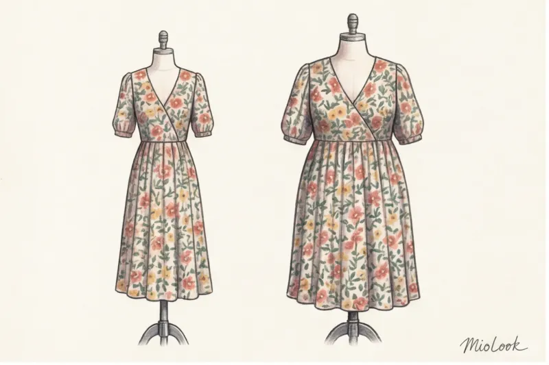
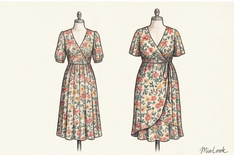
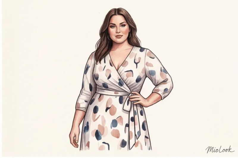
One day, in the fitting room, my client, a European size 44 (a confident L), looked in despair in the mirror. She was wearing a Zara dress with giant poppies, which, according to all the rules of classic glossy magazine advice, should have harmonized her figure. Instead, we got the effect of a "Soviet curtain"—her figure became monumental, and the woman herself was lost behind the garish floral façade.
How to choose the right one print size according to body type — This is a question surrounded by dangerous myths. The main one is that the larger you are, the larger the print on your clothes should be. Forget about it.
The secret lies in optics. Our brain evaluates objects solely in the context of their surroundings. We've already discussed how this optical illusion (the Ebbinghaus illusion) works in more detail in our The complete guide to the perfect accessories for your body type But when it comes to clothing, the harsh economics of the mass market come into play.
Insider fact: fast fashion manufacturers (from H&M to Zara) don't scale fabric patterns to fit different sizes. The pattern repeat (the block of the pattern) is created for a standard European size 36. What happens next? Fabric, costing €5–7 per meter, is cut without regard for scale. On a size XS woman, this print looks like a subtle accent. On an XXL woman, the same unchanging pattern is multiplied across a huge area of fabric, creating a visual mess.
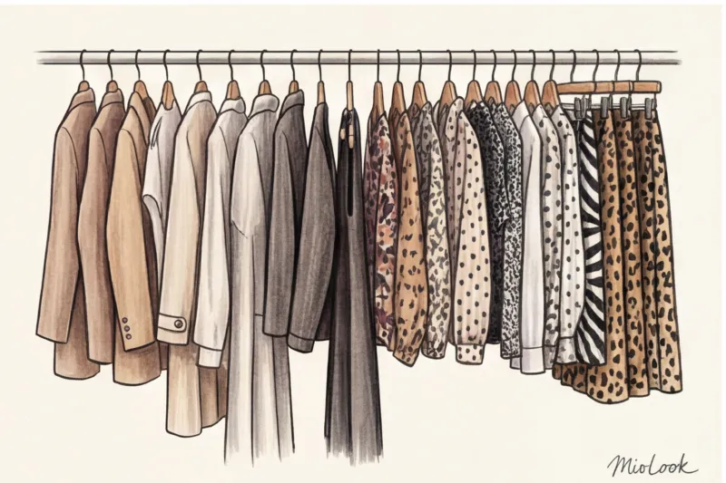
Anatomy of a Pattern: Three Metrics That Are More Important Than Physical Size
Back in 1867, the German physicist Hermann von Helmholtz proved that a square filled with vertical stripes appears wider than the same square with horizontal stripes. The Helmholtz illusion proves the main point: the size of a pattern is just the tip of the iceberg. Completely different factors influence the perception of a silhouette.
Air (Negative Space): the density of the drawing
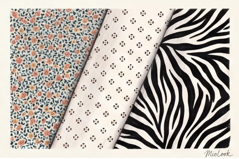
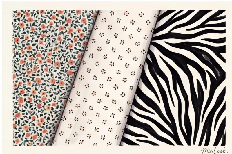
A WGSN trend bureau study (2024) confirms what I've been observing in fitting rooms for years: patterns where the background takes up more than 50% of the space visually slims. That's it. negative space - "air" between the elements.
A sparse, medium-sized polka dot on a deep, dark blue background will elongate the silhouette much more effectively than a densely packed micro-floral (millefleur), where the background is barely visible. When the eye has no room to rest, the design is perceived as a continuous, expanding blob.
Contrast: How Sharp Lines Cut the Silhouette
Compare two prints: a black and white zebra and a monochrome leopard in beige and caramel tones. Both may be the same size, but they will work differently.
High contrast (black and white, red and green) works like a neon sign—it draws the eye to the area where it's placed. If you have wide hips, a contrasting skirt will only accentuate them. Low-contrast, tone-on-tone prints soften the volume and allow even those who typically shy away from them to wear a bold pattern.
Try MioLook for free
A smart AI stylist will select the perfect look and help you seamlessly incorporate prints into your wardrobe.
Start for freeRhythm and Direction: Dynamics vs. Static
Orderly geometric prints (checkered, striped, argyle) are static. They demand a flawless fit. The slightest tug on the fabric across the chest or stomach, and the neat checkered pattern warps, screaming to those around you, "This thing's too small!"
Chaotic prints (watercolor splashes, abstracts, tie-dye) are dynamic. They're incredibly flattering, as they easily forgive folds in fabric, uneven silhouettes, and slight asymmetries in the figure.
Print Size by Body Type: A Practical Guide
Forget about "apples" and "pears." In my practice, I use medical body typology (based on bone width), because bone structure dictates body size.
For miniature (asthenics and height up to 160 cm)
Your bone structure is thin (wrist circumference up to 15 cm). Enormous flowers or wide architectural color blocks in the COS style will simply "eat up" your height. You won't be able to see your figure behind the dress.
- Ideal choice: Small to medium prints, the elements of which are no larger than a 2-euro coin. Fine stripes, fine houndstooth.
- Danger: Large, contrasting geometric patterns. If you really want a large-scale design, choose low-contrast watercolor options.
For average height and normosthenics
You are the lucky ones who find the golden mean. Your goal is to maintain the natural balance. Use print as a tool for localized correction.
- Ideal choice: Medium print, classic geometry (pied de poule, medium caliber argyle).
- Stylist's secret: Need to add volume to your bust? Try a blouse with a medium floral print. Want to slim your waist? Keep your stomach area in a dark monochrome.
For plus-size and corpulent figures
Those with hypersthenic tendencies (large builds, large bones) should definitely avoid dense micro-prints. They make your figure look like a monumental mountain. And giant flowers, as we discussed at the beginning, make you look like sofa upholstery.
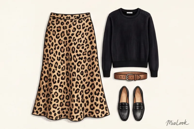
- Ideal choice: A medium-sized or medium-sized print with a huge amount of "air" (background). Diagonal stripes are your best friend; they create movement and visually cut off the sides.
- Prohibition: A small country-style flower is a no-no for a fuller figure, unless it's a small inset on the collar.
Danger Zones: Prints Guaranteed to Distort Proportions
Over 12 years of wardrobe analysis, I've compiled my personal anti-rating of patterns that ruin 9 out of 10 body shapes.
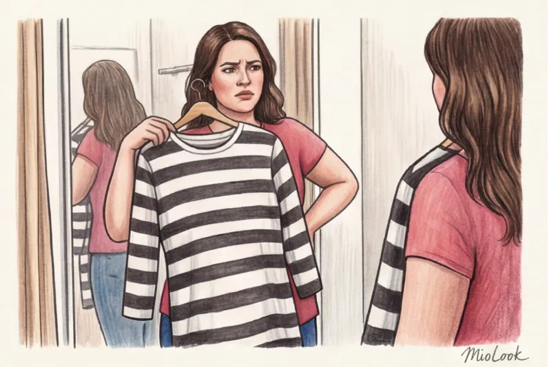
The first enemy is a wide, horizontal, contrasting stripe. A narrow Breton shirt (a sailor shirt) works great; it creates rhythm. But a wide stripe (5 cm or more) acts as a bulkier element. We recently photographed a client wearing a Zara dress with a large, psychedelic checkered pattern and thick horizontal lines—it visually added two sizes and about 10 kilograms to her weight.
The second mistake is large, symmetrical logos or patterned elements placed directly on prominent points (the center of the chest, the widest part of the hips). They create a target effect.
The third trap is 3D illusions in knitwear. Cheap knitwear is tricky enough, but if it's printed with a 3D cubic pattern, every fold on your stomach will turn into a crater.
Your perfect look starts here
Join thousands of users who look flawless every day with MioLook. Upload your items and get ready-made capsules.
Start for freeWardrobe Geometry: How to Combine Prints with Basics
A print shouldn't exist in a vacuum. To avoid looking like you've escaped a carnival, adhere to the rule of proportion: 30% active print to 70% calm solid color.
My favorite styling trick for figures with a larger upper body (broad shoulders or a full bust): we transfer the entire print to the lower body. We wear a statement midi skirt in an abstract pattern, and then layer it with a sleek, dark top or a tailored jacket to tone down the riot of color.
How to choose a complementary color? Never choose a base item to match the brightest color in a print. Look at the pattern and find the complementary color in it. least active , the most neutral shade (gray background, beige veining, muted khaki). This is the color your cardigan or trousers should be. This instantly elevates the look, moving it from mass-market to the visually premium segment.
By the way, if you have trouble visualizing these combinations in your head, you can put them together digitally. Upload a photo of a printed skirt to MioLook , and the app will suggest ideal basic companions from your own closet.
Katarzyna's Checklist: Print Test in the Fitting Room
The next time you pick up a patterned item (whether it costs €40 or €400), run these three quick tests right in the fitting room:
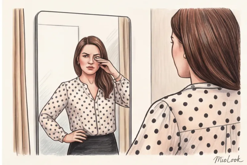
- Squint test. Move 2 meters away from the mirror and squint hard. If a high-contrast print (such as a small black and white check) merges into a dirty gray blob, it's best to avoid the item. It will give your complexion a sallow cast.
- Distortion test. Put the item on and look at the pattern across the chest and hips. Have the perfectly even polka dots become oval? Are the stripes arched? The fabric is too small; you need a larger size. Strict geometric patterns don't tolerate tension.
- Face test. Hold the fabric up to your chin in good light. Is the print too overpowering? If people see "that leopard print blouse" first and only then you, the scale of the pattern isn't right.
Of course, there are exceptions to these rules. This algorithm doesn't work if your goal is to shock or create an exaggerated, theatrical look in the style of Demna Gvasalia. But for an elegant everyday wardrobe, it's a basic.
Summary: Managing attention with patterns
A print isn't just a pretty design on fabric. It's a powerful optical tool for directing the viewer's gaze. You can use it to conceal excess, add volume where it's lacking, and elongate the silhouette.
Today, open your closet and take stock. Find that patterned item you bought impulsively but never wore. Evaluate it through the lens of negative space, contrast, and the scale of your bone structure. Remember the cardinal rule of a smart wardrobe: clothes should work for you, not you as a backdrop for a designer's rapport.


