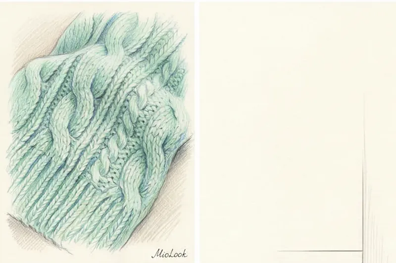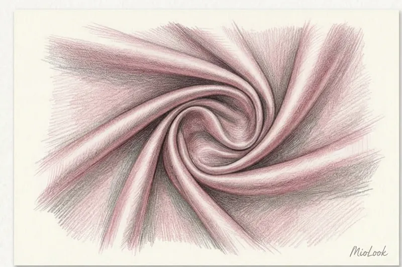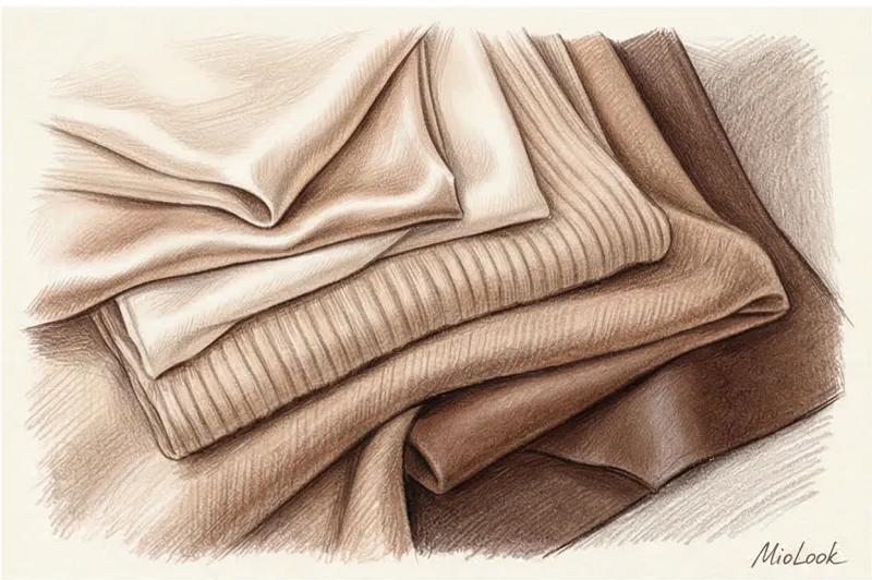

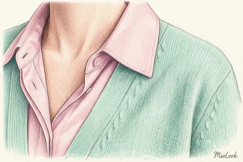
Pastel colors are soft, light shades of any primary hue created by diluting the base pigment with white. These tones lack harsh saturation, ranging from barely visible tints to powdery hues with various undertones. They are used in clothing to create fresh, low-contrast outfits.
What Are Pastel Colors in Clothing?
The term originates from fine art, specifically referring to artists' crayons manufactured with a high chalk content. These crayons produce a characteristic matte, powdery finish entirely devoid of a glossy sheen. When translated into apparel, this concept retains its core visual identity. The primary characteristic of these garments is their low saturation and complete lack of harshness. Visually, these shades reduce the overall contrast of an outfit, making the wearer appear more tranquil and approachable.
Unlike neon or pure spectral dyes, a pastel garment never steals the show. Instead, it acts as a subtle, sophisticated background that highlights the wearer's features and the garment's tailoring. In modern wardrobes, this aesthetic frequently manifests in the form of basic cashmere sweaters, fluid silk blouses, or classic structured coats in muted tones. They offer a refined alternative to stark neutrals while maintaining a high level of versatility.
The Core Color of Pastel: Types and Temperatures
In color theory and fashion design, pastel palettes are systematically divided into three main groups based on their perceived color temperature. Understanding these categories helps in building a cohesive wardrobe.
Cool Pastels
This category includes baby blue, mint green, lavender, and icy gray. These shades create a crisp, refreshing visual effect. Designers traditionally rely on them for spring and summer collections, applying them to lightweight linen dresses, breathable cotton shirts, and fluid skirts. However, they also work exceptionally well in structured garments. A strict trouser suit in a cool lavender shade offers a contemporary, confident twist on traditional corporate tailoring.
Warm Pastels
Warm variations encompass peach, powder pink, creamy yellow, and light coral. They inject softness and visual warmth into an ensemble. These hues look particularly harmonious when paired with dense, tactile textures like tweed, corduroy, or heavy brushed cotton. A peach jacket or a powder pink chunky cardigan feels inherently cozy and inviting, making them excellent choices for transitional weather.
Neutral Pastels
Neutral light tones combine cream, ecru, ivory, and sand. These are the ultimate versatile wardrobe staples. They bridge the gap between stark whites and deeper earthy browns. Neutral pastels pair effortlessly with bright statement accents, as well as with both cool and warm palettes, without ever overwhelming the outfit's balance.
Table of Popular Pastel Shades
To accurately identify these tones when shopping or designing, refer to their standard digital color codes and inherent temperatures.
| Color Name | HEX Code | RGB Value | Undertone |
|---|---|---|---|
| Baby Blue | #89CFF0 | 137, 207, 240 | Cool |
| Mint Green | #98FF98 | 152, 255, 152 | Cool |
| Lavender | #E6E6FA | 230, 230, 250 | Cool |
| Powder Pink | #FFD1DC | 255, 209, 220 | Warm |
| Peach | #FFE5B4 | 255, 229, 180 | Warm |
| Creamy Yellow | #FFFDD0 | 255, 253, 208 | Neutral |
Is White a Pastel Color for Clothes?
A common point of confusion is whether white itself belongs to this category. In color theory, white is an achromatic color, meaning it completely lacks a specific hue. Pastels are intentionally created by mixing a primary or secondary color pigment with white to reduce its saturation and lighten its appearance. Therefore, white is the essential base ingredient required to create these soft tones, but it is not a pastel itself.
Despite not being part of the family, white plays a crucial role in styling. Pairing pastel pieces with pure white garments greatly enhances their freshness. The starkness of the white creates a clean canvas that allows the subtle undertones of the tinted garment to stand out clearly.
How to Combine Pastel Tones in Your Wardrobe
Styling muted tones requires an understanding of contrast, texture, and proportion. Here are the most effective strategies for integrating them into daily wear.
The All-Over Pastel Look
A monochrome or all-over look involves combining several elements in the same or adjacent light shades. For example, wearing a powder pink pantsuit or pairing a lavender jumper with a mint green skirt creates a cohesive, visually effortless aesthetic. To add necessary complexity to this type of outfit and prevent it from looking flat, you must use contrasting textures. Pair smooth, reflective silk with chunky matte knitwear, or delicate chiffon with heavy, structured denim.
Pairing with Achromatic Basics
Combining these soft pieces with basic achromatic colors like white or light gray is a foolproof method that greatly enhances their crispness. A classic example of a refined casual wardrobe is a soft blue, loose-fitting poplin shirt tucked into white straight-leg trousers. This combination feels intentional, clean, and highly appropriate for daytime activities.
Grounding with Dark Shades
Pairing pastels with dark shades helps ground the overall look and removes any overly romantic or juvenile connotations. Deep colors like black, navy blue, or chocolate brown adapt lighter tones to a formal business wardrobe. For instance, a peach silk blouse paired with a navy pencil skirt, or an ecru tailored jacket worn with dark blue jeans, looks understated, professional, and perfectly appropriate in an urban setting.
Matching Pastels to Your Skin Tone
Selecting the right shade depends heavily on your natural complexion. The goal is to find a tone that enhances your features rather than washing them out.
- Fair Skin: Opt for cool tones like icy blue, soft lavender, and mint. These complement cooler undertones. Avoid pale yellow or beige, which can blend too closely with the skin.
- Medium and Olive Skin: Warm tones look exceptionally flattering. Peach, light coral, and creamy yellow bring out the natural golden undertones of the skin.
- Dark Skin: High contrast makes almost all light shades look striking. Powder pink, bright mint, and baby blue create a beautiful, vibrant juxtaposition against deeper complexions.
Choosing Fabrics and Transitioning Seasons
The texture of the fabric significantly alters how a light dye is perceived. Matte fabrics like linen and raw cotton emphasize the chalky, powdery nature of the color. Cashmere and mohair enhance the softness, making the garment look incredibly plush. Conversely, fabrics with a slight sheen, such as silk or satin, catch the light and give the muted tone a subtle, elegant glow.
While traditionally associated with spring, these tones easily transition into colder months. A powder blue heavy wool coat or a chunky mint sweater brightens dreary winter days. The key to wearing them in winter is choosing substantial, weather-appropriate fabrics that provide physical warmth while maintaining visual lightness.