Have you ever noticed how the atmosphere in a room instantly changes when a woman walks in, not wearing the usual navy blue blazer, but a tailored suit in icy mint or dusty rose? It's not just a color choice—it's a statement. Over 12 years as a personal stylist, I've learned one ironclad rule: pastels aren't about being "cute"—they're about status.
A year ago, a client, the CFO of a large IT company, approached me. She was terrified of light colors, believing they would make her look childish compared to her male colleagues. We took a chance and put together a men's-cut trouser set in a bleached lavender shade for the board of directors. The result? She didn't just attract everyone's attention—they listened to her with double the interest. That's how a well-designed set works. pastel monochrome in clothing , when airy colors are grounded by strict architectural silhouettes and rough textures.
We talked in more detail about the basic principles of creating images in one color in our the complete guide to a monochrome wardrobe , and today I want to immerse you in the magic of the most complex, but most luxurious - pastel shades.
What is pastel monochrome in clothing and why is it "quiet luxury"?
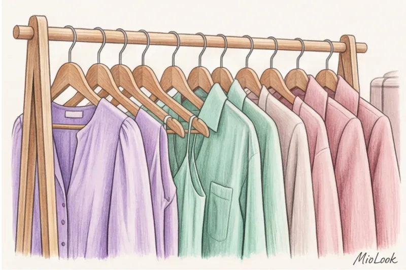
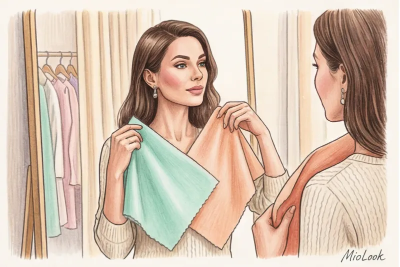
Let's agree right away: true monochrome isn't about trying to find a sweater, skirt, and shoes that all match the same Pantone code. It's a sophisticated blend of tones. Imagine a gradient: from an icy, almost white powder shade to a rich ash rose. It's this versatility that draws the viewer's eye into your look.
Why have light colors historically been associated with luxury? The answer lies in the philosophy of Italian luxury. If you look at the collections of Brunello Cucinelli or Loro Piana (where a basic jumper starts at €800), you'll see a sea of light palettes. Historically, white and pastel colors were a sign that a person didn't need to engage in heavy physical labor. Light-colored clothing conveys, "I have the time and resources to care for these things."
In modern business and casual wardrobes, pastel monochrome works as a soft power tool. It manages impressions without aggressive colors (like scarlet or deep black), evoking subconscious trust. According to color psychology research, a formal, light-colored suit increases trust in an expert by 40% compared to a classic black suit.
Your perfect look starts here
Join thousands of users who look flawless every day with MioLook. Its smart algorithm will help you create a stylish monochrome look from your clothes.
Start for freeThe biggest mistake: how to avoid looking like a marshmallow
My clients' biggest fear is, "Pastel colors make me look fat and like a pastry." And you know what they do to avoid that? They add a black bag or black pumps. It's a disastrous mistake.
Black is the worst companion for pastel. It doesn't ground the image, as is commonly believed, but creates a too-sharp, cheapening contrast. Next to a black spot, delicate mint or powder instantly appears dirty and washed-out. The secret lies not in the introduction of dark spots, but in the temperature gradient and the use of form.
"The main rule for a stylist when working with pastels: a sweet color requires a strict form. The more delicate the shade, the more aggressive the cut and texture of the fabric should be."
The 70/30 rule of contrasting textures
If you wear a smooth powder-colored silk skirt with a smooth silk top in the same shade, you'll get a flat look, reminiscent of a nightgown. There's nothing to catch the eye.
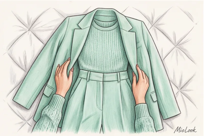
I always use the 70/30 formula. Your look should be 70% basic texture (for example, smooth suiting wool or matte cotton with a weight of 180 g/m² or higher) and 30% contrasting (silk, chunky knit, shaggy suede, embossed leather). For example: silk top + heavy wool trousers + suede loafers. Different materials refract light differently, and the same color begins to play in 3D.
Architectural cut versus ruffles
Avoid childish details if you choose candy colors. No ruffles, bows, or soft, shapeless cardigans. Men's wardrobe elements are a lifesaver for mint and lavender shades. Wide shoulders on jackets, crisp lapels, and creases on trousers made of thick viscose. Angles offset the softness of the color.
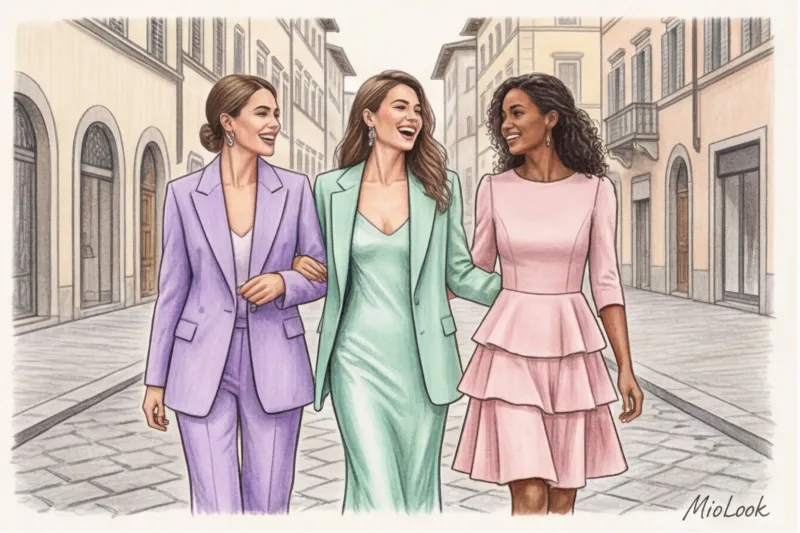
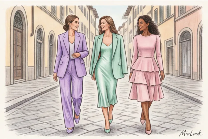
Three royal shades: lavender, mint and powder
Not all pastels are equally useful for a business or casual wardrobe. I've identified three investment colors that always look expensive and appropriate.
- Cool Lavender (Digital Lavender): According to the PANTONE Color Institute (2024), this shade is associated with digital escapism and intellectual calm. It's an intellectual color. It's ideal for conference speakers, educators, and creative agency executives. It commands attention without being overwhelming.
- Refreshing mint and sage: It exudes energy, eco-friendliness, and innovation. Mint is a luxurious base for spring/summer business casual. It's incredibly refreshing after a sleepless night (my personal life hack before morning shoots).
- Dusty Rose: This new foundation successfully replaces the traditional beige. While classic beige can blend into the skin, making the face look sallow, ash rose creates a soft flush. Look for a powder with a slight gray or lilac undertone—it looks the most expensive.
How to choose a pastel monochrome for your color type
It's time to put the myth that pastels make your face look pale into the past. They only ruin your look in one case: if you don't get the right temperature and contrast ratio for your complexion. And here, my method has a fair limitation: This does NOT work if you are trying to wear a warm peach shade when you have a cool contrasting complexion.
For a contrasting appearance (Winter): Your pastels should be icy, as if bleached by frost. Choose icy mint, frosty lilac, or crystal pink. Avoid muddy, dusty shades—they'll make you look tired.
For a soft look (Summer/Fall): You, on the other hand, need dusty, complex tones with a touch of gray or brown. Sage, ash rose, and lavender with a hint of blackberry are your options.
Portrait Zone Life Hack: What to do if you've fallen in love with a pastel suit that's "not your thing" (say, for €200 at COS)? Simply pull it away from your face. Wear a white top in your ideal shade under the jacket (pristine white for cool skin tones, off-white for warm skin tones), or unbutton your shirt deeply, revealing your collarbone. Your skin will act as a buffer.
Look formulas: putting together a delicate monochrome look for different occasions
Enough theory, let's get practical. Here are three of my favorite formulas, which can be found in both premium and mass-market styles (budget: €100-€300 per look).
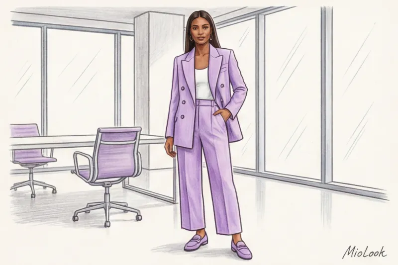
- Office / Business Casual: A loose-fitting mint pantsuit (look for wool-blend viscose) + a pistachio ice cream-colored basic top + taupe suede loafers. Add a structured sagebrush bag for a flawlessly professional look.
- Date / Evening Out: A dusty rose silk midi slip dress + a voluminous mohair cardigan a shade darker (for that 70/30 texture contrast) + nude sandals with thin straps.
- Everyday chic: Lavender wide-leg jeans (yes, colored denim is all the rage right now) + a blackberry-toned cashmere sweater + lilac or silver sneakers. Perfect for brunch with friends or a trip to an exhibition.
Try MioLook for free
A smart AI stylist will create the perfect look from your own items. Upload a photo of your wardrobe and get ready-made formulas for every day.
Start for freeAccessories and Shoes: How to Add a Pop of Color to a Pastel Look
As we've already established, black shoes are persona non grata. So what should you wear?
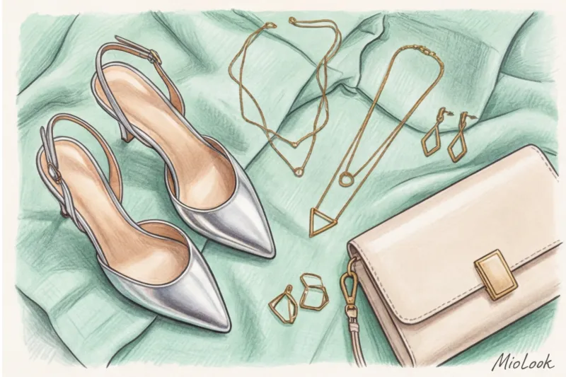
Shoes: Silver and gold are your best friends. Metallic shoes work like a mirror, neutral yet chic. If metallic seems too bold, choose shoes 2-3 shades darker than your outfit (for example, dark olive ankle boots with a mint suit) or a classic nude that blends with your legs.
Bags: A delicate color scheme should be complemented by a crisp, geometric accessory. A soft, powder-colored hobo bag will transform you into a cloud. A rigid, rectangular tote or baguette bag in smooth leather will bring your silhouette together.
Decorations: Forget the cheap glitter of rhinestones. A prestigious monochrome calls for precious metals. For powder and mint, matte gold is ideal (it complements the fabric). For cool lavender, try white gold, silver, and baroque pearls.
Stylist Checklist: 5 Steps to the Perfect Pastel Look
Putting together this look in 15 minutes in the morning is possible if your closet is organized. Check yourself before you go out:
- Step 1. Start with a basic piece (like a suit) and choose complementary pieces in varying shades. Don't look for a perfect match—a gradient looks more expensive.
- Step 2. Check out the mix of textures. Does the look include at least one shiny (silk/leather) and one fuzzy/matte (suede/wool) item?
- Step 3. Make sure there's a strong architectural quality. Does the shoe have a defined shoulder line or a pointed toe?
- Step 4. Remove black and overly dark accessories. Replace them with metallic or related shades.
- Step 5. Assess the look in daylight by a window. Yellow room lamps distort the perception of color temperature.
Pastel monochrome isn't just a trend this season; it's the pinnacle of personal style that speaks volumes about you before you even utter a word. Don't be afraid of light shades—beware of boring shapes. Start with one suit or dress, add the right texture, and you'll see how your shoulders straighten. And if you're unsure about combinations, you can always test your ideas in a virtual fitting room. MioLook - It will help you find the perfect color balance before you even open the closet.