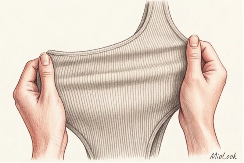
Forget the wrist vein test
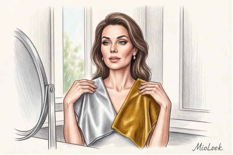
How many times have you stood in front of a mirror, holding gold and silver foil to your face, or tried to discern whether the veins on your wrist are blue or greenish? Common advice is to identify your undertone and only buy items in the same color range. As a practicing stylist, I can tell you straight: this is an outdated myth that makes your style flat and predictable.
The most precious, prestigious, and memorable looks are built not on strict adherence to "their" palette, but on subtle conflict. It is precisely the skillfully mixed cold and warm shades in clothing create that very "quiet luxury" effect that trendsetters are after. We've covered the basic principles of working with a palette in more detail in our The complete guide to color combinations and the Itten circle , and today we will go further and learn to break the rules.
Let's figure out why old methods no longer work, how fabric texture changes the perception of color, and how to learn to mix temperatures to look like a million bucks.
Why old methods of measuring temperature no longer work
The rigid typing system has long been cracking at the seams. When new clients come to me, 8 out of 10 are convinced they are "pure summer" or "deep autumn," and are terrified of taking a step to the left. But science says otherwise.
Three pigments are responsible for our skin color: melanin (brown), carotene (yellow-orange), and hemoglobin (reddish-blue). Research by dermatologists and colorists shows that less than 15% of natural skin tones are pure "warm" or "cool." Most of us have neutral or mixed undertones.
Moreover, it is important to distinguish overtone And undertone Overtone is the visible color of the skin, which changes. Whether you went on vacation to Tuscany and got a light tan, or developed rosacea from the cold in the winter, your overtone has changed. But your true undertone remains the same. This is why vein tests often fail: you see a distortion through the translucent layer of skin. To better understand your natural color palette, I recommend studying 12 color types of appearance , but perceive them not as a rigid cage, but as a starting point.
Try MioLook for free
A smart AI stylist will select the perfect look based on your contrast and temperature preferences.
Start for freeCool and warm shades in clothing: how to train a stylist's eye
To learn to play with color, you need to stop thinking in terms of "just red" or "just gray." Every color contains impurities. Johannes Itten's principles of coloristics state that adding yellow pigment warms a color and visually brings an object closer. Adding blue pigment cools a color and visually recedes it.
This is critical knowledge for figure shaping. Cool shades (such as icy blue or emerald) visually compress volume, while warm shades (terracotta, mustard) expand and accentuate it.
Practical advice from an expert: In stores with artificial lighting, colors are often distorted. Over 12 years of working in the industry, I've developed a foolproof trick: the white sheet test. If you're unsure whether a beige sweater is warm or cool, place a plain white sheet of paper (or a store receipt) next to it. Against a pure white background, hidden pigments will immediately appear: the fabric will either have a yellowish tint (warm) or a blue or grayish tint (cool).
The Psychology of Temperature: What Impression Does Your Image Make?
Choosing color temperature is a tool of nonverbal communication. We don't just dress; we convey a message.
- Warm shades Camel, peach, and chocolate colors encourage conversation, create a cozy atmosphere, and subconsciously reduce distance. They're an ideal choice for psychologists, coaches, HR specialists, or for dates where creating a trusting atmosphere is essential.
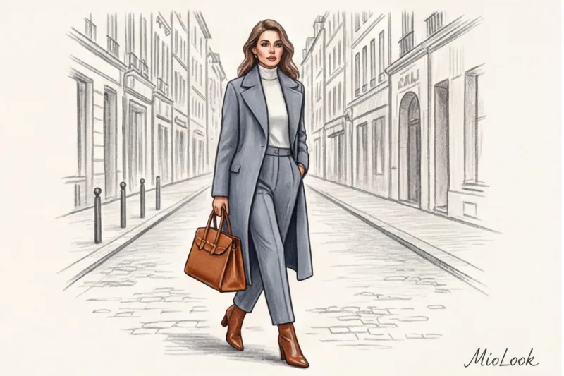
- Cool shades (steel gray, sapphire, snow white) convey authority, status, and maintain distance. Choose them for complex negotiations, project defense, or if you're a lawyer who needs to emphasize your objectivity and rigor. Learn more about What to wear with blue to look expensive.
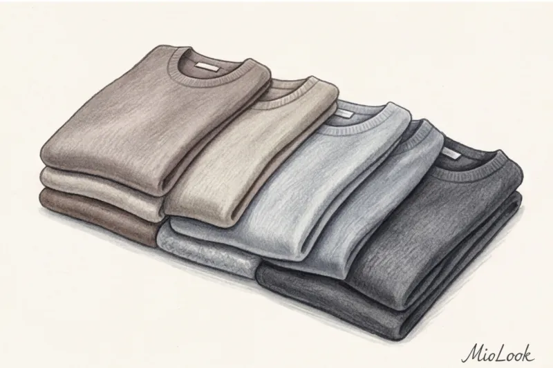
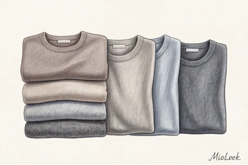
The Secret to Premium Style: How Fabric Texture Changes Color Temperature
My favorite insight, which I share in my masterclasses: texture is more important than color itself. Veteran fashion houses like Hermès brilliantly balance the temperature of their silk bobbins precisely through the weave of the threads.
Remember this rule: glossy surfaces (satin, smooth leather, lurex) reflect light and visually "cool" the color. The same shade of beige on a silk blouse will appear cool and distant. Fleecy, matte textures (cashmere, velvet, corduroy, suede) absorb light and "warm" the color. The same beige on suede will appear soft, warm, and deep.
Italian artisans create an aesthetic of "quiet luxury" precisely through this playful approach. When putting together a monochrome look, say, in beige tones, never choose pieces of a single texture. Mix smooth silk with fluffy mohair or rough leather. Yes, pieces with complex textures are more expensive, but their cost-per-wear is well worth it, because they do all the styling work for you.
Your perfect look starts here
Join thousands of users who look flawless every day with MioLook. Digitize your wardrobe in just a few clicks.
Start for freeThe Art of Mixing: How to Combine Cool and Warm Shades in a Single Look
If you want to look truly classy, break the rules, but do it wisely. The main rule for expensive looks from stylists: never mix colors 50/50. This creates visual chaos. Use the 80/20 formula.
I had a client in my practice, a development manager at an IT company. Her dress code was casual, and she wore only cool gray and blue base colors. She found her wardrobe dull and "flat." We didn't change her favorite suits. We used the technique "temperature anchor": They added a warm, classy accent to the icy gray wool—a bag and belt in a rich cognac hue. The look instantly acquired depth and London street style character.
But there's one strict limitation—the "dirty stain" effect. It's absolutely forbidden to place shades of the same value but different temperatures close together. For example, if you wear a warm ivory jacket over a cool, crisp white shirt, the jacket will appear washed out and yellowed with age. Temperature contrast requires a difference in saturation.
Status accessories as a tool for temperature contrast
Bags, belts, and shoes are the safest testing grounds for experimentation. If you're afraid to wear yellow color in clothes near your face, let it be a mustard suede bag to go with your dark blue coat.
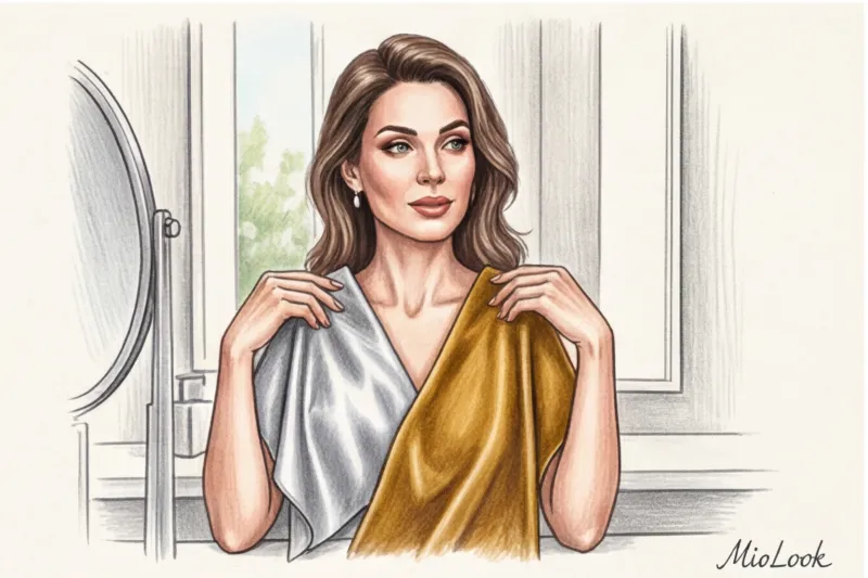
Metals deserve special attention. Gone are the days when gold and silver didn't mix. Take a look at the iconic Trinity ring by Cartier—three types of gold (including cool white and warm yellow) work in perfect synergy. The key is for one piece to be more substantial (the same 80%), while the other serves as an accent (20%). You can find more examples in our article. "Gold or Silver: Which Metal Suits Your Color Type?".
Investing wisely: what items should strictly match your undertone
It's time to talk budget. As an investment wardrobe consultant, I demand strict discipline from my clients in just one area—the face. Everything from the collarbone upwards should complement your skin.
Professional shopping checklist:
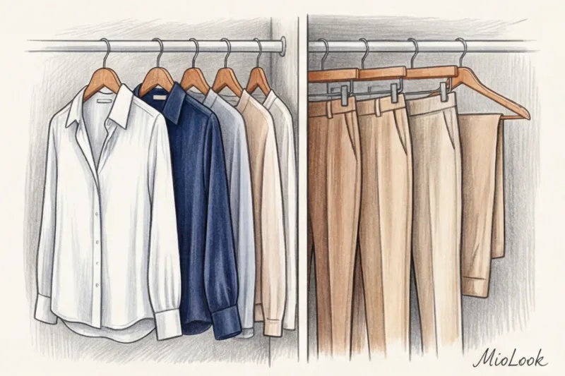
- What to spend your budget on strictly according to color scheme: Coats, jackets, turtlenecks, silk blouses. If you have an olive skin tone, it's not a good choice. pink color in clothes near the face (for example, warm magenta instead of cool icy pink) will instantly emphasize the shadows under the eyes and make you look sickly.
- Where to relax and experiment: The bottom doesn't matter. Pants, skirts, jeans, and shoes are too far from the face to affect skin reflexes. Buy them at any temperature.
When does this rule NOT work? If you have pronounced skin conditions, such as severe redness (couperose or rosacea), even if your natural complexion is considered "cool," wearing cool red or burgundy shades near your face will magnify your redness. In such cases, we use a neutral base near your face.
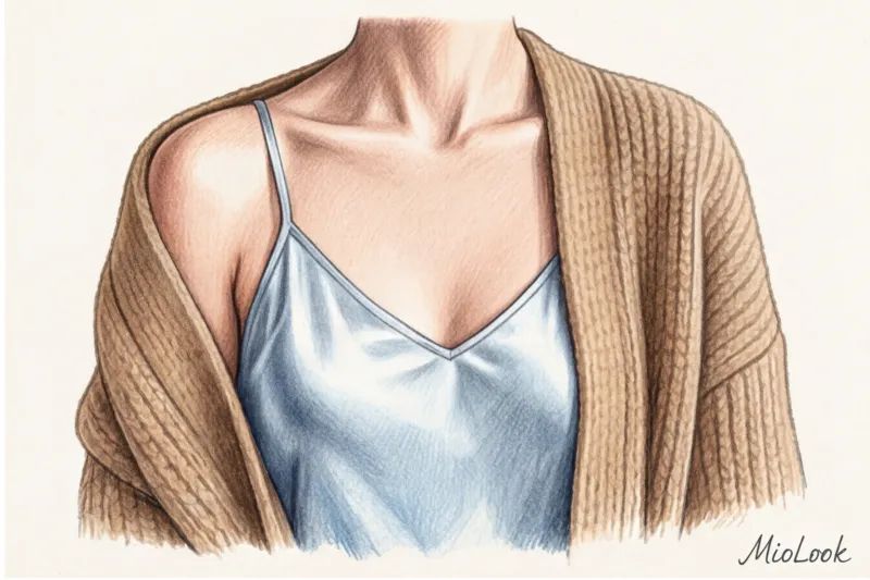
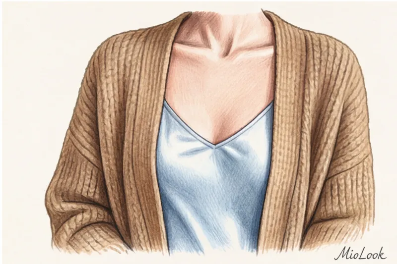
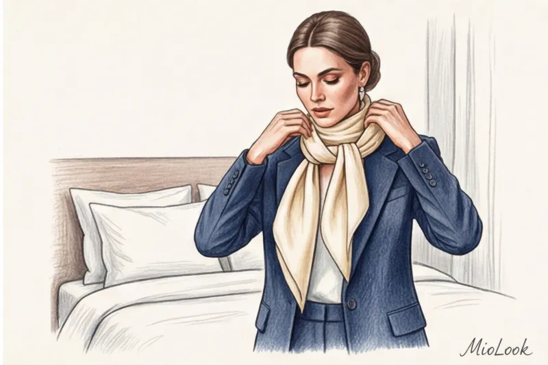
How can you "save" an expensive item that's too warm? Let's say you were given a luxurious cashmere sweater in a warm camel shade, and you have porcelain skin with a blue undertone. The secret is simple: create a barrier. Wear a white shirt with a stiff, cool collar under the sweater or tie a cool silk scarf around your neck. This will prevent the offending color from coming into contact with your skin.
Ready to get started?
Try the free plan—no commitments. Upload your items to MioLook and create harmonious looks for every day.
Start for freeWorkshop: A quick audit of your wardrobe for color clashes
Theory without practice is dead. Take 15 minutes today to do a quick closet audit. It'll save you hours of morning preparation.
- Step 1: Separation. Take out your basic items and sort them into two piles. One contains anything with a hint of blue or gray undertone (cool). The other contains items with yellowish, golden, or reddish-brown undertones (warm).
- Step 2: Search for "singles". Find those pieces you've always struggled to pair. We bet you intuitively tried to match them 50/50, or they fell under the "dirty spot" rule? Now you know why.
- Step 3: Synthesis. Create three new outfits using the 80/20 rule. Take a base from one pile (80%) and add a bright, textured accent from the other (20%). For example, a dark green chunky knit sweater (cool) and terracotta pants (warm).
Managing color temperature is a skill that requires a keen eye. To avoid wasting time on lengthy fittings, I recommend using the "smart wardrobe" feature in MioLook Take a photo of your items once, and the app will help you visualize temperature contrasts on your smartphone screen before you take them out of the closet.
Color is the most powerful, free, and quick tool for impression management. Stop hiding behind the safe, monochrome rules of glossy magazines of the 2000s. Allow your wardrobe to be a little bold, mix fire and ice in a single look, and you'll see how not only your reflection but also your posture will change.