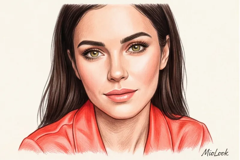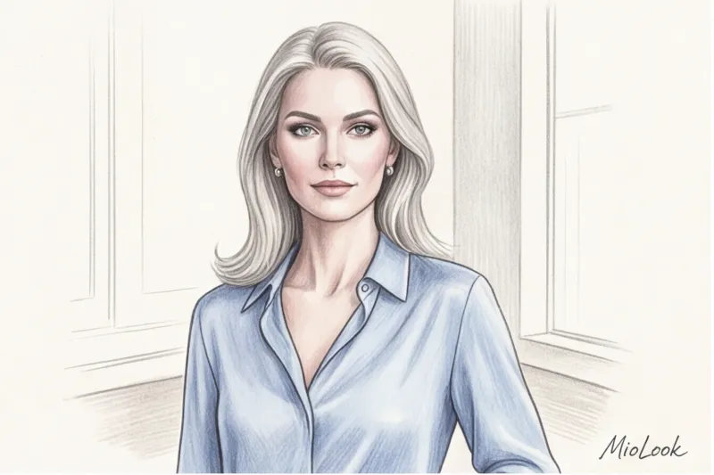

At one of the Max Mara shows in Milan, I closely observed the guests in the front row. Glossy editors, top buyers, influencers—they all exuded power and status. And do you know what distinguished the most striking women in this crowd? They didn't wear black. Their looks were dominated by shades of camel, ivory, and washed-out gold. It was a masterclass in "quiet luxury," and that's exactly how a wardrobe should work. Light Spring color type.
There's a harmful stereotype: if your complexion is light-toned, you're destined to forever wear childish "princess dresses" and look frivolous. This is a dangerous misconception. Working as a stylist for over 12 years, I constantly see women with light complexions hiding behind heavy, dark suits to appear more authoritative, only to end up with a haggard face and accentuated shadows.
In this article, we'll put childhood associations to rest once and for all. I'll show you how to use the optics and physics of color to build a prestigious, luxurious, and powerful wardrobe that works for you, not against you.
What is the Light Spring color type in the 12 seasons system?
To understand the mechanics of your appearance, we must turn to science. The classic four-season system often led Light Springs into a dead end. Due to their translucent skin, they were mistakenly classified as Light Summers (forcing them to wear cool gray) or even Winters (suggesting contrasting black), which led to disastrous wardrobe consequences.
Everything fell into place when coloristics adapted Albert Munsell's spatial color theory. In this system, each color has three dimensions: value, hue, and saturation. We've covered how this mechanics works for each color type in more detail in our a complete guide to the 12 color types of appearance.
The architecture of the Bright Spring color is built in a strict hierarchy:
- Dominant - Lightness (High Value). There is a lot of white in your pigments.
- Secondary characteristic - Warmth (Warm Hue). Carotene is responsible for this, giving the skin that golden-peach glow.
- Tertiary characteristic - Brightness (Chroma). Your colors should be clear, not clouded by gray pigment.
How to Unmistakably Identify the Bright Spring in You: A Stylist's Checklist
Clients often come to me convinced they know their skin undertone thanks to the "wrist vein test." Let's be honest: on the thin, translucent skin of a Light Spring, veins will always appear bluish-green due to light refraction. This test is a complete myth.
As a professional, I only trust the draping method—applying fabrics to a bare face in neutral daylight.
What we see when analyzing the natural data of Bright Spring:
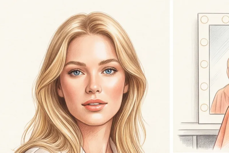
- Hair: From wheat and golden blonde to light brown with distinct copper or caramel highlights. In the sun, they always fade to gold, not ash.
- Eyes: Transparent, often with a sunburst pattern. Colors range from clear blue to warm green and light hazel.
- Leather: Ivory or warm peach. She rarely tans to a bronze hue, but rather has a slightly golden hue, and is often prone to fine freckles.
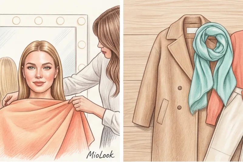
Light Spring is a chameleon-like personality type. Because of the low contrast in your appearance, you easily pick up on the reflections of your clothing. Wear a cool blue, and your skin will appear sickly pale. Wear a warm coral, and you'll achieve a healthy, lit-from-within glow.
Access to MioLook for €0.99 — one-time payment
A smart AI stylist will select the perfect look based on your coloring in just a couple of clicks.
Get access — €0.99 onceBasic Palette: How to Create an Elegant Wardrobe Without Black and White
This is where the most difficult psychological challenge for my clients begins. Should I give up black and crisp white as my base? Yes, that's right. And here's why.
It's all about the simple physics of light. A pure white shirt next to a warm-toned face makes the skin look dirty, highlighting even the slightest redness. Black pigment, on the other hand, absorbs light. According to research on the optical properties of fabrics, light-colored shades reflect up to 40% more light onto the face than black. A black turtleneck casts harsh shadows on the nasolabial folds and under the eyes. Why would you want clothes that voluntarily add five years to your age?

Perfect neutral shades
To beige color in a business wardrobe worked for you, it must be at the right temperature.
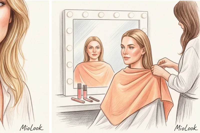
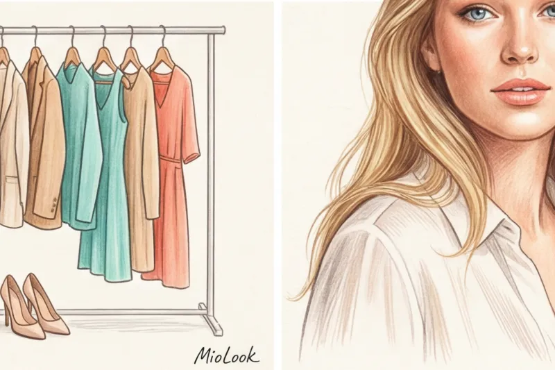
- Instead of white: Ivory, cream, and baked milk. This is the secret to a truly luxurious look.
- Instead of black: Milk chocolate, camel, warm taupe, pine and soft navy (not too dark).
Invest in a camel cashmere coat or an ivory silk blouse—these items will pay for themselves a thousandfold.
Bright accents: from peach to aquamarine
Your accents should be diluted with water. Think of watercolor painting: the color is clear, but the white of the paper shows through.
The Pantone Color Institute named Peach Fuzz the color of the year 2024. Experts noted its ability to optically illuminate skin. For Bright Spring, this isn't just a trend; it's a staple. Add coral, the color of young spring greens, turquoise, and warm banana yellow.
Your perfect look starts here
Join thousands of users who look flawless every day with MioLook's wardrobe analysis feature.
Get access — €0.99 onceLight Spring color type in the office: how to look classy, not childish
I remember Elena, the CFO of a large IT company, approaching me. Her pain point was, "I adore my light suits, but at board meetings with men in dark blue, I feel like an intern." We didn't dress her in black. Instead, we applied the professional contrast rule for fair-skinned individuals—the "1 to 3 rule."
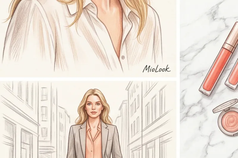
The essence psychology of color in business attire For Bright Spring, balance is key. To maintain authority without black and white, we use mid-saturated tones from your palette.
- Monochrome with micro-contrast: A milk chocolate-colored suit paired with a cream shirt. The contrast is subtle, yet refined.
- Invoice management: Light spring avoids heavy tweed, coarse burlap, or stiff drape. They overpower the delicate look. Smooth, slightly shimmering fabrics are your weapon of choice. Super 120s wool, dense silk, and high-quality viscose. The subtle sheen of the fabric adds a touch of sophistication and class to light shades.
Beauty Guide: The Perfect Makeup and Hair Color for Bright Spring
While chatting with leading makeup artists backstage at Fashion Week, I discovered a golden rule for fair, warm skin types: makeup should look like an extension of skincare. The trend for translucency and a "wet skin" effect (glass skin) seems to be made just for you.
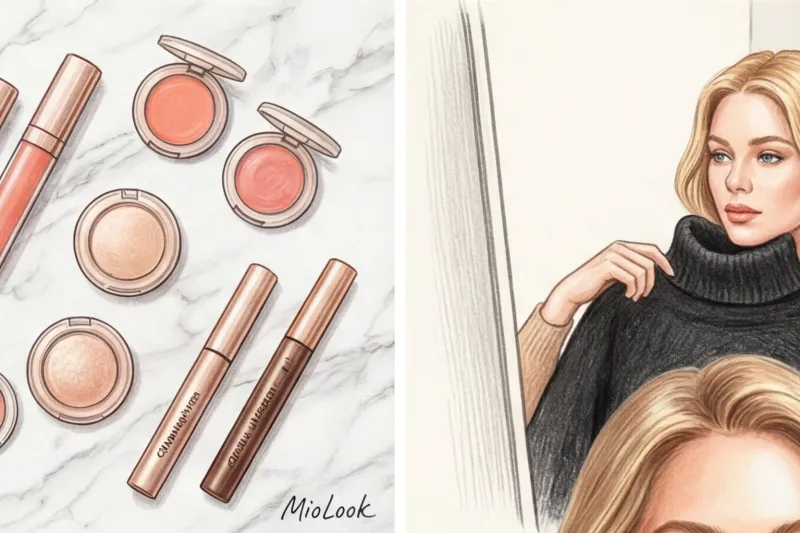
Foundation, blush, and lipstick: the rule of translucency
The worst thing Bright Spring can do is apply a thick matte foundation and harshly contour with a brown contouring product. This will instantly create a mask-like, tired-looking effect.
- Tone: Light fluids or BB creams with a warm undertone and a radiant finish.
- Blush: This is your essential beauty tool. Choose apricot, coral, or warm pink shades. Forget cool fuchsia—it will look out of place on your skin.
- Eyes: Black eyeliner is a total no-no. It looks too harsh. Replace it with chocolate, bronze, or graphite.
Hair Color: Why Ash Blonde Is Ruining Your Look
The most common mistake I see in salons: a naturally bright spring woman comes to the stylist and asks to "remove the yellowness" by going a cool ash or platinum blonde. As a result, the skin takes on a sallow tone, and the eyes lose their brightness.
Nature has already given you the perfect balance. Your options: honey blonde, strawberry blonde, light caramel highlights. A solid, dense color always looks harsher than a subtle balayage or babylights that mimic sun-kissed strands.
Access to MioLook for €0.99 — one-time payment
Not sure if a new hair color or makeup look will suit you? Test your ideas with an AI stylist.
Get access — €0.99 onceThe Main Mistakes: What Ages and Cheapens the Bright Spring Look
It's time to voice a counterintuitive insight that's rarely mentioned in basic style guides. The popular advice, "A bright spring should wear pastels," is dangerously inaccurate and often results in women looking unhealthy.
The thing is that pastels come in different types Traditional dusty pastels are created by adding gray pigment to the color. It's the perfect palette for Summer. But if Bright Spring wears dusty pink or gray-blue, the gray pigment in the fabric will bring out even the slightest shadows on your face. You'll look like you haven't slept in a week.
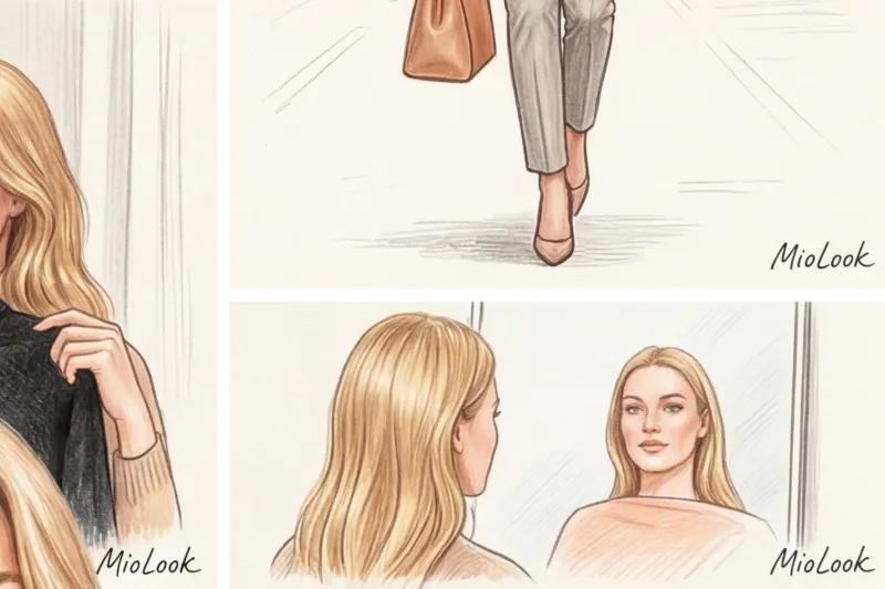
Do you need pure pastel - icy shades, which are obtained by diluting pure color with white or water, without a drop of gray.
Two more main enemies:
- Muted autumn colors: Burgundy, mustard, swamp khaki. They're too heavy and earthy for your watercolor-lightness.
- Extreme contrasts: Black jacket over a white shirt will "eat" your face People will see the suit first, and then you.
Capsule Wardrobe: A Look Plan for Bright Spring
Assembling the perfect basics is easier than it seems. I provide my clients with a specific seasonal capsule plan that allows them to transition their wardrobe to the desired palette without breaking the bank.
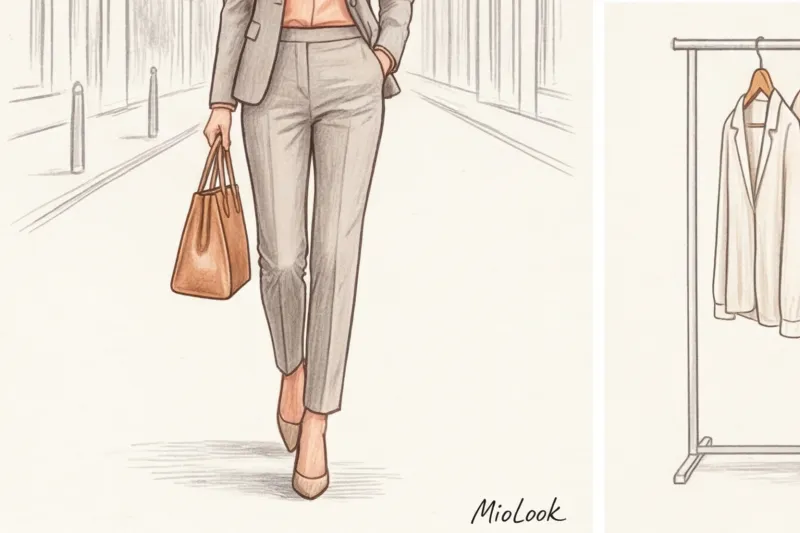
Formula for spring/summer:
- 3 basic bottoms: Cream palazzo pants in a flowing fabric, classic light blue jeans without fading, camel midi skirt.
- 4 tops: An ivory silk blouse, a thin coral cashmere jumper, a basic warm white T-shirt, and an aquamarine top.
- 2 layers: A light grey (warm taupe) jacket with a well-cut design and a classic caramel trench coat.
Accessory group: Avoid bulky black shopper bags. Light leather (ecru, taupe, cognac) looks much more expensive. When it comes to jewelry, opt for yellow gold, rose gold, or a combination of the two. Silver can look a bit too formal, although glossy white gold is perfectly acceptable.
Working with the Light Spring color palette is the art of manipulating light. You don't need to scream with dark colors to be noticed. Your strength lies in the clarity, luminosity, and noble delicacy of your shades. Once you stop hiding your natural transparency behind other people's harsh palettes, your wardrobe will begin to work for you with the efficiency of the world's best stylists.