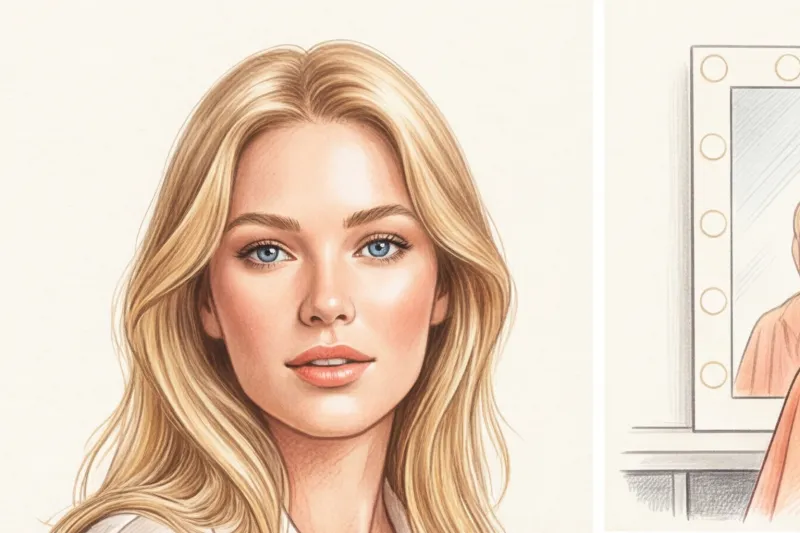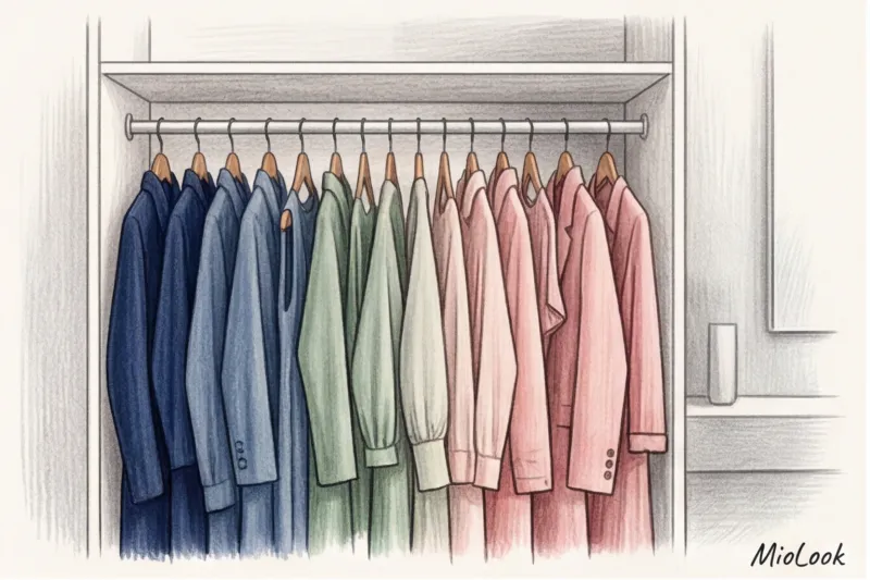

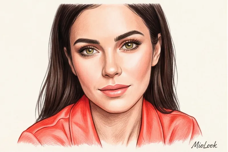
Have you ever noticed how one girl in a black turtleneck looks like a French movie star, while another in the exact same thing looks tired and sickly? I encounter this all the time. In 12 years of working as a personal stylist, I've learned one ironclad rule: if black stubbornly doesn't suit you, despite dark hair and a contrasting appearance, your color type is most likely Bright Spring. We discussed how seasonal color types are formed in more detail in our a complete guide to the 12 color types of appearance But today I want to examine precisely this most paradoxical and striking category.
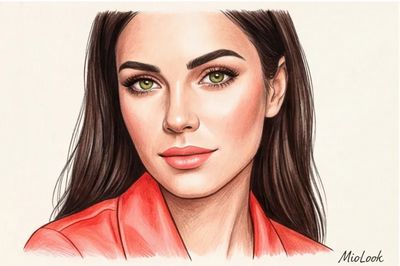
Instead of clichéd internet advice like "just wear bright colors," we'll explore the anatomy of your contrast. You'll learn how to integrate neon and pure shades into a formal or minimalist wardrobe without losing class and elegance.
What is the Bright Spring color type: the anatomy of contrast and purity
In directional color analysis, Bright Spring straddles the line between True Spring and Bright Winter. This means it draws warmth from the former and vibrant contrast from the latter. But to truly understand this color type, we'll have to turn to science.
American artist and color theorist Albert Munsell created a system back in 1905 that is still used by professional colorists. According to Munsell's system, any color has three dimensions: hue, value, and chroma. And it is precisely high color purity (chroma) - the absolute absence of grey pigment is the dominant characteristic of Bright Spring.
The natural markers of this type are often confusing. Typically, they feature very clear, lit-from-within eyes (transparent green, topaz-blue, vibrant hazel), fair skin with a warm peach undertone, and fairly dark hair—from rich chestnut to warm brunette. The appearance appears incredibly contrasting, like Snow White, but with a warm filter.
"The standard four-season test (Winter, Spring, Summer, Fall) is completely useless here. Bright Spring is too contrasting for the classic warm Spring and too warm for the contrasting Winter. This is a unique intersection of temperature and saturation."
The main trap: why the Bright Spring color type is constantly confused with Winter
According to my internal statistics, about 70% of Bright Spring women mistakenly classify themselves as "Winter" at home. The main culprit is the myth about dark hair. We're used to thinking that if a girl has fair skin and dark hair, she automatically qualifies as a Winter type.
One of my clients, Elena, a top manager at an IT company, wore exclusively black for 10 years. She considered herself Winter, bought formal black-and-white suits, and covered the dark circles under her eyes with a thick layer of concealer every day, complaining of looking tired. When we conducted a color test, it was a real wow-factor. It turned out that black is the worst enemy of Bright Spring. It literally "eats" the natural warmth, turning her skin gray and emphasizing even the slightest shadows on the face.
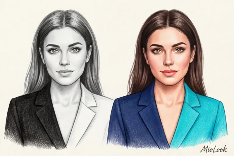
The difference between Winter and Bright Spring lies in the color temperature. Winter calls for icy neon (fuchsia, electric blue), while Bright Spring calls for tropical (coral, lime, watermelon). As soon as we replaced Elena's black with warm navy and her white with buttery white, her face literally lit up. People started asking if she was back from vacation.
Access to MioLook for €0.99 — one-time payment
A smart AI stylist will select the perfect look based on your natural contrast and color type.
Get access — €0.99 onceBasic Palette: How to Wear Bold Colors in Real Life
There's a pernicious stereotype that a Bright Spring wardrobe should consist exclusively of neon colors. This is fundamentally wrong. If you dress head to toe in neon, you'll get lost in the crowd. The main purpose of clothing is to frame your appearance, not drown it out.

I always recommend using the 80/20 rule. Make 80% of your look deep neutrals, and 20% high-chromatic (clear) accents in the portrait area. Adding just 15-20% of a highly saturated color near the face visually refreshes the skin more than heavy foundation.
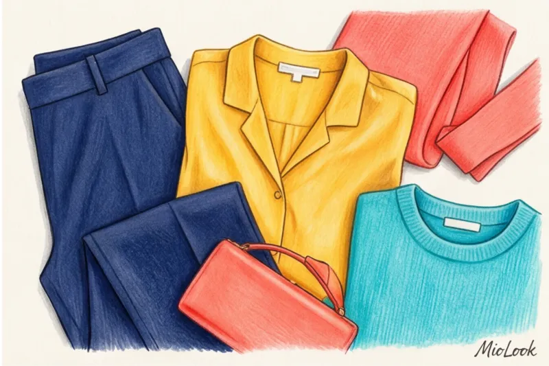
Neutrals for a Bright Spring (instead of black)
If black is contraindicated for you, what should you build your base on? In the article about beige color in a business wardrobe We've already touched on the topic of warm neutrals, but Bright Spring calls for more contrasting solutions:
- Best Dark Neutrals: warm navy, dark chocolate (no red tint, but warm), deep pine green.
- Best Light Neutrals: cream and ivory (never snow-white!), light warm beige, warm light gray (with a subtle yellowish undertone).
Warm navy works as the perfect contrast anchor. It adds the necessary depth without creating harsh shadows on the face.
Accent Colors: Your Superpower
It's in the accents that the magic of your color type is revealed. Your palette is the colors of a tropical island on a sunny day: coral, flamingo, sparkling lime, turquoise, pure sunny yellow. All shades should be clear, without a hint of gray.
To integrate these bright colors in office clothes Use tricks: a silk turquoise scarf, a coral blouse under a strict navy jacket, or a structured lime-colored bag paired with a neutral beige trench coat.

A Capsule Wardrobe for a Bright Spring: A Stylist's Guide
Building a high-status wardrobe with a vibrant color palette is a delicate task. The "quiet luxury" trend is traditionally associated with dusty, muted tones that simply kill the Bright Spring. How can you look expensive using bold colors?
The secret lies in texture. Bright colors on loose materials (linen, bouclé, coarse wool) often look cheap and rustic. But the same colors on smooth, glossy textures look luxurious. Choose dense mercerized cotton, natural silk (19 momme and up), smooth leather, and cashmere with a subtle sheen. Smooth textures enhance the purity of color (chroma), which perfectly resonates with your appearance.
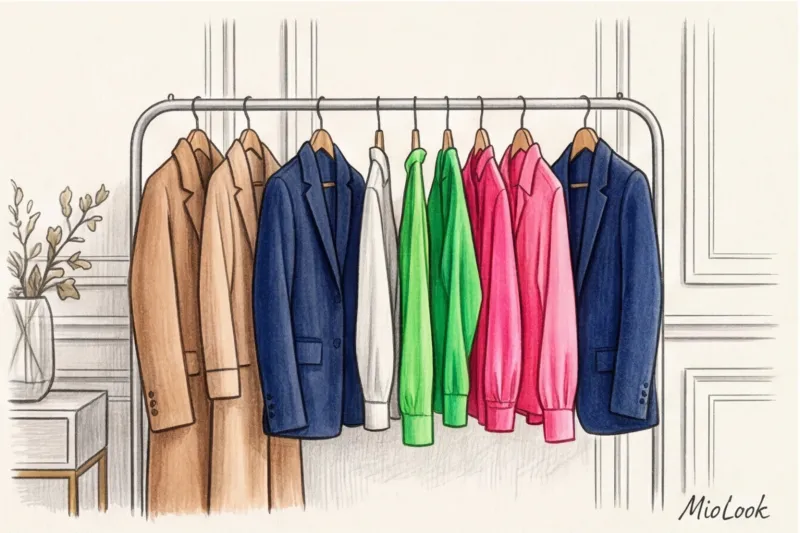
An example of a micro-capsule for business and casual meetings:
- A structured pantsuit in a warm navy shade (the perfect base).
- Coral silk blouse (focus on the face).
- Light cream basic T-shirt made of thick cotton.
- Smooth leather midi skirt in a dark chocolate shade.
- Thin cashmere jumper in turquoise color.
- Classic blue jeans without fraying.
- Light beige trench coat.
- A rigid bag in a warm yellow shade.
- Beige loafers.
- Silk scarf with tropical print (connecting element).
To avoid confusion in combinations, I strongly recommend digitizing your items. Personally, I upload clients' clothes to MioLook app Its smart wardrobe feature allows you to clearly see the percentage ratio of basics to accents, preventing your closet from turning into a theatrical dressing room.
Your perfect look starts here
Join thousands of users who look flawless every day and plan their capsules with MioLook.
Get access — €0.99 onceBeauty Routine: Makeup That Matches Your Outfit
The popular "no-makeup" makeup trend is a bad idea for Bright Spring. Due to the high natural contrast, leaving your face completely neutral will blur against even basic clothing. A pop of color is essential.
The first thing you need to do is ditch the black mascara and eyeliner. Seriously. Replace them with a rich dark brown (espresso) or graphite shade. Your eyes will instantly become brighter and your gaze softer.
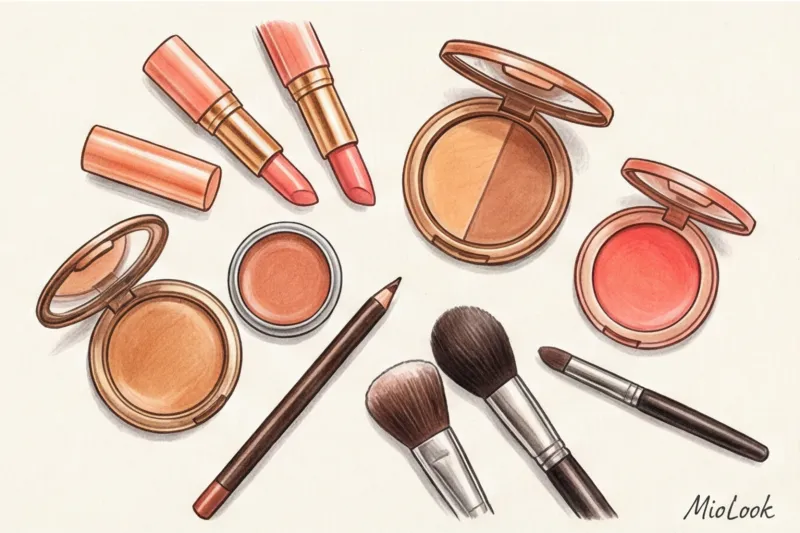
Your ideal lipstick shades are warm peach, rich coral, watermelon, and tomato red. Blush should be a warm pink or coral with a subtle shimmer (a satin finish works better on you than a matte finish).
"A little stylist's secret: if the corporate dress code requires you to wear a gray or black jacket, compensate with makeup. A bright coral lipstick and a touch of warm blush will save your look from looking unhealthy and will act as a buffer between your face and the wrong color of your clothes."
Checklist: A Quick Wardrobe Audit for a Bright Spring
Of course, all these rules have their limitations. If you have active breakouts, avoid placing neon coral right under your chin—it'll magnify the redness, highlighting it. In this case, it's better to use a deep navy color and use accessories to accentuate the color. But overall, your wardrobe needs an overhaul.
Here are 3 steps for a quick audit:
- Remove the "dust": Get out all the muted, grayish, and powdery shades (the Summer and Autumn palette). They shouldn't be worn in portrait mode. They make you look invisible.
- Save errors: If you have a black cashmere sweater dear to your heart (or wallet), don't rush to throw it away. Add a chunky chain in a warm gold hue or tie a bright scarf from your palette around your neck. This will create the necessary barrier.
- Check out the white stuff: Compare your white shirt to a piece of paper. If they're the same color, the shirt makes you look washed out. Look for shades with a hint of warmth.
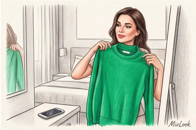
Stop hiding behind safe black and boring gray. Your appearance is designed to wear colors that others are afraid of. Digitalize your boldest pieces, try pairing them with contrasting outfits, and observe how your reflection in the mirror and others' reactions change. Color is the fastest way to influence impressions, so use it to its full potential.