One day, a client of mine burst into tears in the fitting room. She was wearing a basic knit vest, and looking in the mirror, she said bitterly, "I look like a retired sailor; this thing has added at least ten kilos." The problem was that she blamed the horizontal lines. But the real culprit was something else: the thin, flimsy viscose had stretched across her chest and hips, distorting straight lines into convex curves. This created the illusion of excess volume.
We talked in more detail about the fear of active drawings in our a complete guide to fashionable prints in clothing , but geometry deserves a separate, scientific discussion. Over 12 years of working as a personal stylist in Europe, I've realized one thing: women are terrified of horizontal lines due to old stereotypes. In this article, we'll examine them from the perspective of the physics of optics and cut architecture. How to wear stripes without looking fat , and why a tight striped shirt can narrow the waist more effectively than shapewear.
The Main Myth of Stylistics: Why We're Unnecessarily Afraid of Horizontal Lines
"Horizontal makes you look wider, vertical makes you look longer." We've heard this rule so many times that we've taken it for granted. But let's turn to science. In 2008, scientist Peter Thompson of the University of York conducted a famous experiment. He showed subjects two identical squares: one with horizontal lines, the other with vertical ones. The overwhelming majority of people rated the square with horizontal stripes as taller and narrower.
This phenomenon in optics is known as the Helmholtz illusion (Hermann von Helmholtz described it back in the 19th century). Our brain, when reading frequent horizontal lines, spends more time moving our gaze upward, causing an object to appear taller than it actually is.
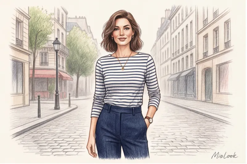
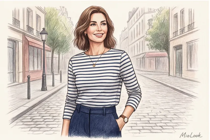
So why does horizontal lines sometimes actually make you look fat in real life? The secret lies in the frequency of the lines and the quality of the background. Wide rugby stripes (5-10 cm blocks), especially in contrasting colors, break the figure into distinct segments, making it appear squat. But a classic Breton stripe with thin, dense lines (0.5-1 cm) draws the eye along, creating a single, elongated plane.
Your perfect look starts here
Join thousands of users who look flawless every day with a smart AI stylist.
Start for freeHow to wear stripes without looking fat: 4 ironclad rules
The main principle of working with geometry, which I implement in every wardrobe revision: it’s not the line itself that’s important, but its scale in relation to your body and how much “air” remains between the stripes.
The rule of proportionality: the larger your facial features and body size, the wider the print can be. If a woman with a size 52 (XL) wears a shirt with microscopic, rippled stripes 1 millimeter thick, the print will be lost against her figure, emphasizing its volume.
If you want to go deeper into understanding your proportions, I recommend studying stylistic types of appearance - this will greatly simplify the choice of print scale.
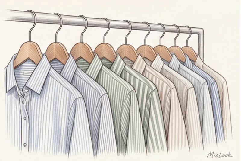
Width and contrast matter
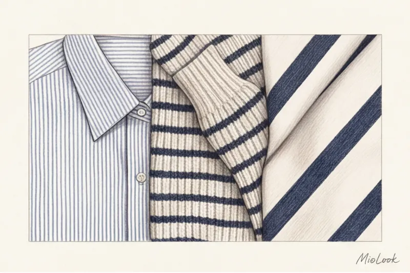
The safest investment for any body type is a stripe 0.5–1 cm wide. It doesn't dazzle the eye or break up the silhouette. The next important factor is contrast. A harsh black and white contrast steals the show. If you have a soft, low-contrast complexion (light brown hair, light eyes), such a striped shirt will flatter your face. Choose softer options: navy blue with off-white, olive with beige, or muted burgundy.
The Treachery of Knitwear: Why Lines "Float"
Now about that incident in the fitting room. Any Helmholtz illusion, even the most perfect one, is destroyed if the line is distorted. As soon as a straight horizontal line stretches across the chest or hips, turning into an arc, the brain instantly reads: "There's volume here, and it's large."
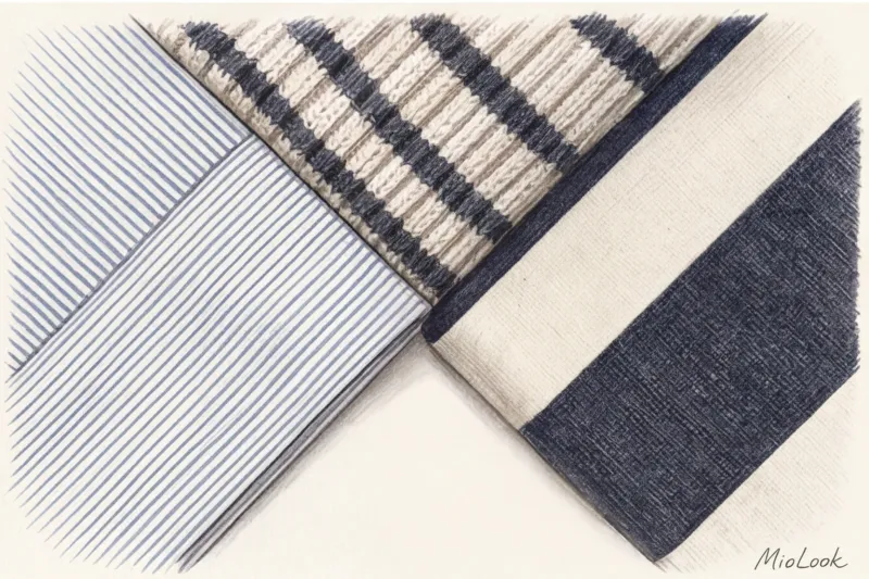
That's why a tight, striped knit dress is fashion suicide for an imperfect figure. This rule doesn't work in just one case: if you have perfectly even proportions without a single wrinkle and you're deliberately trying to exaggerate your curves. Everyone else needs the right texture. Choose heavyweight cotton (at least 180 g/m²), linen, or shape-resistant viscose with minimal elastane. The fabric should support its own structure, not cling to your body.
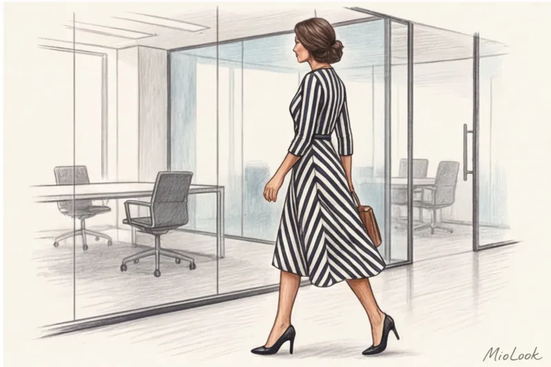
Vertical and Diagonal Geometry: Silhouette Correction Tools
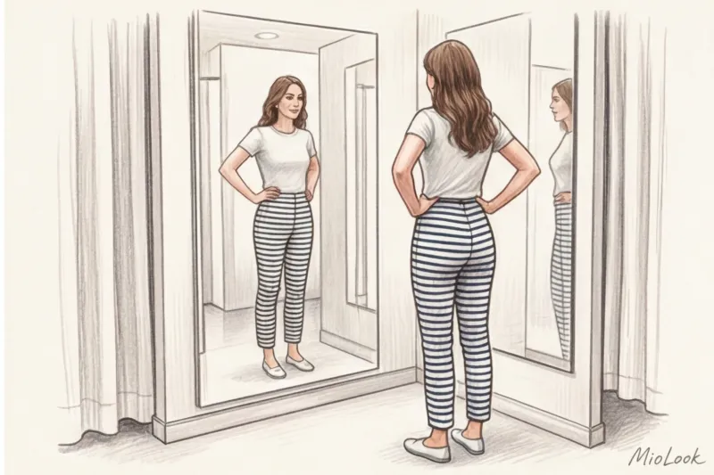
It's time to shatter another ironclad stereotype. Vertical stripes don't always make you look taller. I often see girls in tight pants or leggings with vertical stripes on the streets of Paris and Warsaw.
Do you know what's happening? On the curved parts of the body (buttocks, thighs), vertical lines diverge. This creates a "globe" effect, or the meridians of a watermelon. This visually widens the hips one and a half times more than any horizontal lines.
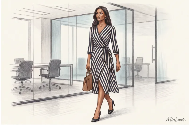
If you want to really slim your silhouette, use diagonal stripes. A wrap-over cut with diagonal stripes creates a powerful narrowing effect (chevron). It draws the eye to the center of the figure, visually creating a slim waist.
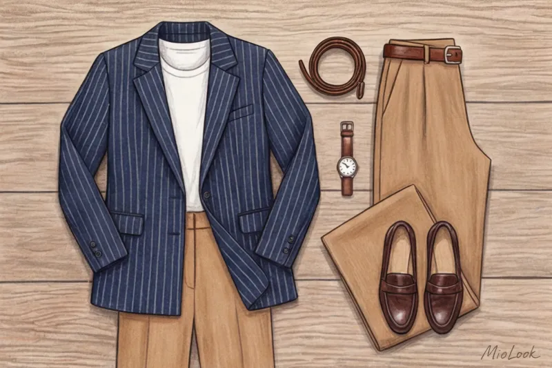
Want to embrace verticality? Choose straight-leg suit pants or palazzo trousers with a pinstripe. They're not clingy, and the lines fall perfectly straight, creating those coveted, endless legs. These pants fit perfectly with the concept. masculine cut in a women's wardrobe.
Smart Shopping: Where to Find the Perfect Items and How Much They Cost
Over the years of shopping assistance, I've sifted through hundreds of brands. High-quality geometric shapes are always a matter of good patterns and proper fabric matching. European mass-market and mid-market brands have their own leaders.
Massimo Dutti and COS consistently produce impeccable basic shirts made from thick, crisp poplin. Their price range is typically €60–€100. These are the kind of shirts that won't lose their shape after twenty washes. Zara and H&M also offer gems, but look for them exclusively in the premium lines (Studio, Premium Quality) and in the €50–€80 range. Regular polyester for €20 won't provide the necessary stiffness—it'll hang loosely, and the lines will blur.
Insider Quality Test
Here's a stylist's secret: how to tell in three seconds whether a geometric print is worth the money? Look at the side seam. If the horizontal stripes where the back and front meet don't line up, creating a crooked step, the garment was sewn in a hurry. A quality brand always uses more fabric to ensure a perfect seam or herringbone pattern.
Ready to clean out your wardrobe?
Try MioLook's free plan—digitize your items and let AI create stylish outfits every day.
Try MioLookFrom Fear to Style: How to Incorporate Stripes into Your Wardrobe
Stripes are a unique print that works within the rules of neutral color. They're perfect for those looking to add a dynamic touch to their look. capsule wardrobe , but not ready for leopard or complex floral patterns.
Start with the "one active piece" rule. A basic turtleneck with a thin Breton stripe instantly elevates a simple jeans and sleek beige trench coat (by the way, you can find some great ideas in the article What to wear with a women's trench coat ).
For advanced users, there's the concept of "functional accent." Try mixing stripes with another print, such as polka dots or florals. The main rule: the prints should have a unifying color (for example, navy stripes and florals with navy leaves). If you have trouble visualizing such combinations, you can upload your items to the app. MioLook , and the algorithm will show how well these patterns fit together.
Stylist checklist: how to wear stripes without looking fat in the fitting room
To avoid shopping mistakes, I've created a strict four-step algorithm for my clients. Just go through it before you go to the checkout.
- Checking fabric tension. Put the item on, stand up straight, and take a deep breath. Look closely at your chest and waist. Are the lines still straight? Excellent. Have they become a curved bow? Leave the item in the store or go up a size.
- Rear view. We often forget to look at ourselves from behind. Check the symmetry of your shoulder blades and buttocks. Is there any "sliding rails" there?
- The "flickering eyes" test. Step two meters away from the mirror and look at yourself with a slightly unfocused gaze. If the print blurs into a dirty gray spot or makes you dizzy (as is often the case with micro stripes), it's a bad choice.
- Assessment of the portrait zone. Place the item against your face in good daylight. Too much black contrast can highlight under-eye circles and make your face look tired. You might want a dark blue or chocolate-colored line instead of black.
Geometry in clothing isn't magic, but rather the laws of physics, which can be put to good use. Forget the old rule about the harm of horizontal lines. Thick fabric, the correct 0.5-centimeter scale, and a semi-fitted cut can make your figure appear slimmer and more toned than any boring black sweater.


