Last week, I was sorting through a client's digital wardrobe in Milan. She proudly showed me a stunning silk blouse with an abstract geometric print, bought for €300. But when she paired it with completely flat, matte black polyester trousers, the magic disappeared. The expensive piece looked like it had been bought on sale for €15. Why? Because the question of How to combine prints and textures It's not just a play on color. It's a true physics of light and the geometry of proportions, where one mistake cheapens the entire image.
Over 12 years of personal styling, I've noticed a clear trend: 90% of women wear only basic matte fabrics. As soon as a bold pattern appears in their wardrobe, they instinctively try to "calm it down" with the most boring, flat piece in their closet. We've covered the fundamental rules of working with fabrics in more detail in our guide. How to Create an Expensive Look: Combining Textures in Clothing But today we'll go further and explore the finer points: how to mix patterns and materials simultaneously to give your look a sophisticated, high-end look, even if it's mass-market.
Why the "one print" rule no longer works in a status wardrobe
"There should only be one active pattern in an image" – forget that phrase. This outdated rule from the 2000s makes your style look flat and downright provincial. True, luxurious European style is built on carefully crafted dissonance, not perfect matching.
Perfectly coordinated outfits, where the bag matches the shoes and the floral print on the dress, detract from the overall look. Research by retail marketing and the WGSN agency (2024) reveals an interesting statistic: adding a third texture to an outfit increases its perceived value by 40%. This visual merchandising principle is the foundation of top brands' storefronts.
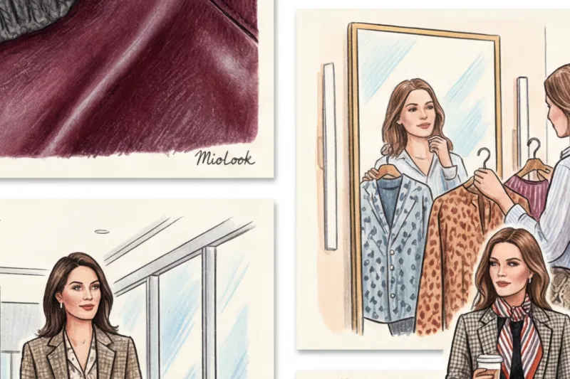
Look at how Massimo Dutti or COS's styling has evolved over the past five years. They've moved away from sterile minimalism toward visual complexity. You won't see a simple sweater and jeans on mannequins anymore. Instead, you'll see a silk scarf with chains worn over a textured striped linen jacket and an embossed leather belt. I spend half my consultations trying to wean clients off buying yet another "safe" pair of black trousers to go with every new printed item.
The Physics of Style: How to Combine Prints and Textures by Manipulating Light
The secret to successful styling lies in the ability of fabrics to absorb or reflect light. A print on smooth silk and the same print on loose cotton are two completely different tools that require different partnerships.
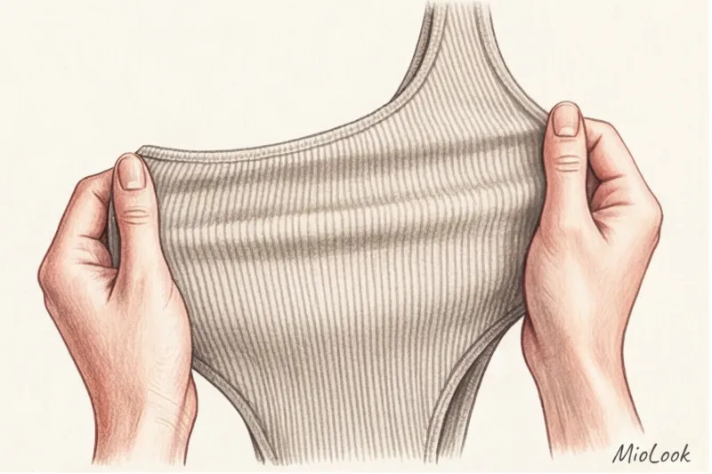
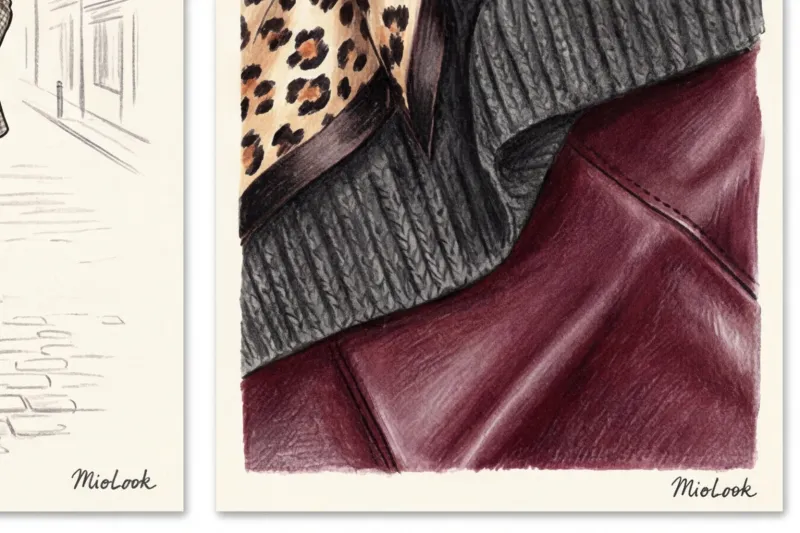
Smooth materials (silk, satin, patent leather, shiny viscose) act like mirrors. They reflect light and make any design applied to them as sharp and striking as possible. Matte and fleecy materials (wool, cashmere, bouclé, suede) act like black holes—they absorb light, creating soft contours and deep tones.
The main rule of advanced styling: never mix two vibrant prints on fabrics with the same reflectivity. Two glossy prints next to each other will create a cheap circus effect.
Smooth + Pile: The Gold Standard for Beginners
If you're just learning how to work with complex combinations, start with contrasting surfaces. Take a glossy silk midi skirt with large polka dots (&Other Stories always has great options in the €80-€120 range) and wear it with a chunky, matte textured knit sweater.
The pile of mohair or cashmere physically "damps" the excessive vibrancy of the glossy pattern on the skirt. You achieve balance: the skirt adds dynamism and shine, while the sweater grounds the look, making it cozy, luxurious, and suitable for everyday wear.
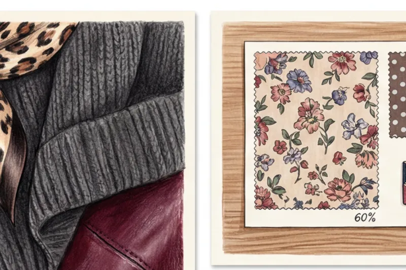
The 60-30-10 Formula: The Mathematics of the Ideal Image
To overcome the fear of looking "too much," I always advise my clients to follow the 60-30-10 rule. It's a style that originated in interior design and works flawlessly when creating complex looks.
What this looks like in practice:
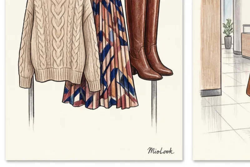
- 60% - main print and texture. This is the base of your look. For example, a flowing midi dress with a vibrant floral pattern on viscose. It sets the mood.
- 30% - supporting pattern with different geometry. This is your second layer. For example, a structured wool-blend jacket in a low-contrast houndstooth check. It takes up less space but complements the dress.
- 10% - accent texture without print. Shoes, a bag, or a belt. For example, a smooth patent leather burgundy bag or suede Cossack boots. They serve as the finishing touch, bringing the whole outfit together.
By the way, to avoid spending hours sorting through your closet, you can use the “smart wardrobe” function in MioLook — the app allows you to visualize these proportions on your smartphone screen in advance and immediately understand whether the balance is achieved.
Your perfect look starts here
Join thousands of users who look flawless every day with MioLook.
Start for free4 foolproof schemes from European stylists
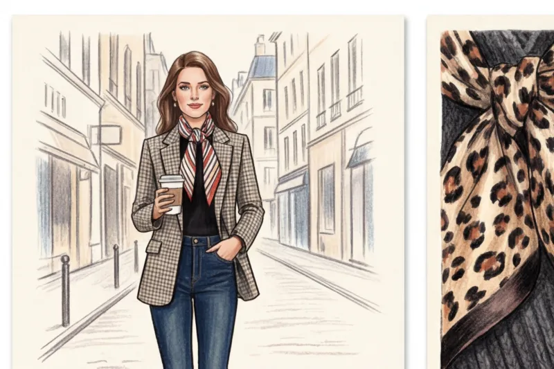
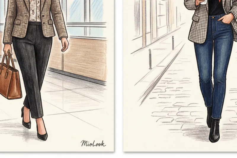
Instead of reinventing the wheel every morning, use ready-made templates. I constantly look for these patterns in the lookbooks of premium lines like H&M and COS. They're easily adaptable for both a strict Friday dress code and a relaxed weekend.
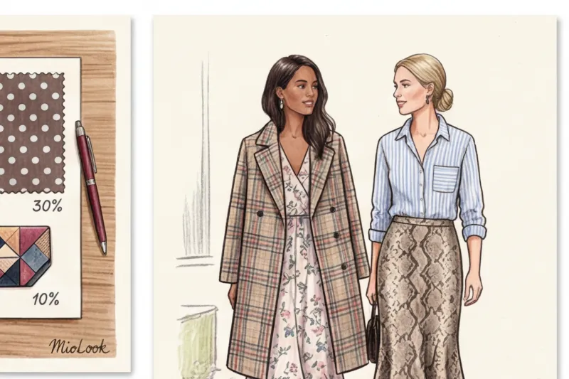
Geometry + Floristry: A Play on Contrasting Meanings
Romantic florals often look childish when worn alone. But add a strict, masculine stripe or graphic check, and the look becomes sophisticated. The rule of scale applies here: if the flower is small (millefleur), the check should be large (for example, tartan or window frame). If the flowers on the blouse are huge, choose a jacket with a pinstripe.
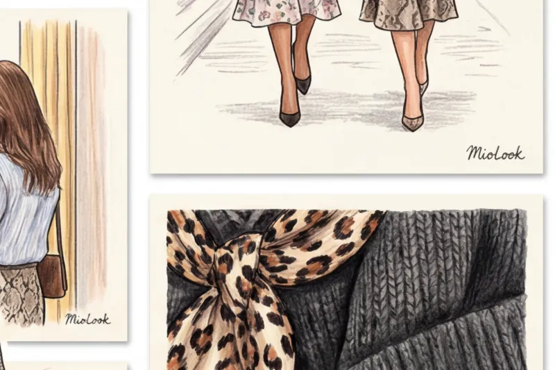
Animalistics + Strict Cage: Taming the Leopard
Many people are afraid of leopard or zebra print, considering them vulgar. This predatory print truly becomes dangerous when worn on fine knitwear. The secret to class is to pair animal print exclusively with rugged, masculine textures. A silk python-print skirt paired with a crisp tweed jacket in a subtle check—and you'll look like a Vogue editor, not like a '90s throwback.
The main mistake: conflict of temperatures and undertones
There are situations when you follow the scale rule and choose the right textures, but still see a mess in the mirror. Why does this happen? The answer lies in the temperature conflict of the background colors.
According to Itten's color theory, our eyes need a connecting element—a single, common color denominator. And the most common mistake beginners make is mixing warm and cool backgrounds. Imagine: you're wearing a blouse with black polka dots on it. snow-white (cold, icy) background, and a jacket where the blue check is painted on ecru (a warm, yellowish back). These two backgrounds will begin to clash. Contrasted with icy white, the ecru shade will appear washed-out and dirty, rather than stylish.
Fair warning: This mixing technique WON'T work if you have a naturally low contrast ratio and choose two equally loud, neon prints. In this case, the clothes will simply "eat" your face.
Checklist: How to check your look before leaving home
I don't believe in abstract advice like "trust your taste." Taste is a combination of observation and a clear algorithm. Here's my signature three-step checklist, which I make all my clients use:
- Squint test. Take a step back from the mirror and squint hard to blur the details. Assess the stains. Do the prints blend into one mishmash? Is there a clear division of volume (those 60 and 30 percent)? If you see one continuous, mottled spot, you need to replace one item with a more subdued texture.
- The rule of three textures. Consider the materials you're wearing. Cotton (shirt), wool (pants)... and that's it? Your look is flat. Add a third texture. Maybe it's a smooth leather belt, suede ankle boots, or a silk scarf on your bag.
- Checking the distance. A good, complex look should work at two distances. From three meters away, it should look harmonious in color, while from half a meter away, your interlocutor should want to examine the complex mix of ribbed fabric on your sweater and geometric patterns on your skirt.
Summary: The Art of Slight Nonsense
There is a beautiful word in Italy sprezzatura — the art of looking like you've put together your flawless look in five minutes, even if it actually took half an hour in front of the mirror. This is precisely the effect we achieve when we learn to mix prints and textures.
Don't strive for perfection. Let the fluff of a mohair sweater subtly offset the strict geometry of a silk skirt. Let the rough texture of a bag contrast with the delicacy of your blouse. If you're still hesitant to try this approach on larger pieces, start with accessories: add a scarf with a bold pattern and suede gloves to a basic wool coat.
Open your closet right now. Pull out that "complicated" patterned piece you've only ever worn with black pants. Find a cardigan in a different texture to pair it with, or a pinstriped shirt that matches it in at least one shade. And remember: if you need help analyzing what's already hanging in your closet, MioLook It will always help you digitize your database and find the most unexpected, yet stylish, combinations. Style begins where the fear of making mistakes ends.