
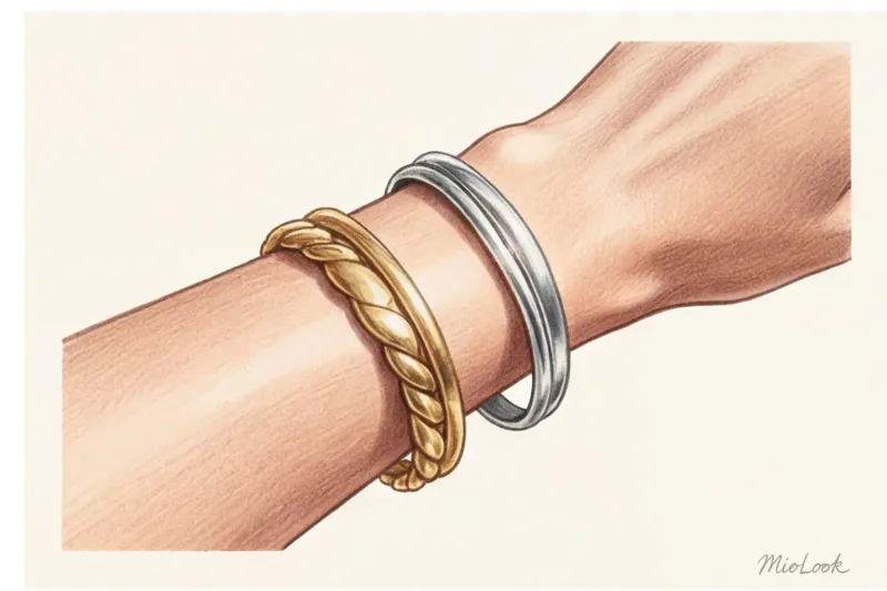
Forget about your wrist veins: Why old tests don't work
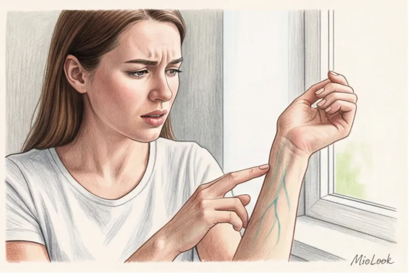
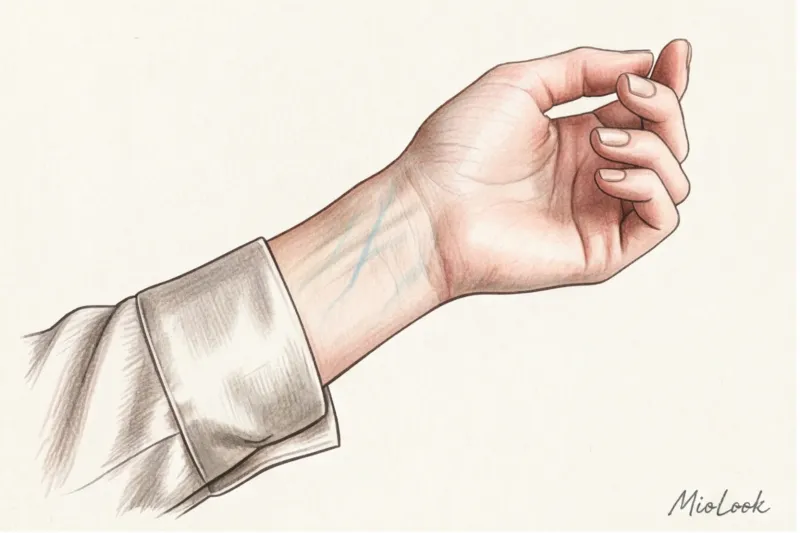
Look at your wrists right now. What color are the veins there—blue, purple, or greenish? If you've ever searched for information on how to determine your skin undertone, I bet you started with this very question. And, most likely, you were left completely baffled. In my 12 years as a personal stylist, I've sorted through hundreds of wardrobes and seen closets filled to the brim with expensive, yet unworn items. In 80% of cases, these "orphaned items" were purchased because the woman believed a popular internet myth and misdiagnosed her color temperature.
The temperature of your appearance is the foundation without which it is impossible to build a smart, eco-friendly wardrobe. We've covered color architecture in more detail in our a complete guide to the 12 color types of appearance But let's start with the basics: why do popular home tests lead us astray?
The famous "vein test" doesn't hold up to scrutiny from a physiological standpoint. According to research in spectrophotometry of human skin, the visible color of veins depends not on whether you have a warm or cool undertone, but on their depth and the thickness of your epidermis. Light refracts through skin layers: through thin, light skin, veins will always appear bluer, while through dense, tanned skin, they will appear greenish. This is a simple optical phenomenon, not a marker of skin tone.
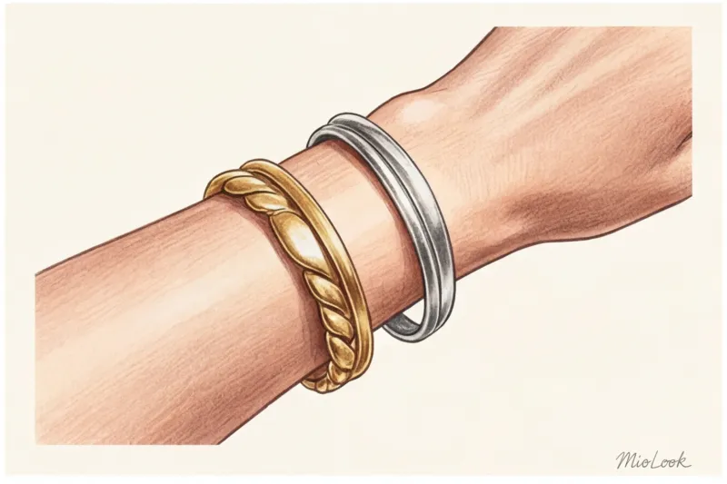
The "which metal suits you best: gold or silver" test is even more insidious. The perception of a metal is influenced by its texture (matte gold looks softer than glossy gold), the lighting in the room, and, let's be honest, simple trends. We often choose what we simply prefer psychologically, ignoring objective reality.
What is skin undertone and how is it different from complexion?
The biggest mistake women make is confusing their surface tone and undertone. Your surface tone can change dozens of times throughout your life: you might get a tan on vacation, develop a blush in the cold, or experience acne or rosacea. Your undertone, however, is genetically determined and never changes.
Modern professional coloristics is based on Albert Munsell's three-dimensional color system (hue, value, saturation). Translating this to human biology, our color is formed by three pigments:
- Hemoglobin: gives a pinkish or bluish-red glow (cold spectrum).
- Carotene: responsible for the yellowish-golden glow (warm spectrum).
- Melanin: provides a brown base, the intensity of which determines how light or dark the skin is.
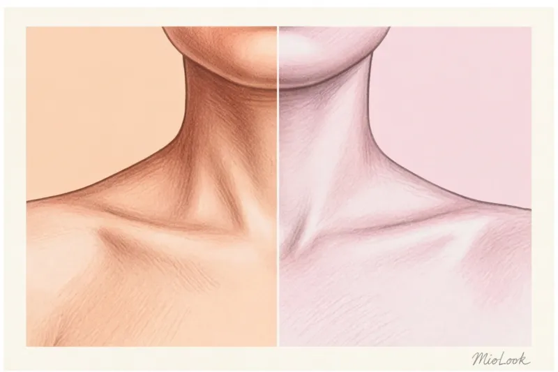
"One of my clients, Anna, suffered from rosacea for years. Because of the persistent redness of her cheeks, she was convinced she had an icy, cool undertone. She wore steel and bright blue clothes, which paradoxically made her face look gray and tired. When we analyzed her skin, it turned out that her natural temperature is warm. As soon as Anna switched to soft terracotta and ecru organic cotton, the redness visibly faded, and her skin literally glowed from within."
The influence of fabric texture on skin color perception
Here's a professional secret that fashion magazines rarely mention: the texture of fabric can change your temperature. Eco-friendly matte materials (linen, nettle, organic cotton with a weight of at least 180 g/m²) absorb light. They act as a soft filter, delicately highlighting natural pigments.
But shiny fabrics—silk, satin, or viscose with a satin weave—work like mirrors. They reflect light directly onto your face. If you wear cool emerald silk while having a warm, carotene-like undertone, it will cast a sickly greenish shadow on your face.
Your perfect wardrobe starts here.
Tired of buying things that don't flatter you? MioLook's smart AI stylist will analyze your appearance and create a capsule wardrobe of just the right shades.
Get access — €0.99 onceHow to Determine Your Skin Undertone: 5 Reliable Stylists' Tips
Before we get to the tests, let's set the scene. Forget about fitting rooms at high-street stores like Zara or H&M. Their fluorescent lights are designed to make the clothes on the hanger appear brighter, not you in them. Artificial light mercilessly distorts pigments. Test yourself exclusively at home, facing a window in diffused daylight. No makeup, with your hair pulled back, and wearing a neutral gray T-shirt (or one with bare shoulders).
Method 1: The White Sheet Test (and why paper texture matters)
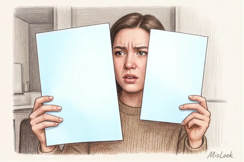
Take a standard sheet of white A4 paper. Important: the paper should be matte, not glossy. Hold the sheet up to your face at chin level. Against the stark white background, your skin pigments will begin to contrast.
What are you looking for? If your skin appears slightly yellowish, golden, or peachy next to the leaf, you're warm. If pinkish, reddish, or bluish-pearl tones take center stage, you're cool.
Method 2: Directional draping with contrasting fabrics
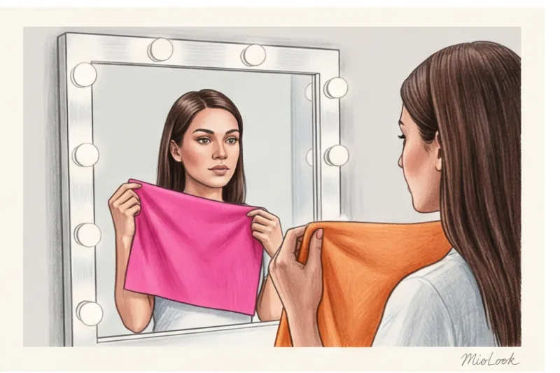
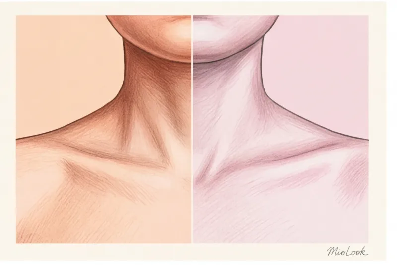
This is the basis of my professional color analysis. Take two pieces of fabric or garments of the same weight: one distinctly warm (peach, terracotta, warm orange), the other polarly cool (fuchsia, icy blue, cool pink). Apply them to your face, one at a time.
Don't focus on the color of the fabric! Focus your gaze on your eyes, nasolabial folds, and jawline. The right color, "your" color, will work like an expensive concealer: it will visually erase dark circles under your eyes, even out your skin tone, and create a more defined contour. The wrong color will immediately deepen shadows and highlight even the slightest redness.
Method 3: Reaction to ultraviolet light (sun test)
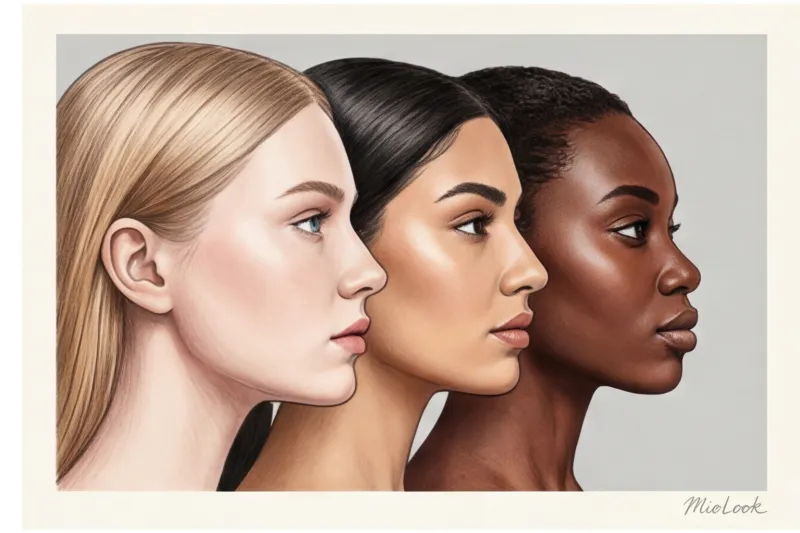
This method is based on melanin levels. Skin with a cool undertone typically contains less pigment, so it quickly reddens and burns easily in bright sunlight. Tanning is difficult and often has a reddish tint. Warm skin, on the other hand, quickly and painlessly develops an even golden, bronze, or olive tan.
But there's an important exception (when this method doesn't work). Women with very deep, dark skin tones may have a distinct cool undertone with a bluish tint, but they almost never burn in the sun thanks to a high concentration of protective melanin.
Method 4: Analysis by basic wardrobe colors
Pull out basic neutrals from your closet. First, compare how crisp white (the color of snow) refreshes you compared to a soft cream (the color of baked milk). Then move on to a dark base: compare charcoal black with deep chocolate or classic navy.
If you clearly look better in pure white and graphite black, you're on the cool spectrum. If your face becomes softer and more youthful in cream and chocolate, you're on the warm spectrum.
Method 5: Blush and lipstick test
Makeup is a great temperature marker. Apply a cool pink blush to one cheek (without foundation!) and a warm peach blush to the other. Blend. The wrong shade will sit on your face like a foreign spot, creating a cheap "matryoshka doll" effect. The right shade will blend into your skin, mimicking a natural, healthy glow after an hour-long stroll in the park.
Doubt the result?
Upload your photo to the MioLook app. Artificial intelligence will accurately detect your skin tone and select a flattering makeup and clothing palette.
Analyze appearanceOlive and Neutral Undertones: What to Do If You're "Somewhere in the Middle"
If after completing all five tests you feel like none of the results are 100% right for you, don't worry. You're not alone. According to a large-scale study by the WGSN trend bureau (2024), approximately 30% of people worldwide have neutral or olive undertones. With these skin types, the outdated "4 Seasons" system simply breaks down.
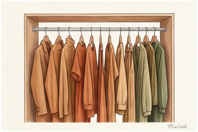
Olive undertone Contains a specific greenish pigment. Because of its visual swarthiness, it's often mistaken for warm. However, if an olive-skinned woman wears a warm mustard turtleneck, she'll look downright unhealthy. Olive skin requires a complex, muted cool spectrum or rich, deep tones.
Neutral undertone This means that the balance of carotene and hemoglobin is almost equal. You may feel equally comfortable in warm terracotta and cool cobalt. In this case, the decisive factor will not be the temperature, but the level of contrast and lightness of your appearance (this is why the 12 color type system is so important).
Knowing your undertone is your step towards conscious consumption.
I often repeat in my lectures: sustainable fashion doesn't start with buying T-shirts made from recycled plastic. It starts with eliminating unnecessary items. McKinsey analytics confirm that eliminating inappropriate colors and creating a cohesive wardrobe reduces impulse purchases by 40%.
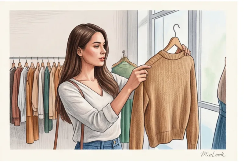
Understanding your temperature reduces your carbon footprint: you'll make fewer returns when shopping online because you know for sure that "dusty rose" will suit you, while "salmon" won't. Furthermore, there's a direct correlation between fabric quality and color rendition. High-quality, eco-friendly materials (such as certified merino wool, Tencel, or dense cupro) retain their complex color pigments much longer after multiple washes, unlike budget polyester, which quickly fades and loses its desired temperature.
Checklist: How to Use Your Undertone When Shopping
How can you put this theory into practice tomorrow when you go shopping?
- Window Rule: Before checking out your item at the checkout, be sure to take it to the nearest window or exit the store into natural light. Make sure the color remains the same without artificial lighting.
- The portrait zone decides everything: When putting together your basic capsule, strictly adhere to the temperature limits for items that are close to your face (sweaters, blouses, jackets, scarves, hats).
- Wear "someone else's" wisely: What if you're cool-toned but have fallen madly in love with a warm camel-colored cardigan? Don't give up on the color, just move it away from your face. Choose skirts, pants, shoes, or bags in the "wrong" shade. If you're wearing a sweater, layer a shirt in your ideal cool tone underneath, ensuring the collar creates a buffer between the sweater and your face.

Results: From understanding undertones to creating the perfect wardrobe
Your color temperature isn't a strict checklist that prohibits you from wearing half the Pantone palette. It's a powerful tool for impression management. When you know your settings, you stop spending money on things that make you look tired and start investing in clothes that work for you.
But it's important to remember one thing: determining your undertone (warm/cool) is just the tip of the color iceberg. If you stop there, you'll miss the fun. The real magic of a transformation begins when you evaluate your appearance holistically, taking into account contrast and luminosity according to the 12 color types. Only then will your palette truly become yours.
Ready to find your perfect style?
Try MioLook for free: A smart AI stylist will analyze your appearance and create a wardrobe that works 100%.
Get access — €0.99 once