How many times have you passed on a stunning pistachio-colored jacket or powder-colored wide-leg pants simply because you were afraid you'd look like a little girl or a macaron? Let's be honest: for most women, light, muted shades are associated exclusively with spring romance, ruffles, and vacations. But as a practicing stylist with 14 years of experience, I can confidently say: this is a huge misconception.
We have already discussed basic coloring in more detail in our complete guide to color combinations in clothing and the rules of Itten's circle Today I want to take a closer look at How to beautifully combine pastel colors in clothing , so they enhance your status rather than dull your appearance. We'll completely dispel the myth of these shades being "vanilla" and learn how to use them as a tool for elegant, mature "soft power."
Why Pastels Are the New Basics (and How to Avoid Becoming a Marshmallow)
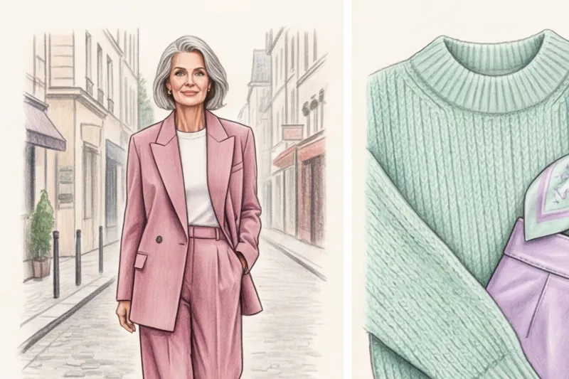
During one of our consultations, my client Anna, the CFO of a large IT company, confessed, "Olena, I'm tired of black and dark blue suits. I look like a man in a sheath in them, but I'm afraid that in a lighter color, people won't take me seriously at the boardroom." We took a chance.
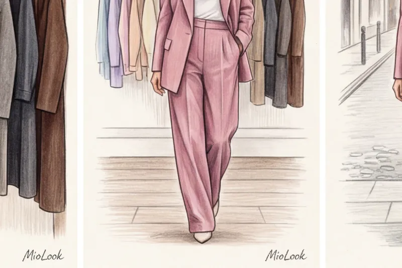
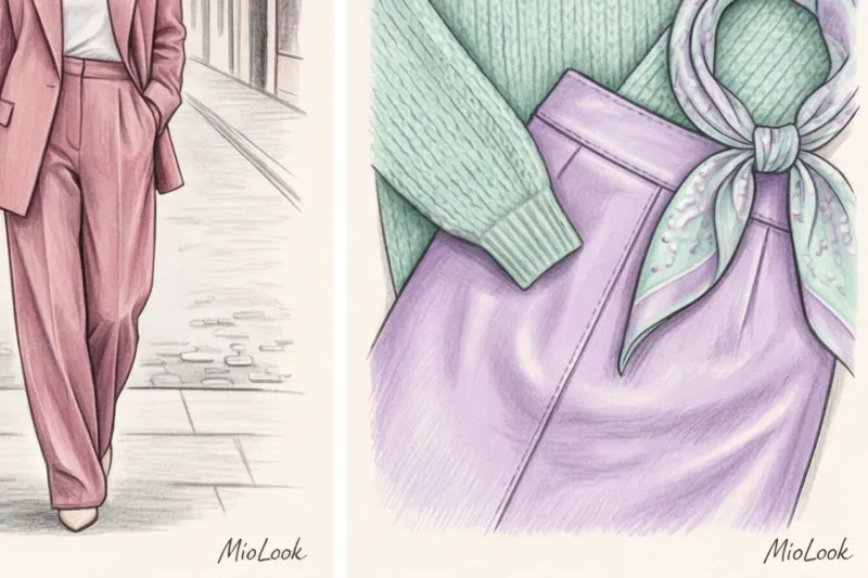
I replaced her stiff black "armor" with a structured, oversized dusty sage jacket and ash-pink straight-leg trousers with a crease. Guess what happened? According to Anna, the tension during difficult negotiations noticeably decreased. Her partners subconsciously stopped seeing her as an aggressive opponent, but at the same time, the strict, almost masculine cut made it impossible to doubt her authority.
The secret to using pastels for adults lies in breaking the mold: the more delicate and childish the color, the more rigorous, rigid, and architectural the shape of the object should be.
The Pantone Color Institute's 2024-2025 reports clearly demonstrate a global shift: pastels are no longer gendered and seasonal. The trend is not for the open, "clean" colors of children's chalk, but for complex, "dusty" shades with added gray pigment. They act as an ideal new base, allowing for a smooth and safe transition from the familiar beige wardrobe.
The main rule of a stylist: Texture decides everything
Over the years of working in showrooms and on shopping trips, my fingers seem to have learned to scan fabrics blindfolded. And here's the brutal truth: the same powdery pink will look like a quiet luxury on thick cashmere and like a cheap rag on thin, shiny polyester.
If the color itself is subdued and understated, the fabric simply must be expressive. Cheap viscose or thin, flimsy knits will instantly ruin the elegance of a light shade.
Take a look at the collections of premium brands like Brunello Cucinelli or Loro Piana. They focus on a luxurious mix of textures in light tones. And this trick is easy to replicate in mass-market stores (for example, at COS or Massimo Dutti), if you follow these guidelines. rule of contrasting textures:
- Smooth silk (or high-quality thick viscose) + matte suede
- Chunky, chunky wool knit + flowing satin
- Thick cotton (from 180 g/m²) + textured leather
Interesting fact: According to internal statistics from my wardrobe analyses, looks that combine three different textures in one pastel color are visually valued by people at 40-50% more than their actual retail price.
How to beautifully combine pastel colors in clothing: 4 working schemes
To avoid racking my brain in the morning, I adapted the classic rules of the color wheel specifically for muted shades. These four formulas work flawlessly.
Scheme 1. Monochrome with a secret (Gradient transitions)
Creating an outfit using a single color but varying the lightness and saturation is the easiest way to achieve a classy look. You take one color, like green, and stretch it throughout the outfit.
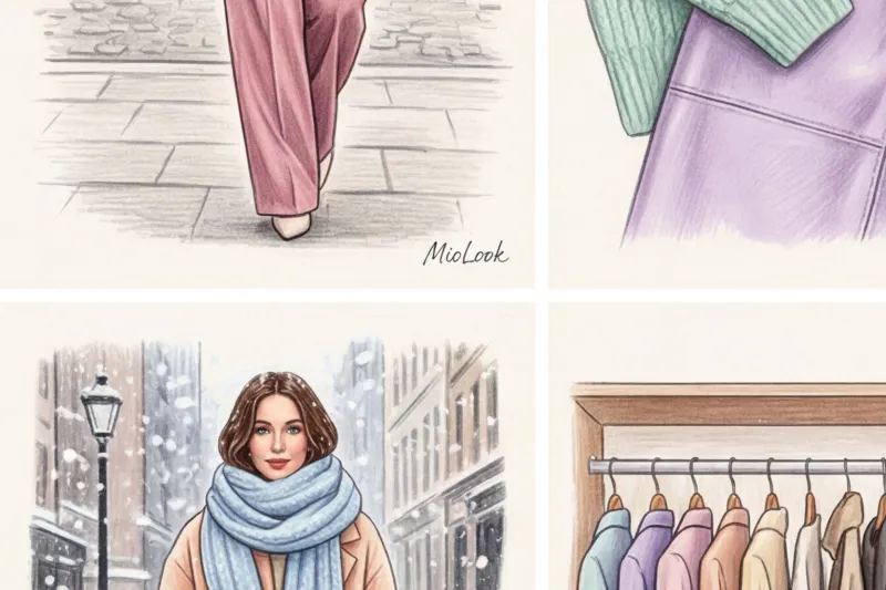
Imagine a milky mint top, a pistachio-colored jacket layered over it, and deep, dark sage-colored pants. This gradient creates a continuous vertical line that dramatically elongates the silhouette (perfect for petite women looking to add a few inches to their height).
Pattern 2. Color Block on Minimals (Two Pastels Together)
A classic color block of bright colors requires boldness. But pairing two different pastel shades with the same level of "dullness" looks fresh without being overbearing.
My favorite duets, tested on dozens of clients:
- Cool Lavender + Bleached Lemon
- Warm peach + dusty blue
- Soft pistachio + powder pink
An important nuance: Use the 70/30 rule, not the 50/50 rule. Let one color dominate (for example, a pantsuit), and the other be an accent (a top or a bag). If you're unsure how things will look together, try photographing them and uploading them to MioLook — a built-in AI stylist will help you assess the balance of proportions before trying on the item.
Your perfect look starts here
Join thousands of users who look flawless every day with the help of MioLook's smart algorithm. Create capsule collections of your items in one click.
Start for freeScheme 3. Pastel + Deep Dark (Abandoning Black)
Now I will say something that will cause outrage among many: Black is the worst companion for delicate pastels. Contrary to the popular myth that "black goes with everything," when paired with light blue or powder, it creates a stark, eye-catching contrast.
Black absorbs light, while pastel softly reflects it. When paired together, they look like a design flaw, instantly cheapening the outfit. What's a good substitute for your usual black bottoms?
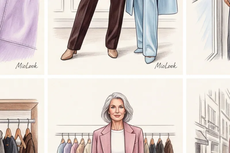
Use deep, refined dark tones: bitter chocolate, dark graphite, rich wine (Marsala), emerald, or classic navy. Dark colors will ground pastels, creating a collected look while maintaining soft lines.
Scheme 4. Pastel + Achromats (White, Gray and Denim)
If you're just starting to incorporate color into your wardrobe, use an achromatic base. Light gray melange is the perfect canvas for absolutely any pastel shade. It highlights them without stealing the show.
Crisp white makes pastels pop, truly summery and fresh. And classic blue denim (without heavy distressing) is a great way to tone down the overly dressy look of a pastel silk blouse, adapting it for a Friday office dress code.
"Forbidden" techniques: what mistakes cheapen the image
Let's be honest: pastels have their limitations. They don't always work and don't look equally good on everyone. Here are three mistakes guaranteed to ruin your look:
- Flimsy, tight-fitting knitwear. Light colors reflect light. If you wear a thin, powder-colored turtleneck, it will highlight every curve of your body, even the ones you didn't know you had. Choose a thick, semi-fitted knit.
- Excess of romantic details. I've personally cut off dozens of lace collars and ripped out ridiculous ruffles from my clients' pastel blouses. If the color is sweet (pink, peach, mint), the cut should be as simple as possible. Otherwise, hello to a child's doll look.
- Ignoring the contrast in appearance. This is a fair limitation that many people don't mention. If you have a high-contrast, dramatic appearance (for example, you're a striking brunette with porcelain skin), a pale peach color near your face will make you look sick and tired. In this case, simply tuck pastels down into skirts, pants, or shoes, and keep your complementary colors near your face.
Pastels in a business wardrobe: how to maintain status
The modern corporate world has long since moved away from rigid formalism in favor of smart casual. According to behavioral psychology research (in particular, publications in Journal of Business Research (As of 2023), specialists in "helping" and consulting professions (psychologists, lawyers, HR) inspire 30% more initial trust if they wear light, muted tones in their clothing.
My top recommendation for business women: invest in a quality pastel pantsuit. For example, dusty blue. It can be broken down into a dozen different looks:
- Jacket + white t-shirt + dark blue jeans (Casual Friday).
- Jacket + dark chocolate colored pencil skirt (meeting with clients).
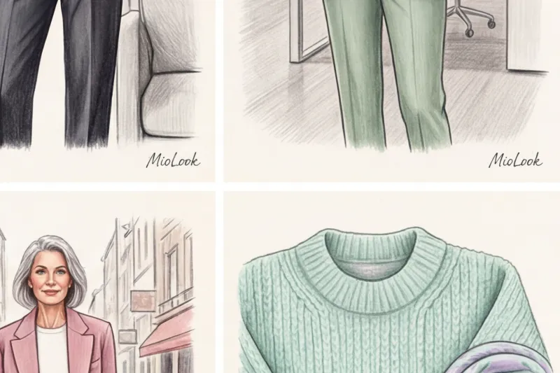
- Trousers + oversized grey cashmere sweater (comfortable for workday).
This approach is the foundation of a smart wardrobe. And if you have trouble keeping all these combinations in your head, simply digitize your items using MioLook applications so that the program itself offers you fresh combinations every morning.
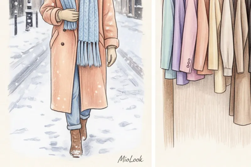
Seasonality: Why winter pastels look more luxurious than summer ones
Another stereotype I constantly fight: "light colors are only worn in summer." Forget it! Aesthetics winter white and winter pastels are the pinnacle of styling.
Imagine a heavy, double-breasted, dusty rose wool coat paired with a voluminous, chunky mint-colored scarf. In the gray-black winter crowds of a metropolis, a woman in a light coat looks as if she travels exclusively in a chauffeured car.
Yes, I agree with the obvious downside: light-colored outerwear gets dirty faster. It's a fair price to pay for aesthetics. But think of dry cleaning as a strategic investment in your personal brand. In winter, dense textures (wool, cashmere, alpaca) reveal the depth of pastel shades in a way that no summer linen can.
Ready to start your transformation?
Try the MioLook free plan—no commitments required. Digitize your wardrobe and get ready-made look formulas for every day.
Start for freeA Stylist's Checklist: How to Incorporate Pastels into Your Wardrobe in 3 Steps
If after reading this article you've decided to give pastel shades a try, don't rush out and buy half the store's inventory. Instead, focus on a targeted approach, following this proven algorithm:
Step 1: Start small (accessories).
Buy a dusty blue bag or a voluminous pistachio scarf to complement your usual gray or beige coat. Your eye will need time to adjust to the new color in the portrait area.
Step 2: Add the top.
Choose a basic menswear-style shirt or a chunky jumper in a pastel shade that complements your skin tone (warm peach for warm undertones, icy pink for cool undertones). Wear with your usual jeans.
Step 3: Replace the black base with a chocolate one.
Buy a pair of impeccably fitting trousers in dark chocolate or graphite. Now you can confidently pair them with new pastel tops without worrying about the cheap contrast with black.
Pastel shades aren't a sign of weakness, childishness, or overly romantic. With the right choice of dense textures, clean cuts, and clever pairings with refined dark colors, pastel becomes your most powerful style tool. It sets you apart from the crowd without being overly flashy, declaring your status quietly yet incredibly confidently.


