
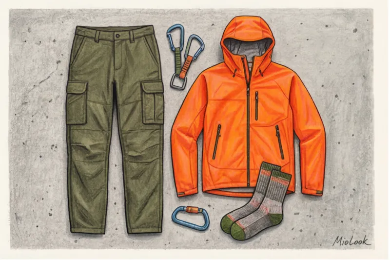
Last month, a client came to me for a wardrobe review with a stunning, acid-yellow Arc'teryx windbreaker. She'd bought it for €500, jumping on the global trend, but had worn it exactly twice. "Every time I wear it, people ask me if I'm sick," she complained. As a colorist, I immediately spotted the problem: the aggressive neon, designed for rescuers in the snowy Alps, mercilessly "killed" her muted summer coloring, highlighting even the slightest shadows on her face.
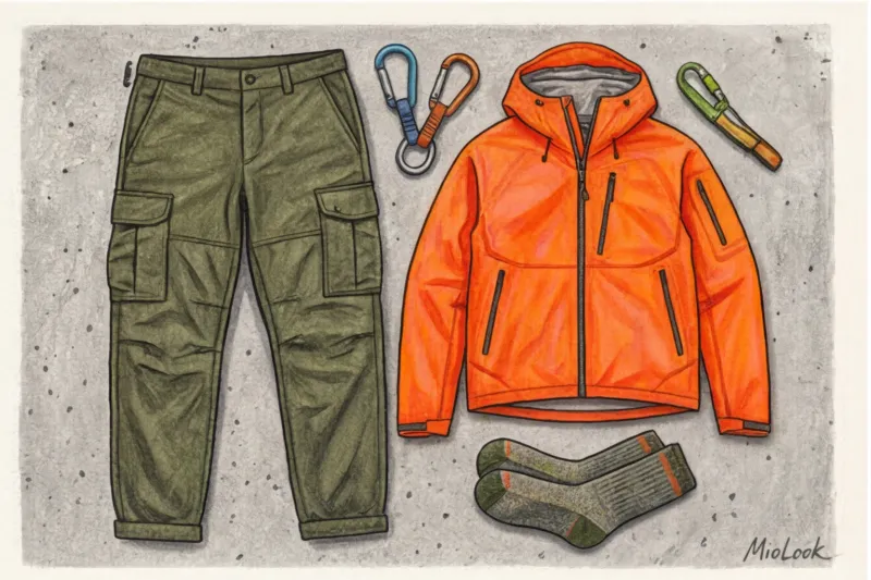
This is the main paradox of modern fashion. We've transferred utilitarian clothing from the mountain peaks to the pavement, but we've forgotten to adapt its palette. We've already discussed the origins of this phenomenon and the rules of styling in more detail in our a complete guide to the gorpcore style and its integration into the urban environment In this article, I propose looking at the trend through the eyes of a professional image maker.
Let's figure out how to tame complex gorpcore style colors so that they work for your appearance and don’t turn you into a tired tourist.
Anatomy of a Palette: Why Are Gorpcore Colors the Way They Are?
To understand how to wear outdoor clothing, you need to understand one thing: their colors were never intended to be "fashionable." Function always dictated aesthetics.
Gorpcore is built on a powerful visual contrast between two opposing worlds:
- Earthy tones (camouflage): Khaki, peat, moss, slate. Their purpose in the mountains is to camouflage dirt, dust, and signs of wear.
- Signal Neon (Survival): so-called Rescue Red And Safety Orange According to a 2024 report by the analytical agency WGSN, over 80% of classic outdoor jackets for professional mountaineering are produced in colors with high wavelengths. Why? Because red, orange, and acid yellow are best seen by rescue helicopters against white snow and gray rocks.
When this gear migrated to the streets of megacities, its perception changed dramatically. What was once a matter of life and death became a fashion statement. But the laws of optics remained unchanged.
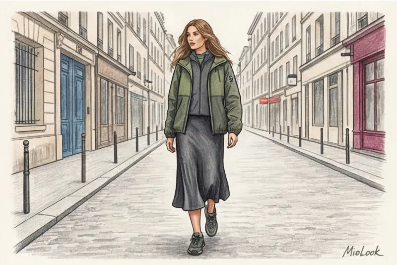
Basic Natural Shades: How to Wear "Forest" and "Rocks" in the City
The foundation of any gorpcore look is a natural base. Graphite, cool sand, faded terracotta, and all variations of olive. But there's a catch, one I encounter in almost every consultation.
The natural palette of outdoor brands often appears dull or downright "dirty" on city streets. This is due to the lighting: these colors were created for the bright, harsh mountain sun, not the diffused gray light of a gloomy metropolis.
To keep earthy tones from looking dull, I always use rule of contrasting textures If you're wearing a matte khaki fleece, pair it with a glossy GORE-TEX membrane in the same shade. The difference in light reflectivity will make the color pop and look expensive.
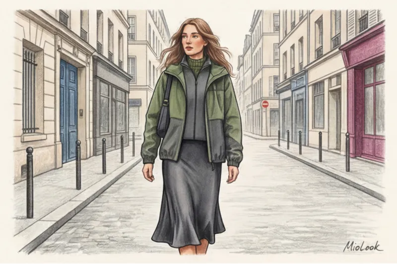
Adapting your outdoor base to your color type
There's no one-size-fits-all khaki color. When choosing basic gorpcore colors, consider your skin tone:
- For warm colors (Spring, Autumn): Look for utilitarian shades with a pronounced yellow or red undertone. Warm olive, mustard, rust, and warm terracotta are good choices.
- For cold colors (Summer, Winter): You need colors with a blue or gray base. Choose pine, deep graphite, cool taupe, or wet asphalt.
Life hack from a stylist: If you've already bought a jacket that's not your shade, don't rush to sell it. Simply separate it from your face with the right scarf or hat in your ideal color. Read more about how to find your shades in our A guide to the 12 color types of appearance.
Your perfect look starts here
Join thousands of users who look flawless every day with the smart AI stylist MioLook.
Get access — €0.99 onceNeon Accents: The Main Pitfall and Colors of Gorpcore Style
Acid green, piercing electric blue, fuchsia, and signal orange are the core of gorpcore. They distinguish this style from the usual military or safari.
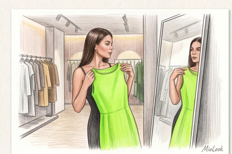
But herein lies a coloristic paradox. Colors that save lives in extreme conditions become your worst enemies in the city if placed too close to your face. Neon is highly reflective. If you wear an acid-green raincoat, it will act as a reflector, casting a green glare on your chin and neck. The result? Visually deepened nasolabial folds and the effect of chronic sleep deprivation.
The Distance Rule: How to Wear Neon Safely
My main advice: Move aggressive neon away from the portrait area Save bright colors for the lower body or micro-accents.
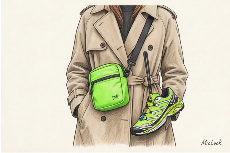
How to install neon safely:
- Bright laces on trekking shoes (for example, classic Kevlar laces from Salomon).
- Pullers (tabs) on backpack zippers.
- Climbing carabiners attached to the belt loops of basic trousers.
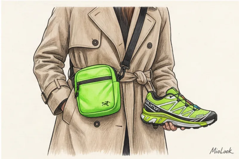
- A crossbody waist bag that drops to hip level.
Johannes Itten's color theory of complementary color proportions works perfectly here. Contrast looks most harmonious when there's a small amount of bright color. An orange rifle against an oversized dark blue jacket looks much more stylish than an all-orange jacket with blue details.
Combination Formulas: How to Mix Gorpcore Colors Without the "Tourist" Effect
To look like a fashion industry insider, and not like someone who just came down from a mountain pass and got lost on the subway, use proven composition formulas.
1. The 80/20 Golden Rule
80% of your look should be a calm, neutral base (graphite, black, khaki), with only 20% dedicated to high-tech neon. For example: wide-leg dark gray cargo pants, a black long-sleeve T-shirt, a matte black jacket, and piercing blue sneakers with yellow accents.
2. Technological monochrome
This is the choice for those who are afraid of bright colors. Create an all-black or gray look, but opt for a clash of textures: combine fluffy fleece, smooth ripstop nylon in a small check, and rough cordura. In monochrome, texture replaces color.
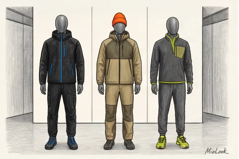
3. 90s Color Blocking (Vintage Outdoor)
Think back to old Patagonia or The North Face catalogs. A combination of three bold colors in one piece (for example, purple, emerald, and mustard). If you choose such a statement jacket, everything else—pants, shoes, hat—should be strictly neutral and minimalist.
Advice from practice: If you're wearing chunky, aggressive trekking sneakers in a bright color, be sure to balance them with a voluminous top in a neutral color. A tight top with such shoes will throw off your figure's proportions.
Ready to get started?
Try MioLook's free plan—upload your items and let AI create perfect color combinations, no strings attached.
Get access — €0.99 onceSmart-casual integration: muted gorpcore colors for the office
Is it okay to wear gorpcore to the office? Yes, if you embrace the "quiet outdoor" concept.
Save the flashy logos and bold accents for the weekend. For a business environment, choose tech pieces in a classic masculine palette: deep navy, charcoal black, minimalist beige, or wet asphalt. We discussed how these shades work in a business setting in detail in our article about business wardrobe according to color type.
The beauty of this approach lies in the contrast of materials. The combination of classic wool suiting (pants with creases) with a smooth, matte, straight-cut membrane jacket looks incredibly fresh and modern.
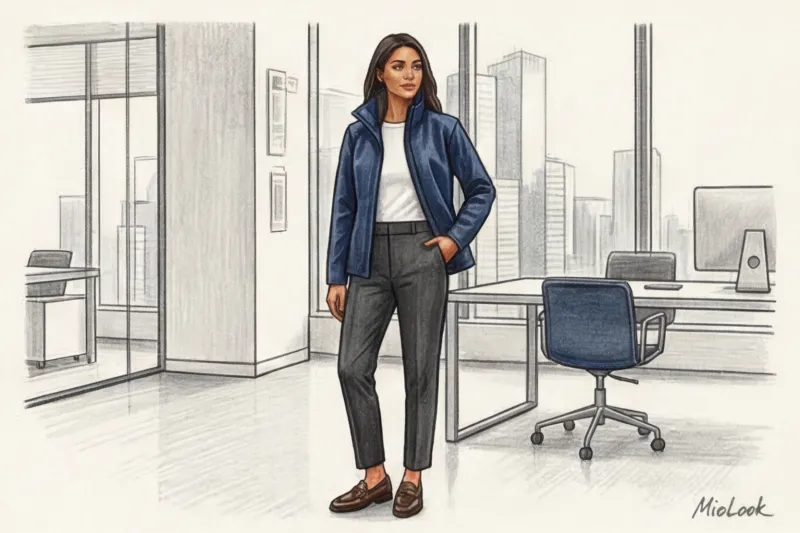
When it does NOT work: I'll be honest with you—gorpcore isn't all-powerful. If you have a strict corporate dress code (Business Traditional), wearing a shiny, rustling windbreaker over a formal three-piece wool suit is a bad idea. You'll look less like a street style icon and more like a courier who forgot to take off his coat in the conference room. For such occasions, a classic coat is better.
Colorist Checklist: 5 Steps to Your Perfect Gorpcore Capsule
To avoid buying up half the tourist store and being disappointed, I suggest following the algorithm I use when creating capsules for clients:
- Determine your natural base. Explore your color type and choose 1-2 dominant dark shades (cool graphite or warm olive). These will make up 80% of your wardrobe.
- Choose one "signal" color. Find a neon that resonates with you. It could be electric blue or fuchsia. Buy sneakers, a beanie, or a fanny pack in this color.
- Check the invoices. Make sure that the capsule contains both matte (fleece, cotton) and glossy (membrane, nylon) surfaces.
- Take inventory. See what from your current urban staples (jeans, silk skirts, cashmere sweaters) will work with the new gorpcore colors.
- Visualize before you buy. To avoid spending money on things that won't fit together, use MioLook app Upload photos of your basics and try on vibrant outdoor accents in your virtual wardrobe.
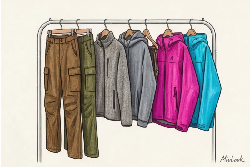
Gorpcore style teaches us an important fashion lesson: comfort and functionality don't have to be boring. The key is to remember that in the concrete jungle, survival isn't dictated by the weather, but by your ability to master color and proportions. Leave the acid-colored jackets to the climbers and opt for sophisticated, sophisticated shades with bold neon details.