Three years ago, a client of mine bought a cult Max Mara coat in shade 101801 camel for almost €3,000. Do you know how many times she wore it over three winters? Exactly twice. Unbuttoned, it clashed with her favorite cool gray trousers, and buttoned, it made her face look tired and sallow. This story from my styling practice perfectly illustrates the main problem with glossy fashion advice. For decades, we've been told the same thing: buy a beige trench coat and a black wool coat. But in reality, basic outerwear colors work completely differently.
We have already talked in more detail about the architecture of a seasonal wardrobe in our The complete guide to basic outerwear Today, I suggest you forget about formulaic shopping lists. We'll choose color not abstractly, but rather as a strict mathematical formula: based on the dominant shade of your base layer and the texture of the fabric.
Why Classic Basic Outerwear Colors Don't Work Anymore
In cold climates, outerwear accounts for 80% of your visual impression for six months. When you walk into a café, office, or theater, people see your coat or down jacket. Glossy magazines suggest buying "universal" pieces to solve this problem. But versatility is a myth.
I always teach my clients to calculate Cost Per Wear (CPW)—the price per outing. If you buy an emerald coat for 300 euros and wear it every day because it perfectly matches your eyes and wardrobe, its CPW approaches zero. But a "basic" black coat for the same price, hanging in the closet because your cat's fur sticks to it, is unjustifiably expensive. Your personal base coat is dictated by the climate, the level of street pollution in your city, and how you get around—by metro, on foot, or by car.
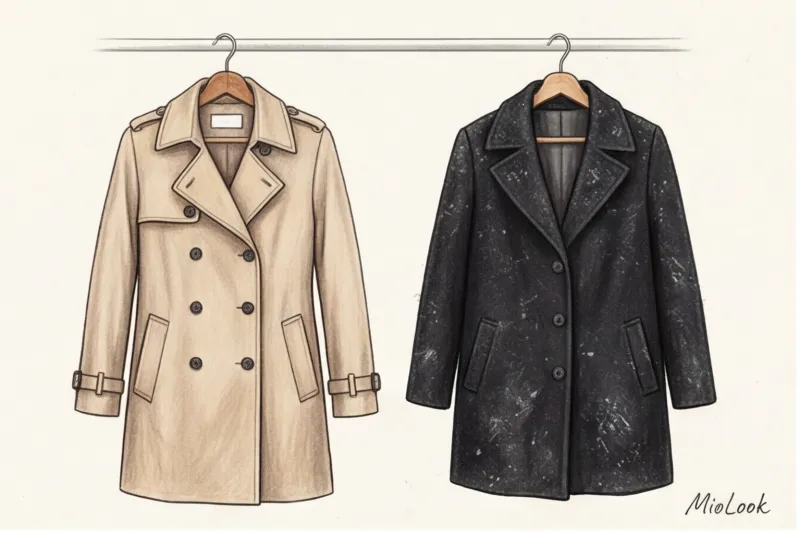
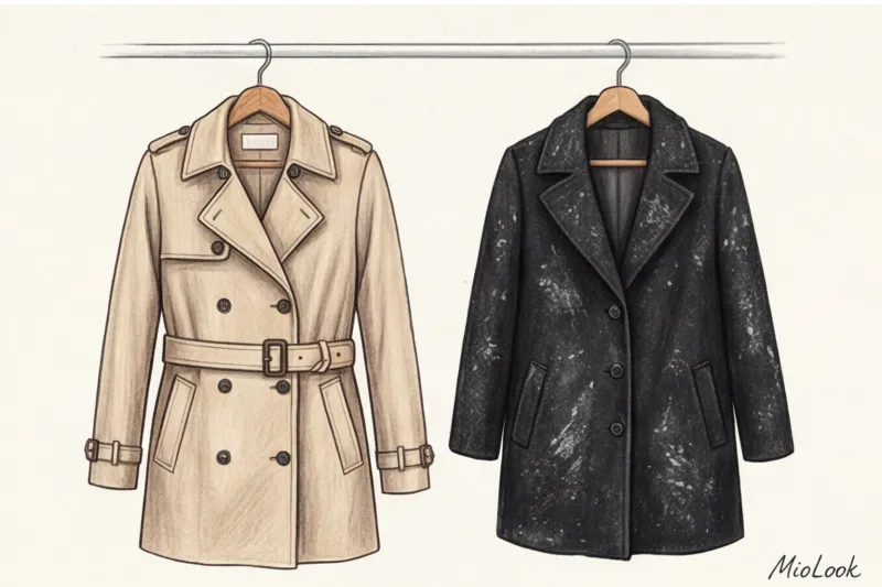
The myth of the ideal black and beige
Black is the worst choice for a wool coat for everyday wear. This is my firm belief as a stylist. Unless it's premium and perfectly smooth, black instantly attracts dust, lint, and fluff. In winter, it leaves white salt stains from chemicals. Furthermore, a deep black color near the face visually emphasizes under-eye shadows and nasolabial folds, requiring heavy makeup.
Camel is no less tricky. It looks luxurious on the runway, but in real life it often blends with Slavic skin tones, making the look dull. Moreover, warm camel flatters cool gray and black bottoms, creating a visual clash.
Your perfect look starts here
Join thousands of users who look flawless every day with MioLook. The smart AI stylist will analyze your wardrobe and suggest the best color combinations.
Start for freeThe formula for the perfect palette: from the inner layer to the outer
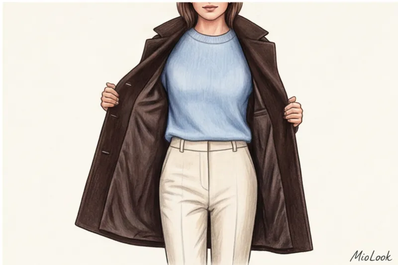
When shopping, I never hold a coat up to a client's face. The main rule I've learned over the years is to match the base colors of your outerwear to your most frequently worn trousers, skirts, and shoes, not the other way around.
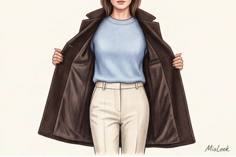
You need to create a "color column." If you're wearing dark blue jeans and black boots, your coat should either continue this dark vertical line (drawing height) or create a deliberate contrast. Adapting Johannes Itten's color theory for a layered wardrobe, we arrive at the rule of "temperature unity": never mix overtly warm and icy-cool base shades in the same capsule.
"If your inner layer consists of cool tones (graphite, snow white, cool blue), a warm chocolate or sand-colored outer layer will visually 'cut' your figure and create a sloppy appearance. The temperature of your layers should match."
To avoid mistakes, you can upload photos of your everyday trousers and shoes to MioLook app The algorithm will help you visualize how a particular jacket color will look with your actual base, eliminating the need to guess in the fitting room.
"Dark Complex" Instead of Black: New Urban Base
If black is impractical, what should you wear in mud and slush? The answer lies in the concept of "complex dark" shades. According to the PANTONE Color Institute's 2024 Color Report, the New Classics palette has finally replaced deep black in urban collections. Complex dark colors look more prestigious, more expensive, and possess an optical illusion: they change their undertones in different lighting.
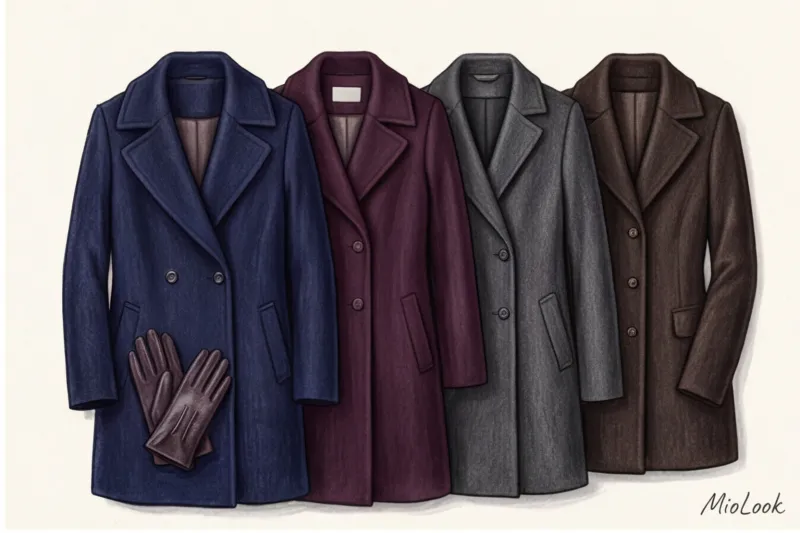
- Graphite and anthracite: The perfect alternative to black for a high-contrast look. The dark gray melange completely hides dust and pet hair.
- Dark chocolate and espresso: A luxurious, warm alternative. These colors pair beautifully with cream, beige, and gold hardware.
- Deep Navy (Sea Blue): A color that suits 90% of women. Unlike black, navy blue refreshes the face and makes the whites of the eyes appear brighter.
- Colour of aged wine (Marsala/Bordeaux): The most underrated basic color. It works as a neutral, pairing easily with both black and brown shoes.
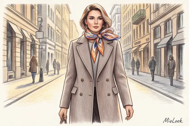
Light base: how to choose a shade that refreshes
Let's be honest: light-colored outerwear is a bad idea in a city winter with chemicals and public transportation. This is where stylists' advice comes into play. A light-colored basecoat is essential for women driving, those living in dry climates, or as a second, extra coat for dry weather.
If you decide to go with a light color, avoid stark white. Against the gray asphalt and overcast sky, it creates a "dirty stain" effect and highlights even the slightest redness on the skin. Opt for more refined alternatives:
- Pearl gray (ideal for blondes with cool undertones)
- Oatmeal (a soft, textured, undyed wool color)
- Cool taupe (a grayish beige that doesn't make your face yellow)
But what if you've already bought a coat that's the wrong color? I once "saved" a client's pale yellow down jacket, which was making her look sickly. We simply added a voluminous scarf in a deep sapphire blue. The scarf created a buffer zone, offsetting the offending color from her face. The rule is simple: your ideal shade should always be in the portrait zone.
Ready to get started?
Try a free plan—no commitments required. Upload your wardrobe to MioLook and discover which colors really suit you.
Start for freeThe Practicality of Color: How Texture Changes the Basic Colors of Outerwear
Color doesn't exist in a vacuum. The same shade of dark blue will look completely different on cashmere drape, a glossy raincoat, and smooth leather. A 2023 study by trend analytics agency WGSN found that color perception is 40% dependent on the material's reflective properties.
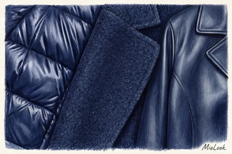
Matte fabrics (wool, cashmere, bouclé) absorb light. They make colors deeper, richer, and more expensive. Shiny textures (nylon down jackets, patent leather) reflect light, making the color flatter and more vibrant. This is why a dark chocolate-colored down jacket can look like cheap brown oilcloth if the fabric is too shiny.
Consider the stain-repellent properties of the leather. On smooth, matte graphite-colored leather, splashes from puddles are virtually invisible and can be easily wiped away with a cloth. On a shaggy black coat, the same stain will become embedded and leave a whitish stain until the next dry cleaning.
Checklist: Building Your Personal Outerwear Palette Step by Step
I teach this algorithm in my style courses, and now I offer you a revised checklist for an independent wardrobe audit.
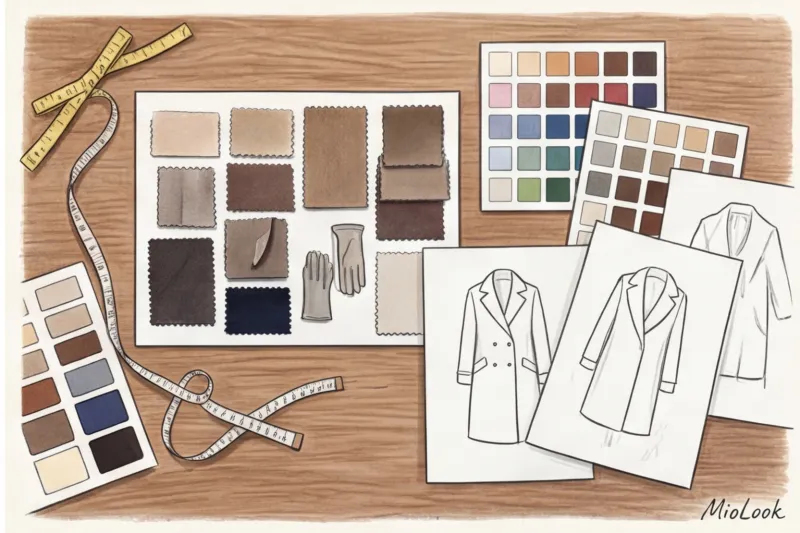
- Analysis of the "core" (footwear + belts). Open your closet. What color are your favorite winter boots and your three most common pairs of trousers/jeans? If blue denim and black leather predominate, your coat base should be cool.
- Assessment of appearance contrast. If you have light hair and light eyes, a dark espresso coat might overwhelm you. Opt for medium tones (taupe, medium gray).
- Choosing a basic dark color for cold and dirty weather. Eliminate black. Choose your "sophisticated dark" (navy, graphite, burgundy).
- Select an additional light/bright color. This is an option for dry weather or car travel.
- Checking for compatibility with accessories. Compare your hats, gloves, and bags to the chosen color. If 80% of the accessories match, the color is correct.
Conclusion: Color as an investment in your image
Basic outerwear colors aren't boring restrictions or a uniform that robs you of individuality. They're a well-tuned tool that allows you to create prestigious, expensive looks in 15 minutes before leaving the house.
Stop buying things just because they're on "10 Things Every Woman Should Own" lists. Your ideal wardrobe essentials are unique. Take out your outerwear this evening, hang it next to your casual pants, and honestly evaluate how they pair. You might just realize why that expensive coat so rarely leaves your closet.


