If you still think a flawless all-black suit is the perfect armor for any negotiation, I have bad news. In 12 years of working as a stylist and fashion journalist, observing the transformation of business dress codes from Milan to New York, I've seen hundreds of brilliant professionals sabotage their own success with a single, poorly chosen palette.
We're used to thinking that black signifies authority and white signifies neatness. But in the post-COVID era, when the management paradigm has shifted from rigid dictates to empathy, the old uniforms no longer work. Your interlocutor's brain is reading colors in business clothes in the first 90 seconds, and it's in those ninety seconds that it's decided whether you'll be given a multi-million dollar contract or a promotion. I wrote more about the evolution of this phenomenon in our a complete guide to the ideal image of a female leader.
In this article, we'll explore color theory not from the perspective of abstract "color types," but as a precise tool for managing psychological distance. You'll learn why complex shades convey your expertise better than words, and how to create a palette that works for you.
Why the old rules of coloristics no longer work
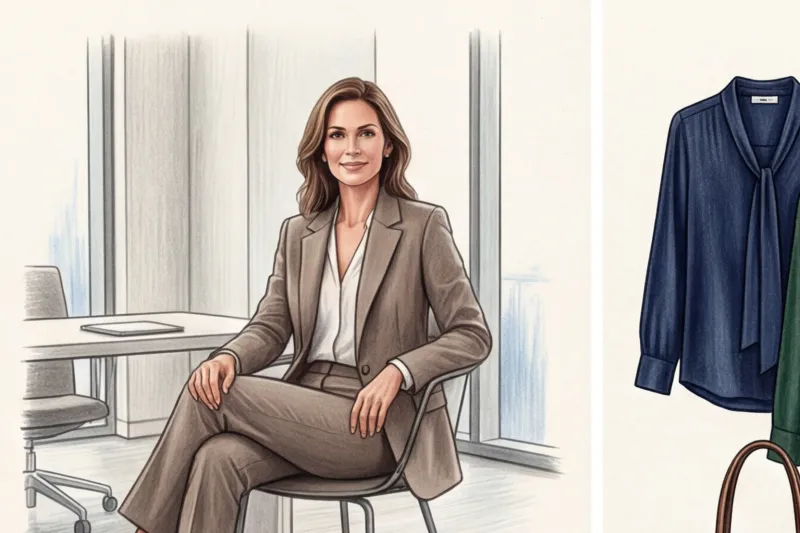
Let's start by debunking the biggest myth of the corporate world: black doesn't make you look more professional. In the psychology of perception, pure, light-absorbing black (especially in large volumes, like a pantsuit) acts as a visual wall. It signals closedness, categoricalness, and distance. This is the so-called "man in a case" effect.
According to a large-scale study Institute for Color Research , between 62% and 90% of a person's subconscious first impression is based solely on color. And today, these percentages are working against the rigid power dressing of the 1980s. Premium retail analytics for 2023 reveal a staggering figure: the use of pure black in business wear collections at brands like The Row and Jil Sander has decreased by 24% in favor of sophisticated dark shades.
Why does this happen? British psychologist Angela Wright explains in her system Color Affects System It proved that we respond not just to color, but to its wavelength. Long wavelengths (red) excite the nervous system, while the absence of color (black) mobilizes the interlocutor's psyche, anticipating a trick or authoritarian pressure. Modern business demands rapport and empathy, not suppression.
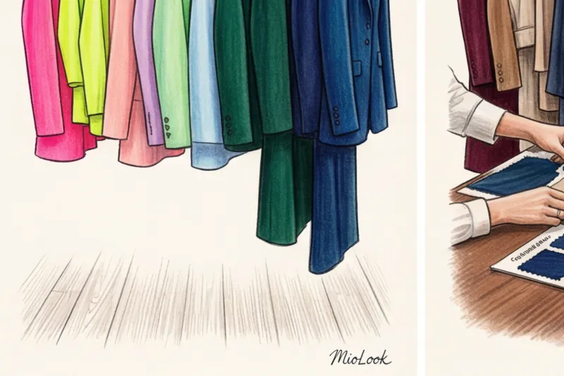
Try MioLook for free
A smart AI stylist will select the perfect look for your next important meeting, taking into account the psychology of color.
Start for freeThe Foundation of Trust: 3 Key Colors in Modern Business Attire
The secret of an “expensive” and prestigious wardrobe lies in the rejection of open, pure colors (as on Itten’s color wheel) in favor of complex, mixed shades - complex colors Our brain is designed to take longer to analyze complex colors that contain multiple pigments. This visual intrigue is subconsciously associated with depth of intelligence, reliability, and high status.
Compare a flat, bright blue jacket from a mass-market store with a stormy blue jacket from a premium line. The latter looks more refined precisely because of the admixture of gray and black pigments. Let's explore three fundamental colors of a modern business wardrobe.
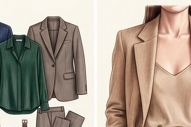
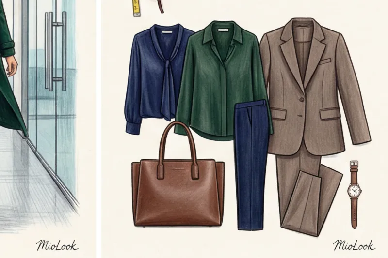
Deep blue (Navy) and its modern alternatives
Classic navy is rightfully called the "color of intellect." It's been scientifically proven that looking at the color blue physiologically lowers the heart rate and blood pressure of those you're talking to. Whether you need to calm a nervous client or navigate difficult budget negotiations, this is your trump card.
But to avoid looking like a flight attendant or a bank employee from 2005, opt for modern variations. Consider midnight blue, inky blue, or gray-blue. Airforce Blue These tones retain the association with logic and focus, but add relevance to the image.
Complex shades of green: pine, olive, sage
On the sidelines of European fashion weeks, green has long been dubbed the "new blue." It's the color of balance, confident growth, and tranquility. Historically, green is the color of financial stability (remember the green baize on the desks of bankers and pawnbrokers in Renaissance Italy).
For HR directors, finance professionals, and those negotiating long-term partnerships, I recommend investing in a suit in a pine or deep olive shade. Unlike blue, which can feel cold, a sophisticated green conveys, "I'm in control, but I'm on your side."
Architectural beige and taupe
The psychology of the brown-gray palette is based on groundedness, reliability, and openness. But herein lies a major pitfall: there's "cheap" beige with a pronounced yellow undertone (which makes skin look tired), and there's "expensive" cool taupe—a noble blend of gray and brown.
Monochromatic taupe looks have become the ultimate signifier of "quiet luxury." Wearing a cashmere turtleneck with matching wool trousers in this shade creates the image of someone who doesn't need to shout about their status—everyone already knows it.
Managing Distance: How Image Contrast Affects Negotiations
One of the most powerful tools in my stylist's arsenal is contrast management. Color alone is only half the battle. How you combine light and dark areas in a portrait determines how close you let people get to you.
High contrast — is the classic combination of a crisp white shirt and a dark blue or black jacket. The sharp distinction between the colors conveys rigidity, clear boundaries, and authoritarianism. When is this necessary? In crisis management, when you need to walk into a room and say, "This is how we do things now, period." But if you show up to a design thinking or mentoring session dressed like this, people will subconsciously shut down.
Last year, Anna, the CEO of a large fintech company, approached me. Her problem was, "The board of directors is hostile to my initiatives, even though the financial results are perfect." We analyzed her wardrobe: it consisted of sharp, high-contrast combinations—a black suit, a white blouse, and red lipstick. Anna looked like a warrior you'd want to fight with.
Low contrast was our solution. We transitioned her wardrobe to monochrome and complementary shades: a navy blue jacket with a light blue silk blouse, taupe suits with ecru tops. The lack of sharp boundaries in clothing visually softens the look, conveying empathy and a willingness to engage in dialogue. After two months, Anna noticed that the level of tension at board meetings had noticeably decreased. People began to... listen , and not to defend ourselves.
Color and Status: Shades That Reveal Expertise
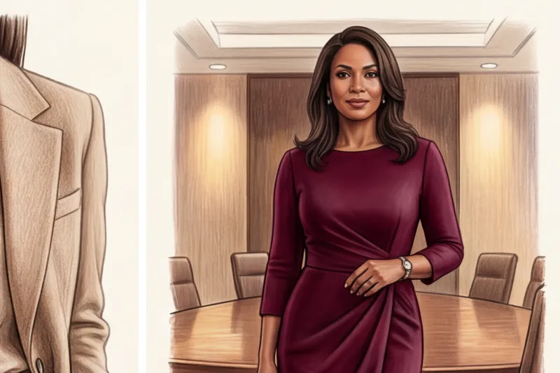
If your goal is to highlight your high qualifications and justify a high bill for services, pay attention to Jewel tones (gemstone colors): sapphire, emerald, deep amethyst and rich burgundy.
Historical memory is at work here. For centuries, dyes of these shades (especially purple and madder root for burgundy) were incredibly expensive and accessible only to the aristocracy and high clergy. Our brains still firmly associate these deep, rich tones with power, wealth, and exclusive expertise.
How can this be put into practice? If your corporate dress code is strictly regulated and doesn't allow for an emerald suit, use status colors as accents. A sapphire silk scarf, a burgundy tote bag, or even a deep wine-colored watch strap will add just the right amount of weight to your basic gray suit.
Your perfect look starts here
Join thousands of users who look flawless and stylish every day with the MioLook app.
Start for freeDangerous Palette: Which Colors Destroy Rapport?
In their quest to "spice up their dull days," many people make fatal mistakes. There are shades that are categorically unsuitable for building trusting business relationships.
- Pastel shades in a strict cut: A soft pink, powder blue, or lilac suit risks infantilization. These colors are subconsciously associated with childish innocence and weakness. If you come to ask for a million-dollar budget in a powder pink jacket, you'll have to expend three times as much effort to prove your competence.
- Open yellow and orange: These are the colors of heightened visual activity. They're good for creative industries, but in traditional business, they can cause visual fatigue and subconscious anxiety in the interlocutor (yellow and black are the natural colors of danger—think of wasps).
- Pure Red: It is the color of dominance, aggression and sexuality, not trust. When to avoid it: During initial meetings with clients, interviews, and when negotiating compromises, red only works when you're in a position of undisputed power and your task is simply to deliver the verdict.
How to Incorporate "Trust Colors" into Your Wardrobe (Checklist)
Theory is useless without practice. Here's a step-by-step algorithm I give my clients before updating their business capsule. You can put it into practice today.
- Step 1: Identify your primary communication goal. Do you need to push a solution (high contrast, deep dark tones), win over your team (low contrast, warm, close-knit shades), or emphasize creativity (unconventional textures in basic colors)?
- Step 2: Choose a deep base color. It should perfectly match your appearance. If you don't know your natural colors, I recommend studying the material. 12 Color Types of Appearance: A Guide to Choosing a Palette Navy and emerald are ideal for cool types, while olive and chocolate are ideal for warm types.
- Step 3: Adjust the contrast. Buy two tops to complement your basic suit: one high-contrast (for example, ivory with a blue jacket) and one low-contrast (light blue or gray-blue). This way, one suit will fulfill two different psychological needs.
- Step 4: Consider the texture of the fabric. This is insider knowledge that's often overlooked. The same color performs differently depending on the material. Matte worsted wool (like Super 120s) absorbs light, making the color appear more austere, solid, and dull. Smooth mulberry silk, on the other hand, reflects the light, making the same shade appear more vibrant, light, and more elegant. For maximum confidence, choose matte or semi-matte finishes.
Summary: Color as an extension of your leadership
There is a concept in psychology Enclothed Cognition (embodied cognition). She proves that clothing influences not only how others perceive you, but also how you feel about yourself. By wearing a deep pine green suit, you physically begin to behave more balanced and confident.
A conscious choice of color palette is a nonverbal communication tool that begins working even before you utter your first word, say hello, or open a presentation. Don't leave this powerful force to random purchases or outdated stereotypes about "white tops and black bottoms."
Take a look at your closet right now. Look at the clothes you wear to important meetings. Ask yourself one question: "What emotion does this color convey?" If you're not happy with the answer, you know what to do. By the way, to avoid spending hours choosing the right combinations, I recommend using MioLook — the app will help you digitize your wardrobe and show you how to skillfully mix fashionable shades every day.


