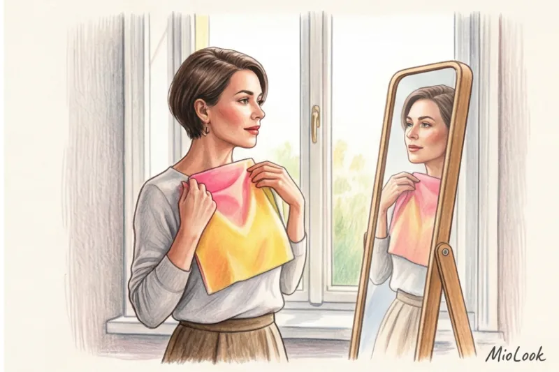
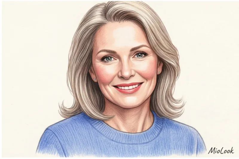
Clients often come to me with the same discouraging request: "Darina, I bought a stunning dusty rose jumper to freshen up my complexion, but in the fitting room I looked like I hadn't slept in a week." In moments like these, I have to act not only as a stylist but also as a bit of a physicist.
It's generally accepted that dark tones make you look older, while light and pastel tones are guaranteed to make you look younger. But when we start to break it down, What colors in clothes make you look older? In fact, an interesting detail comes to light. It's not the pigment itself that adds age, but how it reflects light onto your face. We discussed the mechanics of this process in more detail in our The complete guide to style mistakes that add age.
Let's forget the typical glossy advice like "never wear black" and explore the optical illusions our wardrobe creates.
Light, shadow, and microcontrast: why do we even ask ourselves which colors in clothing make us look older?
Clothing color has no set pattern. It can't age you on its own. What does age you is how it interacts with your skin under certain lighting. To understand how this works, you need to know two technical terms: microcontrast And reflector effect.
Microcontrast is the difference between your skin tone, the brightness of your lips and eyebrows, and the color of the whites of your eyes. According to dermatological studies, by age 40, this natural contrast decreases by an average of 20-30%. Lips lose their vibrant pigment, the whites of your eyes lose their sparkling whiteness, and your skin tone becomes less uniform. This is where clothing comes into play.
The golden rule of coloristics: if the color of the thing near your face is purer, brighter and more active than your natural colors, it will come to the fore, and your face will appear faded, tired and aged.
The second point is the reflector effect. Think about physics: light falls from above, hits your blouse or sweater, and is reflected upward—on your chin, neck, and nasolabial folds. If the fabric is the right shade, it acts like a makeup artist's ring light. If the shade is wrong, it will highlight every wrinkle and capillary. According to the law of simultaneous contrast (described in detail by color theorist Johannes Itten back in 1961), our brain automatically searches for a shade on the face that is opposite to the color of the clothing.
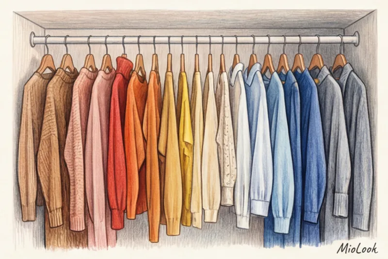
Stylist's Anti-Rating: 7 Clothing Colors That Visually Age Your Face
Let me clarify right away: this list isn't a death sentence. I'm not forcing you to throw out half your closet. But this is a high-visibility area. If you wear an item from this list in the portrait zone (closer than 20 cm to your face), be prepared to use a heavier foundation and brighter makeup to elevate the look.
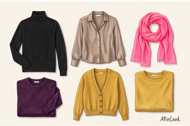
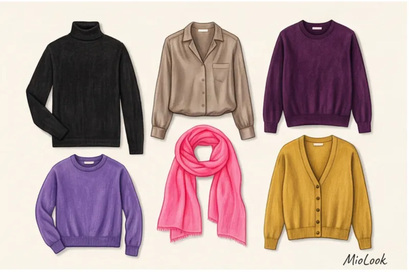
1. Solid matte black (especially turtlenecks)
It's high time to debunk the myth of black's universality. Dull, matte black cotton or thick knitwear acts like a black hole—it absorbs all light. As a result, harsh shadows appear on your face: nasolabial folds appear deeper, and under-eye circles appear darker.
In my studio, I often conduct a simple experiment: I ask a client to sit in front of a mirror in daylight and place black cashmere and then white silk on her neck. The difference is dramatic. The famous "Steve Jobs effect" (a black turtleneck as a uniform) is extremely rarely flattering for women over 35. If you love black, choose textures with a slight sheen Silk, satin, or fine leather. The sheen reflects light and counteracts the dullness of the color.
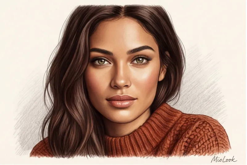
2. Earthy tones and dirty beige
Khaki, marsh green, and dull taupe are the colors of camouflage. Their purpose in nature is to blend into the earth. They do the same to your face. Beige, a total look often touted as the pinnacle of elegance, is especially insidious.
One time, a client and I went shopping with a budget of about €400 to find that "expensive beige." We tried on a dozen sweaters, and every second one made her face look sickly yellow. The secret is that beige with a grayish or greenish undertone blends with tired skin. For beige to work, it should be slightly lighter or richer than your skin tone—for example, camel or warm caramel.
Try MioLook for free
A smart AI stylist will select the perfect look for every day based on your appearance.
Start for free3. Complex dusty pink (insidious "youth")
And so we come to my favorite myth. It's commonly believed that pastel pink tones are refreshing. This is true, but only if the color is pure. "Dusty rose" contains a gray pigment. It's this grayness that instantly highlights age spots, rosacea, and redness on the skin.
Instead of a complex, dusty shade, try a pure icy pink (if you have a cool complexion) or a soft peach (if you have a warm complexion). Purity of color is much more important for visual rejuvenation than its lightness.
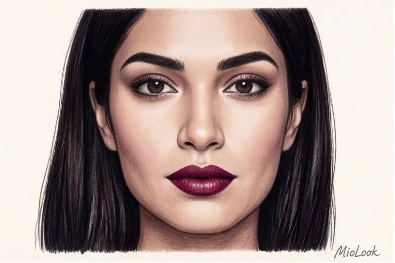
4. Deep eggplant and dark purple
Let's return to Itten and his color wheel. Purple is the complementary (opposite) color of yellow. What does this mean in practice? By wearing a dark purple sweater, you force the optics to bring out all the hidden yellowness in your skin.
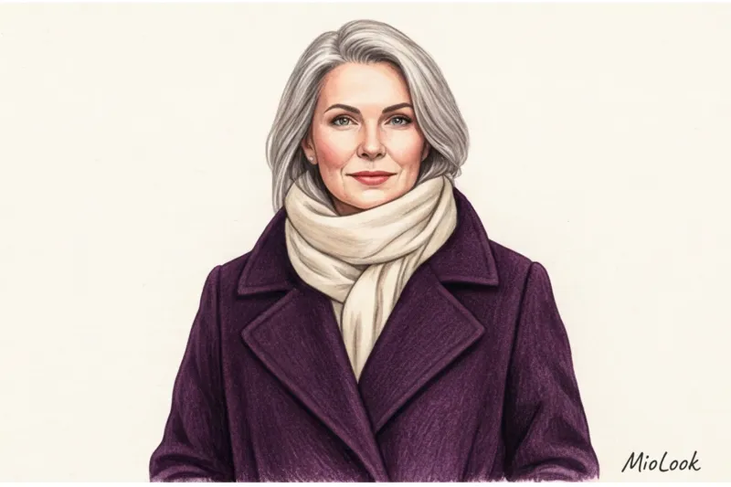
Eggplant on the face masterfully highlights dark circles under the eyes and makes teeth appear more yellow. If you like purple tones, try select colors according to color type — perhaps your alternative would be a light, cool lavender or a rich plum without a noticeable red tint.
5. Mustard and yellow-green
These shades cast a greenish tint on the chin and neck. Even the healthiest, vacation-rested skin can appear pigmented or unhealthy against the backdrop of a mustard sweater.
These colors are especially dangerous for women with a Slavic (light-haired, cool-toned) complexion. One of my clients ditched her favorite mustard-colored cardigan near her face, opting for pants instead. The next day, her colleagues asked if she'd had biorevitalization. Conclusion: color matters.
6. Aggressive neon (fuchsia, electric, marker yellow)
A common psychological trap: trying to "rejuvenate" your look with youthful, garish neon shades. The effect is counterproductive and cheapening. The neon overpowers your natural, diminished microcontrast. You look in the mirror and see not a woman in a dress, but a bright fuchsia splash, with a washed-out face nestled somewhere above.
Fair Limit: This rule doesn't apply if you have a naturally extreme, contrasting appearance (for example, you're a striking brunette with porcelain skin and bright, icy eyes). In this case, neon may look natural, but for 90% of women, it's detrimental to the face.
7. Cool gray melange
That same color you'd find in your favorite sweatpants or basic hoodie. The problem with gray melange is that it's associated with relaxed loungewear, visually "loose" the look. Plus, mouse gray makes your complexion look ashy.
The difference between a luxurious wardrobe and a dull one lies in the nuances. Swap loose gray knits for smooth silver-gray silk or a dense suiting wool in a refined graphite shade.
The Buffer Rule: How to Wear Dangerous Shades If You Love Them
What do you do if your favorite, most expensive jacket ends up on the anti-rating list? I have a client who bought a stunning, trendy eggplant-colored jacket for €350 and refused to give it up. We saved the situation using a technique I call the "buffer rule."
- Transfer technique: The easiest way to wear complex colors is use them in color blocking , but away from the face. Skirts, trousers, shoes, and bags—mustard and black are completely safe here.
- Color buffer: Move the dangerous color at least 10-15 centimeters away from your skin. Wear a crisp white shirt under a black sweater, allowing the collar to show through. Wear a light silk scarf or a chunky pearl necklace.
- Deep neckline: A V-neckline moves the fabric away from the chin. The more exposed skin (your base color) between your face and the garment, the less likely you are to get unwanted reflections.
3 Colors That Work as a Visual Anti-Aging Filter
If there are colors that steal youth, it stands to reason that there are also colors that work as a good concealer.
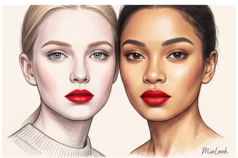
- Refreshing white. Just avoid stark white (the color of paper), which will highlight imperfections in your teeth and the whites of your eyes. Choose eggshell, pearl, or ecru. In the price range of basic T-shirts (€20–€40), these shades always look more expensive than pure white.
- Sky blue and cornflower blue. Let's recall the color wheel: blue neutralizes yellowness. A sky-blue blouse will visually brighten the whites of your eyes and freshen your complexion.
- Coral and peach. It's no coincidence that PANTONE Institute stylists chose Peach Fuzz as the color of 2024. Soft, warm pink tones mimic a healthy, natural glow, illuminating the skin from within.
Your perfect look starts here
Join thousands of users who look flawless every day with MioLook's intelligent recommendations.
Start for freeChecklist: Wardrobe Review with MioLook
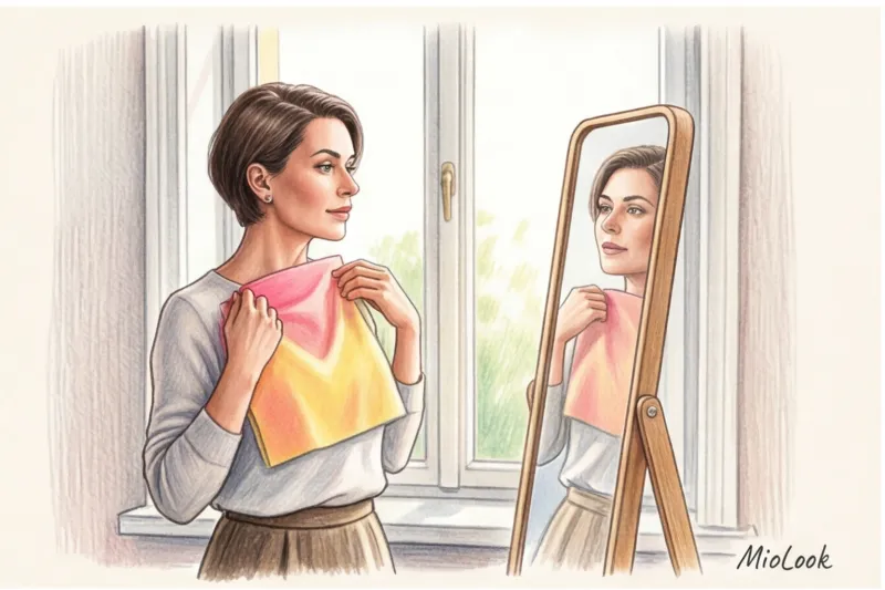
Theory is great, but style is born in practice. To stop guessing in the mirror, take stock of your portrait zone.
Choose a sunny day, stand by the window (facing the light), and hold each item from your closet up to your face one by one. Take a makeup-free selfie with each item. You'll instantly see which jumper makes you pop and which one makes you look flattering.
To automate this process and not keep complex color type rules in mind, I recommend determine skin undertone using AI in the app MioLook By uploading your items to a virtual closet, you can sort through "dangerous" wardrobe items and choose refreshing, light-colored toppers to go with them in advance, without wasting time in the morning.
Remember the most important thing: color is just a tool. It should serve you, highlighting your individuality, not draining your energy. If a piece of clothing makes you need to apply two layers of foundation, it might be time to give it to someone else.