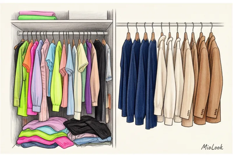

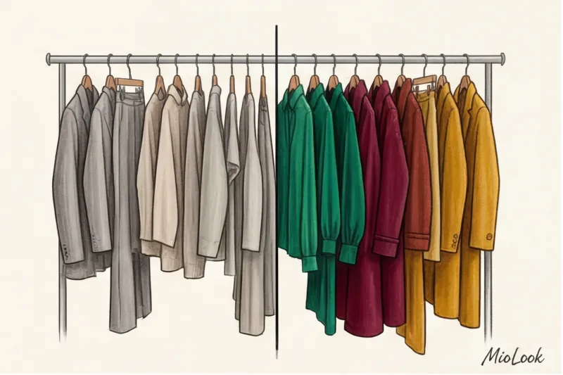
Did you know that 80% of so-called "orphaned items"—those that hang with their tags in the back of your closet for years—are bought for the same reason? In my 12 years as a stylist, I've heard this excuse time and time again: "I thought the color was so pretty in the store." The problem is that the color was purchased in a vacuum, without considering the context of the rest of the outfit. When it comes to choosing colors for a capsule wardrobe, popular blogs have been feeding us the same myth for decades: take black, add beige, and mix it up with a white shirt.
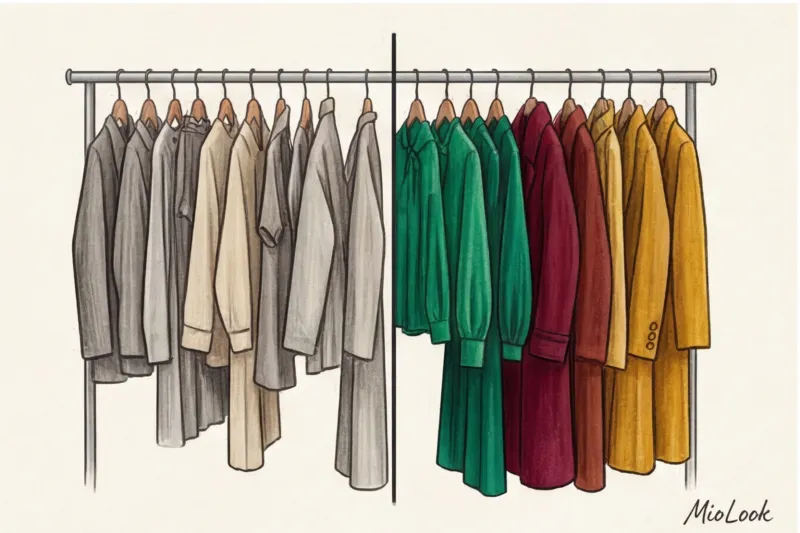
I'm willing to challenge this rule. Popular minimalist challenges like Project 333 trap women in neutral palettes. The irony is that black and crisp white are the most difficult colors for integration if your natural contrast is low. We've already discussed the basic architecture in more detail in our The Complete Guide to Creating a Capsule Wardrobe , but today I want to talk about the most difficult thing: how to stop being afraid of color and make it work for you.
Why the classic formula of "3 basics + 1 highlight" is hopelessly outdated
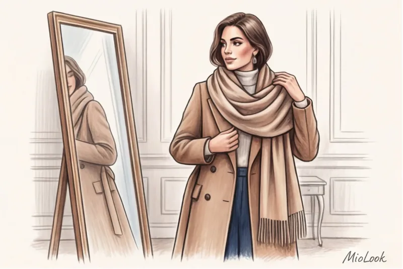
Let's be honest: a beige trench coat isn't for everyone. At the recent Paris and Milan Fashion Weeks, I was delighted to see houses like Bottega Veneta and Loewe ruthlessly dismantling the concept of a "safe base." They're suggesting deep olive, rich burgundy, or dark chocolate as bases.
Black creates harsh shadows near the face, highlighting even the slightest traces of fatigue and fine lines. Instead of a boring base, I offer my clients the concept Dynamic color core It's a system in which a wardrobe is built on complex, vibrant shades, excluding sterile neutrals.
Access to MioLook for €0.99 — one-time payment
A smart AI stylist will select the perfect look.
Get access — €0.99 onceThe Mathematics of Color: 3 Working Schemes for a Capsule Wardrobe
Back in 1963, artist Josef Albers demonstrated in his groundbreaking work "The Interaction of Color" that the same hue is perceived completely differently depending on its surroundings. We're transferring this law from painting theory straight to your closet. To avoid the "clown" effect, stylists use Itten's color wheel not intuitively, but mathematically.
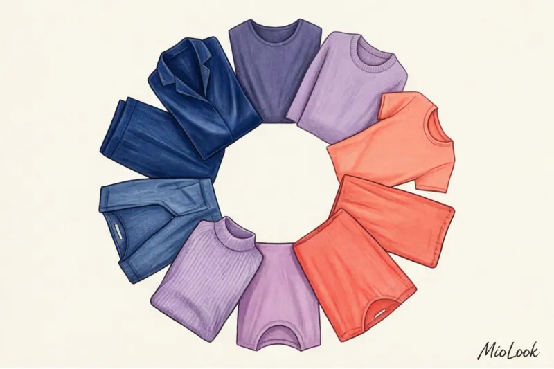
Scheme 1: Monochrome depth (Tonal wardrobe)
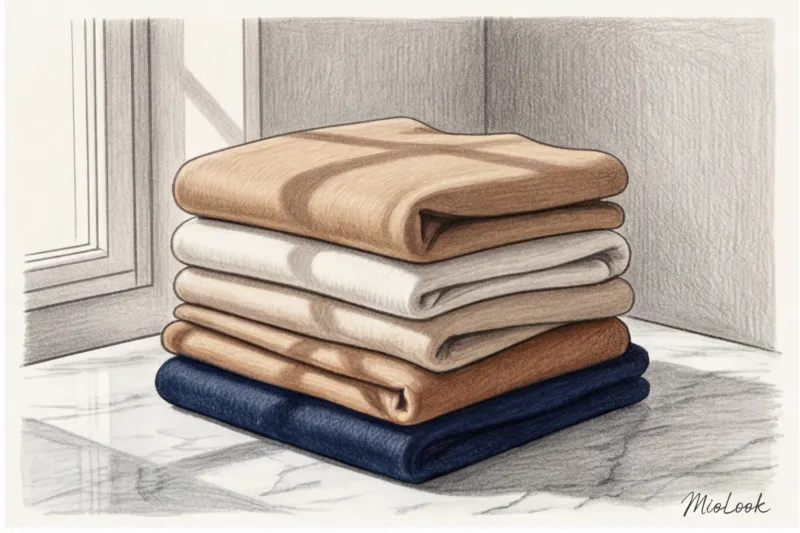
The most elegant technique, adored by stylists at brands like The Row, is to take one color and stretch it into three or four shades, from azure to inky blue. But there's a strict rule here, often overlooked by fashion magazines.
"A monochrome scheme doesn't work if all your pieces are made from the same flat, matte cotton. Regardless of texture, you'll look like you're wearing a corporate uniform or hospital pajamas."
The secret lies in the light reflection. Combine smooth silk (19-mommie count and up), fluffy cashmere, and structured leather. Glossy surfaces brighten the color, while shaggy surfaces deepen it. This scheme perfectly elongates the silhouette, creating a continuous vertical line.
Diagram 2: The 60-30-10 rule in clothing
We borrowed this formula from the golden rules of interior design. In the context of clothing, 15 items are distributed like this:
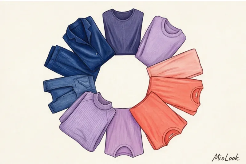
- 60% (9 items) - Main color. These are your trousers, skirts, coats, and jackets. They set the mood.
- 30% (4-5 items) - Complementary color. Blouses, tops, knitwear. They support the basics without contradicting them.
- 10% (1-2 items) - Accent. Bags, shoes, scarves.
For example: 60% dark green, 30% caramel, and 10% neon orange in the details. This prevents visual chaos when you're trying to wear "all your best at once."
Scheme 3: Related-contrasting palette
This is the most complex scheme for those already comfortable working with color. The Pantone Color Institute often builds its seasonal palettes using this principle. You take two adjacent colors on the wheel (for example, blue and violet) and add their opposite (mustard yellow).
The key here is to manage saturation. If all three colors are too bright, the look will fall apart. Keep only one color bright and tone down the other two with a drop of gray pigment.
Access to MioLook for €0.99 — one-time payment
Start creating perfect images with the help of artificial intelligence
Get access — €0.99 onceHow to Choose Colors for a Capsule Wardrobe: A Step-by-Step Guide
It's time to stop buying individual items and start thinking in formulas. When planning your palette, each new purchase should cover at least three needs in your current wardrobe. By the way, Smart wardrobe at MioLook allows you to visualize these connections even before going to the store, saving you tens of thousands of euro.
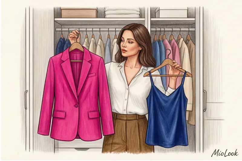
Step 1: Taking an Inventory of Color Anchors
Open your closet and take out two or three items you wear most often (jeans don't count). These could be the items you get the most compliments in or the ones that make you feel the most confident. Analyze them. What color are they? What's their undertone? These will become the foundation, the "color anchor" of your new capsule wardrobe.
Step 2: Defining the temperature vector
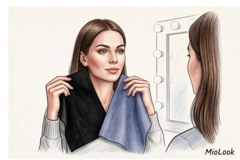
The most common mistake beginners make is trying to mix distinctly warm (with yellow undertones) and cool, icy shades in the same look. Choose the dominant color of the capsule. If your skin has a peachy or golden undertone, build a base on warm shades of rust, terracotta, and warm olive. If your skin is porcelain with a pinkish undertone, go for emerald, sapphire, and wine tones.
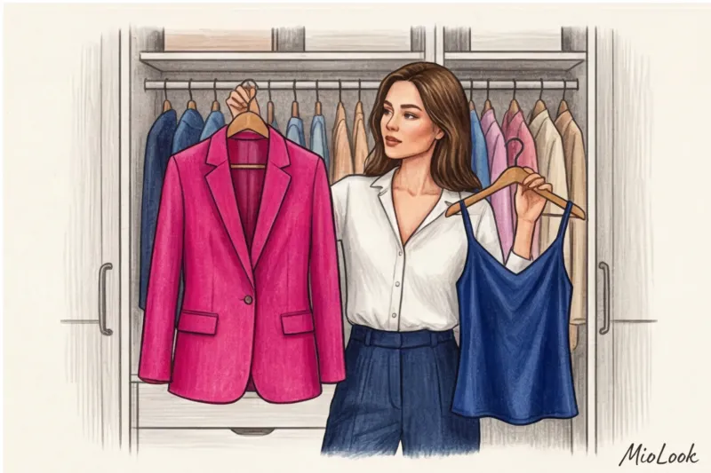
A vibrant capsule collection without black and beige: a real-life case study
A few years ago, during a wardrobe review in Milan, my client, a top IT manager, confessed, "These beige sweaters make me feel like I've been erased. I want color, but I'm afraid of looking frivolous at board meetings." This is a common pain point: dress codes demand strictness, but the soul craves color.
We experimented and put together a capsule collection of 15 pieces, completely eliminating black, white, gray, and beige. Deep, jewel-toned shades served as the base: emerald, rich fuchsia, and dark sapphire.
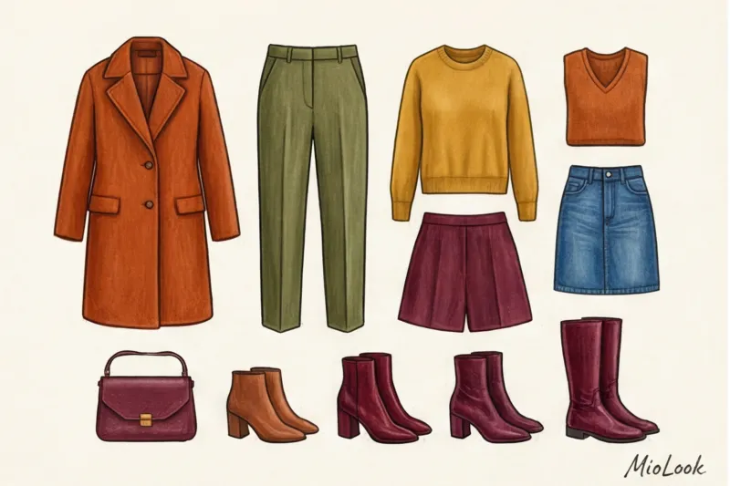
How did this work in practice?
- Link: Instead of a plain white shirt, we opted for a silk blouse with a complex geometric print that intersected blue, green, and pink. This print mathematically tied together any solid-color tops and bottoms.
- Hidden contrast: Emerald straight-leg trousers looked as formal with a sapphire cashmere turtleneck as a black suit, but a thousand times more expensive and intellectual.
- Result: Fifteen colorful pieces gave us 42 completely wearable looks for the office and evening wear. The key rule we followed was consistent saturation levels. A deep, dark emerald paired perfectly with an equally deep, slightly darkened fuchsia.
Your perfect look starts here
Join thousands of users who look flawless every day with MioLook.
Get access — €0.99 onceThe Main Mistakes When Creating a Color Palette (and How to Avoid Them)
Even perfectly chosen items from the premium segment can look cheap if the laws of proportion and temperature are violated.
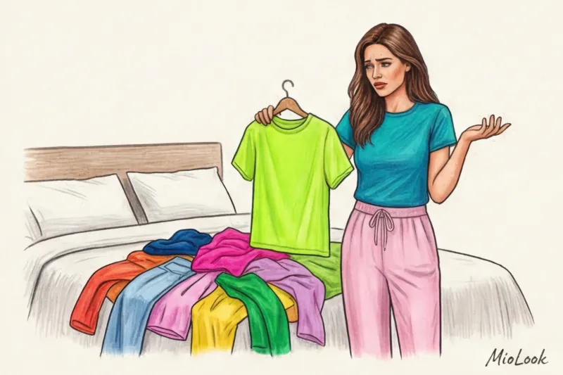
Mistake 1: Buying shoes without regard to the palette. Women often put together a stunning pastel capsule (lavender, pistachio, dusty rose), and then pair it with chunky black ankle boots, simply because "black goes with everything." No, not everything. Black shoes under a light outfit visually "cut off" the legs and make the bottom look heavy. The solution is deep burgundy or navy blue.
Mistake 2: The "traffic light" effect. This happens when you divide your figure into 50/50 blocks of color. For example, a bright blue jumper ends exactly where a pair of bright red pants begins. This widens the waist and throws off the proportions.
How to test yourself? In styling schools, we use an insider trick: Squint Test.
Stand in front of a mirror two meters away and squint hard. Your gaze should glide smoothly over your silhouette. If any detail (such as a too-bright belt or contrasting shoes) hits your eyes like a spotlight, your look is unbalanced. There should be some distinction between colors, but they shouldn't be jarring.
By the way, to avoid having to do this test every morning in a hurry, I recommend Digitize your closet with MioLook The program will automatically suggest which elements conflict with each other in terms of contrast.
Action Plan: Your Personal Palette Builder
A study by psychologists from the University of Hertfordshire has proven the concept of "dopamine dressing": the colors we wear directly impact our productivity and stress levels throughout the day. By choosing a color, you literally choose your mood.
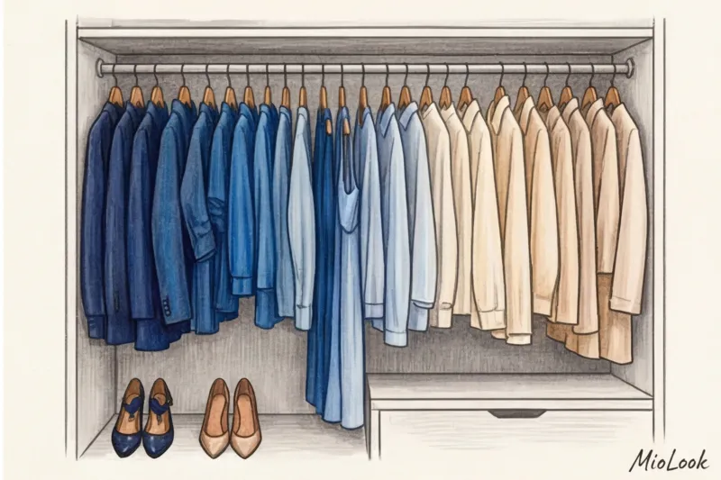
To put theory into practice today, take three simple steps:
- Break free from the stereotype that base colors have to be boring. Find your personal "dark neutral" (eggplant, pine, graphite) and "light neutral" (butter, sage, dusty blue).
- Hang your closet not by type (all skirts together, all shirts together), but in a gradient—by color. You'll immediately see what cohesive elements you're missing.
- Do a Squint Test before leaving home tomorrow morning.
A capsule wardrobe should adapt to your personality, your appearance, and your lifestyle, not force yourself into gray turtlenecks for the sake of minimalism. Color is your primary, completely free, impression management tool. Use it to its full potential.