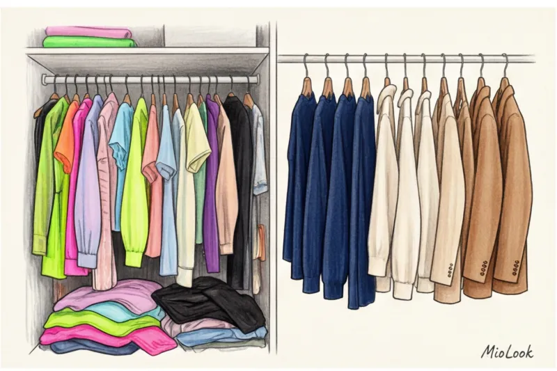
Did you know that 80% of the items in your closet remain in a "blind spot" simply because your brain refuses to solve a complex equation involving three unknown colors early in the morning? According to global environmental organization WRAP, in 2023, the average woman regularly wears only about a fifth of her wardrobe. And the main reason for this isn't a change in clothing size, but rather the cognitive overload of trying to create a harmonious look from a chaotic palette.
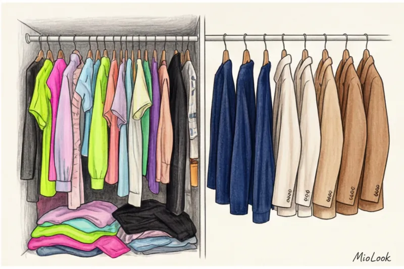
We talked in more detail about the architecture of the smart closet and how algorithms solve the “nothing to wear” problem in our The complete guide to MioLook, the AI-powered capsule wardrobe app Today we'll talk about the mathematics of color. I'll show you how the right colors for a capsule wardrobe can cut your getting ready time from 20 minutes to three, and why the usual advice from glossy magazines often leads to wardrobe disasters.
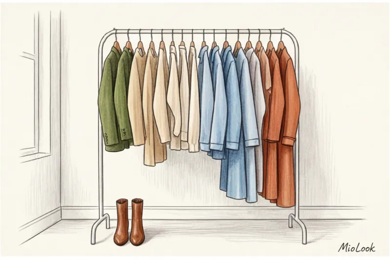
The Architecture of Color: Why Standard Capsule Rules No Longer Work
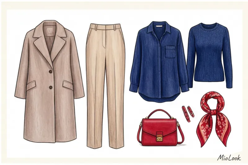
"Buy the basics: black pants, a white shirt, a beige trench coat—they'll go with everything." I'm sure you've heard this advice hundreds of times. Over the years as a stylist, I've realized one thing: this template is hopelessly outdated. Basics come in different temperatures, and the versatility of some shades is greatly exaggerated.
The main myth I have to combat daily is the myth of the absolute universality of black. Many consider it a safe foundation, but in reality, black is the most difficult and dangerous base color for a capsule skin tone. It absorbs light, visually "cuts" the body's proportions when paired with soft tones (for example, powder pink or dusty blue), and requires a very high contrast in appearance. According to statistics, only 15% of Slavic women have such natural contrast.
"Mathematically and algorithmically, navy or dark chocolate work much more effectively as a base than black. They create a softer gradient when transitioning to other colors and don't look heavy in daytime looks."
If you swap out a classic black jacket for a deep navy blue one made of thick viscose (even from a mass-market store like Zara for €60), you'll immediately notice how the rest of the items in your capsule wardrobe come to life and start to fit together more easily.
Your perfect look starts here
Join thousands of users who look flawless every day with MioLook.
Start for freeThe 60-30-10 Formula: How Capsule Wardrobe Colors Program Your Style
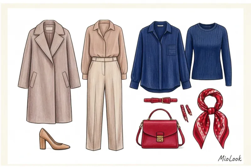
Color abhors chaos. The best tool for organizing a palette comes from interior design—the 60-30-10 rule. When you apply this formula to your wardrobe, you literally program your style for success by reducing visual noise to a minimum.
How does this work in practice?
- 60% — Main color (base). These are your "oversized" investments: coats, pantsuits, basic shoes, tote bags. Neutral, subdued shades that take up the most space in the look.
- 30% - Complementary color. Second layer items: blouses, jumpers, cardigans, skirts. This color supports the base, but has its own character.
- 10% - Accent color. Bright flashes: a silk scarf, a textured micro bag, bright pumps or even red lipstick.
I love relying on numbers. Having digitized over 500 of my clients' wardrobes in an app MioLook I discovered a clear pattern: users whose capsule wardrobes are strictly structured according to the 60-30-10 ratio wear 82% of their items regularly. Artificial intelligence algorithms (like our brains) find it three times easier to create successful combinations when there's a clear color hierarchy.
Temperature and Contrast: The Invisible Code of Perfect Combinations
Even if you've got the proportions perfect, the look can fall apart due to temperature clashes. The PANTONE Color Institute releases palettes every season, and professional colorists always divide them into warm (with yellow undertones) and cool (with blue undertones).
The basic rule is: never mix warm and cool shades of the same color in a base layer. Otherwise, one of the items will inevitably end up looking washed out and unkempt. Let's look at a real-life example.
The "White Mismatch" Trap: The Story of One Wardrobe Malfunction
One of my clients, Anna, who works in IT, decided to put together a summer capsule collection exclusively in light colors. She bought 14 basic pieces, from heavy cotton shirts to silk tops. In theory, it sounded like the epitome of minimalism. In practice, it turned out to be a disaster.
Anna bought items in ecru and ivory (warm) and snow-white and icy (cool) shades. When she wore a warm, creamy top under a cool, crisp white blazer from COS, the top looked like it hadn't been washed in a year. The juxtaposition of these temperatures created a "walking glitch" effect—the eye detected the dissonance, but the brain couldn't figure out the cause. We solved the problem simply: sorted the items by warmth of undertone and created two independent mini-capsules.
Contrast Level: How to Look Expensive
How "expensive" and classy a garment looks on you depends largely on how well the contrast of your clothes matches the contrast of your appearance. If you have soft features, light-brown hair, and light eyes (low contrast), wearing a crisp white shirt and jet-black trousers will simply make you look lost. The clothes will take center stage, and your face will become a blur.
That is why smart AI assistants today analyze not only colors, but also the contrast of the portrait area when selection of contrasting shades of clothing If your appearance doesn't handle high contrast, tone it down in your clothing: replace white with cream, and black with graphite or mocha.
Try MioLook for free
A smart AI stylist will select the perfect look based on your contrast and color type.
Start for freeItten's Color Wheel for the Busy: 3 Workable Schemes
You don't need a color theory degree to create stunning outfits. Simply use the adapted theory of Swiss artist Johannes Itten. Here are three foolproof patterns that work with any budget—whether it's basic knitwear from H&M for €30 or premium cashmere for €300.
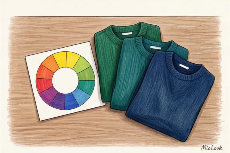
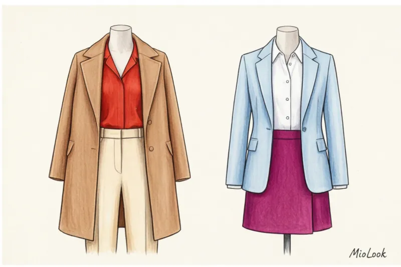
- Monochromatic scheme. Combining different shades of the same color (for example, from light blue to deep indigo) is the quickest way to look classy. Monochrome creates a single vertical line of color that elongates the silhouette and makes you appear taller and slimmer. Life hack: When choosing a monochrome look, be sure to mix different textures (silk with coarse wool, leather with cashmere), otherwise the look will be flat.
- Analogous circuit. Using two or three colors that are adjacent on the color wheel. For example, emerald, aqua, and deep blue. This creates very soft, flowing, and cozy looks. Ideal for everyday workdays and relaxed casual wear.
- Complementary scheme. Colors that are directly opposite each other (for example, blue and orange, burgundy and emerald). This is a tool for directing attention through dynamic contrast. But there is an important limitation here: This doesn't work if you split the colors 50/50. That would make you look like a flag or a sports uniform. Complementary colors should be used in an 80/20 ratio (for example, a navy suit and a pair of orange pumps).
We write more about the mechanics of the circle in the article about Itten's color wheel in clothing.
The "Print Bridge" Theory: How to Link Disparate Shades
Often, wardrobes become filled with "orphans"—perfect pieces that don't have a color pairing. Imagine you have a gorgeous mustard sweater and chic, rich burgundy trousers. They could clash directly with each other, creating a visually overwhelming block.
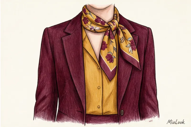
A stylist's secret tool for saving such broken capsules is the "bridge print." This is an accessory or item (a scarf, a blouse, a structured bag with a geometric pattern) whose print simultaneously incorporates both complex colors of your outfit.
As soon as you tie a scarf around your neck that features both mustard and burgundy elements, your brain instantly perceives these colors not as a coincidence, but as a deliberate composition. In my experience, introducing just a couple of such "bridges" increases the compatibility of disparate pieces in a capsule wardrobe by 45%.
Auditing Your Palette: A 15-Minute Checklist
Theory is useless without practice. Today, instead of scrolling through online store feeds, spend 15 minutes auditing your current database.
Here's a step-by-step plan you can implement immediately:
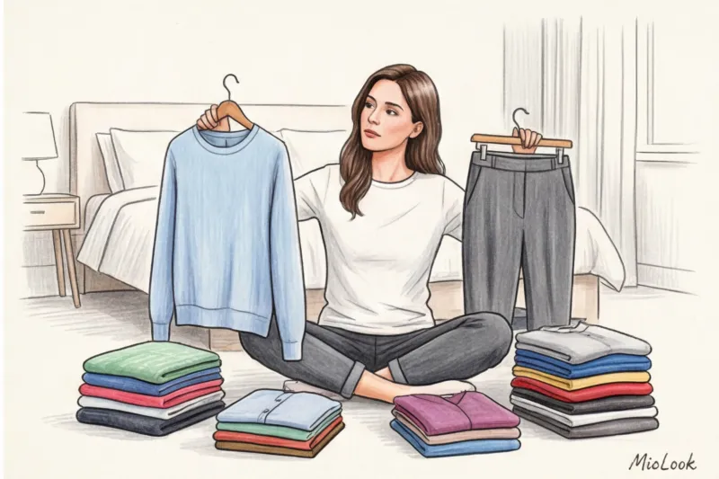
- Step 1: Sort by blocks. Lay out all the season's clothes on the bed. Sort them not by type (skirts to skirts), but by color. Make a pile of blue, a pile of beige, a pile of black. You'll immediately see your true base color (and often it's not what you thought).
- Step 2: Search for "singles". Put aside items whose colors appear only once in your wardrobe. These are your "problem assets." They need to be either integrated through a "print bridge" or considered a failure.
- Step 3: Digitization and analysis. Take a photo of your color blocks and upload them to MioLook AI algorithms will analyze your palette and clearly show you whether the 60-30-10 balance is being maintained, and which 10% of accent shades you need to complete your capsule.
Ready to get started?
Try the MioLook plan for free—no commitment—and get organized in your closet today.
Start for freeBottom line: less color, more variation
The paradox of a stylish wardrobe is that limitations breed freedom. Strict color discipline and avoiding random, emotional purchases don't make your style boring. On the contrary, the limited palette of a capsule wardrobe frees up your morning time and ensures that any item you pick out of your closet will pair perfectly with the rest.
Color is a powerful tool for managing impressions. Choose the right temperature, manage contrast, and delegate the math of color combinations to smart apps. Save yourself only the most pleasant thing—the joy of seeing your flawless reflection in the mirror.


