Over the course of 14 years as a personal stylist, I've recycled hundreds of black turtlenecks and white office shirts. Clients would look at me in horror: "Olena, but these are basics! What am I going to wear with my jackets now?"
Let's be honest. When women ask me, What colors are suitable for a basic wardrobe? , 9 out of 10 expect to hear the fast-fashion marketers' mantra: buy black, white, and, yes, beige. This is the main stylistic trap of the modern era. What works in glossy photos of twenty-year-old models, in real life, mercilessly highlights dark circles under the eyes, wrinkles, and traces of yesterday's deadline on women over thirty.
Creating a wardrobe that works for you, not against you, doesn't start with styles. I discussed the smart capsule philosophy in more detail in our The Complete Guide to a Basic Wardrobe at 30 Today we'll talk about foundation—how to find the perfect shades that will keep you looking fresh and classy even after a sleepless night.
The Black and White Myth: Which Colors Are Really Suitable for a Basic Wardrobe?
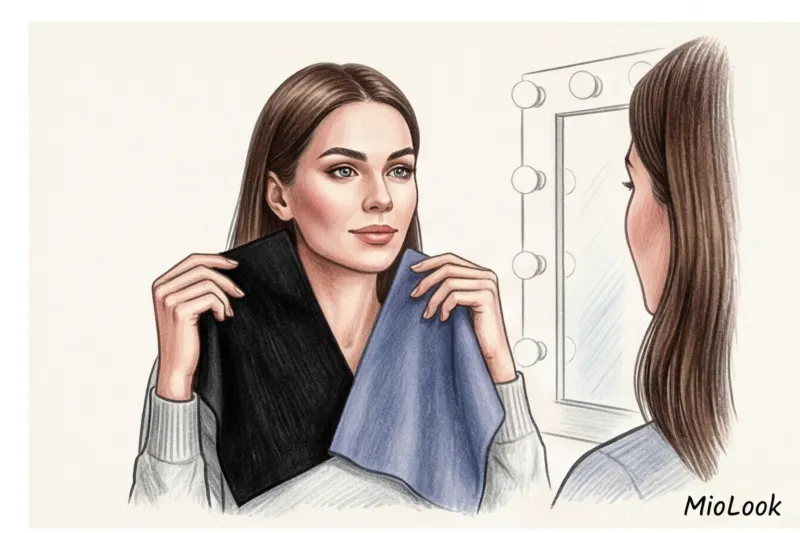
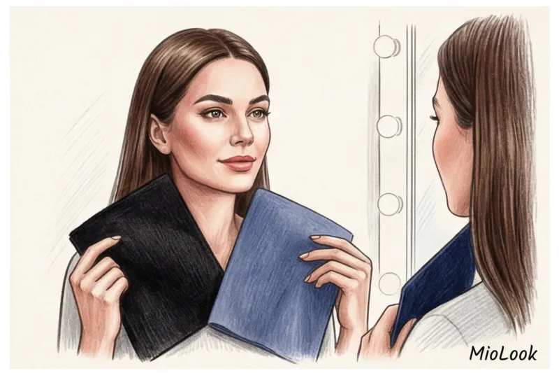
Snow-white and jet-black are the colors of the highest contrast. They are extremely rare in nature. Unless you have the porcelain skin of Snow White and contrasting black hair, these shades will "eat up" your face. Black near the chin acts as a poor reflector—it casts gray shadows on the face, visually adding 5-7 years.
One of my clients, a finance executive, came to me with the question: "I look tired, even though I get eight hours of sleep." Her wardrobe consisted of black suits and white blouses. We simply replaced her black with a palette of "personal achromats"—deep navy (night sky) and dark chocolate, and her crisp white with an ecru shade (milky). At the next board meeting, her colleagues asked if she had returned from vacation. Her face literally lit up.
"Personal Neutrals are sophisticated, muted darks and lighter shades that act as black and white in your wardrobe but complement your appearance perfectly: graphite, taupe, khaki, deep burgundy."
Try MioLook for free
A smart AI stylist will select the perfect look from your items.
Start for freeColour architecture: the 3-2-1 formula for perfect combinations
Wardrobe math is relentless: if your clothes don't color coordinate, you'll regularly experience the "closet full, nothing to wear" syndrome. To help my clients put together outfits without thinking twice, I use the 3-2-1 formula.
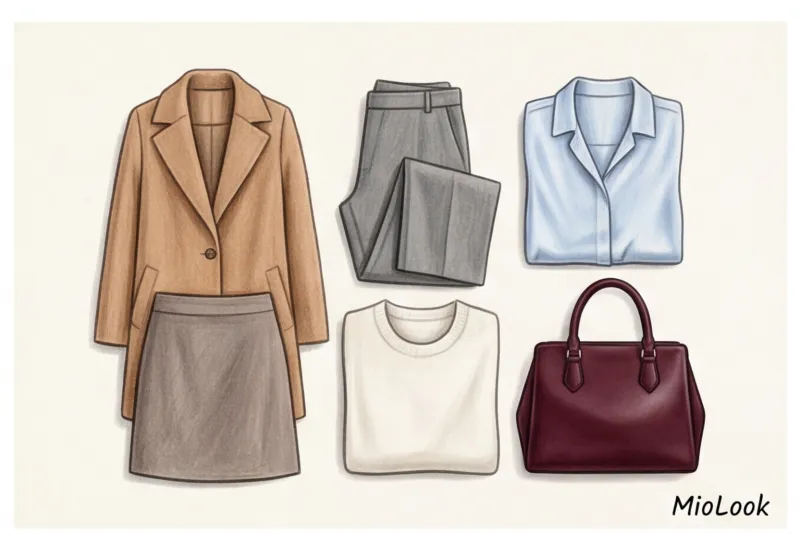
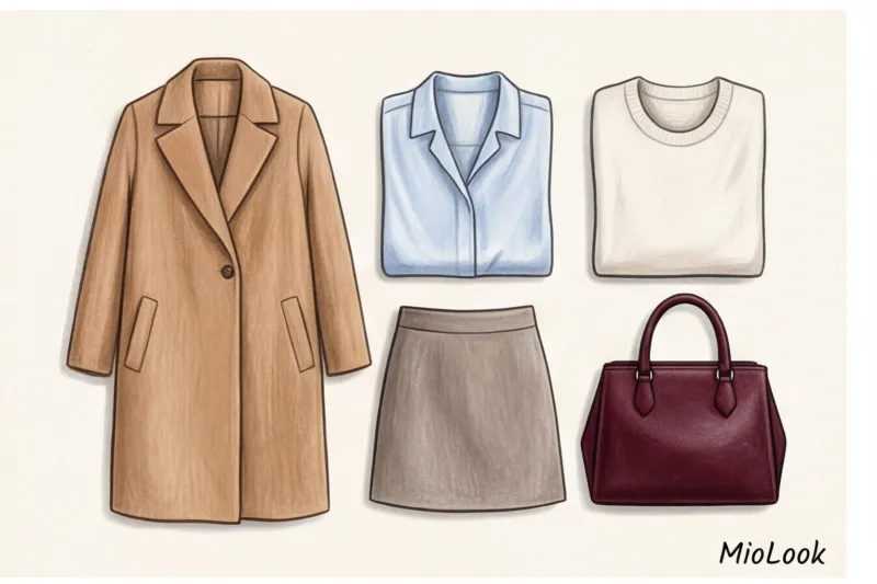
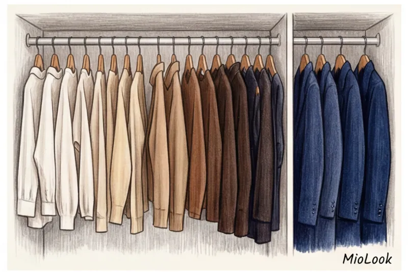
- Three base colors (Foundation). These are the most prized items in your wardrobe: coats, business suits, bags, shoes. Choose your personal achromatic shades for them. For example: camel, navy blue, and ivory.
- Two complementary shades. These include blouses, knitwear, and shirts. Colors that easily blend with the base color. For example: muted blue and soft olive.
- One or two accent colors. Scarves, jewelry, trendy elements, pumps. Here you can indulge in fuchsia, emerald, or leopard print.
Why does this work? A capsule of 12 items, assembled using this proportion, yields over 40 unique, engaging combinations. The increase in variety is 300% compared to random shopping.
The secret to expensive combinations: monochrome and tonality
The easiest way to look like a million without spending a million is to use tonal combinations. According to the analytical agency WGSN (2024), the trend for "quiet luxury" has firmly cemented tonal monochrome as the ultimate status symbol. This is when you dress in a single color, but with a gradient of shades from light to dark.
But there is a strict rule here that fashion bloggers often keep quiet about. Monochrome doesn't work on cheap fabrics. The same beige color in polyester looks flat and dull, but in a mix of textures—a cashmere sweater, a silk skirt, and a leather belt—it creates a deep, luxurious look. If you're on a budget, always go for the texture of the fabric rather than a complex cut.
Temperature and contrast: finding your shades without outdated color type theory
Forget the division into "Winter, Spring, Summer, and Fall." This 80s system is hopelessly outdated and only serves to limit us. Just because you're a Fall doesn't mean you're forbidden from wearing fuchsia for the rest of your life. Modern stylists use a directional approach: we look at temperature and contrast.
There are only two things you need to know about your appearance:
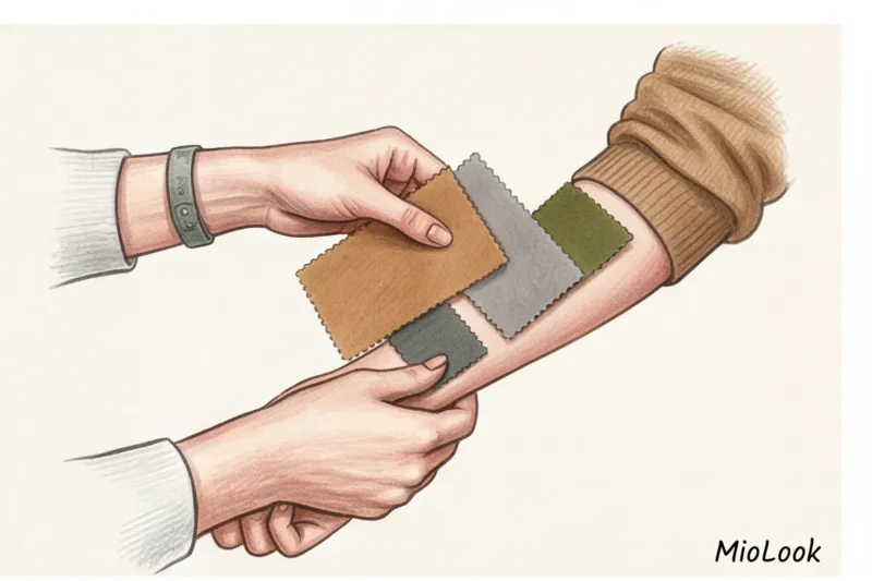
- Temperature (skin tone). Look at the veins on your wrist in daylight. Greenish? You have a warm undertone (your base is camel, khaki, or warm beige). Bluish/purple? Cool (your base is graphite, navy, or cool taupe). If in doubt, a guide to appearance palettes will help you understand the nuances.
- Contrast level. This is the difference between your skin, hair, and eye color. If you're a brunette with porcelain skin (high contrast), you'll look best with bold color blocking and rich hues. If you have light brown hair, light eyes, and a soft skin tone (low contrast), your ideal combinations will be built on smooth gradients and a pastel base.
By the way, it's very easy now to digitize your wardrobe and see how different colors match your appearance. I recommend my clients upload their items to MioLook smart wardrobe — The AI stylist will suggest which shades from your closet create the best contrast.
Your perfect look starts here
Join thousands of users who look flawless every day with MioLook.
Start for freeColor and Status: Wardrobe as a Tool of Influence for Women Over 30
After thirty, clothing ceases to be just a covering. It becomes a tool of non-verbal communication. What colors in business attire inspire confidence? , has long been studied by marketers and psychologists.
A 2022 study by Cambridge University on the psychology of perception in business yielded impressive results. It found that deep navy blue increased trust levels in initial negotiations by 43% compared to a black suit. Black conveys a sense of reserve and dominance, while blue conveys analytical intelligence and reliability.
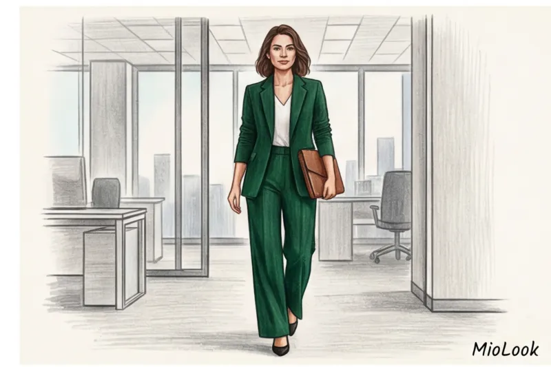
- Burgundy and deep emerald — the colors of hidden power. Ideal for status business image , when you need to show authority without putting pressure on your interlocutor.
- Beige and camel — codes of old money aesthetics. They convey openness, calm, and a high standard of living (because light-colored items require expensive dry cleaning and taxi rides). More on this in the article about Beige as the secret of soft power.
Instructions: How to Safely Introduce New Colors (Checklist)
Let's imagine you've realized that your ideal base color isn't black, but graphite or khaki. How can you remodel your closet without going broke? Be strategic.
- Use the "on behalf of" rule. If you have a favorite blouse that's the wrong shade (for example, too pale), don't rush to throw it out. Just put the color down. Pants, skirts, and shoes don't reflect on your face. The face is your primary concern.
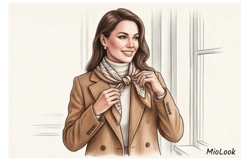
- Use "bridge colors". If you need to wear a jacket in a shade that's not your favorite, tie a scarf around your neck in a print that combines both the jacket's color and your ideal natural shade. The scarf will act as a visual "bridge."
- Color test drive. Never buy an expensive coat in a new color. Start small: buy a top to match the jacket, a belt, or a scarf. Wear it for 2-3 weeks. If you're looking for compliments, invest in a basic outfit.
Fair warning: The "bridge" method doesn't work if the color of the item is completely at odds with your skin tone (for example, a cool fuchsia right next to a girl with a distinctly warm, spring-like undertone). In this case, no scarf will save the look.
Three fatal mistakes when choosing a color palette
According to statistics, 70% of items hanging in closets with tags and labeled "nothing to wear with" were purchased because they were the wrong shade. Here are the three traps we fall into most often:
- Buying a "thing in itself". You see a gorgeous terracotta sweater in the store. You buy it. You bring it home and realize there are no pants or matching shoes. A domino effect begins—to wear one sweater, you need to buy three more. Before buying, always ask yourself: "Can I wear this with the three things I ALREADY have in my closet?" MioLook For example, you can take a photo of an item right in the store and try it on in your virtual closet.
- Ignoring the light in the fitting room. Have you noticed that clothes from the store often look different at home? The artificial yellow light in mass-market stores kills cool tones. Always step out of the fitting room and into the living room (closer to the windows or natural light) to assess the true color of the fabric against your face.
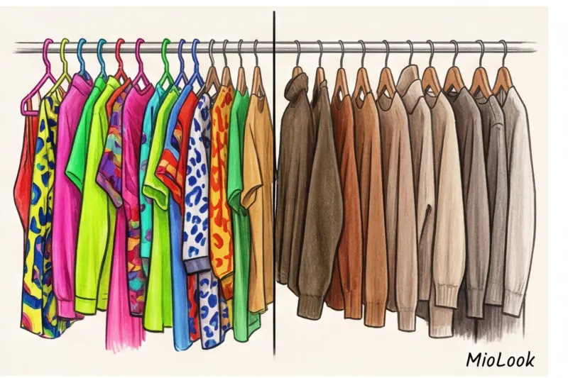
- A wardrobe full of unique features. When your wardrobe consists solely of statement pieces (lots of prints, neon colors), you literally have nothing to rely on. It's like trying to bake a cake with just frosting and forgetting about the layers. Bright colors need to be used in moderation.
Ready to get started?
Try the MioLook plan for free—no commitments required. Organize your closet today.
Start for freeConclusion: Your palette is your personal signature
Smart wardrobe investments always start with color. A well-chosen basic palette isn't a constraint, but an incredible freedom. It's those 15 minutes you save each morning when you simply pick up your pants and sweater in the dark, and they match perfectly.
Let's recap: find your personal achromats (the ones that make your skin look fresher, not grayer), determine your contrast, and build your capsule wardrobe according to the 3-2-1 rule. Your goal this weekend is to open your closet, take out all your black items, and honestly try them on your face in daylight, without makeup. I guarantee you'll make many unexpected discoveries.


