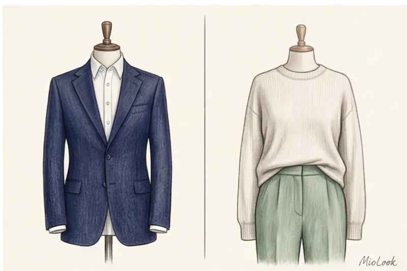


The human brain processes visual information in 0.2 seconds. Long before someone evaluates the perfect cut of your jacket, the cost of your watch, or the quality of your presentation, their subconscious has already made a judgment based on a single factor: color. According to research on visual perception, 70% of first impressions are formed nonverbally. Over 12 years of working as an image consultant, I've seen hundreds of times how well-chosen colors of business style in clothing opened the doors to top management offices, while the wrong ones sabotaged brilliant performances.

We talked about the architecture of the corporate wardrobe in more detail in our The Complete Guide to Business Attire for Women Today, we'll explore the anatomy of color: why rigid uniforms are giving way to complex shades, how to manage distance in negotiations, and why your favorite black suit is likely working against you.
Business Style Colors: Why '90s Armor No Longer Works
Remember the aggressive power dressing of the '90s? Broad shoulders, contrasting ties, bold, loud colors, or a stark, all-black look. This visual armor literally screamed, "I'm in charge, fear me." Today, this approach is hopelessly outdated. According to a large-scale study by the Center for Talent Innovation (now Coqual) on the concept of Executive Presence, modern leadership is conveyed through empathy, confidence, and authenticity, not aggression.
Instead of stark, stark colors (pure red, deep black, dazzling white), complex, dusty, and deep hues have entered directors' offices. They convey a sense of soft power. When you wear a deep caramel or stormy blue suit, you're communicating, "I don't have to shout to be heard."
As research agency WGSN notes in its 2024 report, corporate palettes have shifted toward natural, grounding tones. This is a direct response to the high levels of stress in the business environment. We are intuitively drawn to those whose visual image promises stability.
The Psychology of Color in Business: What Your Suit Says Before You Greet
Color is your nonverbal elevator pitch. It acts like a thermostat, allowing you to regulate the temperature of communication and the distance between you and your interlocutor.
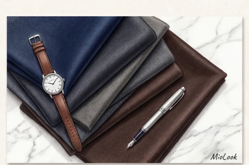
Cool shades (blue, gray, emerald) create a professional distance. They bring the image together, make it more structured, and suggest an analytical mindset. Warm shades (camel, terracotta, chocolate) reduce distance, encourage dialogue, and convey empathy. By skillfully mixing these colors, you take control of the negotiations.
Dark base shades for authority: blue, gray, chocolate
If you need to demonstrate absolute authority without being overbearing, choose the right base. Forget about plain black (we'll get to that later), your arsenal looks like this:
- Midnight blue (dark blue): The color of absolute trust. It works flawlessly in a corporate environment. Unlike black, dark blue has a subtle reflective effect, making the whites of the eyes appear brighter and the face look more rested.
- Graphite and anthracite: Intellectual neutrality. The perfect backdrop for complex negotiations. In a gray suit made of high-quality wool (120S and above), you look like a person who operates on facts, not emotions.
- Dark chocolate: A modern alternative to austere classics, deep brown evokes a sense of security and stability.
Light tones for empathy: ecru, camel, and "quiet luxury"
A light palette is indispensable when you need to win over a team or conduct a mentoring session. However, there's a catch: crisp white often looks cheap or reminiscent of a medical uniform.
"Always opt for ivory (ecru) or pearl shades. They look ten times more expensive than pure white and are incredibly flattering to the skin tone, creating a soft, lit-from-within effect." This is a rule I repeat to every other client.
Beige and camel are great for bridging the gap. But there's a catch: texture is crucial in light colors. Flimsy beige polyester will make you look like a tired housewife. Opt for thick cotton (from 180 g/m²), heavy matte silk, or cashmere.
Your perfect look starts here
Join thousands of users who look flawless every day. Upload your items, and the algorithm will create an office capsule.
Get access — €0.99 onceThe Myth of Black: Why It's Harming Your Career
It's time to dispel the biggest stereotype of the corporate world. "A black suit suits everyone, makes you look slimmer and professional." No, no, and no again. For 70% of Slavic women with a low-contrast appearance, all-black is visual sabotage.

Let's turn to the physics of light. Black is an absolute absorber. When placed near the face, it acts as an anti-reflector, drawing out all the warm pigments from the skin and casting harsh shadows. Even the slightest lack of sleep, dark circles under the eyes, or nasolabial folds—a black jacket will highlight all of these with merciless harshness.
One of my clients, 38-year-old Maria, came to me after being rejected three times for a CFO position. She wore a solid black suit to all her interviews, considering it the ultimate business attire. At the fitting, I put her in a dark chocolate-colored ensemble. The difference was phenomenal: her sickly pallor was gone, her face looked fresh, and her appearance became luxurious. She aced her next interview. Coincidence? Nope. HR professionals interpret fatigue as an unpreparedness for the workload.
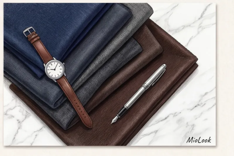
Besides, a mass-market black suit always looks cheaper than a similar blue one. Every speck of dust shows on black, and budget fabric has a telltale sheen. Who can really wear black to the office? Only those with a winter, high-contrast complexion (with porcelain skin and jet-black hair), and only in perfect lighting.
Rules for color combinations in corporate dress codes
To make your wardrobe work for you, it's not enough to buy the right colors. You need to know how to combine them. In the business world, we rely on Johannes Itten's color theory, adapted to a strict framework.
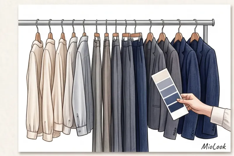
The main tool of influence is contrast control.
- High contrast (eg navy blue jacket + icy blue shirt). Creates a sharp, dynamic image. Ideal for speakers on stage, investor presentations, and situations where you need to dominate. The high contrast attracts attention and keeps the audience focused. Read our article to learn how this works under artificial lighting. about the ideal colors for stage performance.
- Low contrast (monochrome in taupe or grey tones). Conveys calm, self-confidence, and a willingness to compromise. It's an ideal choice for complex one-on-one negotiations where the other person shouldn't feel pressured.
My favorite rule that saves my morning get-ready is the "Three Color Formula." Your outfit should consist of a base color (about 70% of the total area, like a suit), a light companion (20%, like a blouse or top), and an accent (10%, like shoes, a bag, a scarf, or even lipstick). If you have trouble keeping these proportions in mind or want to visualize combinations before buying, try the "smart wardrobe" feature in MioLook — Artificial intelligence will analyze your database and suggest ideal color schemes.
Are bright colors acceptable in business attire: red, emerald, and fuchsia?
Many people are afraid of bright colors in the office, considering them frivolous. But this is a mistake. In business casual settings, the right bright accent becomes your personal marker of success.
Take red, for example. It's a provocative color. I once worked with a top manager who adored red and wore a scarlet jacket to board meetings. The problem was that the jacket had a warm, tomato-colored undertone. Subconsciously, warm red connotes aggression and danger. We replaced it with a cool ruby (with a blue undertone). The tension in the meeting room noticeably decreased, and her leadership status was maintained.
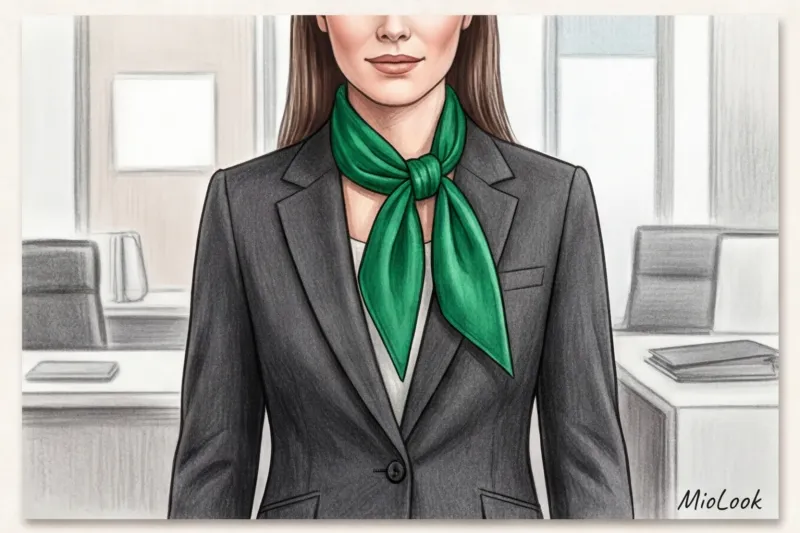
The safest way to incorporate color is to use a precious palette: emerald, sapphire, ruby, amethyst. Historically, these colors are associated with aristocracy and wealth. They add depth to the image without disturbing the corporate hierarchy.
Localization rule: If you're unsure about color, keep it away from your face. Consider a sophisticated burgundy-hued pairing with a neutral graphite top. Or use subtle accents. I once paired a lawyer client's formal, almost masculine gray suit with an emerald silk square scarf. This single detail shifted the emphasis from "dry functionary" to "high-end and successful expert."
Access to MioLook for €0.99 — one-time payment
A smart AI stylist will select the perfect look for you, taking into account your color type and dress code.
Get access — €0.99 onceChecklist: How to integrate natural colors into business attire
To put this theory into practice, you need to align your corporate palette with your natural features. Here's a step-by-step guide based on these principles. seasonal color analysis:
- Determine the temperature of the exterior. Look at the veins on your wrist in daylight. Blue-violet veins indicate you're a cool type (your base colors are graphite, marengo, and sapphire). Greenish veins indicate you're a warm type (your base colors are chocolate, pine, and terracotta).
- Replace black with your ideal dark. Choose the deepest shade from your palette (like deep aubergine or aquamarine) and use it as the base for suits and skirts.
- Find your "white" shirt. This is a critical point. The color of the blouse next to your face shouldn't be whiter than your teeth or the whites of your eyes. Otherwise, your teeth will appear yellowish and your eyes will look tired. Your choices are milky, ivory, or unbleached linen.
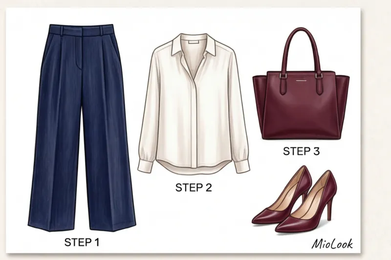
- Assemble the micro capsule. The basic minimum to start with: 2 suits in basic dark colors, 3-4 blouses/tops in light shades and 1 accent item (jacket or skirt in a precious shade).
Strategic Summary: Your Personal Color Code for Success
Color in your business wardrobe isn't a tribute to boring HR rules. It's an investment in your personal brand and a powerful tool of influence that works for you every second you're in the office.

Ditching the standard black and embracing sophisticated, basic shades instantly sets you apart from your colleagues, projecting competence and class. I highly recommend auditing your work wardrobe this weekend. Pull out everything you wear to work and honestly ask yourself: which colors make you feel rested and accomplished, and which make you look like you've been in the office for 48 hours without sleep?
Keep only those shades in your closet that work for your career, not against it. After all, you deserve to look as impeccable as your professionalism.