You know what question I hear most often from new clients? "Isabella, how can I avoid dying of boredom in this gray-and-black office hell, yet still be taken seriously?" Many still believe that professionalism is measured by the dullness of your jacket. And most online articles offer the same, teeth-grindingly banal advice: "Just wear a bright silk scarf around your neck."
Let's forget about these outdated cliches. We've already discussed the basic rules in more detail in our The Complete Guide to Business Wardrobe for Women , but today I want to take the game to a whole new level. I call it the concept of Mediterranean corporate aesthetics. We'll use business attire colors not as a timid accent, but as a tool of "Soft Power," where complex, deep hues work in perfect tandem with the texture of the fabric.
The End of the Gray Era: How Business Attire Colors Reflect the Concept of Soft Power
Think back to the '80s and '90s: women were breaking through the glass ceiling, donning exaggerated shoulders and aggressive power dressing. We literally hid behind tough, dark armor, trying to visually mimic a male leadership style. But the rules of the game have changed.
At recent Milan and Paris fashion weeks—especially at The Row and Jil Sander—I observed a striking shift. Designers are incorporating color into "relaxed tailoring" en masse. Physical and psychological comfort has become synonymous with productivity. You can't negotiate effectively if you're uncomfortable in your clothes.
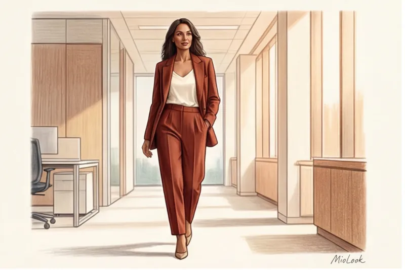
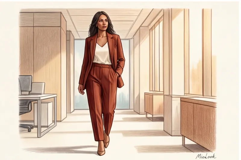
The Mediterranean approach to business style is one of relaxed, confident elegance. It's the ability to wear a suit as if you were born in it. And color is the primary conveyor of your inner confidence. A woman who walks into a conference room in an impeccably tailored burnt terracotta suit sends the message: "I don't have to shout to be heard."
The Biggest Myth of Color: Why Black Is the Worst Choice for an Office Base
"Black is the safest and most professional choice for the office." I'm willing to argue with that statement. After 12 years as a stylist, I've learned that black is the most insidious color in a corporate wardrobe.
Firstly, black on cheap or blended fabrics instantly betrays the low quality of the garment. It becomes shiny, collects lint, and looks flat. Secondly, let's remember the physics of light. Standard office lighting (fluorescent lamps with a temperature of 4000K-5000K) produces a cold, unforgiving spectrum. When paired with a black jacket near your face, this light creates an optical illusion: it highlights every dark circle under your eyes, deepens nasolabial folds, and visually adds five years to your age.
I had a client, a top manager at a large IT company. She had been wearing solid black for years, considering it her uniform. During our first consultation, we replaced her black jackets with shades of dark chocolate and navy. A month later, she got a promotion. She says her colleagues began asking her for advice more often. Why? Research into the psychology of color shows that solid black creates an insurmountable distance and blocks empathy, while deep blue or warm brown evoke subconscious trust.
Try MioLook for free
A smart AI stylist will select the perfect office capsule wardrobe based on your appearance and dress code.
Start for freeThree-tier architecture: how to implement the right business attire colors
For those accustomed to a gray-black palette, a sudden shift to color can be a source of panic. My signature technique involves a three-tiered wardrobe architecture. The key rule to remember is to abandon pure, open colors (like those in Itten's children's circle) in favor of complex, dusty, or deep shades. Pure red in the office is aggressive. Muted burgundy conveys status.
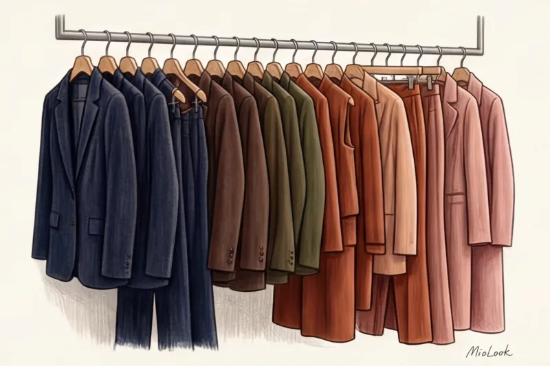
Level 1: "New Neutrals" for the Costume Group
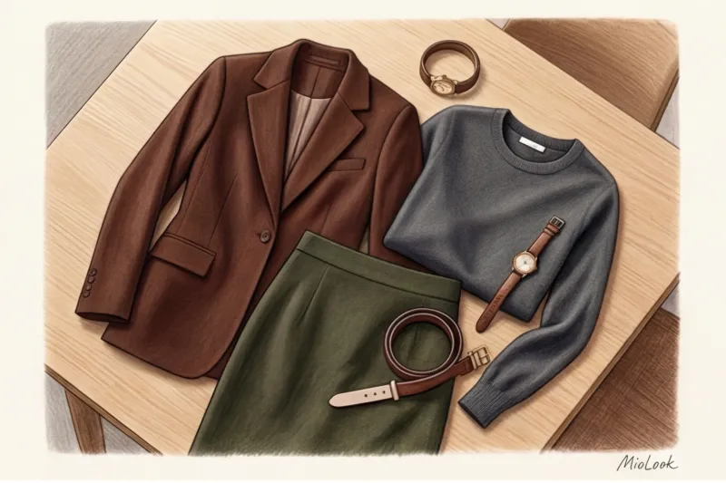
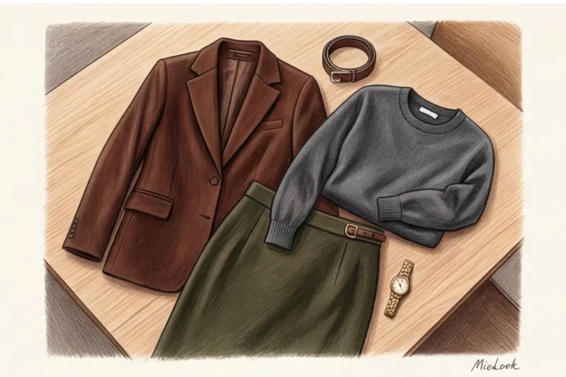
Your base doesn't have to be just gray and black. Camel, taupe, dark olive, and marengo are excellent alternatives. These colors pair beautifully with classic tailoring.
Imagine a loose-fitting pantsuit. In black, it looks like a security guard's uniform. But the same suit in dried sage instantly transforms you into an art director or an upscale consultant. These shades enhance the visual value of a garment, even if it's purchased at a high-street store like COS or Massimo Dutti.
Level 2: Soft Power Shades for Blouses and Knitwear
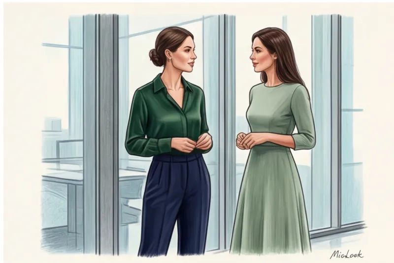
These are the items that are placed in the so-called "portrait zone" (near the face). They are the ones that absorb the brunt of office lamps. Terracotta, muted emerald, wine, and dusty rose shades work perfectly here.
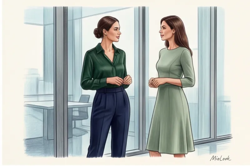
If your suit falls into the "new neutrals" category (like graphite), the blouse can take on a starring role. We discussed how to choose a shade to suit your complexion in more detail in the article. Business wardrobe by color type One basic rule: if you have a warm undertone, choose mustard or peach; if cool, choose dusty blue or emerald.
Level 3: Microdosing Color Through Statement Shoes and Accessories
For the most conservative dress codes, color can be introduced in homeopathic doses. Bags, belts, silk scarves (not the 2000s flight attendant style, but tied to a bag or wrist), and loafers.
Burgundy, mustard, and cobalt are the perfect trio for leather accessories. And please, let's forget about "classic red pumps" forever. It's an outdated cliché from 2000s TV shows. Replace them with dark chocolate loafers or pointed-toe slingbacks in a deep wine color.
A Stylist's Secret: How Fabric Texture Dictates Color Rules
Now, some insider information that distinguishes a professional stylist from an amateur. Color doesn't exist separately from material. The same pigment on different fabrics conveys two completely different messages.
Take, for example, a rich burgundy. On high-quality wool or heavy cotton (180 g/m² and above), it looks elegant and expensive. Why? Because the matte surface absorbs light, "calming" the color, making it soft. But apply the same burgundy to cheap polyester satin or even natural but overly glossy silk, and the color will become overpowering. Glossy fabrics reflect light, doubling the color's intensity, which can often look vulgar in an office setting.
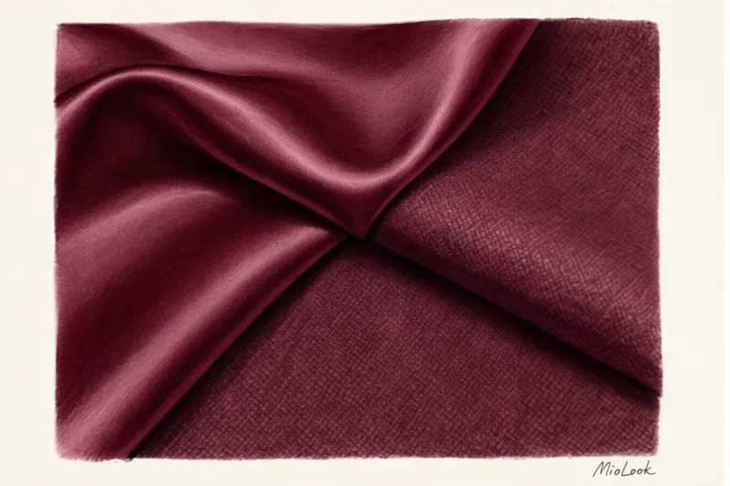
But there's a catch: when you mix different textures of the same color, a monochrome look of a matte silk blouse and heavy wool trousers in the same shade (for example, navy blue) is the height of style. The difference in texture creates a depth that's impossible to achieve with a ready-made suit made from a single fabric.
Adaptation to dress code: from Business Formal to Smart Casual
Of course, the advice above isn't universal. My experience shows that the wardrobe of a bank lawyer and a product manager at an IT startup are two different planets. How can you adapt the colors of your business attire to your specific situation?
- Business Formal (Conservative): Banks, law firms, the public sector. Bright experiments don't work here. Dark, very deep shades and interplay of tones are your way. Inky blue (almost black, but with a blue tint), dark eggplant, deep chocolate. You don't break the rules, but you look like a million bucks.
- Business Casual (Traditional): Management, consulting, marketing. Here, expanding the palette is acceptable. Use pastel colors (light blue, pistachio) and prints. A subtle colored check on a gray jacket or houndstooth in brown and blue tones is a great way to introduce color legally.
- Smart Casual (Creative): IT, media, and design. Color blocking (a combination of large color blocks) and bright, relaxed-cut suits are acceptable here. But remember texture: vibrant colors require a flawless, matte fabric.
Your perfect look starts here
Join thousands of users who look flawless every day with MioLook. Upload your wardrobe and get ready-made color combinations.
Start for freeThe 60-30-10 Formula: Your Practical Checklist for Incorporating Color
According to the PANTONE Institute, which released its 2024 corporate color report, a modern business palette requires a mathematical approach. To avoid overdoing it and becoming a parrot, I always use the 60-30-10 rule with my clients. This is a classic interior design rule that works phenomenally well in styling.
“The perfect color balance in an image is not an accident, but a clear proportion: 60% base, 30% complement and 10% accent.”
How does this work in practice? Let's put together an image for tomorrow morning:
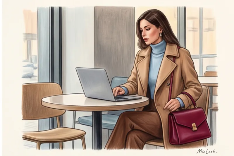
- 60% - Base color (New neutral). This is your base. For example, a pantsuit or a trench coat in a camel shade. It takes up most of the visual space.
- 30% - Additional complex shade. Something that supports the basics but adds life. For example, a soft blue cashmere sweater under a suit.
- 10% - Accent color. A flash of color that brings the look together. A rich wine-colored bag or terracotta loafers.
You don't need to completely change your wardrobe to start looking different. Business attire colors are simply a tool that should work for you, not you for it. Tomorrow morning, when you open your closet, simply put aside your usual black jacket. Choose a shade that communicates your confidence, competence, and taste even before you utter your first word in the meeting.


