Three years ago, I witnessed a true visual disaster in a Parisian studio. The CEO of a major fintech company showed up for a portrait shoot wearing an impeccable, custom-tailored jet-black Tom Ford suit and a crisp white shirt. In person, he looked like James Bond. But when the photographer took the first test shot against a dark gray background, a "flying head" appeared on the monitor. The black jacket completely merged with the background, losing its lapels and texture, and the white shirt turned into a glowing, radioactive blob, drawing all the attention away from the face.
It was then that I was once again convinced: camera optics and the human eye perceive reality completely differently. When deciding, What color clothing should I choose for a business photo shoot? Most experts rely on trivial online advice like "blue for trust." But they forget the most important thing: the physics of studio lighting. We've already written in more detail about choosing styles and posing in our A complete guide to looks for a business photo shoot , and today I propose to analyze the wardrobe through the prism of the camera matrix and the psychology of perception.
The Physics of Light and Color: Why Cameras See Colors Differently
When you walk into a photo studio, the rules of casual style cease to apply. You're exposed to 500 joules of pulsed studio light. What happens to your clothes at that moment?
Firstly, a powerful flash literally knocks up to 20% of the color saturation out of the fabric. That deep sapphire hue that seemed perfect in the dimly lit fitting room will appear as a washed-out blue-gray in the original photo. A camera has a limited dynamic range (usually 12-14 stops), and it physically can't capture color as vividly as the human retina.
Secondly, there's the issue of color reflections. One of my clients insisted on wearing a neon orange jacket to "stand out in the feed." The result? The bright fabric acted as a reflector, casting a persistent carrot-colored glare on her chin, neck, and lower cheeks. Her skin acquired an unhealthy yellowish tint that the retoucher spent hours removing. The color rendering index (CRI) of studio lights is unforgiving to neon and pure fuchsia.
The White Shirt and Black Jacket Trap
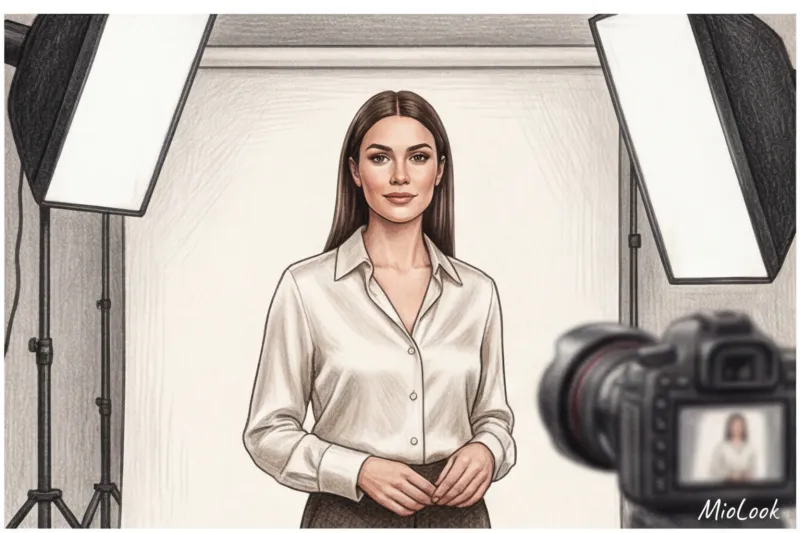
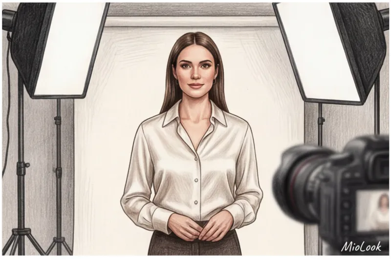
The most pernicious myth of business dress codes is the belief that the "white top, black bottom" combination is universal and safe. In fact, pure white is the worst choice for a business portrait.
- White creates clipping (overexposure). The camera's sensor can't handle the brightness of white fabric under the flash. The fabric loses its texture, and the seams and buttons disappear, leaving a flat white spot.
- White makes teeth yellow. Against the background of a snow-white collar, the whites of your eyes and tooth enamel will always appear slightly yellowish.
- Deep black absorbs volume. Black absorbs light. If you're wearing black, the viewer won't see the luxurious texture of your Super 150s wool—they'll see a black hole.
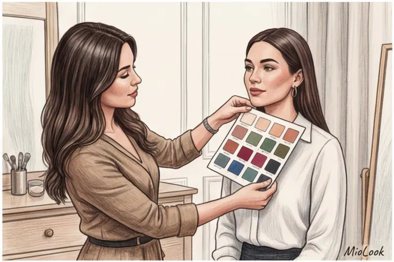
"Professional stylists never use pure white or deep black on shoots. We always use midtones: instead of white, we use ivory, pearl, or ecru. Instead of black, we use anthracite, graphite, or deep navy blue."
Try MioLook for free
A smart AI stylist will select the perfect look and color palette specifically for your next photo shoot.
Start for freeThe Psychology of Color in Photography: How to Create Impressions Without Words
Social media users and HR professionals spend exactly three seconds evaluating your photo. Before they even read your polished resume or expert post, their brains have already calculated the archetype conveyed by the color of your clothing. This unconscious process is brilliantly described in Angela Wright's color theory (Color Affects System).
Color temperature creates distance between you and the viewer. Cool shades (blue, steel, emerald) create a status-based distance. You appear more authoritative, unapproachable, and objective. Warm shades (beige, terracotta, caramel) reduce the distance, inviting dialogue. In my experience, one speaker's switch from a formal dark gray jacket to a warm terracotta one completely changed the tone of the comments under his YouTube interview—the audience stopped calling him a "hard-edged snob" and began perceiving him as a "deep, empathetic analyst."
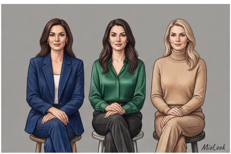
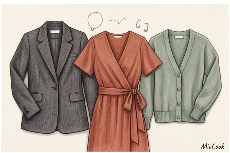
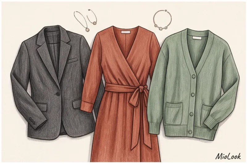
Blue, grey and beige: the new business base
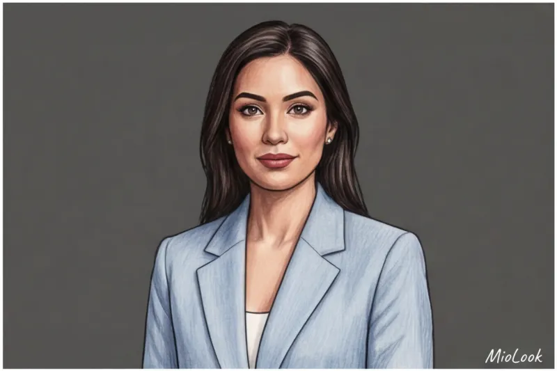
When in doubt, choose Navy This is the absolute standard of trust, logic, and expertise in the corporate world. It suits 90% of appearance types and performs flawlessly under studio lighting, maintaining a refined appearance.
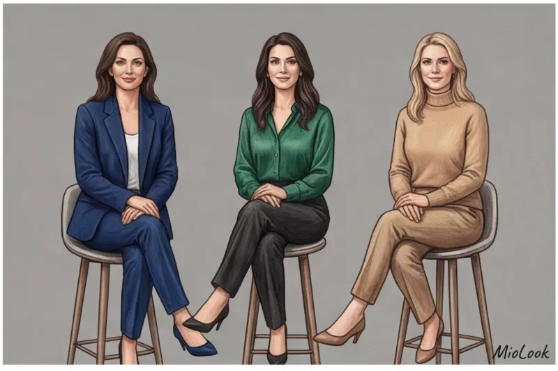
Gray is also a good color, but it can create a "mousy" effect. Smooth light gray polyester will cheapen the look. Gray only works with texture: choose thick wool, tweed, or flannel. Beige and camel, however, are great for creating an "approachable expert" look. It's a "quiet luxury" aesthetic that says, "I'm successful, but I'm also approachable."
Red and emerald: the colors of power and energy
Red is a statement color. In portraits, it can come across as overly aggressive, literally screaming, "I'm in charge, obey." Use it sparingly. For example, a silky red top under a structured graphite jacket will convey your energy without overstepping the viewer's boundaries.
Emerald and deep green (bottle green) are the secret weapon of top managers. They are associated with financial well-being, calm confidence, and growth. Technically, this color is perfectly captured by camera sensors, making skin tone appear fresher.
What color clothing to choose for a business photo shoot depending on your niche
There's no single "right" color for everyone. When deciding what color to wear for a business photo shoot, you should first ask yourself: "What is the main emotion I am selling?"
Finance, law and top management
Your currency is security, stability, law, and asset protection. A client should look at a photo and understand: this is someone they can trust with millions. Your palette should be deep and substantial. Deep blue, graphite, cool brown (dark chocolate), and elegant burgundy work well.
Creative industries, marketing and IT
Innovation, unconventional thinking, and dynamism are all showcased here. A formal blue suit at an IT startup would look like the uniform of an alien from the last century. You need colors that convey a flexible mind: terracotta, mustard, sophisticated purple, or stylish monochrome combinations (like all-gray) with a single bright accent.
Helping practitioners: psychologists, coaches, doctors
Your values are empathy, healing, trust, and non-judgment. Harsh contrasts (black and white) or aggressive red are inappropriate here—they create a barrier. Recommended palette: pastels, dusty rose, sage green, warm beige, soft peach.
By the way, if you're unsure which soft shades suit your complexion, it's directly related to your natural coloring. I recommend checking out our a guide to 12 color types of appearance And to avoid racking your brains in front of the closet, you can always use MioLook — Upload your items to the virtual wardrobe, and the app will automatically create harmonious outfits in the desired color temperature.
Ready to get started?
Try the MioLook free plan—no commitments required. Artificial intelligence will analyze your appearance and select flattering colors.
Start for freeContrast between appearance and background: the rule of three tones
A LinkedIn study (2024) revealed an interesting statistic: profiles with photos that have the right tonal contrast between the background and the subject receive 14% more clicks and offers from recruiters. Your image doesn't hang in a vacuum—it interacts with the studio backdrop.
Remember the golden formula for the perfect shot: Background + Clothing + Appearance = balance of contrasts.
The main rule for separating from the background is: your clothing should be at least two shades lighter or darker than the cyclorama. If the photographer places you against a dark gray background, and you're wearing a dark gray jacket, you'll disappear. In this case, only a reflective texture (like thick silk) can save you, catching the light and outlining your silhouette.
Important clarification: This rule doesn't apply to conceptual fashion shoots, where blending into the background is a deliberate artistic technique. But for a classic business portrait, where the main goal is to show the expert's face and status, blending into the background is an absolute no-no.
Prints and Patterns: Why Solid Colors Always Win
Ask any professional retoucher what they hate most, and they'll answer with one word: moiré. The moiré effect is an optical artifact that occurs when a fine, rhythmic pattern on fabric (stripes, checkered patterns, houndstooth) is superimposed on the pixel grid of a camera's sensor.
As a result, your beautiful blouse or expensive jacket will develop colored gasoline stains and a visual ripple that literally makes the viewer's eyes water. Removing this in post-processing is extremely difficult, and sometimes impossible, without losing the texture of the fabric.
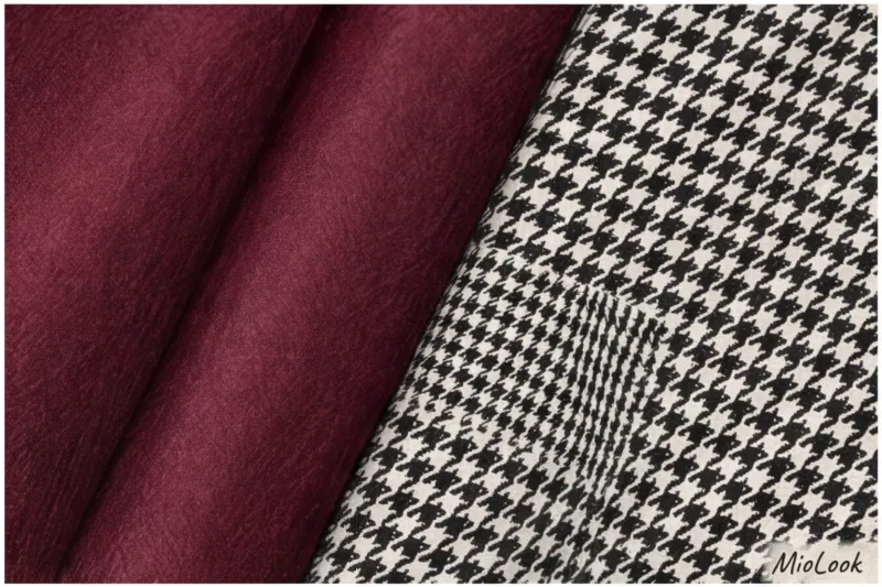
Besides the technical flaws, there's also the psychological aspect. Any bold print draws attention to itself. The viewer focuses on the flowers on your dress, not your eyes. The only acceptable exceptions for a business shoot are large, clearly visible geometric patterns (for example, a wide, contrasting stripe on a shirt) or a low-contrast Prince of Wales check on a dense, matte wool that doesn't distort.
Checklist: How to Test Clothing Color Before a Studio Photoshoot
To avoid any unpleasant surprises on the big day, crash-test your looks at home. Over 12 years of working as a stylist, I've developed an algorithm that saves my clients both stress and money:
- Flash test in the dark. Put on your chosen item, go into a dark room (for example, a dark bathroom), and take a selfie with the flash. You'll immediately see if the fabric becomes treacherously transparent or has a cheap, synthetic sheen.
- Test on a face without makeup. Apply the cloth to your face in daylight, after removing your makeup. If the color "dims" your appearance, highlights dark circles under your eyes, or makes your skin look sallow, it will look three times worse in a studio under harsh lighting.
- Synchronization with the photographer. Send reference photos of your outfit to the photographer in advance. They should know what kind of backdrops (paper or fabric) to prepare for your arrival.
- The understudy rule. Never show up to a shoot with just one look. Bring at least two: one dark and dense, the other light and refreshing.
The color of your clothing in a photograph is your silent spokesperson. It begins to sell your expertise seconds before the client even reads your name. When choosing a palette, avoid the extremes of pure white and black, consider the physics of studio lighting, and remember: the ideal color isn't the one that's currently trending, but one that makes your face look well-rested and conveys a compelling image.


