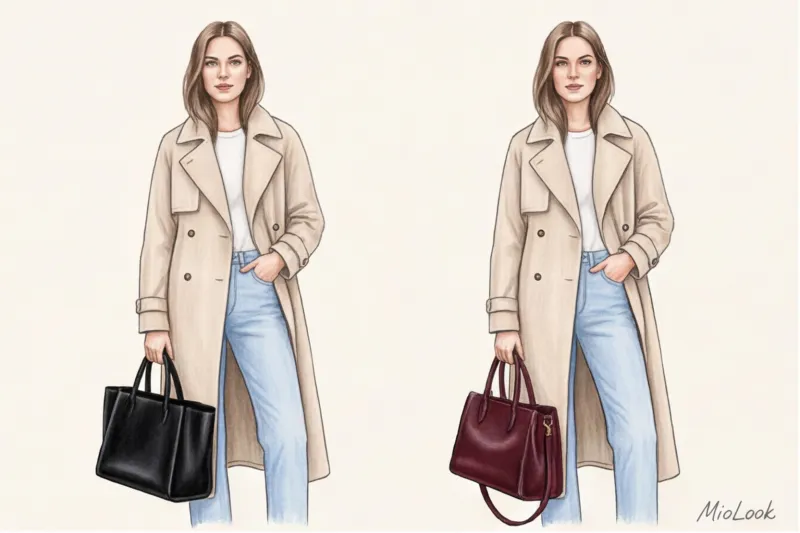

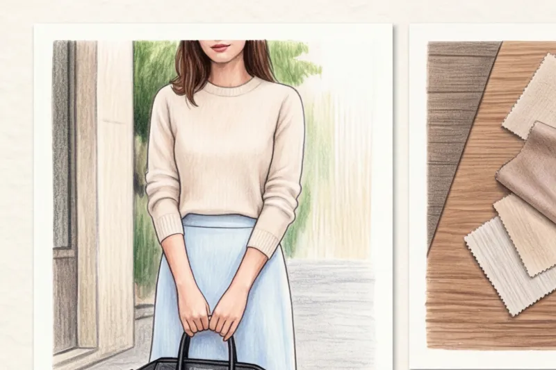
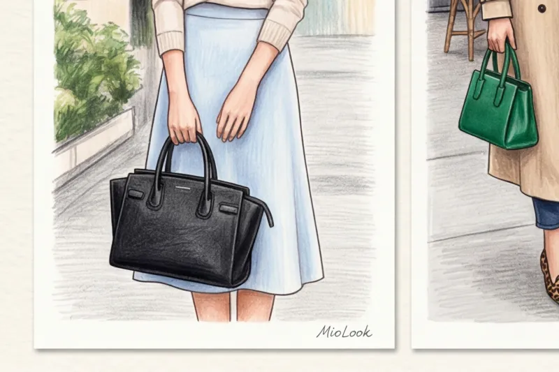
Let's be honest: how many times have you read advice in glossy magazines along the lines of "just buy a nice black bag and classic beige pumps, and they'll go with everything"? If you've tried putting this rule into practice, you've probably noticed something odd. You put on a luxurious beige trench coat, grab that "universal" black bag, and suddenly the look falls apart. The bag looks like a heavy weight, and the whole outfit loses its luster.
Over 14 years of working as a personal stylist, I am convinced: the ideal color of basic accessories — it's not black at all. It's a color that mathematically precisely matches the temperature and contrast of your personal capsule. We talked in more detail about what a collection should consist of in our The complete guide to essential accessories for women Today, I want to revolutionize your understanding of color palettes and introduce you to the concept of "color neutrals," which will make your wardrobe truly luxurious.
Why Black and Beige Are No Longer the Universal Color for Basic Accessories
One of the most memorable cases in my practice involved a client named Marina. She spent a substantial amount of money on a classic, structured Chanel-style bag—in black, naturally, to "make the investment worthwhile." But the problem was, Marina's wardrobe consisted of oat-colored linen suits, pastel silk blouses, and light denim. Every time she picked up the bag, the black stain would brutally cut into her silhouette.
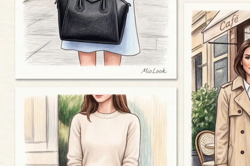
Black is the most overrated color for accessories. It's an optical illusion: against a light or soft background, black looks not like a neutral base, but like a black hole, stealing the show and visually weighing down the look (especially when paired with black shoes and light-colored pants).
Beige isn't easy either. Perfect nude pumps that blend with the skin and elongate the legs only work when your legs are exposed. But pair them with thick gray tights or dark trousers, and they become awkward, light-colored spots that clash with the rest of your outfit.
How black can cheapen an image
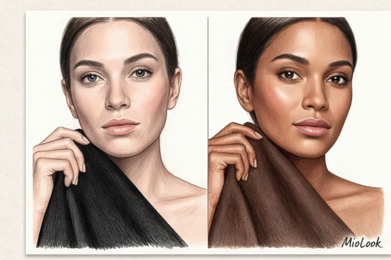
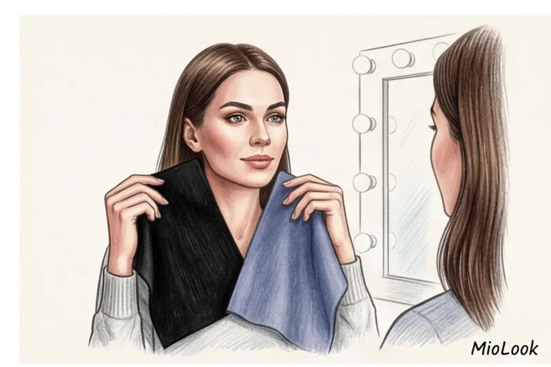
Back at the beginning of the last century, art theorist Johannes Itten demonstrated the influence of color temperature on our perception. And his coloristic principles work flawlessly in styling. Pure black is considered an extremely cool and contrasting color. Statistically, it suits only 15-20% of women perfectly (primarily those with a vibrant "Winter" color type).
If your wardrobe is built on natural, warm, or muted tones, smooth black leather paired with soft knits will create a "dirty" effect. Against the black backdrop, your pieces will appear washed-out or faded, and the look will lose that effortless casualness we all strive for.
Access to MioLook for €0.99 — one-time payment
A smart AI stylist will select the perfect look based on your appearance and wardrobe.
Get access — €0.99 onceThe Perfect Base Formula: How to Choose a Color to Match Your Wardrobe
To make your accessories work for you, not against you, you need to define your closet DNA. It will take exactly five minutes. Pull out your most favorite, frequently worn clothes (or open a virtual wardrobe if you've already digitized your items). MioLook ) and answer two questions:
- What is the prevailing temperature? Warm (beige, peach, khaki, gold) or cool (gray, blue, fuchsia, silver)?
- What is the contrast level? Are these soft, dusty tones (as if they had a drop of grey added to them) or pure, ringing colours (color block)?
The "three main colors" rule, taught in European styling institutes, states: identify the three dominant colors of your everyday clothing. Your base accessory should either be related to one of them or complementary (opposite on the color wheel, but of the same temperature).
The "Color Neutral" Method from Stylists
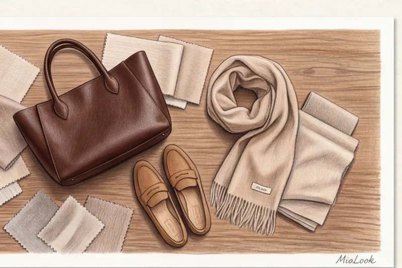
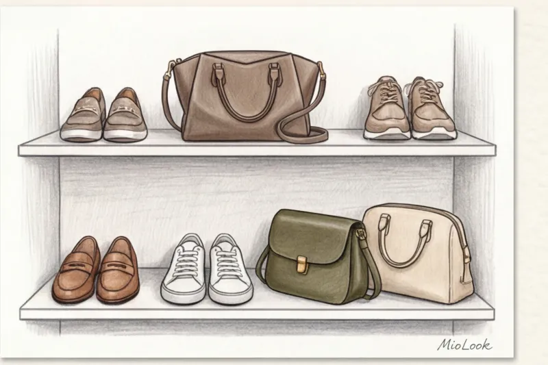
Instead of flat black, I always offer my clients "color neutrals." These are deep, complex, darkened shades that the brain reads as basic, but the eye perceives as more refined.
"Color neutrals are the secret code of old-money style. Shades like dark chocolate, deep olive, or graphite offer the same versatility as black, but they avoid stark contrasts and make any piece, even an inexpensive one, visually richer."
Formula Cost Per Wear (the cost per entry), which WGSN analysts often write about, proves that a bag in a complex cognac shade that perfectly ties together your jeans and trench coats ultimately has a much lower cost per entry than a black “universal” model gathering dust on the shelf.
Alternative base shades that work better than black
According to Lyst, searches for accessories in chocolate and espresso shades increased by 47% in 2024, displacing classic black. Let's explore how to replace your outdated wardrobe staples based on your closet's temperature.
For a warm wardrobe (fall/spring):
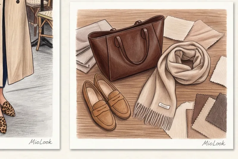
- Dark chocolate and espresso. The perfect alternative to black. It looks softer and pairs perfectly with denim and beige tones.
- Cognac and caramel. A classic example: cognac loafers + blue jeans + a white shirt (preferably made of heavy cotton over 180 g/m²). This works flawlessly thanks to the contrast of warm and cool complementary colors.
- Olive. Works amazingly with grey, white and the whole range of brown tones.
For a cold wardrobe (winter/summer):
- Graphite (dark grey). If you can't live without monochrome dark looks, graphite will give the same severity without killing the texture of the fabric.
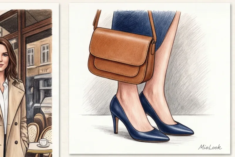
- Deep blue (navy). The color of elegance. A blue structured bag looks much more prestigious than a black one.
- Taupe (grey-brown). The king of complex shades. Adapts to both gray and beige items.
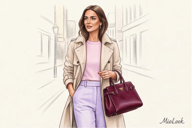
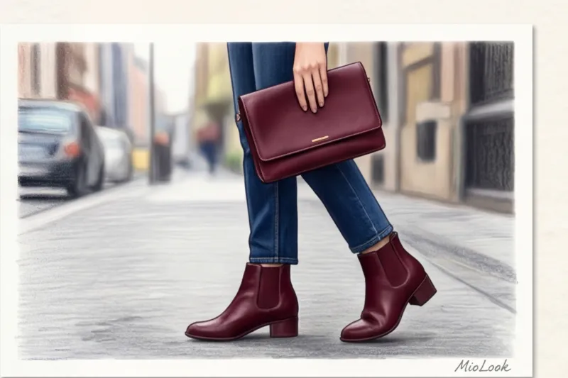
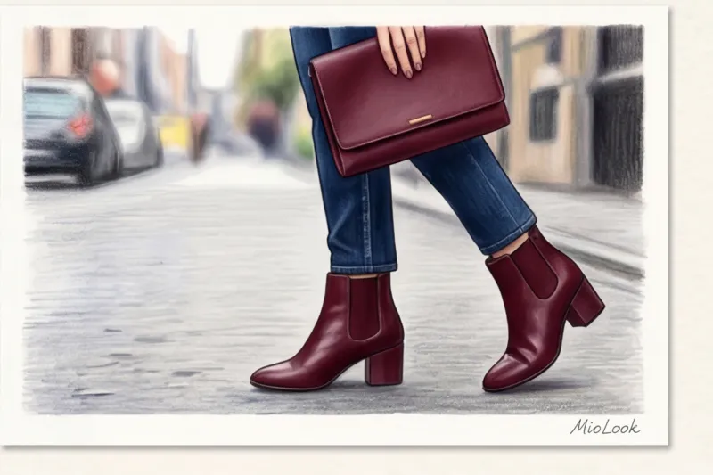
- Burgundy (wine). My personal favorite: wine-colored shoes with a dark gray suit—it's the ultimate styling statement.
If your clothes are predominantly light, forget about crisp white bags and shoes (they often look cheap and plasticky). Your options are off-white, ecru, undyed linen, or light gray.
Your perfect look starts here
Join thousands of users who look flawless every day with MioLook.
Get access — €0.99 onceCan a bright accent become your personal base?
Yes, it can. And it's one of the most underrated techniques. The concept signature color (signature color) works great if your core wardrobe consists of extremely minimalist pieces. I picked up this trick from my Parisian clients: for a French woman, red lipstick and a red crossbody aren't a party accent, but an everyday uniform, worn with a gray sweater and tousled hair.
You can make a base with leopard ballet flats or an emerald tote bag. But there is an important limitation here when this DOES NOT work: Your clothes should be free of complex cuts, ruffles, bold prints, and rhinestones. The accent piece itself should have a crisp, simple form, minimal hardware, and impeccable quality materials.
Combination rule: should the bag and shoes be the same color?
I still meet women who firmly believe in the 2000s rule: "your bag, shoes, and belt must be the same material and exactly the same color." As a practicing stylist, I can say this is the surest way to add 5-7 years to your age. Stiff styles look like you tried too hard.
When a client comes in for a wardrobe review with ready-made outfits from one store, the first thing I do is break down the pairings. Modern pairing schemes are more subtle:
- Related shades. For example, the shoes are dark chocolate colored and the bag is caramel colored.
- Single temperature. Navy loafers (cool) plus graphite bag (cool).
- Unification through invoice. Khaki suede ankle boots pair perfectly with a smooth wine-colored leather bag (both shades are muted and natural).
The only time an exact color match is justified is when there is a strict corporate dress code (traditional business) or when creating a continuous color vertical line to visually elongate the figure (when trousers, shoes, and a bag merge into a single line).
Ready to get started?
Try the MioLook plan for free to manage your wardrobe smartly—no commitments.
Get access — €0.99 onceChecklist: Auditing Your Accessories Collection
Enough theory, let's get practical. Here are some concrete steps you can take right now. Go to the hallway and open the closet.
- Assess the "shoulder" base. Get out your most frequently worn outerwear (coat, trench coat, jacket) for the current season.
- Merge test. Place your everyday bag against your sleeve. If it's a black bag against a soft beige trench coat, you'll immediately notice the stark, unnatural contrast—the bag "takes on a life of its own."
- Finding the missing link. Determine which shade of "color neutral" you're missing. If your outerwear is cool gray, you need a bag in graphite, taupe, or burgundy. If it's warm, look for caramel or olive.
- Bold cleaning. Get rid of those black bags and shoes you wear "out of desperation," simply because "they go with everything." If something doesn't make you happy, it doesn't work.
Summary: Putting together your perfect palette
The color of your basic accessories isn't a truism from a fashion magazine, but a logical extension of your natural coloring and personal style. Swap safe but flat black for a deep, colorful neutral, break up boring sets, and you'll see how your everyday looks will start garnering compliments.
Don't be afraid to experiment with shades of wine, chocolate, and navy blue. A smart wardrobe isn't about lists of must-haves, but rather a deep understanding of your measurements and how pieces interact with each other. If you're unsure which shades will make your ideal base, upload photos of your favorite pieces to MioLook — Artificial intelligence will analyze your palette and suggest the very colors that will tie your wardrobe together.