It's a familiar situation: you've slept the required eight hours, applied light makeup, put on your trusty black sweater, and walked over to the mirror. And there, looking back at you, is a tired woman with dark circles under her eyes. Your first thought is that you need a heavier concealer. But as a personal stylist with years of experience, I can tell you otherwise: it's not the skin. It's the color.
We're used to thinking that black and white are universal, rock-solid classics. We've been told this for decades. But the truth is, basic wardrobe colors shouldn't be one-size-fits-all. They should be personal. And what makes one woman a style icon can make another look five years older. We've already covered how to build a strong stylistic foundation in more detail in our The complete guide to the perfect basic wardrobe for a woman And today we'll talk about its color filling.
The Myth of Versatility: Why Are Classic Basic Wardrobe Colors Ruining You?
In my practice, when I'm doing my first wardrobe review with a new client, the biggest shock is when I throw her favorite black turtlenecks and all-black dresses in the "return" bag. All-black isn't the "safe choice" it's commonly believed to be. For most women over 30, it's a stylistic faux pas that mercilessly highlights every wrinkle, uneven skin tone, and trace of fatigue.
According to statistics from the Pantone Color Institute, color accounts for up to 90% of first impressions of your appearance. Black absorbs light. If your appearance doesn't have naturally high contrast (like a winter color type), black will simply "eat up" your face, taking center stage.
Moreover, there's the problem of color fatigue. In the budget and mid-price segments (up to €100–€150), black cotton and viscose fabrics quickly lose their pigment. They fade, collect every speck of dust, and become covered in pilling, instantly cheapening the look. Meanwhile, sophisticated neutral shades, even in mass-market brands like COS or Massimo Dutti, look expensive and elegant.
Contrast Level: The Secret Glossies Don't Tell You
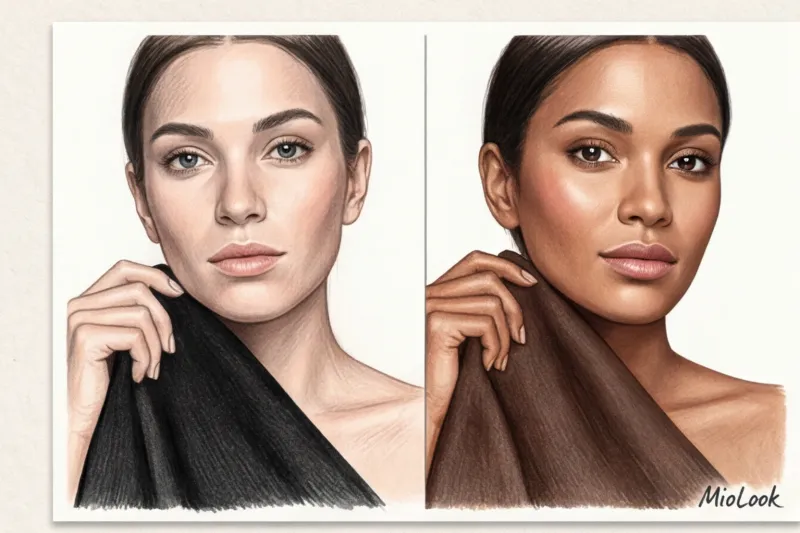
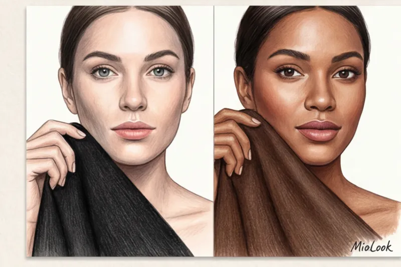
The key lies in your natural contrast level—the difference between your skin tone, hair color, and eye color. A striking brunette with porcelain skin (high contrast) will look great with a black jacket and white shirt. But someone with light brown hair, soft features, and olive skin (medium or low contrast) will be lost in such an outfit. Your palette should complement your natural contrast, not clash with it.
The Anatomy of the Perfect Base: What Are 'Soft Neutrals'?
My academic background in interior design taught me one golden rule: never paint walls pure white or pure black if you want a space to look expensive. Choosing a base palette for a wardrobe is like pouring an architectural foundation. We need "complex neutrals."
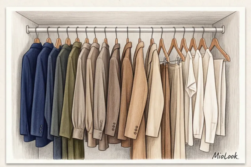
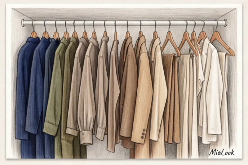
What are they? These are colors with a gray or brown undertone, without overtly garish pigment. They are multifaceted, change depending on the lighting, and serve as the perfect anchor for any accent detail.
Dark Base: Noble Alternatives to Black
The WGSN and Pantone color reports for 2024–2025 confirm a long-term macrotrend: black is being replaced by deep, enveloping tones. Here's what I'm replacing black with in my clients' wardrobes:
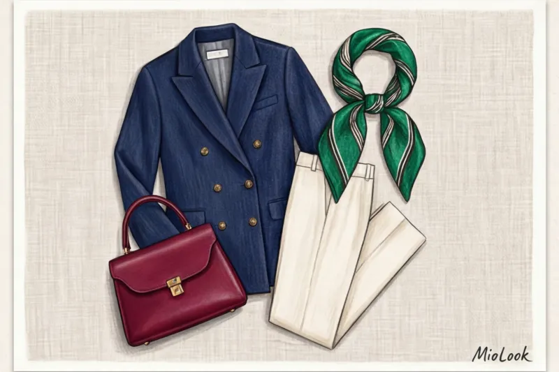
- Navy (Deep Navy): Deep navy blue. The color of absolute trust and status. A blue blazer always looks more elegant than black.
- Dark chocolate and espresso: The most luxurious staple of this decade, flowing chocolate silk or cashmere visually adds a couple of hundred euros to your look.
- Dark emerald, graphite and burgundy: Ideal for the colder months, they fit perfectly even with a strict business dress code without looking too uniform.
Light base: why snow-white will forgive your look
Hospital white (the color of printer paper) suits only a few people. Against a pure white background, teeth and the whites of the eyes often appear yellowish. Replace it with complex, light tones:
- Shades of ivory, ecru and champagne: Warm, soft alternatives to white that literally illuminate the face.
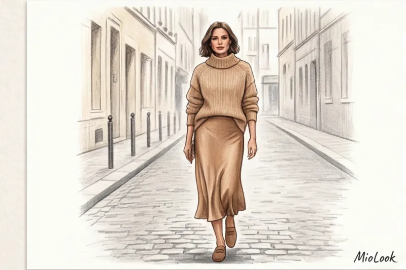
- Taupe and camel: Your ideal beige shouldn't blend into your skin, creating a "bare skin" effect. Choose a shade that's either two shades lighter or two shades darker than your skin tone.
Step-by-step algorithm: how to choose basic wardrobe colors to suit your appearance
To determine which direction to go (warm or cool), you need to determine your skin temperature. I don't recommend the popular "wrist vein test"—in practice, it confuses 7 out of 10 women, as thin skin can make veins appear green even with a cool undertone.
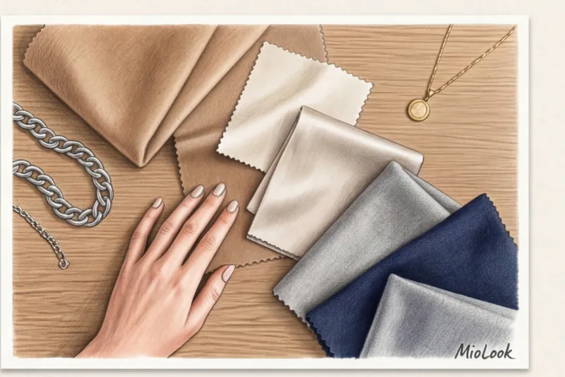
Instead, use the test with jewelry in the portrait area (near the face):
- Take some chunky gold and silver jewelry (or just pieces of foil in matching colors).
- In natural daylight, hold them one by one to your bare face.
- Look at the nasolabial folds, dark circles under the eyes and overall skin tone.
- If silver makes your face look fresh and gold accentuates redness, you have a cool undertone. Your base: graphite, navy, cool taupe, or ecru.
- If gold makes your skin glow and silver gives it an earthy tone, your undertone is warm. Your base colors are: chocolate, camel, olive, or ivory.
Always remember the portrait zone rule: wear shades that 100% match your temperature and contrast near your face (tops, blouses, scarves). And keep colors you're unsure about down low (pants, skirts, shoes).
Your perfect look starts here
Join thousands of users who look flawless every day with MioLook. Our smart AI stylist will help you digitize your wardrobe and find the perfect color combinations.
Start for freeMediterranean Formula: How to Make a Neutral Base Look Expensive
My personal style was shaped by the Mediterranean aesthetic—that effortless elegance that makes a woman look stunning, as if she'd gotten ready in five minutes. And the secret lies not in the flowers themselves, but in how we present them.
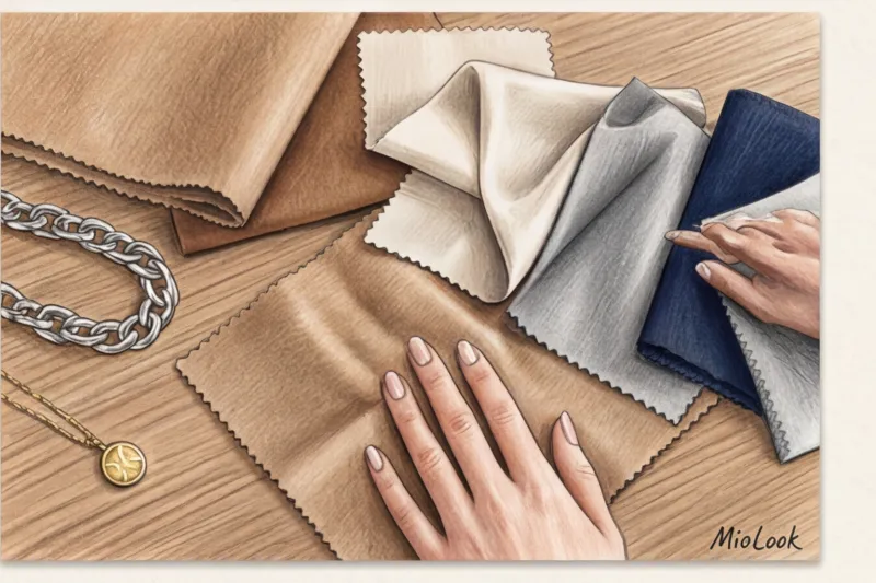
Remember my signature formula: Base color + Complex texture + Structured shape = Instant shine.
When putting together a look in neutral shades (especially in the "Monochrome 2.0" aesthetic, using tones from sand to chocolate), playing with textures is crucial. Wearing a smooth beige cotton shirt with smooth beige cotton trousers will make you look like a safari park employee. But swap the shirt for a flowing silk blouse and pair the trousers with a matte suede belt, and the look instantly elevates to the premium category.
In a basic wardrobe, fabric is always more important than color. Look for viscose with a minimum weight of 180 g/m², wool blends, and dense, structured cotton that holds its shape.
Foundation and decor: how to combine a basic palette with bright accents
In styling, we often apply the Pareto principle (80/20). In an ideal wardrobe, 80% of items should be in your sophisticated neutral shades, and only 20% should feature bold accents and micro-trends.
Why does this work? A neutral base is a canvas that helps tone down aggressive trends. For example, if you bought a trendy fuchsia bag, it will look sharp against a black coat, creating a bold color block. But against a camel or graphite coat, it will look elegant and fresh.
To select accent colors to complement your base, use Johannes Itten's color wheel. The most striking combinations rely on contrast: terracotta or mustard accents are ideal for a navy base, while wine and burgundy accents complement a khaki base.
Try MioLook for free
Not sure what to wear with your new bright bag? Our smart AI stylist will create the perfect look from your basics in seconds.
Start for freeChecklist: Revisiting Your Current Basic Palette
Any style transformation begins with an audit. Set aside a couple of hours on the weekend and go through your closet. We need to find and eliminate "color parasites"—items that pretend to be basic but actually don't flatter you.
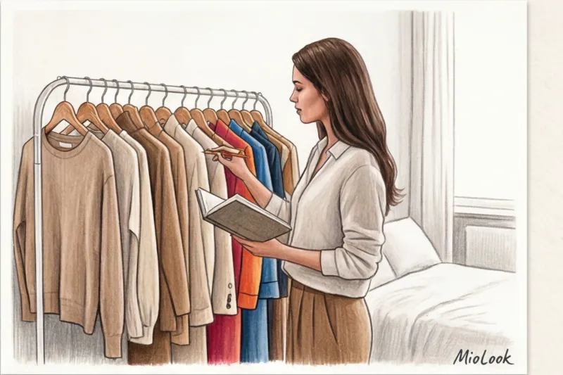
Take 3 steps to an updated palette:
- Remove black from face. Sort through your turtlenecks, T-shirts, and sweaters. If there's a lot of black, put them away in a box for now. Keep only pants, skirts, and shoes black (they won't ruin your complexion).
- Identify your dark neutral. Choose one main dark color that will replace black for you for the coming season: navy, espresso or graphite.
- Create a targeted shopping list. Don't buy everything at once. Start with three key purchases in the €50–€150 price range: a structured jacket in your new dark shade, a flowing blouse (ecru or ivory), and classic trousers in the right taupe.
Changing the color palette of your basic wardrobe isn't just a shopping spree. It's a rejection of imposed patterns in favor of what truly reveals your natural beauty. Stop hiding behind black, embrace sophisticated, luxurious shades, and you'll see how not only your reflection in the mirror changes, but also your inner sense of self-confidence.


