Last week, on a shoot, my photographer and I witnessed pure magic. A 52-year-old model sat before us in a tight, matte, mustard-colored turtleneck. Her face looked tired, and there were deep shadows under her eyes. The makeup artist was already reaching for a thick concealer when I asked for a break and simply changed her into a warm peach silk blouse. Something incredible happened: without a single ounce of new makeup, the shadows disappeared, her skin tone evened out, and her face literally began to glow from within.
Over 12 years of working as a stylist, I've become convinced that the secret to the perfect wardrobe isn't magic, but pure physics. When choosing the right colors for women over 50, we're essentially selecting photographic reflectors. We've covered how this mechanism works in more detail in our the complete guide to anti-aging coloristics Today we'll dig deeper and explore how fabric texture and the laws of light reflection can replace a visit to the cosmetologist.
How Color Works in Women's Clothing Over 50: The Physics of Light and Shadow
To understand "anti-aging coloristics," you need to forget about fashion trends and remember your high school physics course. Any item of clothing in your portrait zone (from your chest to your chin) acts as a reflector. Daylight hits the fabric, absorbs its pigment, and casts a colorful highlight right on your face.
Why does this become critically important after a certain point? According to a 2023 report from the British Institute of Dermatology, by the age of 50, the natural color contrast in appearance decreases by an average of 30%. Hair loses pigment, lips become paler, and microcirculation in the capillaries slows down, causing the skin to lose its natural inner glow (the very same effect). dewy skin ).
If at 20, a high natural contrast can elevate even the most ill-fitting swamp sweater, then at an elegant age, clothing should act as a highlight. The right color works like a ring light: it fills wrinkles with light and neutralizes earthy undertones.
The Pastel Myth: Why Light Doesn't Always Make You Look Younger
"After fifty, wear only light and pastel colors" is perhaps the most harmful and widely replicated style stereotype. Have you ever noticed how sometimes you put on a pale blue jumper in the fitting room, expecting a fresh look, only to see a sickly person in the mirror?
This happens because of a conflict of contrasts. If your hair is already touched with a noble gray and your skin has a fair, cool undertone, pale pink or watery blue shades simply blend into your appearance. They blur your facial features, turning your look into a single, washed-out blur.
"The biggest mistake in anti-aging styling is confusing freshness with pallor. Pastels only work when the fabric has a subtle sheen or when the color is dense enough to create a line between the garment and the jawline."
The role of fabric texture in color perception
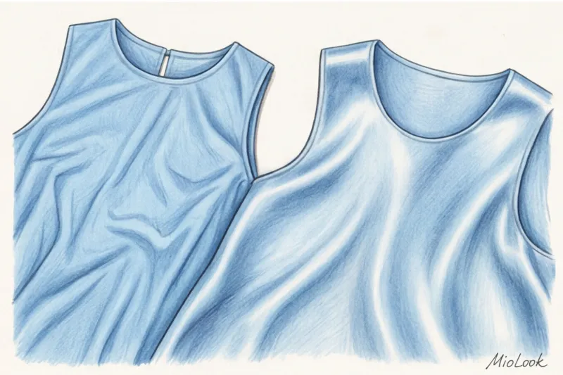
Color doesn't exist in a vacuum—it's always tied to the material. Textile research from the University of Leeds (2022) confirms that fabrics with a satin weave (where the weft threads overlap several warp threads) reflect 40% more light onto the face than loose, matte fabrics.
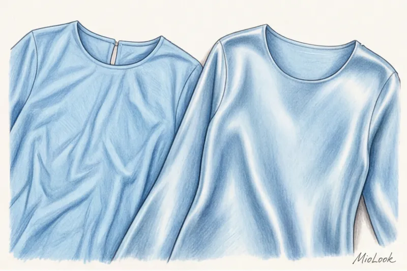
That's why cheap matte polyester or acrylic in pastel shades absorbs light and gives the complexion a dull appearance. I always tell my clients: an investment of €120-€150 on one high-quality blouse made of smooth cotton (at least 180 g/m²), silk, or cupro will pay for itself faster than buying five cheap blouses in the "right" color for €25. A sustainable approach to your wardrobe isn't just about saving the planet; it's also about saving your appearance.
Your perfect look starts here
Join thousands of users who look flawless every day. Digitize your wardrobe and discover the best color combinations.
Start for freeA Noble Palette: 5 Rejuvenating Shades for an Elegant Age
So, if pastels are tricky, what should you choose? There's a proven base of shades that physiologically harmonize with age-related changes in skin.
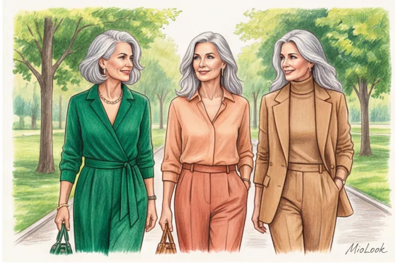
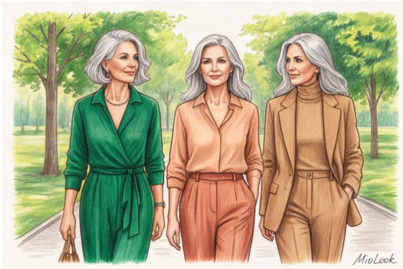
Shades of dusty rose, salmon and warm peach
These colors are your go-to "blush" shades. They brilliantly mimic a natural flush and neutralize blue or gray undereye circles. If you have a cool undertone with a rosy tint (the veins on your wrist appear blue), choose a dusty rose with a cool undertone. If your skin is warm, olive, or tans easily, your ideal choice lies in shades of salmon and peach.
Deep jewelry tones (emerald, sapphire, amethyst)
This is a stunning, classy alternative to black. Deep, rich gemstone tones restore lost contrast to women with gray or ash-colored hair. Unlike pale pastels, sapphire or emerald silk creates a clear frame for the face, making the oval of the face appear more toned and the whites of the eyes appear pure white.
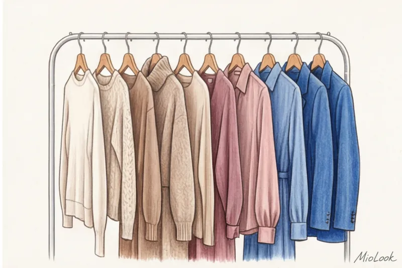
Complex neutrals (camel, taupe, milky)
This is the foundation of the "quiet luxury" (old money) aesthetic. An important rule: after 50, pure white (the color of office paper) often becomes an enemy. It's too aggressive and highlights even the slightest yellowing of teeth or skin discoloration. Replace it with ivory, cream, or ecru. Pair it with taupe or a refined camel for an expensive, enveloping look.
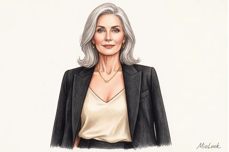
How to Wear Black When You're Over 50
Almost every stylist online is screaming, "Get the black off your face!" And from a physics perspective, they're right. Black absorbs 100% of light. It acts as an anti-reflector: it draws deep shadows along the nasolabial folds, emphasizes bags under the eyes, and makes the face look sunken.
But what if your wardrobe is 80% black, and you feel incredibly confident in it? In my experience, there are three life-saving life hacks:
- Neckline rule: Never wear black turtlenecks. Choose a deep V-neck or U-neck. Your natural skin on your neck and collarbone will act as a buffer, pushing the dangerous color away from the portrait area.
- Play of textures: Solid black drape and black translucent organza are two different colors. Chiffon, silk, and lace allow light to pass through without creating harsh shadows.
- Using reflectors: Break up a black collar with a light silk scarf, a strand of baroque pearls, or a chunky gold chain necklace. Metal and mother-of-pearl will bring light back to your face.
Fair Limit: This trick won't work if you have deep age-related changes (rings of Venus) on your neck paired with a high black collar. In this case, it's best to replace dark skin tones with deep sapphire or chocolate.
Colors that mercilessly add age
Some shades can't be salvaged by fabric texture or lighting. They're simply physiologically incompatible with mature skin.
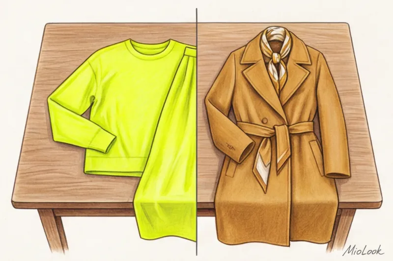
- Earthy tones (dead swamp, khaki, mustard). A mustard sweater may be the runway's hit of the season, but it casts a yellow-green tint on the chin. This creates a lasting effect of liver disease and chronic sleep deprivation.
- Neon shades (fuchsia, acid yellow, electric). They exist in complete dissonance with natural human pigments. Neon reveals any unevenness of the skin's texture, from rosacea to fine lines.
- Cheap melange grey. We're not talking about a noble graphite cashmere, but a thin, light-gray, speckled knit. It's strongly associated with washed-out loungewear, depriving the look of status, and making the face look downright tired.
Try MioLook for free
A smart AI stylist will create the perfect look for you. Upload your items and receive ready-made combinations every day.
Start for freeA Practical Guide: Assembling a Rejuvenating Capsule
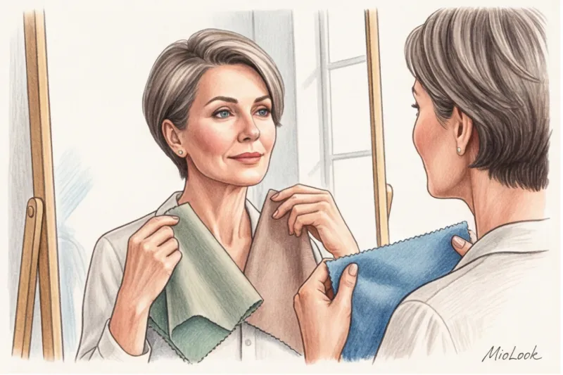
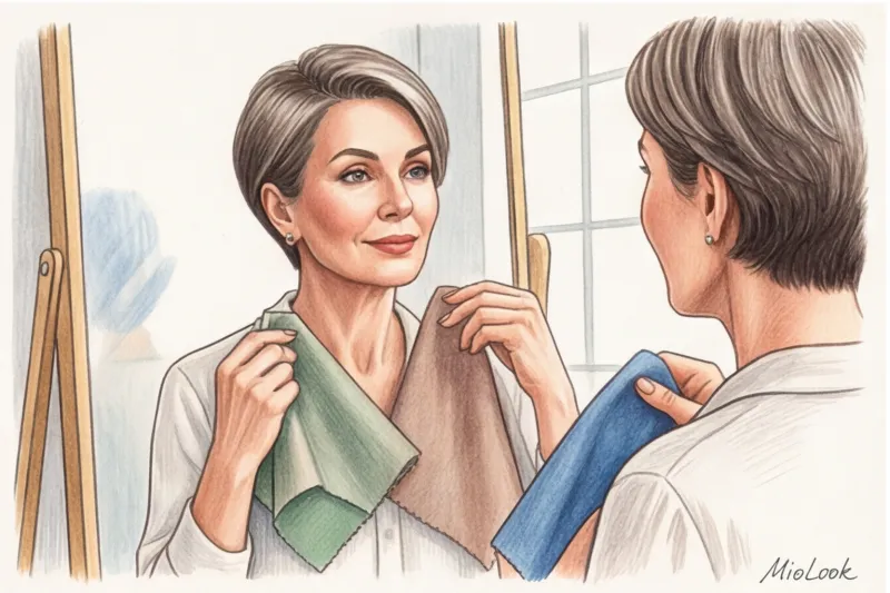
Theory is great, but how do you apply it in the store? I have a favorite trick I teach all my students. I call it the "window test."
When you take an item into a mall fitting room, remember: overhead halogen lighting distorts everything. To check the true color effect, hold the item up to a window in natural light. Place the fabric on your face (without a thick layer of foundation) and look in a pocket mirror. If you feel like you need to immediately apply lipstick or blush, the item isn't right for you. If your eyes look brighter and your skin tone more even, head to the checkout.
Building a rejuvenating structure capsule wardrobe , observe the golden ratio of color: 60/30/10.
- 60% - Basic neutrals and lights: Milky, ecru, taupe, camel. This is canvas.
- 30% - Deep Jewelry Tones: sapphire, emerald, wine. These are your jackets, skirts, multilayer elements.
- 10% - Bright or refreshing accents: a salmon silk scarf, a dusty rose handbag, or gold hardware.
I always recommend digitizing your palette to avoid impulse purchases. Upload your best finds to MioLook app , and the algorithm itself will tell you which shades are missing for the ideal balance.
Conscious consumption after 50 is based on a simple rule: fewer things, but of the highest quality. Color works best when paired with impeccable texture. Forget the compromises of matte synthetics—your skin deserves to be illuminated by natural silk, thick cotton, and fine wool.


