Have you ever noticed how whenever we talk about light-colored clothing, we immediately picture either a marshmallow cake or a five-year-old's wardrobe at a party? Many women are terrified of washed-out shades, believing they make you look fat, clash with pale skin, or look too frivolous for the office.
As a practicing colorist and image consultant with 12 years of experience, I am ready to argue with this. Competent pastel colors in clothing combination This isn't about childishness. Today, it's one of the most powerful tools for creating a prestigious image in the "quiet luxury" aesthetic. Replacing the usual harsh black or white with a sophisticated cream or powder blue on the face can erase signs of fatigue more effectively than expensive cosmetic procedures.
We have already discussed in detail the phenomenon of the return of femininity in our The complete guide to flirty style and romantic trends , but today I suggest we dig deeper. Let's look at pink, blue, and cream through the lens of silhouette architecture, Johannes Itten's color theory, and psychology.
New Romanticism and the Psychology of Color: Why We Choose Pastels
The mass shift away from bland normcore and oversized clothing isn't accidental. We're tired of hiding behind dark, baggy hoodies. According to the WGSN global trend research for 2024, after a series of global crises, consumers have developed a strong psychological need for "escapism through clothing." We physically crave colors that provide a sense of security and comfort.
This is where pastel shades come into play. The Pantone Color Institute regularly highlights in its reports that a certain wavelength of soft blue can physiologically reduce heart rate and stress levels. By wearing light, off-white tones, you literally convey a sense of calm and confidence to those around you.
In modern fashion, pastel has finally ceased to be considered "childish." Brands like Jil Sander, The Row, and COS have long since adapted delicate colors to strict, minimalist silhouettes, proving that this is precisely what intellectual femininity looks like.
Anatomy of Shades: Pink, Blue, and Cream in the Wardrobe
Why this trio? Color theory has three basic characteristics: value, saturation, and temperature. Pink, blue, and cream, in their pastel interpretations, have the same value and low saturation. This means they blend perfectly with each other without the risk of creating a visual mess. You simply can't go wrong mixing them in one look.
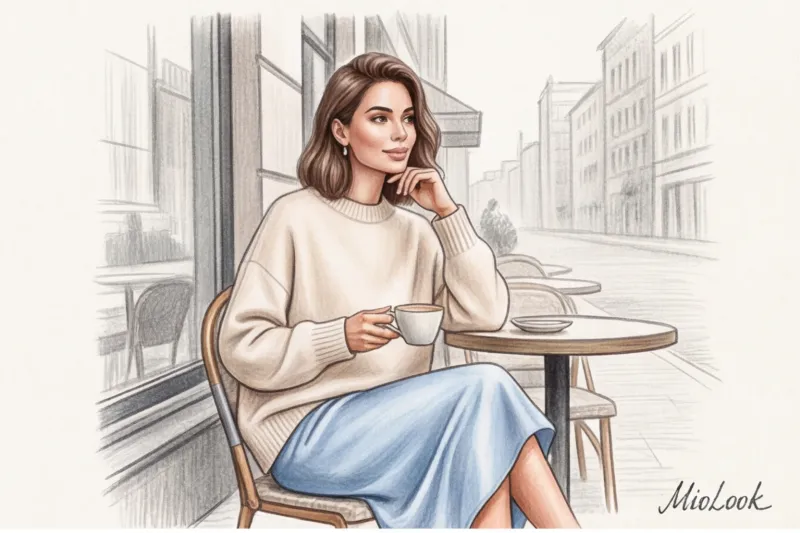
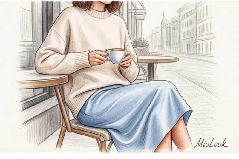
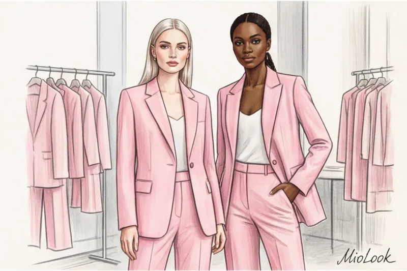
Baby Pink: From Coquette to Base
Forget the loud "Barbie pink" that dominated the scene a couple of seasons ago. Baby Pink is a shade with a high proportion of white pigment. Its main superpower is that it complements a natural flush. In the portrait zone, powdery pink acts as a light reflector, illuminating the skin from within and visually evening out its tone.
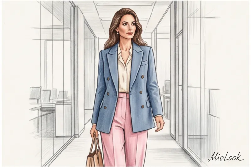
Dusty Blue: An Intelligent Accent
Light blue is subconsciously associated with reliability, intelligence, and expertise. Dusty light blue (with a subtle hint of gray) is the perfect base for a modern business wardrobe. If you're interviewing at an IT company with a smart-casual dress code, a loose-fitting light blue shirt will work much better than a formal white one, demonstrating your flexibility and modern approach.
Creamy and buttery: the right substitute for white
And now the bitter truth, which I often voice during wardrobe reviews: pure white suits only a few people. Harsh white creates too much contrast, highlighting even the slightest redness, pigmentation, and nasolabial folds. This is one of the main reasons What colors in clothes make you look older?.
Creamy and buttery shades are your built-in Instagram filter. They have a soft, warm undertone that smooths out imperfections and serves as the perfect bridge between cool blues and soft pinks.
Try MioLook for free
A smart AI stylist will select the perfect combination of pastel shades based on your appearance and the clothes you already own.
Start for freeColoristics Rules: Stylish Combinations of Pastel Colors in Clothing
To avoid the look of wearing all light colors at once, use the classic golden ratio rule of color: 60-30-10.
- 60% (Base): Cream-colored loose-fitting trouser suit.
- 30% (Addition): A dusty blue basic t-shirt or top.
- 10% (Accent): A soft pink baguette bag or scarf.
Johannes Itten's principle of temperature contrast also works brilliantly here. By combining cool icy blue and warming butter in a single look, you create a complex visual dynamic. This outfit is captivating to the eye.
The Magic of Textures: How to Avoid Turning into a Marshmallow
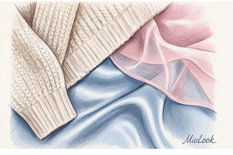
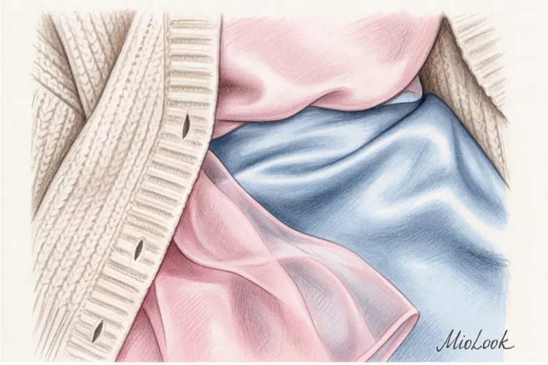
Stylists have a golden rule: the more delicate the color, the more complex and textured the fabric should be Pastels on smooth, thin polyester look cheap. Pastels on thick wool, cashmere, or textured linen look fantastic.
Mix opposites. Wear a voluminous chunky knit cardigan (cream) over a flowing silk skirt (blue). Pair rough faux leather with lightweight cotton of at least 180 g/m². The difference in texture is what separates a well-thought-out outfit from a haphazard selection.
Debunking the myths: who (or who doesn't) suit light shades
During my consultations, I constantly encounter three ironclad fears from my clients. Let's examine them from the perspective of the physics of color and cut.
"It's not the color that makes you look fat. It's the flimsy fabric, the poor cut, and the horizontal lines that cut you off at the widest point. Cream-colored pleated trousers made of heavy wool (from 200 g/m²) will make your legs appear endless, while black leggings made of fine knitwear will accentuate every nuance of your figure."
Myth 1: Pastels are not suitable for pale girls.
Many people believe that fair skin will blend in with light-colored clothing. This is only partially true—if you get the temperature wrong. Girls with cool, porcelain undertones need icy pink or frosty blue. Girls with warm, peachy skin will suit shades with a hint of yellow pigment—salmon pink and the color of baked milk. You can find out your type by taking a look at Test for 12 color types of appearance.
Myth 2: It's only for young people.
I had a 45-year-old client, a top manager, who exclusively wore black turtlenecks and dark blue jackets, considering them "age-appropriate dress code." When we swapped the graphic black sweater near her face for a sophisticated powder-blue cashmere jumper, she visually shaved 10 years off her age. Soft colors neutralize the shadows on her face—those that reveal fatigue and age.
Your perfect look starts here
Join thousands of users who look flawless every day with the MioLook AI assistant. Upload your items and receive ready-made capsules.
Start for freePractical formulas: putting together looks from pink, blue, and cream
Theory is great, but how do you apply it in the morning when you only have 15 minutes to get ready? Here are three foolproof formulas for different needs. Focus on items in the mid-market price range (from €80 to €200 per item) to ensure the fabric holds its shape.
Formula 1: For the Office (Smart Casual)
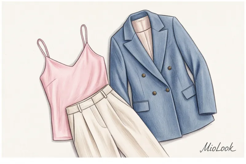
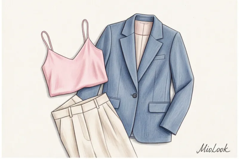
A structured, double-breasted, dusty blue jacket with a mannish twist, cream palazzo pants, and a barely-there pink top underneath. Shoes: beige pumps or loafers. The strict silhouette completely offsets the softness of the palette, creating the image of a confident yet empathetic professional.
Formula 2: For a Date (New Romance)
A cream-colored silk bias-cut midi skirt (slip skirt) + an oversized powder-pink sweater, slightly tucked in at the front + a small blue baguette bag. The look is tactile, begging to be touched.
Formula 3: Everyday Casual
Straight fit blue jeans without fading (read our guide on how to What colors go with blue jeans? ) + a thick cream long-sleeve T-shirt + pink retro-style sneakers (like suede Adidas Gazelle) or ballet flats. Perfect for brunch with friends or a weekend getaway.
Stylist's Checklist: 5 Rules for Wearing Pastels Without Looking Childish
To reinforce this material, I've put together a short checklist for you. Check your looks against these points before leaving the house:
- Use a masculine cut. A pink dress with ruffles is Barbie. A pink three-piece pantsuit with sharp creases is the street style of Fashion Week. Blend sweet colors into strict shapes.
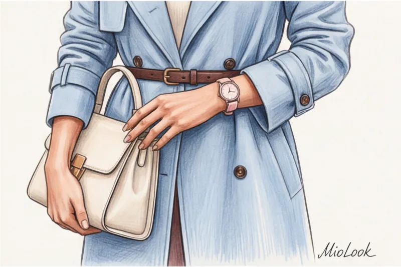
- Add a grounding accent. This is my favorite counterintuitive rule. A pastel look can seem too flighty if it's not grounded. A thin dark chocolate-colored belt, burgundy shoes, or a khaki bag will instantly make an outfit look sophisticated and grown-up.
- Pay attention to the density of the fabric. Leave the thin, translucent knits at the store. Pastels don't tolerate cheap textures. If you choose a light-colored item, it should be thicker than its dark counterpart.
- Portrait zone rule. Place the shade from our trio that best suits your skin temperature near your face. If you have redness, avoid pink near your face; relegate it to accessories or shoes, and pull a calming blue toward your face.
- Don't be afraid to experiment. If you're still afraid to wear head-to-toe light colors, start with a light blue trench coat and a cream bag against your usual gray jeans.
A pastel palette isn't just a seasonal indulgence for spring. It's a wardrobe investment that will enhance your confidence and status year-round. Light shades require a little more attention to cut and fabric quality, but the result—a fresh, rested complexion and an elegant silhouette—is definitely worth it. Try incorporating at least one cream or blue detail into your look tomorrow, and you'll notice how your reflection in the mirror changes.