Backstage at Paris Fashion Week a couple of years ago, I witnessed a curious scene. The show's lead stylist was deliberately dressing 18-year-old models in heavy, tapestry-like dresses with intricate, dusty patterns. When I asked him why young women needed this overtly "granny" chic, he replied: "We're creating an intellectual grunge. Their fresh, almost translucent leather creates maximum contrast with this heavy fabric." And that's the absolute truth. But there's one thing the fashion magazines aren't mentioning: this trick is absolutely devastating for women over 35.
The thing is, with age, our appearance changes not only structurally, but also color-wise. And that's why prints that make you look older — this isn't a subjective myth or a matter of taste, but the harsh physics of light and optical illusions. We discussed the mechanics of age-related color changes in more detail in our the complete guide to anti-aging coloristics , but today I want to talk specifically about patterns. About how to translate the abstract concept of "women's print" into clear metrics: scale, contrast, and rhythm.
Why Some Patterns Work Like a Time Machine (and Age Us)
Let's figure out why the face can't withstand visual noise after a certain age. According to research by WGSN Beauty (2023), after age 40, our natural contrast—that is, the difference between skin tone, eye color, eyebrows, and hair—decreases by an average of 20–30%. Lips lose their vibrant pigment, the whites of the eyes lose their dazzling whiteness, and skin becomes more matte.
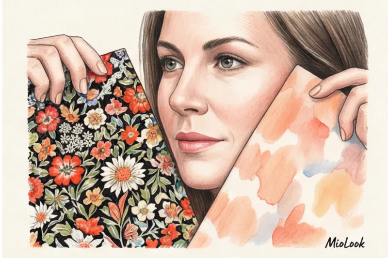
What happens when we wear an item with an aggressive, stark print? The brain operates according to the laws of Gestalt psychology: it always reads the most contrasting and rhythmic object first. If the pattern on your blouse has a 90% contrast ratio, and your face (without heavy makeup) has only 40%, the fabric literally "eats" you. Your face becomes a pale, tired backdrop for your clothes.
Moreover, the rigid geometry or fine ripples of the pattern cast micro-shadows. They create a visual resonance that highlights the slightest imperfections in the skin's texture: nasolabial folds, pigmentation, and wrinkles around the eyes. To quickly check your natural contrast level and find safe combinations, I recommend using MioLook smart AI stylist — the app analyzes your appearance in just seconds and eliminates patterns that would depress you.
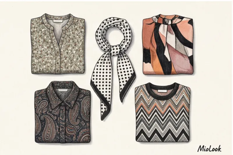
Top 4 insidious prints that age you mercilessly
Over 12 years of working as a personal stylist, I've compiled a blacklist of patterns. These are the prints that age you 9 times out of 10 when placed right next to your face.
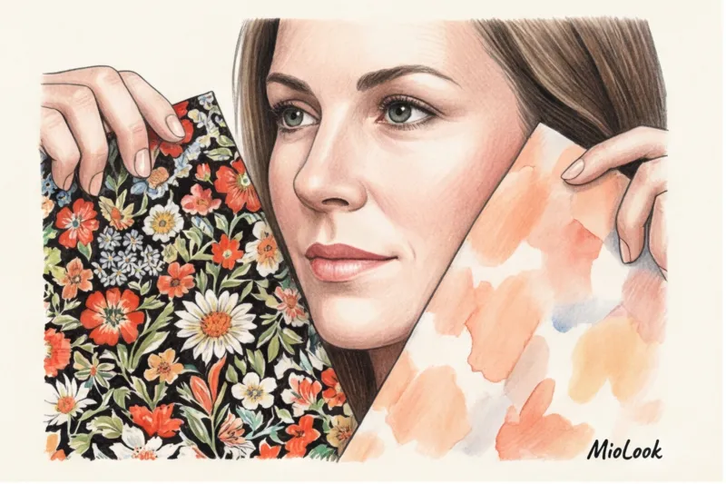
Small flower (Millefleur) in dull tones
Historically, the millefleur (thousand-flower) pattern has been associated with either children's clothing or retro-country style. When the print is executed in dull, earthy, or dusty tones against a dark background, it inevitably evokes the Soviet housecoat. Due to its fragmentation and low contrast, this pattern blurs into a visual mess. On young girls, it works on paradox (that very cottagecore aesthetic), but on a woman over 40, it looks as if she's simply tired and given up.
Classic black and white polka dot
Here's where I'll bust a long-standing myth. For decades, fashion magazines have been insisting that medium-sized black and white polka dots are a "timeless, safe classic." In my experience, they're one of the most dangerous prints for an adult face. The sharp, harsh rhythm of black circles on a white background creates the so-called Hermann illusion (a dazzling effect). This visual noise acts as a magnifying glass for any age-related changes. Furthermore, polka dots carry a powerful charge of childishness (the Minnie Mouse effect), which often looks forced and out of place on an adult woman.
Intricate paisley and tapestry motifs
The visual weight of a pattern is crucial. Paisley, especially in the traditional burgundy-brown-mustard palette, looks heavy. The fabric appears older than the wearer. Dark, dense colors absorb light, failing to reflect onto the face, making skin appear dull and creating shadows under the eyes.
Hard graphics and predatory geometry
Sharp angles, sharp zigzags, and contrasting checkered patterns are psychologically perceived as aggressive and static. The problem is that with age, the facial contours lose their youthful firmness, and the lines become softer and smoother. A harsh geometric print in the portrait area clashes with the soft lines of the face, treacherously accentuating ptosis (sagging contours).
Your perfect wardrobe without mistakes
Tired of wondering if a print suits you? MioLook's smart AI stylist will analyze your appearance and create a capsule wardrobe that will make you look younger.
Start for freeThe Anatomy of a Rejuvenating Print: What Makes a Look More Dynamic
While static and rigidity add age, dynamism and fluidity, on the contrary, act as a visual lift. The right print should create the illusion of movement, energy, and contain sufficient "air" (negative space).
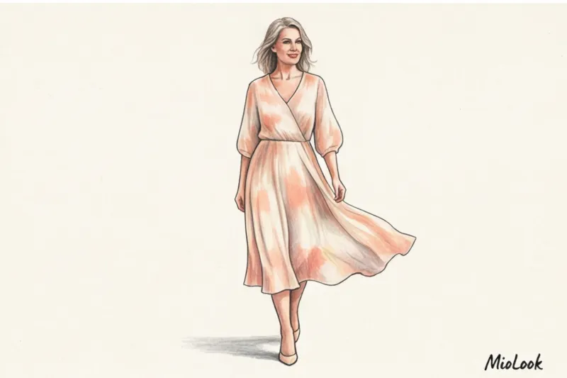
Watercolor abstraction and blurred edges
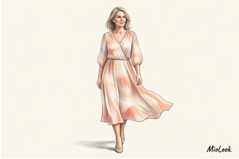
One of my clients, a 45-year-old top manager, complained about looking tired in the office. We removed her formal striped shirts from her wardrobe and replaced them with silk blouses with a soft watercolor gradient (tie-dye) in elegant peach-pearl tones. The effect was stunning! The blurred edges of the pattern worked like an Instagram filter or a lens's soft focus: they visually softened harsh shadows on the face, softened the nasolabial folds, and allowed her to wear minimal makeup. Dip-dye and abstraction are the perfect, modern alternative to classic colors.
The Rule of Scale: Size Matters
Remember the golden rule of stylists: fist size The ideal, safest size for a print element should be roughly the size of your clenched fist (or slightly smaller). If the elements are too small, they'll look cluttered. If they're huge, dramatic poppies the size of two palms, they'll overwhelm your facial features. Proportionality ensures that the print is your ally, not your competitor, for attention.
Asymmetry, diagonals, and new-generation animalistics
Diagonal lines always elongate the silhouette and add a sense of movement to the look. If you love animal prints, forget the classic leopard print in red and brown tones—it often looks vulgar. Opt for zebra. Why? Zebra has a natural, organic (not rigid) geometry that looks fresher, more expensive, and fits perfectly with modern minimalism.
Liven up your wardrobe
Upload your items to MioLook, and the neural network will show you dozens of new, stylish combinations with what you already own.
Try MioLookHow to wear "dangerous" prints if you really want to: stylist secrets
What if you already have a favorite floral dress or a luxurious but heavy paisley skirt? Don't throw them out. You can tame them.
- Move away from the face: The simplest rule: Dangerous prints work well on skirts, trousers, or shoes. If you have a complex printed midi skirt, pair it with a basic cashmere sweater in a refreshing shade (milky, soft blue).
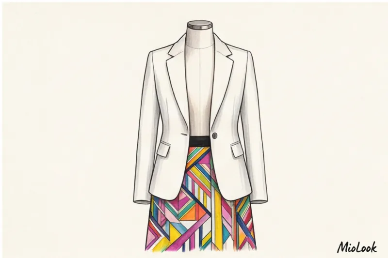
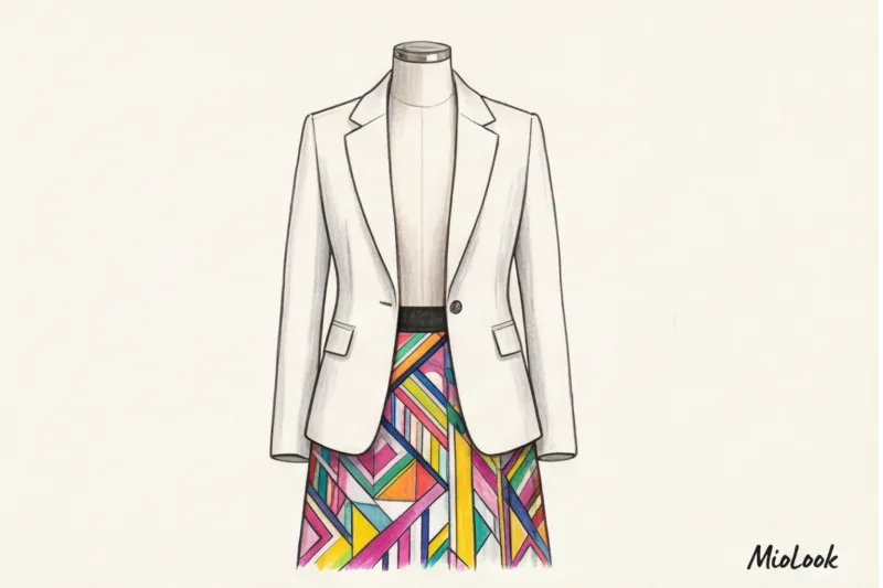
- Breaking the monolith: If it's a dress, layer it with a structured, solid-color jacket (for example, a high-quality wool option in the €120-€180 range from COS or Massimo Dutti). The jacket will hide 70% of the print, leaving only a dynamic vertical stripe of the pattern that will elongate the silhouette.
- Attention management: Distract the eye from an unfortunate pattern with large, status-defying accessories—modern thick-framed glasses, a minimalist watch, or a crisp bag.
Important caveat: these life-saving measures will NOT work if the fabric has a distinctly cheap sheen (like low-quality polyester) or if the background color is completely inconsistent with your skin tone. In this case, it's best to recycle the item.
Pre-purchase checklist: test the print in the fitting room
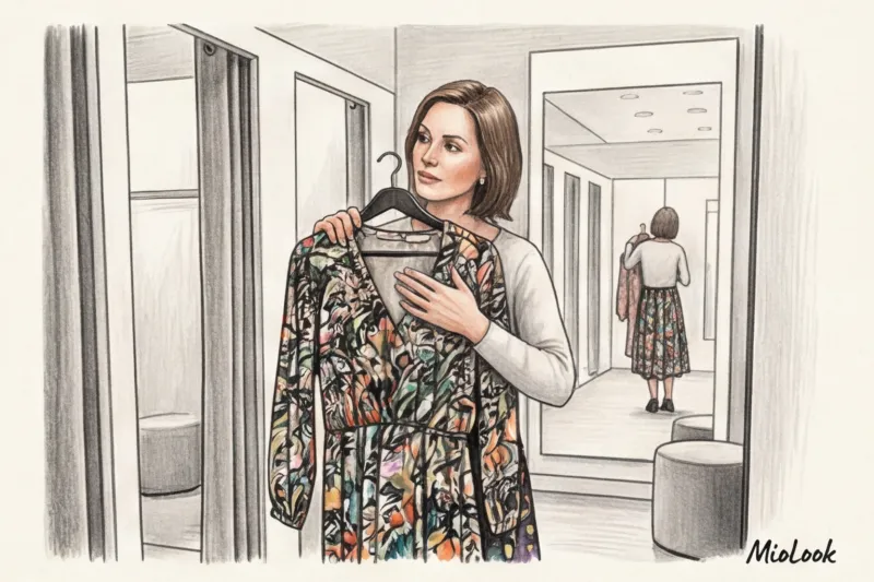
To avoid making mistakes and buying prints that make you look old, use my professional fitting room algorithm. It takes exactly 30 seconds:
- The "squinted eye" technique. Move five feet away from the mirror and squint hard. If the print blurs into a muddy, dirty spot, leave the item in the store. If the pattern maintains a discernible rhythm, it's safe to buy.
- Selfie test without filters. Lighting in fitting rooms (especially at high-street stores like Zara or H&M) often distorts reality. Take a selfie of the portrait section without filters. Look at the photo: where does your gaze fall in the first second? On the eyes and face, or on the pattern of the blouse? If on the fabric, the print has "eaten you."
- Air assessment. Consider the ratio of background to pattern. To prevent the pattern from overwhelming, the background (the free space between elements) should be at least 40–50%. Densely packed patterns almost always add age.
Your wardrobe should work for you, highlighting your individuality rather than turning you into a walking sofa cover. Choose patterns that create a sense of ease, and don't be afraid to leave on the hangers the pieces that require perfect makeup and ten hours of sleep just to look normal.