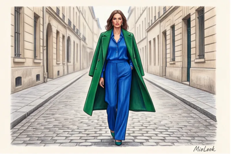
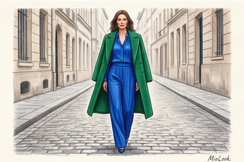
One day, a client of mine, the CFO of a large corporation, said to me, "Julia, color blocking is for teenagers on TikTok or from the garish 2000s. I'm 42, I manage people, I need status, not a traffic light." I smiled, put her usual black blazer back in its case, and pulled out a deep sapphire-colored jacket made of dense raw silk. We paired it with emerald palazzo pants. At the next board meeting, she received a compliment from the company's CEO, and most importantly, she felt completely in control.
This material is intended to destroy the stereotype that color blocking in clothing — it's simply a chaotic jumble of bright spots. In the premium segment, we consider this style a true "architecture of color." Its status is achieved not through neon, but through complex textures—matte leather, heavy cashmere, flowing satin—and deep, "expensive" shades.
Before we move on to the formulas for luxury combinations, I highly recommend brushing up on your basic knowledge of coloristics. I covered this in detail in our a complete guide to color combination rules and the Itten circle - this is the foundation without which it is difficult to build complex architectural images.
What is color blocking and why has it become a hallmark of intelligent fashion?
Let's define the terms. Color blocking is a geometric, deliberate clash of large, localized color spots within a single look. There's no room for prints, florals, logomania, or tiny polka dots. It's all about pure color, working as a standalone design tool.
The iconic Mondrian dress, created by Yves Saint Laurent in 1965, became the historical starting point for this style. While it was pop art back then, today brands like Prada and Valentino have turned color blocking into the uniform of the intellectual elite. Pierpaolo Piccioli, former creative director of Valentino, masterfully demonstrated that color is an emotion, and those who master it command attention.
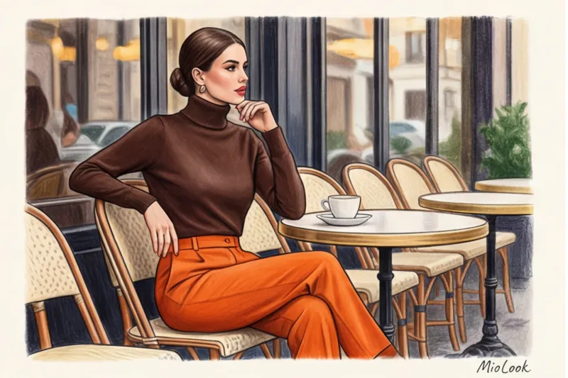
Over the 12 years I've lived and worked as a stylist in Milan, I've consistently observed one pattern. Italian women are masters of color. While many hide behind bland beige minimalism (which, let's face it, often erases individuality), Italians embrace bold color blocking. And it instantly exudes confidence. A beige sweater says, "I want to be relevant." A red cashmere jumper paired with fuchsia trousers declares, "I make the rules."
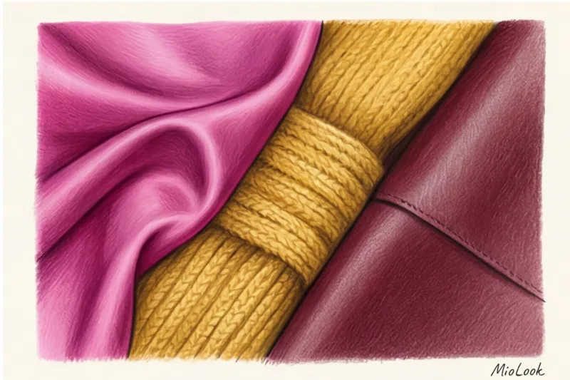
The Main Secret of Expensive Combinations: The Rule of Textures
Have you ever wondered why brightly colored items often look cheap in mass-market stores, while the same shades are so stunning on the runway? The answer lies not in the color itself, but in the material. Cheap polyester doesn't absorb pigment deeply or reflect light properly—it produces a plasticky sheen.
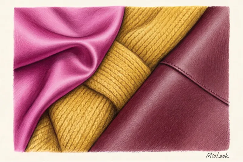
Premium fabrics work differently. Matte suiting wool absorbs light, creating a bottomless hue. Silk delicately reflects, adding movement to your step. I always give my clients a strict instruction: If you take two bright colors, they should be on fabrics of different densities.
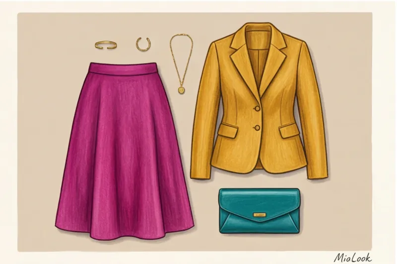
"The perfect color block is a dialogue of textures. A flowing magenta silk skirt will look completely different when worn over a thick, loose mustard cashmere sweater rather than a smooth cotton T-shirt."
How does fabric density affect color temperature?
Texture physically changes the perception of color. Tweed, bouclé, and mohair make any bold color softer, more homely, and sophisticated. A red mohair cardigan looks cozy and luxurious.
Smooth leather, satin, and taffeta, on the other hand, create the ultimate sharpness. They're unforgiving of cutting mistakes. If you choose color-blocking in smooth textures, the silhouette should be architecturally flawless—no unnecessary folds or poor fit.
Color Architecture: 3 Win-Win Formulas for a Status Look
We reject random combinations. Itten's color wheel theory works flawlessly, but for the luxury segment, we adapt it, drawing on techniques from the latest collections of Bottega Veneta (under the direction of Mathieu Blasi) and Loewe.
Formula 1: Jewel Tones
The safest and most luxurious palette for a fall/winter wardrobe. Combine sapphire, emerald, ruby, amethyst, and citrine. Because these shades have similar depth and shades, they pair perfectly. A deep emerald turtleneck and a sapphire midi skirt are a combination that always looks amazing.
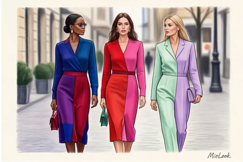
Formula 2: Analogue Luxury
We take colors that are adjacent on Itten's color wheel. Fuchsia and classic red, cobalt and sea green, ochre and terracotta. The secret of Italian fashionistas lies precisely in this formula: such combinations create visual vibrancy, but are completely unobtrusive, as they flow seamlessly into one another.
Formula 3: Pastel Color Block
A solution for the spring/summer season and for those who fear high contrast. Combine lemon, soft blue, and lavender. But there is an important limitation here: This technique doesn't work well on girls with a high-contrast winter color type—pastel can make their appearance look washed out unless they add a bright accent near the face (for example, chunky earrings or a bold lipstick).
Your perfect look starts here
Join thousands of users who look flawless every day with MioLook. Artificial intelligence will help you create the perfect color block from your clothes.
Start for freeA Mistake That Cheapens an Image: Why Black Is a Bad Companion
Now I’m going to say something that contradicts 90% of the advice in mid-range glossy magazines. Using black to tone down a bold color block is a major stylistic mistake.
Black isn't calming. It creates a brutal, aggressive contrast. Think of road signs—they're yellow and black or red and black, designed to be as eye-catching as possible. Wearing bright fuchsia with jet-black trousers doesn't enhance your look; it chops your silhouette in half.
A prestigious wardrobe calls for midtones. What can replace black? Try deep navy blue, espresso, dark chocolate, burgundy, or dark anthracite.
My personal styling trick that changes everything in a second: if you're wearing a bright outfit, swap out your black shoes and belt for a dark chocolate shade. Your look will instantly become more sophisticated, European, and aristocratic. Test this rule in the mirror tomorrow morning—the difference is dramatic.
Investing in Color: What Bright Items Are Worth Buying in the Premium Segment?
Basic T-shirts can (and should) be updated in the mass market. But color blocking is unforgiving of poor fabric. According to a McKinsey study (2024), premium fibers retain their original pigment and shape 40% longer than fast-fashion counterparts. And in bright colors, fading or pilling are visible from a mile away.
Here are the top 3 brightly colored items that are worth investing in:
- Structured wool coat. The cost-per-wear formula works flawlessly here. You'll wear a quality red or emerald coat less often than a beige one, but it will last for a decade, becoming your signature piece.
- Silk blouse. Best with a density of 22 momme or higher. Silk renders jewel tones beautifully.
- Wide trousers made of suit wool. Paired with a neutral top, they make your legs look endless.
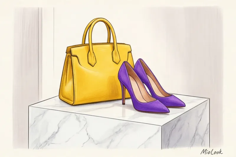
Shoes and bags as a safe start
If you're not quite ready to wear a bright blue suit, start with accessories. Buy a well-cut geometric bag in a ripe orange or some purple suede pumps. Basic bags They may be subdued, but one statement investment piece will elevate any drab look to Fashion Week level.
Try MioLook for free
A smart AI stylist will help you find the perfect look. Simply upload a photo of your clothes, and the app will create dozens of color-blocked outfits.
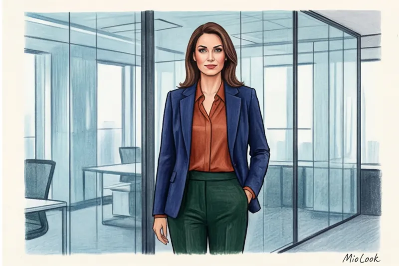
Start for freeColor Blocking in Business Attire: How to Stand Out Without Breaking the Dress Code
Returning to my banking client's story: we didn't violate the dress code. We rethought it. Color blocking in a business environment is about managing the audience's attention. During negotiations, color works faster than words.
For the office, we use muted color blocks. Instead of bold yellow, we choose mustard (with a cotton weight of at least 180 g/m²), and instead of loud blue, we choose sophisticated cobalt or navy. The combination of terracotta and olive in clean silhouettes (a jacket with sharp shoulders and trousers with creases) looks incredibly professional. We've covered how to incorporate these principles into your work routine in detail in the article. about a business capsule wardrobe.
A stylist's checklist: creating the perfect color block step by step
Theory is great, but let's get down to practice. Go to your closet (or open a virtual wardrobe in MioLook ) and build the image using this algorithm:
- The 60/30/10 proportion rule. An outfit shouldn't split colors evenly—it looks comical. Choose 60% of the main color (for example, a suit), 30% of the secondary color (a blouse), and 10% of the accent color (shoes or a bag).
- Complete rejection of prints. Hide all patterned items. Stick to solid color blocks.
- Minimalistic beauty look. A complex color in an outfit requires a clear, airy look. No complicated, pin-up hairstyles or heavy smoky eyes. A sleek low ponytail, glowing skin (the "no-makeup" look), and perhaps one bright detail—like lipstick that matches one of the colors in your outfit.
Color-blocking isn't about standing out at any cost. It's about the courage to be visible and aesthetic intelligence. Start small: tomorrow, swap your usual black bag for a burgundy one, and your white jumper for an azure one. You'll notice how not only your reflection but also your posture changes.


