Itten's Color Wheel in Clothing: Why Bauhaus Artists' Theory Works in Your Wardrobe
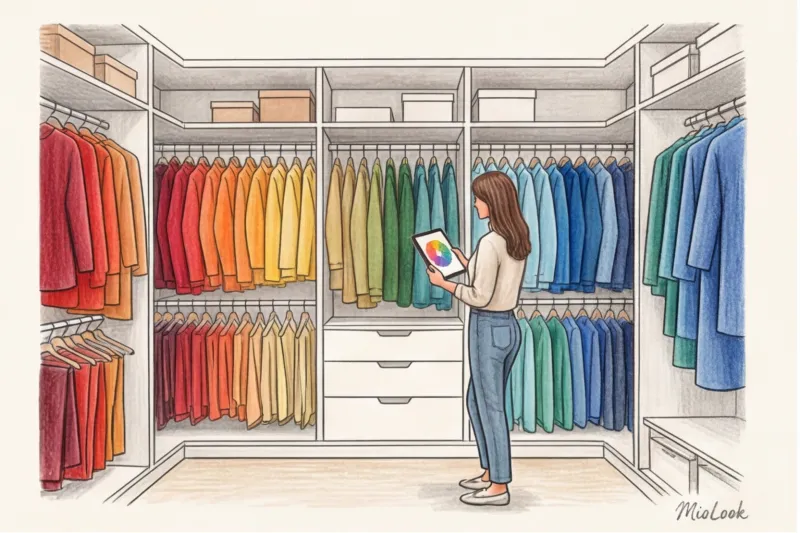
Have you ever found yourself in this scenario? You buy a stunning fuchsia sweater or emerald pants, bring them home, hang them in your closet... and there they remain, tagged, for months. You continue to wear your usual beige, gray, and black clothes because you simply don't have time to figure out what to wear them with in the morning.
This is where it comes into play Itten's color wheel in clothing Most online articles present it as an abstract geometric puzzle, forgetting the main point: Swiss artist Johannes Itten created this tool in 1961 for Bauhaus students. He wrote the book "The Art of Color" for painters working with dense, opaque pigments on flat canvas, not for women wearing translucent silk or textured wool.
We have already discussed the basic principles in more detail in our complete guide about Color combinations in clothing: Itten's rules and circle Today, we'll translate this theory from the language of artists into the language of modern fabrics and a conscious wardrobe. Understanding the color wheel is perhaps the most eco-friendly skill in styling. It allows you to create dozens of new looks from the items already in your closet, instead of impulsively buying new ones.
The biggest mistake new stylists make is ignoring fabric texture.
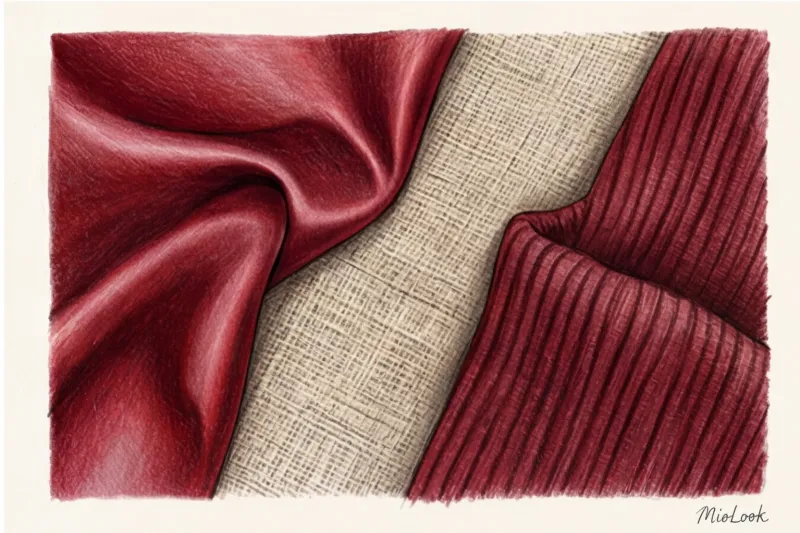
The most subtle paradox, rarely discussed by fashion blogs, is that the color wheel is flat, while our clothes are three-dimensional. A red square on paper behaves completely differently than a red silk blouse or a linen jacket.
I had a client named Elena who mastered contrasting patterns perfectly. She bought a mustard-yellow top and purple pants (a classic complementary contrast according to Itten). The colors were perfect, but in reality, the look looked cheap and reminiscent of a promoter's uniform. Why? Both items were made of thin, smooth viscose with the same matte finish.
The secret to a luxurious look lies in the Light Reflectance Value (LRV). According to research by the Textile Institute (2023), natural matte linen absorbs up to 40% more light than synthetic polyester or smooth Tencel.
Smooth fabrics (silk, satin, viscose) act like mirrors, enhancing the saturation of color and making it "flashy." Loose, matte fibers (organic cotton with a weight of 180 g/m², wool, bouclé) absorb light, making the same shade deeper, softer, and more refined.
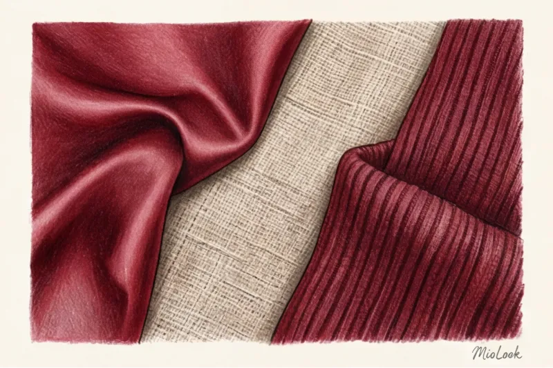
Practical conclusion: if you take two bright colors from Itten's circle, never Don't combine them in identical smooth textures. Mix smooth with rough: an emerald satin skirt with a burgundy chunky knit sweater.
Try MioLook for free
A smart AI stylist will select the perfect look based on your items.
Start for freeBasic Combination Schemes (and How to Use Them Without the "Traffic Light" Effect)
Pure colors from Itten's circle (i.e., 100% saturated blue, red, and yellow) should be used with extreme caution in real life. Dressing in pure spectral colors head to toe risks looking like a child's party entertainer. All the fashion magic happens on the axes of "lightness" and "saturation," when white, gray, or black pigment is added to pure colors.
Monochrome and Analog Harmony: A Safe Start
If you're just stepping out of your gray and beige comfort zone, start with these two patterns:
- Monochrome: Using a single color scheme but varying the lightness. For example, from a soft blue (with white) to a deep navy (with black). This scheme visually elongates the silhouette and adds height.
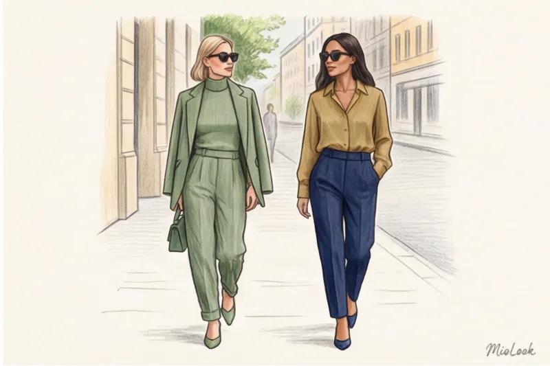
- Analogue: A combination of two or three colors adjacent to each other on the color wheel. For example: blue, blue-green, and green.
These patterns are ideal for creating an eco-friendly capsule wardrobe. They are perceived by the eye as calm, flowing natural gradients, creating that very "quiet luxury" effect that WGSN analysts write so much about in their 2024 reports.
Complementary Colors: How to Tame Maximum Contrast
A complementary scheme is one in which colors are placed directly opposite one another (yellow and violet, blue and orange, red and green). And this is where the main stylistic mistake, which I jokingly call "elf syndrome," occurs.
The combination of pure red and green inevitably evokes the Christmas tree. To make this contrast look stylish, you need dilute colors by saturation Avoid scarlet and grass green. Instead, go for deep wine (burgundy) and muted olive (or sage). The temperature contrast will remain, but the theatricality will be gone.
The Rule of Proportions: The Mathematics of Color in Imagery
Even if you've perfectly matched shades according to Itten's color wheel and considered texture, the look can fall apart due to incorrect proportions. When you use two colors in a 50/50 ratio (for example, a yellow shirt and blue jeans of the same length), you visually "cut" the body in half. The eye doesn't know what to focus on, and a visual conflict arises.
In styling, we use the 60/30/10 rule, which comes to us from interior design:
- 60% - base color. Typically, it's a basic, neutral, or muted shade. It takes up the largest area (coat, pantsuit, maxi dress).
- 30% - additional color. Choose from an analogous or complementary pattern. (Shirt under a jacket, cardigan, skirt).
- 10% - accent. The brightest, purest color in the circle. (Silk scarf, accent shoes, bag, red lipstick).
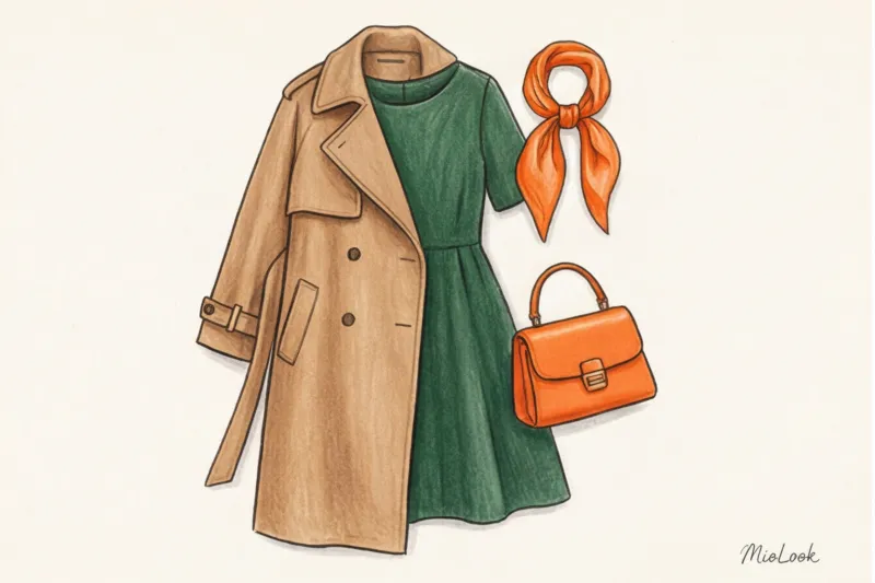
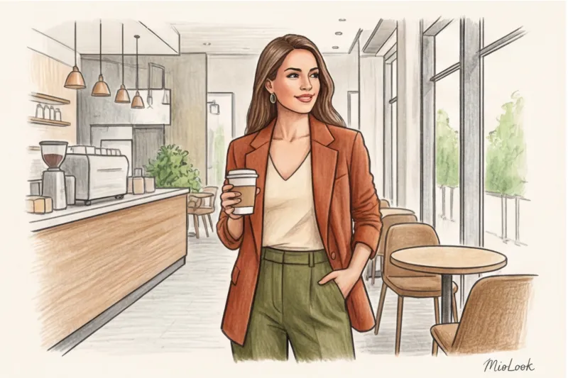
Imagine this look: 60% voluminous sand-colored trench coat (neutral base), 30% dark blue denim (analogous to blue), 10% terracotta-orange scarf (complementary to blue). This math naturally draws the other person's gaze to your face.
Your perfect look starts here
Join thousands of users who look flawless every day with the MioLook AI stylist.
Start for freeHow to Integrate Bright Colors into an Eco-Friendly Wardrobe
Clients often ask: "Sofia, if I start using the Itten circle, will I have to throw out all my gray and beige sweaters?" Absolutely not. Itten's color wheel in clothing doesn't eliminate achromatic colors. Moreover, on the traditional 12-part color wheel, black, white, and gray don't even exist.
Neutrals are your canvas. If you're committed to a sustainable approach to fashion, you don't need to go on a massive shopping spree and buy brightly colored items that will quickly go out of style or become boring.
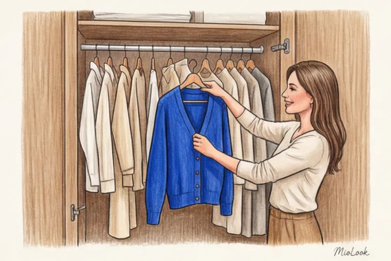
Invest in one or two quality pieces in a complex, rich color. Consider a premium cobalt cardigan or a pair of high-quality wine-colored leather loafers. These pieces will act as that 10% or 30% accent, instantly elevating the style of your basic outfits. The PANTONE Color Institute (2025) confirms this trend: micro-accents of bright colors against a calm base are the key to intelligent styling.
A practical checklist: from theory to a real wardrobe
Let's get practical. Don't buy anything new this weekend. Instead, take stock of your closet:
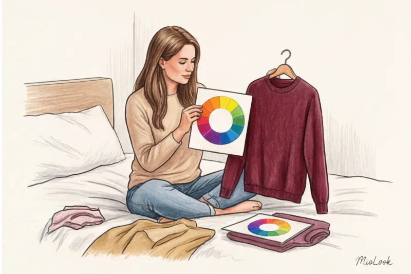
- Determine the dominant. Find the color you have most in your closet (besides black and gray). Perhaps it's navy or camel.
- Find pairs. Look at Itten's color wheel. Which colors are next to your dominant color? Which color is directly opposite?
- Play "shop in your closet." Intentionally pair items you've never worn together, based on patterns. A blue skirt and a mustard turtleneck? Green pants and a pale lilac blouse?
- Take a photo of the result. This is a crucial secret for stylists. In the dim light of a bedroom, our brain often "completes" the picture in front of a mirror. A smartphone lens mercilessly calculates LRV (light reflectance) and proportions. In a photo, you'll immediately see whether the contrast is cutting into a 50/50 figure, or whether smooth textures clash.
Ready to get started?
Upload photos of your items to MioLook and let the app create color combinations for you.
Try it nowConclusion: Color as a Tool for Confidence
Itten's color wheel isn't a rigid set of rules that will get you kicked out of the fashion police for breaking. It's a tool for fine-tuning your personal vision. Once you begin to notice how textures work, how muted colors enhance them, and how the 60/30/10 rule brings a look together, your fear of bright colors will disappear.
Color has tremendous psychological energy. Stepping beyond the safe confines of neutral tones is always an act of stylistic self-confidence. And to ensure this step is flawless, use the "smart wardrobe" feature in MioLook The app will help you digitize your items and check the color laws in real time using your personal closet—eco-friendly, fast, and always flawless.


