The "Lonely Thing" Syndrome: Why We Buy Prints But Wear Black
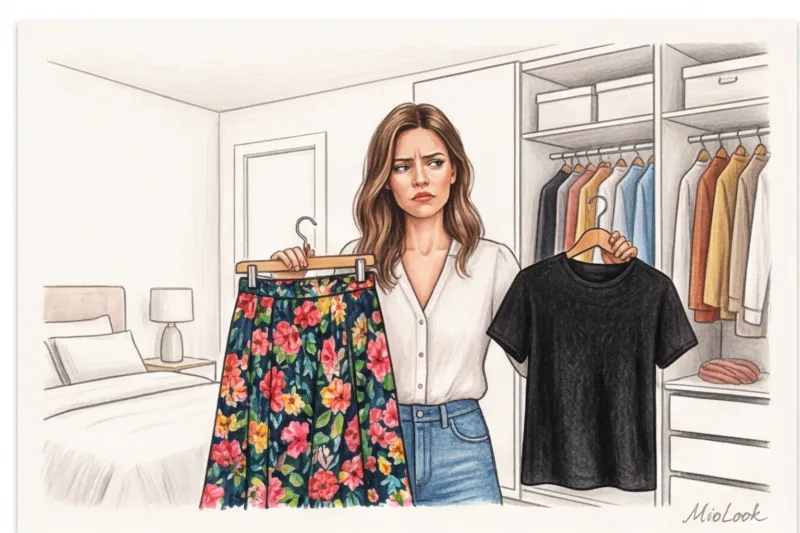
Three years. That's exactly how long my client's stunning asymmetrical skirt with an abstract print from &OtherStories hung in her closet. Every morning, she'd take it out, hold it up in front of the mirror, sigh, and... put on her usual beige pants again. The reason? A simple fear of looking like a "traffic light."
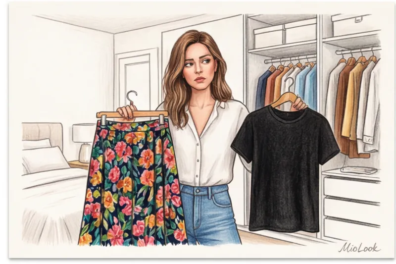
According to 2024 statistics from the analytical agency WGSN, approximately 80% of women wear printed items exclusively in black, white, or gray. We fall in love with the emotion of a bright pattern in the store, but at home we try our best to "damp it down," artificially cheapening our look.
Breaking this vicious cycle doesn't require a colorist's degree. Understanding the basic principles of working with shades is sufficient. We covered this in more detail in our A complete guide to color combinations in clothing and the rules of the Itten circle , but today I want to share with you a purely practical, insider approach. We'll learn how to tame patterns the way professional stylists do.
How to Combine Prints by Color: The Stylists' Essential Method
After 12 years of wardrobe analysis, I've come up with a golden rule. If you want to understand, How to combine prints by color Forget about complicated schemes. Use the "color extraction" method, or, in simple terms, pulling the color out of the drawing itself.
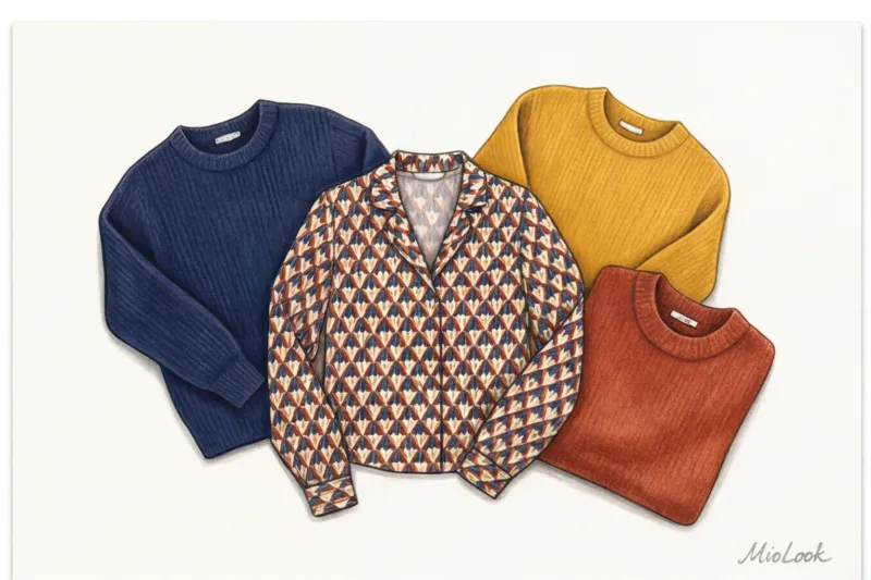
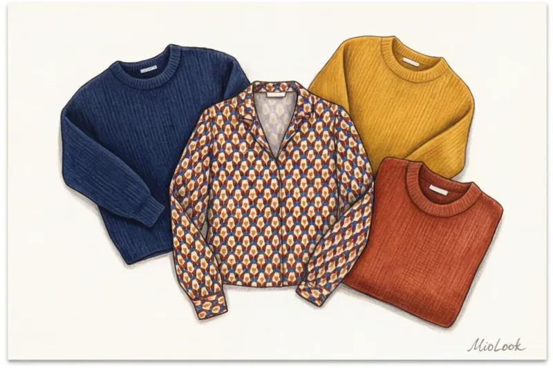
The fabric designer has already done all the hard work for you: they've selected a harmonious palette that works together perfectly. Your task is simply to break down the print into pixels. Any pattern consists of three elements: the background, the main macro pattern, and the smaller accent details.
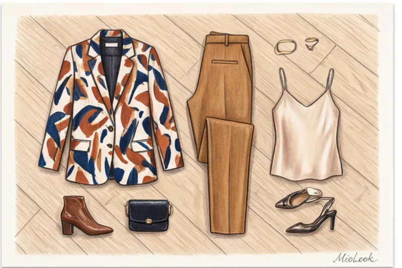
I recently did a personal test drive: I took a complex midi dress from Zara (dark blue background, large red flowers, small green leaves) and created five completely different looks with it, changing only the solid-color sweaters worn over it. The result amazed even me: depending on the color I "pulled," the dress shifted from strict classic to relaxed boho.
An important point: don't try to find a tone-on-tone item. A slight deviation in shade (for example, a dusty pink print and a rich fuchsia sweater) makes the look more complex and casually European. A perfect match often looks like you bought a ready-made outfit from a mass-market store.
Strategy 1: Background repetition (safest)
If you're just starting to experiment, this is your way to go. Look at the base color of the design. If the background is olive, feel free to choose an olive jumper or jacket.
This technique creates the effect of a refined monochrome or a single suit. The pattern on the skirt or trousers seems to dissolve into the overall color vertical. This is the ideal solution for business capsule wardrobe and smart-casual looks when you want to look put together but not boring.
Strategy 2: Focus on Micro-Color (Aerobatics)
Now, here's the secret to creating a visually rich look, a favorite among street-style photographers. Find the color that's least present in the print (it takes up no more than 10% of the area). It could be a subtle mustard vein on a green leaf or tiny blue polka dots on a chocolate background.
Support this micro-color with a large, solid piece—for example, mustard pants. This works according to the 60-30-10 proportion rule formulated by the Pantone Color Institute: when you highlight the rarest hue, the look looks phenomenally well-thought-out. Others may not realize why the outfit looks so harmonious, but the brain picks up on this subtle color combination.
Your perfect look starts here
Join thousands of users who look flawless every day with MioLook. Digitize your printed items and let AI find the perfect color combinations from your closet.
Start for freeContrast Mistake: Why You Shouldn't "Calm Down" a Print with Black
Let's bust the biggest fashion myth: black is NOT universal. The idea that a vibrant, colorful skirt needs to be toned down with a solid black turtleneck is a stylistic crime against your figure and wallet.
Why do European fashion influencers avoid this technique? Pairing a bright print (especially pastel, warm beige, or soft floral) with stark black creates a harsh visual divide. It cuts the figure in half, makes the figure appear shorter, and makes the look downright cheap.
Instead of black, use complex dark shades:
- Graphite (charcoal gray) - works softer than black, goes well with cool prints;
- Deep navy blue - an ideal pair for geometry and red shades;
- Bitter chocolate — the best choice for warm floral and animalistic designs;
- Rich burgundy - adds status to any everyday look.
There is only one exception When black works: If the jet black is already present in the pattern of the garment (for example, in a black and white houndstooth or zebra).
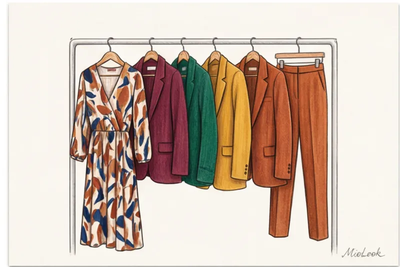
Shopping Hack for Zara, H&M, and COS: How the Collection Matrix Works
I often see clients struggling to find the perfect top to pair with complicated trousers. Let's take a look behind the scenes at European mass-market fashion. Textile designers at Inditex (Zara, Massimo Dutti) and the H&M group (COS, & Other Stories) never create in a vacuum. They work with seasonal templates.
The one-collection rule states that the brand purchases a limited Pantone palette for each season. If you see a complex silk skirt with a print that includes dusty rose on the rail, you can be 100% sure that on the next hanger is a solid cardigan, blouse, or top in the exact same dusty rose shade.
So, it's easiest to find the perfect pair right when you buy a patterned item. But what if the skirt was bought last year?
In this case, look for companions in basic lines with a good composition. H&M Premium Quality collections (look for dense cotton from 180 g/m²) or cashmere turtlenecks from Massimo Dutti's permanent collection are ideal. The colors in these lines are refined and slightly muted, allowing them to easily adapt to other prints.
From leopard to geometric: the specifics of combinations for different patterns
Not all patterns are equally flexible. What works with polka dots can turn a leopard into a disaster. Let's break down the main categories.
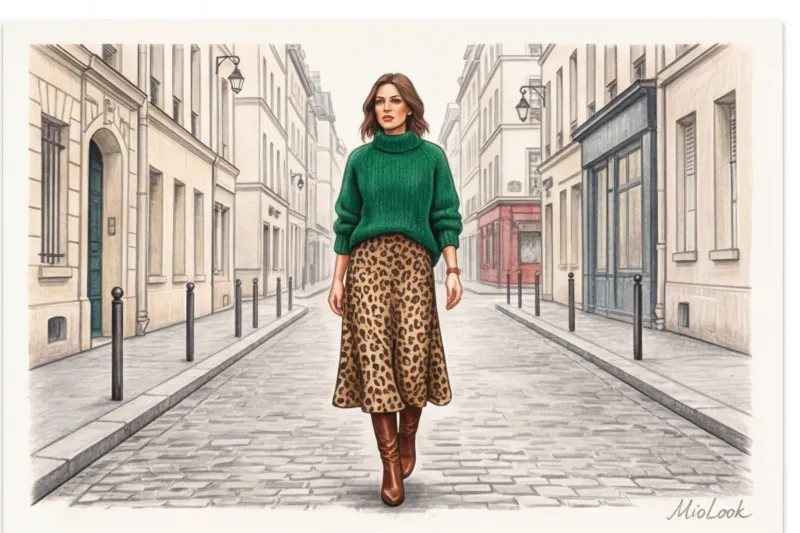
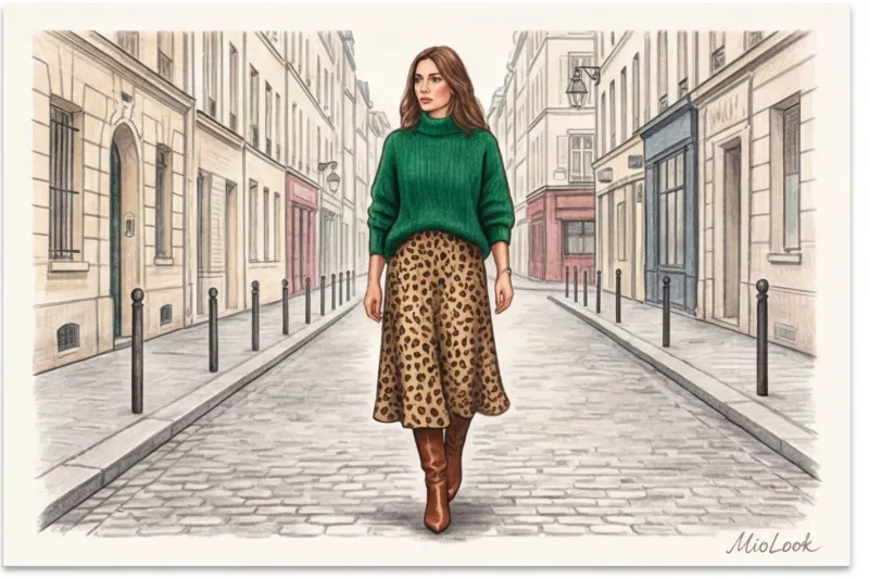
Animalistics (leopard, zebra, python). My client Anna adored her leopard-print midi skirt, but she only wore it with a beige T-shirt for fear of looking vulgar. We swapped the T-shirt for a chunky emerald-green sweater. The look instantly became runway-ready. Animal prints adore noble, "precious" colors: emerald, sapphire, ruby, camel.
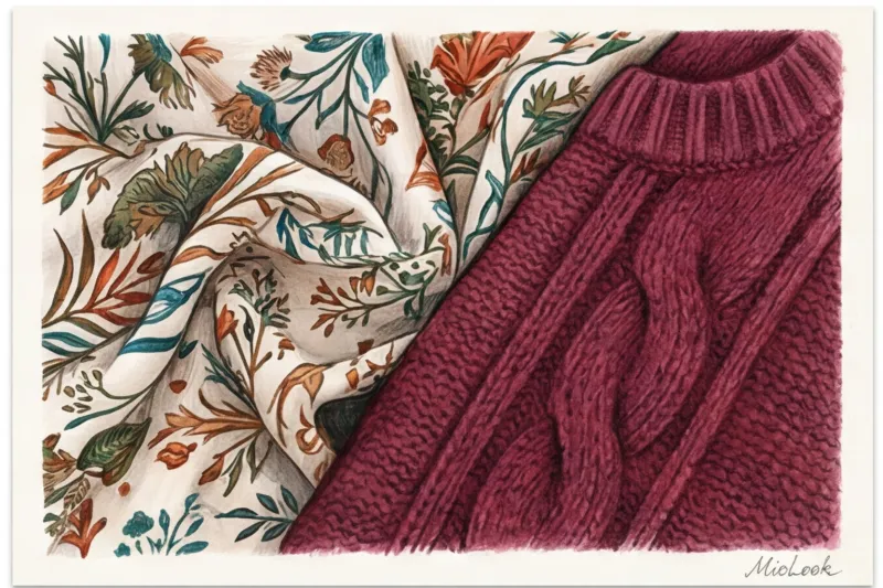
Floristry (flowers and botany). Floral prints often come across as overly romantic and childish. Texture contrast is key. Never wear lightweight floral silk with smooth, fine knits. Add a touch of ruggedness: matte, thick wool, rough leather, or denim. This will tone down the sweetness.
Geometry (check, strip, diamond). The most understandable pattern for capsule wardrobe To make geometric patterns look modern, bring out the brightest colors and complement them with shoes or a bag.
Abstraction. Artistic splashes and brushstrokes are best balanced with completely smooth base fabrics without pronounced texture (suit viscose, thick matte silk). Let the print speak for itself.
Ready to get started?
Upload a photo of your clothes to MioLook. The smart AI algorithm will automatically detect print colors and suggest dozens of stylish combinations from what you already own. Try the free plan—no commitments.
Start for freeChecklist: 5 Steps to Integrating a New Printed Piece into Your Wardrobe
If the theory seems complicated, just keep this practical algorithm handy. Before putting on a new patterned blouse or skirt, go through these five steps:
- Step 1: Photograph the print in daylight. Artificial lighting in the bedroom distorts the midtones. Go to the window. You can upload this photo to MioLook app to keep it handy while sorting out the closet.
- Step 2: Analyze the colors. Write down or mentally highlight 3 main shades: the background color, the color of the largest object, the color of the micro-detail (the smallest one).
- Step 3: Go to your closet. We're looking for any solid-color items (sweaters, T-shirts, jackets) in these three shades. Important: this step won't work with micro-prints (such as fine millefleur prints), which blend into a single dirty gray blob from a distance. They require completely different rules.
- Step 4: Check the invoices. If your printed item is smooth and shiny (satin, viscose), its companion should be matte (wool, cotton, suede).
- Step 5: Add the neutralizer. To avoid making the look too loud, choose shoes and a bag that match your hair color (the most natural shade for you) or a basic neutral color.
Printed pieces aren't museum pieces reserved for special occasions. They're the most powerful tools in your closet, capable of elevating even the most boring pair of basic jeans. Stop hiding behind safe black. Let your wardrobe work for you 100%, and you'll be surprised how many compliments your style can earn with just one well-chosen color choice.