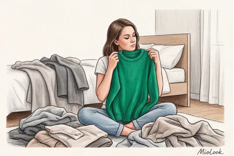

A couple of years ago, a woman came to me for a consultation, literally in tears, telling me how she'd thrown out half her otherwise perfect wardrobe the day before. Perfect because it contained luxurious black slip dresses, graphite turtlenecks, and charcoal jackets. Why did she do it? Another online "guru" had told her she was a "Soft Summer," meaning black would ruin her look forever.
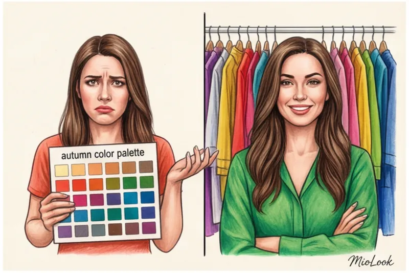
As a practicing personal stylist, I see this drama every month. Women voluntarily lock themselves into a cage of four seasons and lists of "forbidden" shades. But here's the truth: the question of How to determine your color type It's high time to rephrase this. We're no longer looking for a label, we're looking for your individual settings. By the way, we've already discussed how to build a harmonious foundation without rigid rules in our the complete guide to finding your style , and today I'll show you how to tame absolutely any color.
Why the classic "four seasons" theory is outdated (and how to determine your color type today)
The "winter-spring-summer-fall" system became wildly popular in the 1980s after the publication of Carol Jackson's book, Color Me Beautiful. It was a breakthrough for its time. But let's be honest: dividing billions of women with their unique blend of genes, skin tones, and hair textures into just four (or even twelve) boxes is absurd.
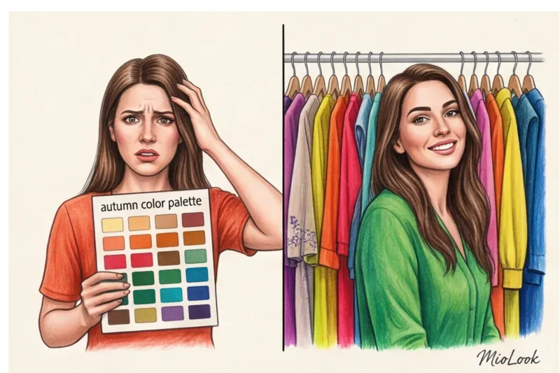
The main myth of old-fashioned color is the idea of a lifelong ban. They tell you, "You're spring, forget about fuchsia." So you're standing in a store, looking at a stunning fuchsia jacket that fits perfectly, but you don't buy it out of fear. This kills all the joy of fashion.
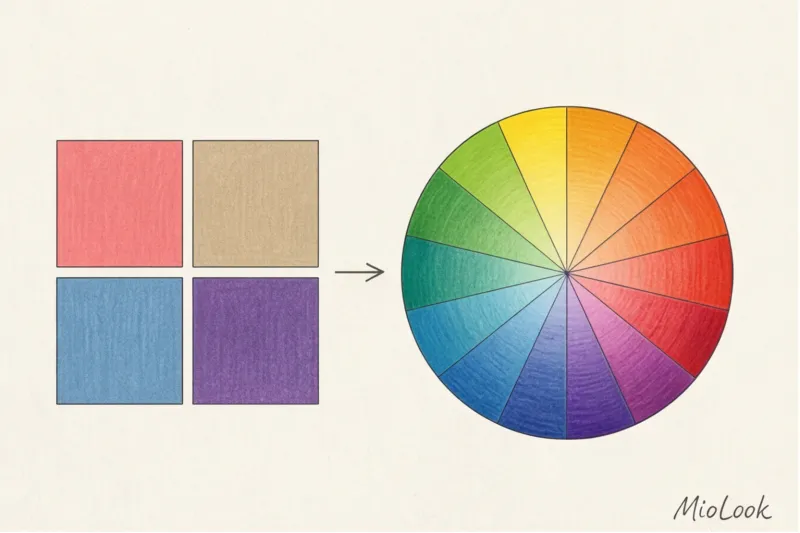
Modern stylists work differently. We use a directional method (based on Albert Munsell's color system). We don't label you as "Autumn." We analyze the physical characteristics of your appearance: temperature, contrast, and saturation. This allows us to find the right variations of colors rather than eliminate them.
Your perfect look starts here
Join thousands of users who look flawless every day with MioLook.
Get access — €0.99 onceThe Stylist's Main Secret: Temperature, Contrast, and Saturation
To understand how color works for you, you need to think of it not as magic, but as optics. According to research by the Pantone Color Institute, the right shade can visually smooth out wrinkles and eliminate signs of fatigue more effectively than expensive concealer.
Instead of seasons, remember the three pillars on which your color scheme is built:
- Temperature: cold (with a blue undertone) or warm (with a yellow undertone).
- Contrast: the difference between the lightest and darkest elements of your face.
- Saturation: pure (bright) colors versus muted (with a touch of gray).
How to determine temperature: Forget about the "vein test"
If you've ever Googled color type advice, you've definitely seen this rule: "Look at the veins on your wrist. Green means you're warm, blue means you're cool." I'm officially saying: forget this nonsense.
The thickness of the skin on the wrist, the degree of tanning, lighting, and the amount of subcutaneous fat distort the color of the veins beyond recognition. This test is completely useless.
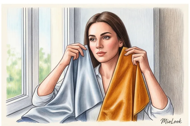
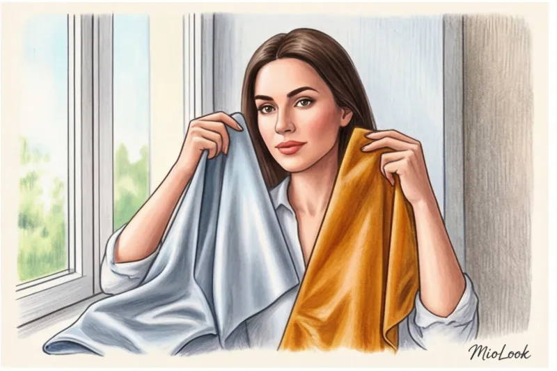
The only effective method is draping, which involves applying fabric to your face. Take foil or fabrics in two radically different temperatures: cool silver and warm gold, or cool icy fuchsia and warm salmon. Apply them to your bare face. Your shade will even out your skin tone, while the wrong shade will highlight redness and cast a gray shadow under your chin.
Contrast: Why It's More Important Than Your Season
In my experience, it's the wrong contrast that most often ruins a look. Imagine Dita Von Teese: porcelain skin and jet-black hair. It's the ultimate contrast. If she wears a pastel gray-beige dress, her face will be lost.
My favorite stylistic formula is this: High-contrast looks require color blocking in clothing. Low-contrast looks favor monochrome and smooth gradients.
A few years ago, I changed my hair color from deep chestnut to a warm honey blonde. My contrast dropped dramatically. My favorite combinations of a crisp white shirt and black jacket suddenly looked like the clothes dominated my face. I had to tone down my palette to creamy and chocolatey tones.
Anatomy of the Portrait Zone: How to Wear "Forbidden" Shades
And now for the main life hack we use with our clients. Remember the girl who threw out her black clothes? We brought black back into her wardrobe with one simple rule.
80% of the impression of clothing color is formed within a 30-centimeter radius of your face. We call this the "portrait zone." What you wear below the bust has no effect whatsoever on your complexion or freshness.
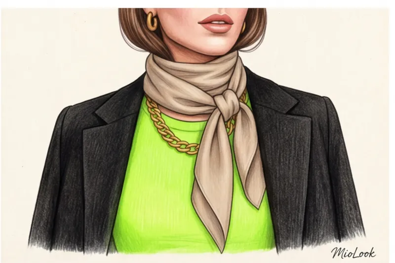
If you're madly in love with a color that objectively doesn't suit you (say, it makes you look tired), use these three tricks:
- Move the color down: Trousers, skirts, shoes, and bags can be absolutely any color. My formula for such cases: A basic neutral jacket + a silk midi skirt in your favorite "forbidden" color + loafers = instant polish.
- Move the color away from your face: The deep V-neckline creates a buffer zone of your own skin.
- Break the border: Place a collared shirt in your ideal shade between the "wrong" sweater and your face. A white collar will save even the most unfortunate earthy sweater.
Access to MioLook for €0.99 — one-time payment
A smart AI stylist will choose the perfect look for you and help you create a capsule wardrobe in your best colors.
Get access — €0.99 onceStep-by-step plan: how to determine your color type at home
Ready to test yourself? Put online tests aside and trust your eyes. Important caveat: this test will NOT work in the evening under a chandelier. Only daylight from a window, with no direct sunlight, is recommended.
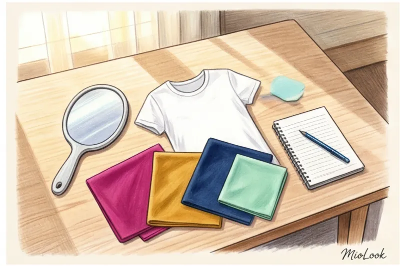
Step 1: Preparation. Remove makeup (especially foundation). If your hair is dyed, tie it back with a white or gray headband.
Step 2: White Sheet Test. Place a sheet of crisp white printer paper against your face, then an ivory-colored (or cream-colored) fabric. If the crisp white makes your face appear grayish or tired, while the soft creamy fabric gives it a glow, your body temperature leans toward warm. And vice versa.
Step 3: Draping from the closet. Get out items in radical shades. Compare them in pairs: bright orange against icy blue. Neon lime against muted olive.
Look not at the fabric, but at your face. You've found "your" color if:
- The shadows under the eyes became less noticeable.
- The nasolabial folds have become visually smoother.
- Pigmentation and redness seemed to be erased with a slight blur.
- The eyes shone brighter (yes, that's how optics work).
By the way, to avoid forgetting my best finds, I recommend that clients take photos of these successful shades in daylight and upload them to smart wardrobe feature in MioLook This way, you can always compare the color in the store with your virtual palette.
A Mediterranean Approach to Color: Building a Flexible Palette
My personal style was largely shaped by observing women in Italy and Spain. Do you know what their secret is? In Spain, we don't think about color types; we think about light and texture. The Mediterranean approach to color is relaxed, confident, and rich, natural tones.
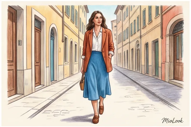
Spanish women rarely wear "clean," open colors like bright yellow or bright pink. They opt for complex, sun-bleached hues: terracotta instead of red, azure instead of blue, olive instead of green. These colors are incredibly adaptable and suit almost everyone, regardless of skin temperature.
Instead of buying items exclusively from your strict color palette, build your wardrobe using the 60/30/10 principle:
- 60% - your basic neutrals (camel, graphite, milky, dark blue).
- 30% - your ideal accent colors (the ones that light up your eyes).
- 10% - trendy or "forbidden" colors that you simply adore and wear as status accessories, shoes, or away from your face.
Common mistakes when choosing shades (and lighting traps)
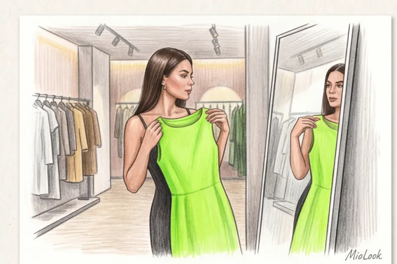
Even if you know your ideal characteristics, it's easy to make a mistake when shopping. The main enemy of your ideal looks is the fitting rooms at mass-market stores (Zara, H&M, and even many premium boutiques).
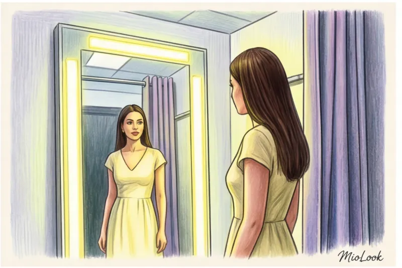
According to statistics from commercial lighting specialists, fluorescent lamps in fitting rooms (often with a color temperature of 4000-5000 Kelvin and a low color rendering index) distort the perception of your skin color by 30-40%. They pull out green and gray undertones, making you look unhealthy. Never judge the color of a garment by looking in the fitting room mirror. Go out into the sales area, find a window or at least a place with soft, diffused light.
The second common mistake is ignoring the texture of the fabric. Color is reflected light. Smooth silk reflects light, making the color brighter, richer, and cooler. Loose linen absorbs light, making the same dye softer, more muted, and warmer. A woman with low contrast might look vulgar in a red silk top, but incredibly aristocratic in a linen jacket of the same shade.
Summary: Your Color Is Your Tool, Not Your Frame (Action Plan)
Finding your perfect shade is a fascinating exploration, not a test you can fail. Color should serve your goals: make you stand out at a presentation, relax you while relaxing, or elevate your status during negotiations.
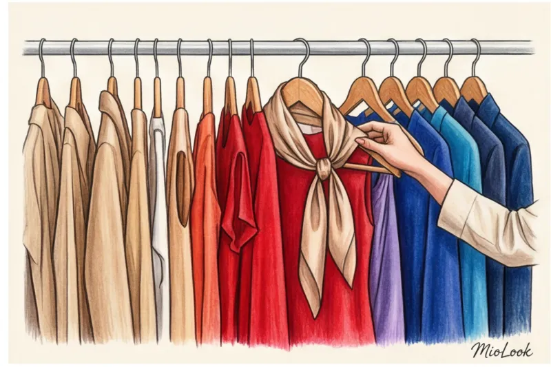
To make sure this theory doesn't just remain text, here's your action plan for today:
- Conduct an audit of the portrait zone. Get out five of your favorite tops or sweaters. Hold them up to your face in daylight and ask yourself honestly: "Does this color make me look fresh or does it make me look like I haven't slept in three days?"
- Determine your contrast level. Take a black-and-white selfie in good lighting. If your hair, eyebrows, and eyes blend into your skin like a single gray mass, you have low contrast (choose monochrome). If your hair is stark black/white against your skin, you have high contrast (color blocking is a good choice).
- Save the "mistakes". Don't throw away items that don't suit you. Style them with a white shirt, a scarf in the right shade, or move them down to the bottom of your silhouette.
Fashion should inspire confidence, not limit you. Experiment with textures, enjoy shades, and remember: there's no color you absolutely can't wear, only the wrong proportions and awkward placement.