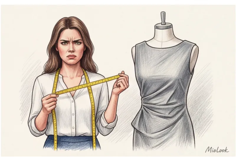
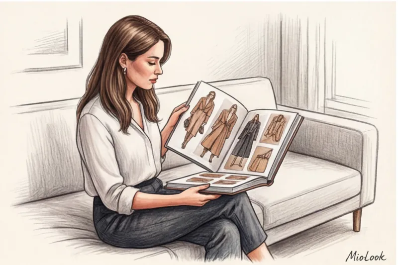
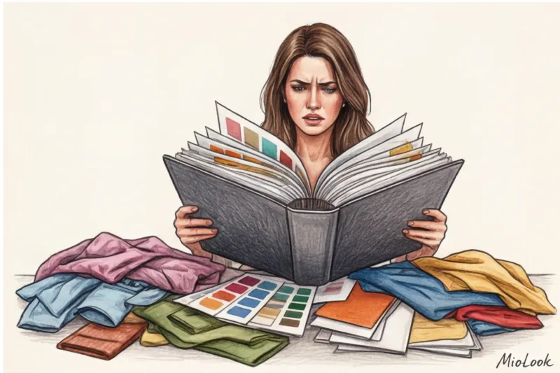
"Camilla, I can't find that perfect silk midi skirt from Massimo Dutti! The link won't open, and we already have fifty photos and voicemails in our WhatsApp." I received this message from my client, a top manager at a large IT company, at 11:00 PM the day before her important presentation. I opened our chat and was horrified: dozens of disparate screenshots, links, and my own text comments had turned into an utterly unreadable visual chaos. It was that evening that I realized: the traditional stylist approach to wardrobe presentation is hopelessly outdated.
If you're wondering how to design a lookbook for a client, forget everything you learned in classic styling courses. Today, we must think not like glossy editors, but like UX/UI designers. Clients don't need a fashion encyclopedia—they need a convenient, intuitive control panel for their own closet. We've already covered the digital transformation of our profession in more detail in the full guide. The Best Styling Apps: How to Manage Clients Online , and today we'll look at the anatomy of the perfect presentation.
The Evolution of Presentation: Why Classic PDF Stylebooks Are Losing Relevance
Let's separate the concepts right away. A stylebook is your visual strategy, a client's style constitution, outlining cuts, lengths, and palette. A lookbook, on the other hand, is a practical catalog of specific, finished looks assembled from purchased items. These days, these two formats often merge into a single document, and that's where the problems begin.
The main enemy of a static PDF file is time. According to Nielsen research (2023), the life cycle of a trending basic item in mass-market stores has shrunk to 2-3 weeks. If you're putting together a shopping list for Zara or COS, be prepared: up to 30% of the links in your carefully designed document will expire within the first 72 hours. The items will simply sell out.
By sending a client a heavy PDF file via messenger, you shift the responsibility for keeping the information up-to-date onto them. The stylist profession is transforming: we're no longer just "shoppers with bags," we're personal style architects. And our job is to create a system that's easily updated and scalable, not leave clients frantically searching for replacements for sold-out pants.
The Gold Standard: The Structure of the Perfect Business Stylebook
The architecture of a competent presentation is always built on the principle of a funnel: from a general strategic vision, we narrow down to a specific button on a jacket. The ideal formula, which I've developed over 12 years of practice, is 20% theory and inspiration and 80% purely practical solutions.
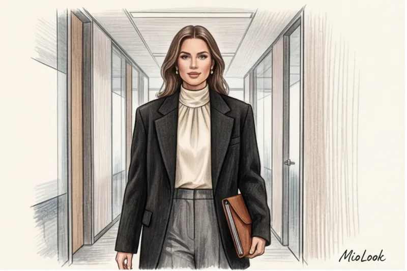
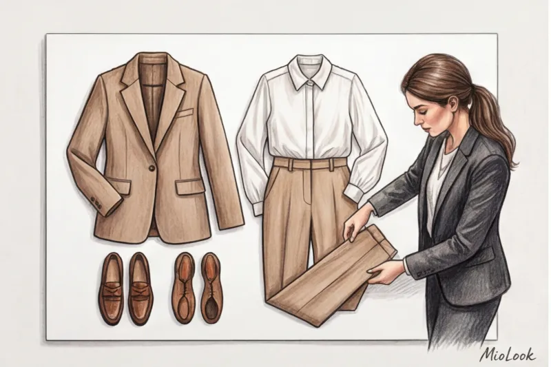
This is especially important when working with experts, lawyers, or speakers, where wardrobe directly impacts their personal brand. They don't need abstract discussions about color types. They need to know how a well-cut navy blue suit will help them capture the audience's attention.
Visual Analysis and Style DNA
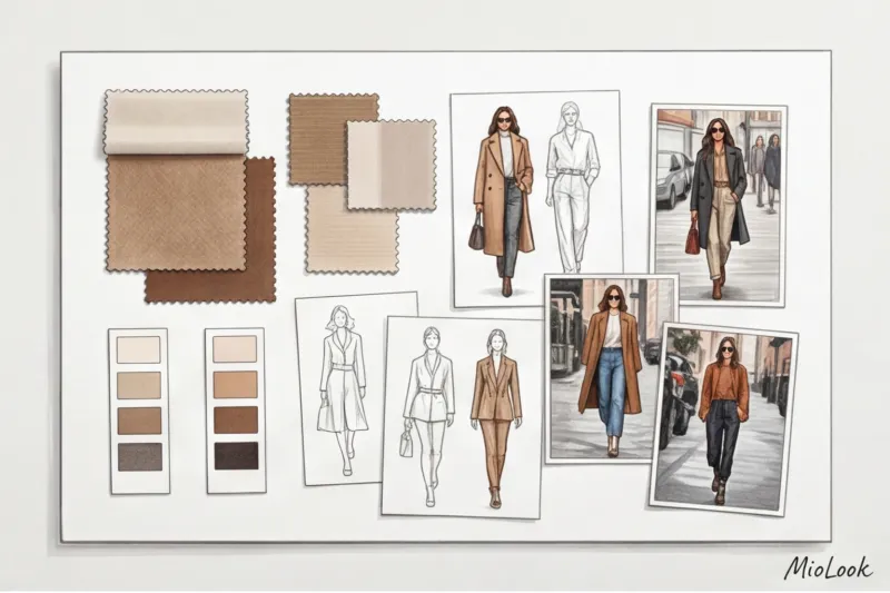
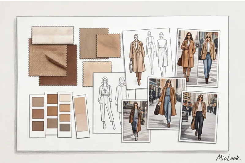
It all starts with a mood board—a collage that conveys the aesthetic without tying it to specific pieces. Here, we showcase textures (for example, thick matte silk or grained leather) and a color palette.
Fair warning: This step doesn't work for everyone. In my experience, if your client is a strictly logical thinker (a financial analyst, a programmer), abstract mood boards can only irritate them. In such cases, I reduce the "mood" section to one slide and move on to clear cut geometry: which collars we wear and which we categorically avoid.
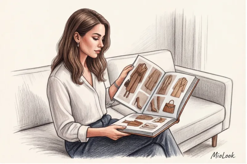
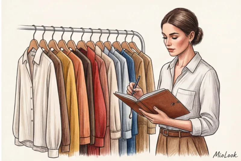
Capsule and smart shopping list
The presentation of items for purchase should be structured according to the "matrix" principle. Not just a list, but a visual table where the tops (horizontally) are seamlessly combined with the bottoms (vertically). This immediately alleviates the client's fear of "what will I wear this with?"
To minimize the stress of the proverbial "sold out," always include room for alternatives in your design. If you're offering a beige trench coat from H&M, be sure to include a mini-link to a similar option from Massimo Dutti or a local mid-range retailer. Also, implement prioritization: highlight items you need to buy in the first 24 hours in red or bold, and those that can wait until next month in gray.
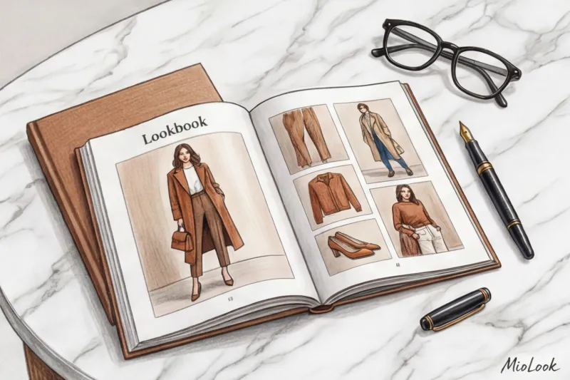
Lookbook
In this section, you assemble specific collages. The main rule of composition: maintain realistic proportions. A huge bag that looks larger than a coat on a slide is disorienting. Items should be scaled to match their appearance in real life.
- Group images according to the client’s life scenarios: “Board of Directors Presentation,” “Friday Casual at the Office,” “Business Trip.”
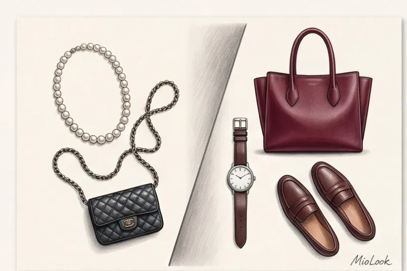
- Create visual anchors: for example, show how one bright accent bag (say, burgundy) ties together five completely different outfits.
Your perfect look starts here
Join thousands of users who look flawless every day and save time getting ready with a smart wardrobe.
Start for freeHow to Design a Lookbook for a Client: Common Mistakes That Kill Trust
You know what many aspiring stylists pride themselves on? Their hundred-page tomes. "I've done a tremendous job, let the client see the value!" they say. This is the most dangerous misconception.
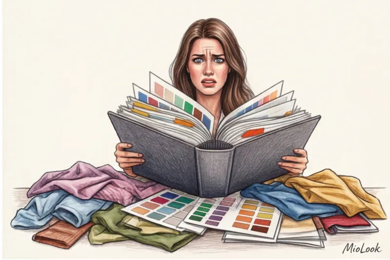
A massive 100-page document causes severe choice paralysis in clients. They'll open it once on the weekend, get overwhelmed by the sheer volume of information, close it, and never return. The ideal length for a working stylebook is 15-20 pages of summary.
Here are three more critical mistakes I regularly encounter in supervision:
- Landscape orientation. This is a conversion killer. According to WGSN analytics (2024), over 85% of clients view stylebooks sent to them on their smartphones while stuck in traffic or having a cup of coffee. If your file is horizontal, clients will have to constantly zoom in and move their screen to read the text. Always use a vertical (portrait) layout to fit the phone's screen format.
- Visual noise. Frames, flowers, watercolor brushstrokes in the background, and five different handwritten fonts. Your design shouldn't clash with your clothes. A complex background distracts the eye from the main product—your wardrobe.
- Ultimacy. When only one pair of loafers is offered for a complex outfit, if the client doesn't like the last, the whole look falls apart. Always offer two or three alternative shoe options.
Top Styling Tools: From Classic Design to Smart Platforms
The stylist's toolkit has undergone significant changes. While we used to layout in PowerPoint, today's choice of platforms allows us to automate 70% of the routine work.
Basic level (Canva, Keynote, Figma): Excellent tools for creating beautiful static images. Figma lets you set up convenient templates with auto-alignment. But their main drawback is that the files remain dead. As soon as the item disappears from the store, you have to open the source file, redo the slide, and re-export the PDF.
Advanced level (Notion): Many colleagues have switched to Notion, creating interactive databases there. This solves the problem with links (they can be updated in real time), but it requires clients to register and understand the interface, which was originally designed for IT managers, not shopping.
The Future of the Profession (Specialized Platforms): These are the apps where your wardrobe lives and scales. In my experience, switching to solutions like MioLook , saves up to four hours of layout time per client. You simply upload items, and the system automatically generates images and organizes them into a phone-friendly format. The client receives access to their virtual smart wardrobe, not just a file.
Try MioLook for free
Start creating perfect images and interactive capsules for your clients using artificial intelligence. Forget about manually formatting PDFs.
Start for freeThe Psychology of Layout: How Design Sells Your Expertise
The design of your stylebook is the packaging of your service. Just as we judge the quality of a cream by the weight of its glass jar, a client judges your professionalism by the layout of your document. And this is where art direction comes into play.
Incorporate the principle of "negative space" (air) into your work. Compare the tightly packed rails at a discount store to a half-empty The Row or Jil Sander boutique. Empty space around an item is subconsciously interpreted by the brain as a sign of luxury and exclusivity. Don't try to squeeze ten photos onto a single slide. Instead, show three, but give them room to breathe.
A crucial mark of professionalism is clean clipping (removing the background from photos of items). Items cut crookedly, with white corners from the store background, look sloppy. Use built-in AI tools for clean background removal to ensure all items in the collage are in a single space.
And the final rule of typography: use a maximum of two fonts. One sans-serif font for body text to ensure it's easy to read on a mobile screen, and one serif font for large headlines to add a magazine-like flair.
Final checklist before sending the presentation to the client
Even the most brilliant work can fail at the delivery stage. Before sending the client that coveted link or file, run the result through this checklist. I do this before every project delivery.
- Test on 13-inch and smartphone. Send the file to yourself via messenger and open it on your phone. Is the text legible without zooming in? Is it clear how to scroll?
- Checking links and sizes. Check all links an hour before shipping. Make sure not only the item itself is in stock, but also the customer's desired size. If there's only one size 44 left, be sure to let them know in the comments.
- Color rendering test. Keep in mind that screens distort colors. What looks like a warm beige on your professional Mac might turn into a dirty yellow on a client's smartphone's AMOLED display. If the hue is critical (for example, for the portrait area), include a note: "The color in real life is slightly cooler, a dusty pink."
- Instructions "What's next?" Never leave a client alone with a file. The closing slide should contain a clear call-to-action: "1. Study the images. 2. Write me your thoughts by Friday. 3. We'll start taking orders on Saturday."
A well-designed lookbook is more than just a pretty picture; it's an effective sales and retention tool. Treat it like a wardrobe dashboard: it should be concise, functional, and always at hand. Stop spending hours aligning pixels in static files—invest that time in finding unique stylistic solutions, and outsource the technical details to specialized digital platforms.