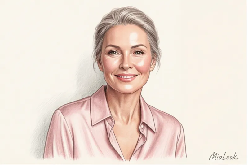
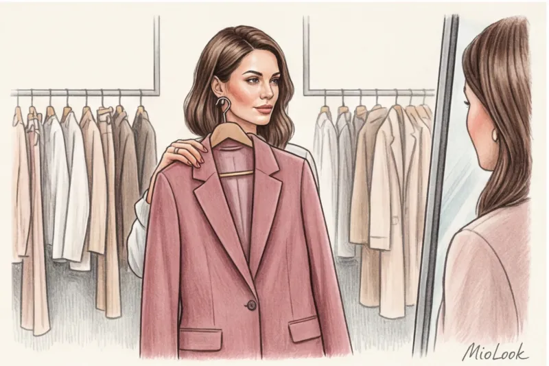
Clients often come to me with the same request: "Olena, I'm 45, I want to look fresher, but don't suggest pink—I don't want to look like an elderly Barbie." One of my clients, the CFO of a large IT company, categorically refused to even consider the color. We compromised: I simply held a silk blouse in a muted dusty rose shade to her face. A second later, she looked in the mirror and asked, "Did I just get back from vacation?"
Everyone says that pink color makes you look younger And this is indeed true. But it's not about psychology, associations with youth, or imposed trends. It's much more prosaic: it's pure optical physics. We've covered how such visual illusions work in more detail in our a complete guide to flowers that make you look younger And today I propose a detailed examination of the color pink—as a tool that can erase fatigue from your face, or, if chosen incorrectly, add a decade to your age.
The Physics of Rejuvenation: Why Everyone Says Pink Makes You Look Younger
Over 14 years of working as a stylist, including on commercial photo shoots, I've learned one ironclad rule: light is everything. In portrait photography, there's the concept of albedo—the index of light reflection off different surfaces. So, the right light shade of pink near the face acts as a professional photographic reflector.
As we age, after 40, inevitable physiological changes occur: hemoglobin levels decline, and blood microcirculation slows. Skin loses that infamous "dewy skin" effect (that dewy, inner glow) and its natural flush, becoming duller and more matte. What does a pink top or scarf do? It catches daylight and reflects it onto your face, mimicking that lost flush.
"The 'pink is refreshing' rule isn't a brand marketing ploy, but rather strict coloristics laws. On set, makeup artists apply half as much foundation to models over 40 if we dress them in pale pink silk."
When you wear dark matte fabrics (black, deep burgundy), they absorb up to 80% of the light. As a result, all the shadows on your face—nasolabial folds, under-eye circles, wrinkles—are more clearly defined. Pink, on the other hand, fills these shadows with a soft glow.
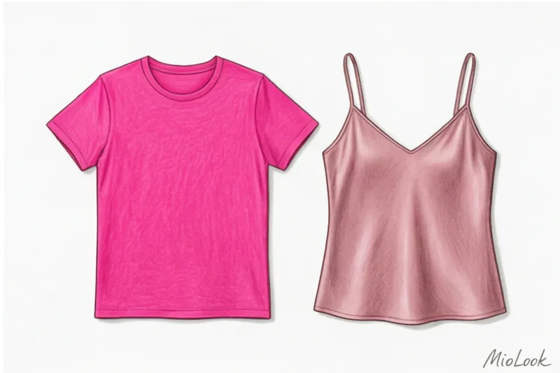
The Biggest Myth: "Barbie Pink" Works for Everyone (Spoiler: It Can Age You)
Now, about when it doesn't work. The biggest mistake I see in fitting rooms is the blind belief that any Pink will automatically take 10 years off your age. I'll let you in on a secret: bright neon fuchsia (shocking pink) on a mature woman's face often produces the opposite of a rejuvenating effect.
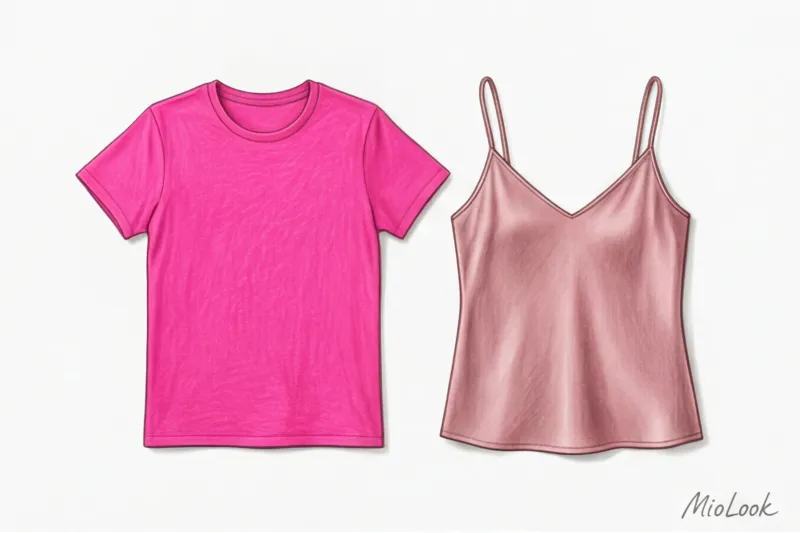
Why does this happen? Let's turn to Johannes Itten's color theory (published back in 1961 in his book "The Art of Color," which remains the bible for designers). Itten described the phenomenon of simultaneous contrast. As we age, our natural contrast diminishes: hair grays or fades, eyebrows become lighter, and pigmentation washes out our even skin tone. If you place a loud, aggressive color against this delicate, watercolor-like background, the clothes will become "louder" than your face.
Against the backdrop of acidic fuchsia, skin instantly takes on an earthy, grayish-green hue. The color brings out all imperfections, capillaries, and age spots. Remember: clothes should never enter the room before you do.
Try MioLook for free
A smart AI stylist will find the perfect look and help you integrate the right shades into your wardrobe without breaking the bank.
Start for freeHow to Find Your Anti-Aging Pink: The Inner Glow Rule
The basic rule of coloristics is that the color of clothing in the portrait area should complement your skin tone, not clash with it. Finding your perfect shade isn't that difficult if you know where to look.
Stylists have a secret test. Place a cloth against your chin in good daylight. Don't look at the color of the cloth—look only at your own hair. nasolabial folds and the area under the eyes If the shadows there have become deeper, or your chin has acquired a strange sheen, remove the item immediately. If your skin has visibly smoothed out, you've found your perfect color.
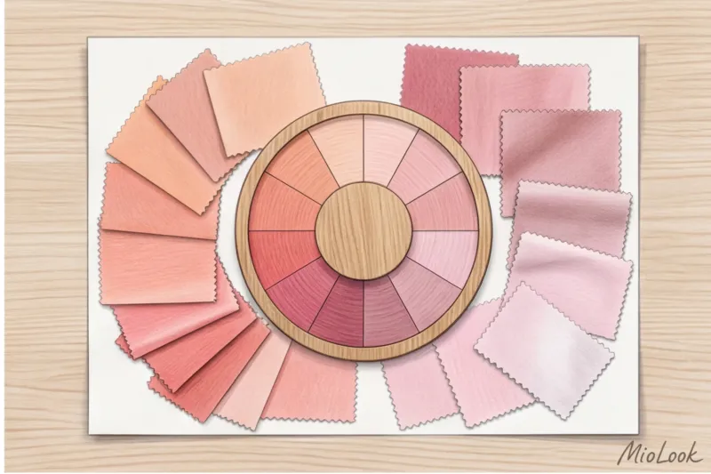
For warm skin tones: peach, salmon, and coral
If you have golden, olive skin, freckles, and the veins on your wrists appear more greenish, you need shades with a hint of yellow or orange pigment. For more information on how to work with this complexion, read our article about palette for warm skin undertones.
- Peach: It brilliantly erases dark circles under the eyes (remember what color concealers makeup artists use to cover up dark circles).
- Salmon: Adds warmth to the face, ideal for those who feel like they look pale.
- Soft Coral: A great alternative to red for evening wear.
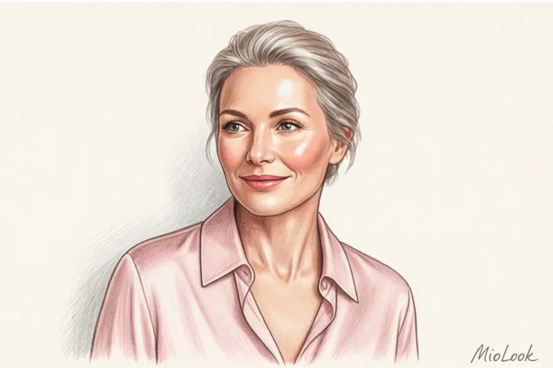
For cool skin tones: dusty rose, ash, and icy
Porcelain skin, light brown or ash-blond hair, and rich gray hair call for cool shades with a hint of blue or gray undertones. We discussed the characteristics of this appearance in the article about stylization of a cool undertone.
The cool "dusty rose" is a true secret weapon. Thanks to its gray pigment, it masterfully neutralizes redness, rosacea, and post-acne marks. And the "icy pink" makes the whites of the eyes appear whiter and brighter.
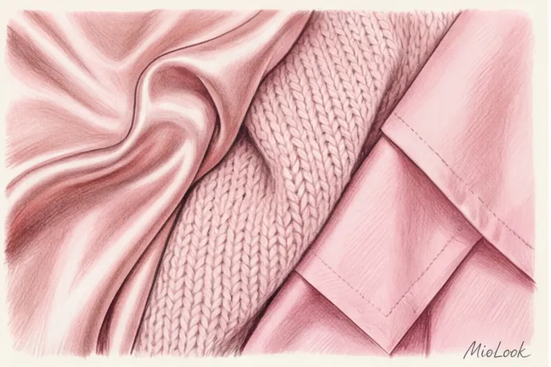
Texture is everything: why not only color but also fabric is important
You can choose the perfect color temperature, but ruin it with a cheap texture. As we've already established, our goal is to make light reflect. Therefore, glossy and smooth fabrics are much more effective at rejuvenating than loose ones.
A silk or satin blouse in a powder pink shade (look for options in dense viscose or natural silk in the €80–€150 range from brands like Massimo Dutti, COS, or local labels) is the best investment in an anti-aging wardrobe. It creates that luminescent effect.
And here it is when it doesn't work Avoid cheap, loose, pink acrylic knits. Fluffy, pilly pink sweaters instantly cheapen the look and create a scruffy, untidy feel instead of the desired freshness.
Your perfect look starts here
Join thousands of users who look flawless every day with MioLook. Take a photo of your belongings, and AI will create the perfect capsule wardrobe.
Start for freeWhat to wear with pink at 40+ to look classy and not childish
Returning to my client, the financier, her main fear was, "I'll look like a teenage girl at a business meeting." This is easily avoided by following the rule of stylistic neutralization. If the color is delicate and romantic, the cut and complementary colors should be as formal as possible.

No ruffles, flounces, bows, or puff sleeves. Opt for straight, menswear-inspired cuts: simple jackets with defined shoulders, straight shirts, and sleek turtlenecks.
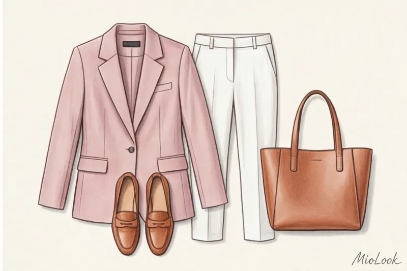
What to combine with to look expensive:
- With a Camel shade: the most noble and aristocratic combination.
- With graphite grey: the perfect balance of femininity and formality for the office.
- With dark chocolate: a deep and warm alternative to black.
What to avoid: A direct contrast of pink and charcoal black. This combination often looks rough, theatrical, and evokes 2000s aesthetics (emo subculture or cheap cabaret). Replace the black with navy, and the look instantly becomes sophisticated.
Pink in a business wardrobe: a stylish replacement for a white shirt
Have you ever noticed that a classic crisp white office shirt often makes your face look tired? The harsh white creates an overly aggressive contrast and unwittingly highlights the yellowish undertones of your teeth and eyes, which change with age.
Replacing the white shirt with a pearly pink is a micro-trend that has become a macro-trend. According to a large-scale study by the WGSN platform (2024), soft pastel tones have replaced stark white in 45% of women's smart-casual corporate wear capsule collections.
Muted powder and ash-pink shades have long been considered the new standard in business attire. You can wear such a silk top under a formal gray suit and look completely professional yet fresh.
Stylist Checklist: 5 Steps to Your Perfect Pink Look
To avoid getting lost in the clothing racks the next time you're shopping, keep this simple algorithm in mind:
- Determine your undertone: Apply gold and silver foil to your bare face. Which makes you look fresher? (Gold means you're a warm type, silver means you're a cool type.)
- Eliminate neon: If you are over 35, skip the open, "poisonous" and flashy shades of fuchsia.
- Check the invoice: For the portrait area, look for smooth fabrics with a slight satin sheen (silk, high-quality viscose, mercerized cotton with a density of 180 g/m²).
- Remove excess decor: If you choose a pink item, let its cut be laconic, like a men's shirt.
- Calm the color with a base: Combine the purchased item with graphite, dark blue or beige bottoms.
Style isn't about blindly following trends, but rather a deep understanding of your physiology and how clothes work with your body. The right pink isn't an attempt to look younger. It's a clever optical trick of a smart woman who knows how to manage impressions and look rested even after a hard week at work. If you're unsure which pieces in your closet truly flatter you, you can always use the wardrobe analysis feature in MioLook app to create the perfect combinations for every day.
Don't be afraid of color. Just find it. mine.


