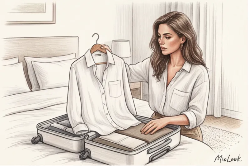
In 12 years of working as a fashion consultant, I've learned one cruel rule: nothing reveals a garment's true value like its color. We're used to thinking that black is safe, and any beige is synonymous with "old money." But the reality is far more complex. Sometimes a €50 mass-market item in the right shade of graphite looks more refined than an €800 designer cardigan if the color is chosen incorrectly.
We talked about building a base in more detail in our The complete guide to looking expensive as you age Today, I propose focusing exclusively on the physics and economics of color. We'll examine colors that look expensive and discover why not only the pigment itself but also the way the fabric reflects light is important for a prestigious look.
The secret behind premium brands: why do some shades look cheap, while others look expensive and prestigious?
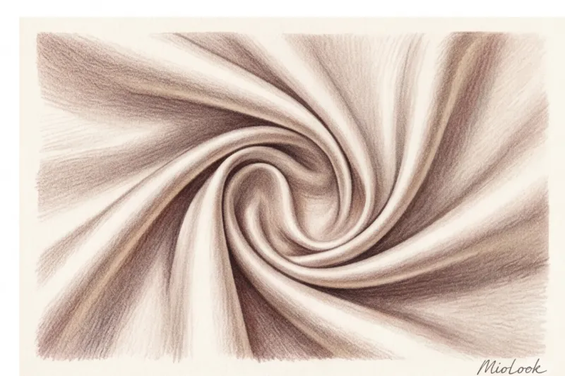
Color is an illusion created by light. And how "precious" a shade appears directly depends on the quality of the texture. A deep wine color on thick cashmere and the same wine on cheap, thin polyester are visually two completely different colors. Architectural cuts and dense fabrics, such as 22-mommie silk or cross-twisted wool, are able to "hold" complex shades, preventing them from disintegrating into muddy undertones under artificial light.
The main difference between the premium segment and its competitors lies in dyeing technologies. Factories like Loro Piana and Brunello Cucinelli use complex reactive dyes. These penetrate the fiber structure itself, creating a multidimensional, iridescent color that retains its depth even after dozens of dry cleanings. Mass-market fabrics save money by using surface disperse dyes. According to textile industry statistics, high-quality dyes are three to five times more expensive than their fast-fashion counterparts. This is why inexpensive items with complex colors (such as taupe) quickly fade and become covered in a whitish lint, losing all their luster.
"Modern luxury no longer screams with neon logos. WGSN's 2024 analytical report highlighted the concept of 'visual tranquility'—a trend toward deep, natural tones that don't overwhelm the nervous system and convey confidence."
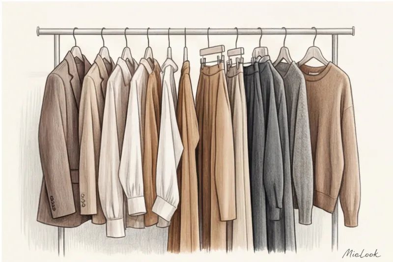
Colors That Look Expensive: Top 10 Status Shades for an Architectural Wardrobe
The "Quiet Luxury" palette isn't boring, it's a safe investment. These shades aren't subject to fleeting TikTok trends. For mature women, they serve as a true light reflector, illuminating the face, erasing signs of fatigue, and imparting an aristocratic nobility.
1. Ecru and ivory (instead of pure white)
Optical white (snow white) is one of the biggest turn-offs in a woman's wardrobe. Due to its high-contrast light reflection, it can accentuate wrinkles and uneven skin tones 30% more than softer shades. Furthermore, in inexpensive fabrics, it often has a bluish cast, reminiscent of a medical uniform.
Replace it with ecru, ivory, or butterscotch. Their subtle warmth works like a Photoshop filter, softening facial features and making skin tone appear healthier. Ecru looks especially luxurious on thick silk and smooth wool blends.
2. Bitter Chocolate
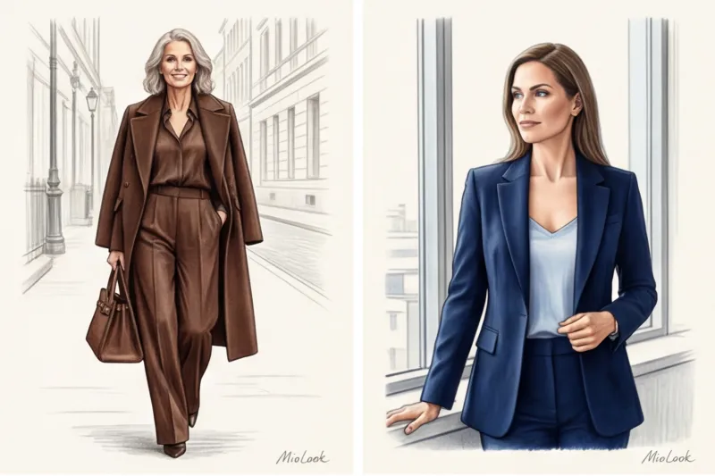
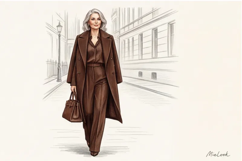
The PANTONE Color Institute and leading fashion houses confirm that deep chocolate has finally displaced black from the pedestal of basic dark shades. It possesses the same visual austerity, but lacks the mournful heaviness. Chocolate is ideal for leather bags, suede shoes, and cashmere coats. It softens facial contours and looks incredibly cozy, yet classy.
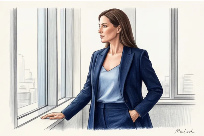
3. Deep dark blue (Midnight Blue / Navy)
An absolute classic for the corporate wardrobe of senior executives, "Midnight Blue" evokes unconstrained trust and projects authority without the slightest aggression. Unlike black, a high-quality Navy Blue begins to glow from within in the sunlight.
I always recommend navy blue for architectural jackets with sharp shoulders and wide-leg palazzo pants. The key rule: the fabric should be matte; any cheap sheen will turn this regal color into a conductor.
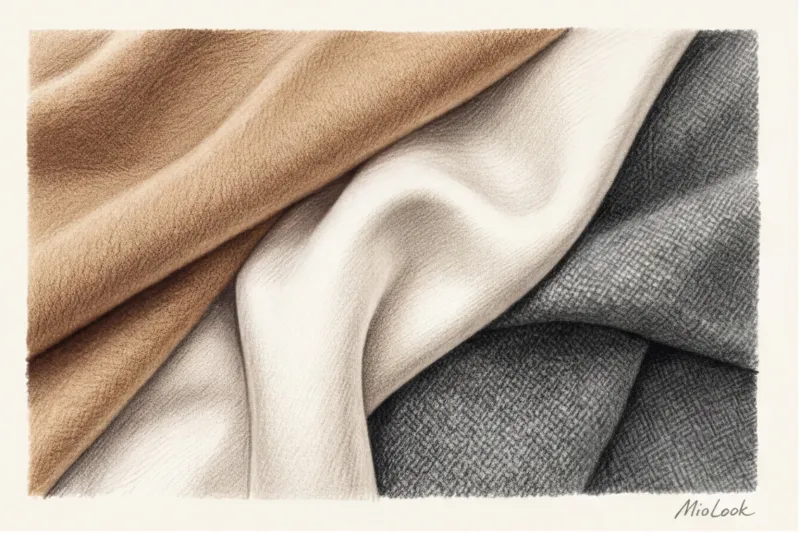
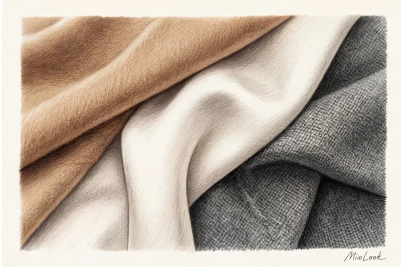
4. Camel and sand tones
A signature piece of Milanese street style and a staple of Max Mara wardrobes, investing in a quality camel coat (wool or camel) pays for itself many times over.
Important limitation: This advice doesn't work for everyone. If you have a pronounced cool undertone (olive or pinkish), a classic warm camel near your face will make you look unhealthy. Choose cool sand tones or wear camel on your lower body (pants, skirts).
5. Graphite gray
The perfect alternative to charcoal, graphite has historically been associated with the cloth of expensive bespoke men's suits. This shade is unforgiving of tailoring mistakes: every stitch is visible, so a garment must fit perfectly. However, a chunky graphite cardigan or a gray jacket made of thick viscose always looks significantly more expensive than its actual price.
Take your wardrobe digital
Having trouble figuring out what to wear with your new graphite jacket? Upload your items to MioLook, and our AI stylist will create dozens of stylish outfits from what you already own.
Start for free6. Taupe
A complex, multifaceted taupe. Its main charm is that mass-market products struggle to capture its true warmth—cheap fabrics often cast a dirty or greenish cast. If you've found the right, pure taupe, grab it without hesitation. It's the perfect color for basic ankle boots, knitwear, and medium-sized tote bags.
7. Wine and Burgundy (Oxblood)
The deep shade of oxblood historically belonged to the aristocracy. Today, it's a key accent color for those who want to add a touch of drama to their look while remaining within the bounds of good taste. The secret to styling: use burgundy in accessories (rigid bags, loafers, leather belts) paired with high-quality gold hardware. This instantly elevates the look to the premium category.
8. Emerald and pine needles
So-called "jewel tones" (precious stone colors) are subconsciously perceived as a sign of luxury. A dark pine green or deep emerald is a magnificent solution for a business environment when you're tired of blue and gray. A silk emerald blouse under a dark chocolate jacket is a combination that's impossible to look away from.
9. Dusty Olive (Khaki / Olive)
A symbol of relaxed chic and elegant casualness. To avoid associations with military uniforms, olive green is crucial to choose refined, flowing textures: linen, cupru, and thick silk. The right olive with a golden undertone luxuriously accentuates a light tan and refreshes the complexion.
10. Pearl Blue
The color of purity, freshness, and intelligent fashion. If a white shirt seems too stiff and straightforward, swap it for a pearl blue shirt. Blue silk or high-quality cotton (from 180 g/m²) reflects light onto the face, creating that "I just got back from a spa vacation" effect.
The illusion of black: why does this color often deprive an image of status?
Perhaps the most counterintuitive insight my new clients argue with is: "Black always looks expensive and slimming." In fact, black is the most demanding color in a wardrobe.
A few years ago, the CEO of a major bank approached me. Her question was, "I buy expensive black suits, but they make me look like I haven't slept in a week." We conducted an audit. The problem was that on mature skin, deep black acts as a harsh frame: it emphasizes under-eye shadows, nasolabial folds, and even the slightest trace of fatigue. We completely replaced her basic black wardrobe with sets in graphite, chocolate, and navy blue. A month later, she admitted that colleagues began asking if she'd had a facelift.
Furthermore, cheap black cotton fades after three washes, and black polyester has a telltale shine in the light. Black only really enhances your status in three situations:
- A perfectly tailored tuxedo made from thick Italian wool.
- A heavyweight crepe (250g/m² and up) that falls in architectural folds.
- High-quality lace or velvet, where texture plays a major role.
Not sure if black is right for you?
Use MioLook's color analysis feature. Artificial intelligence will suggest which dark shades will flatter your appearance and which ones should be avoided.
Choose your colorsThe Visual Silence Rule: How to Combine Colors to Look Like a Million Dollars
Even the most prestigious shades can be ruined by poor styling. In the world of luxury shopping, the rule of "visual silence" applies. This means avoiding harsh, garish contrasts (for example, a crisp white top and bright red bottoms).
The easiest way to look like a million bucks is to create a monochromatic look (Total Look). The secret isn't wearing items of exactly the same color, but mixing different textures within the same tone. For example, camel wool pants, a thin cashmere sweater a shade lighter, and suede loafers. The contrasting textures create volume and a luxurious feel.
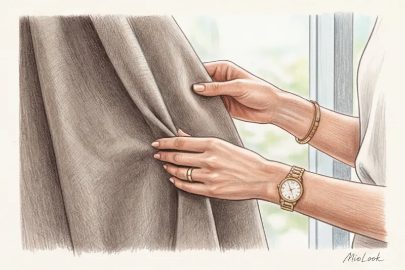
When combining different colors that look expensive, pay attention to the hardware. My golden rule for stylists: if your look is dominated by cool tones (graphite, pearl blue, navy), choose bags and shoes with silver or rhodium-plated hardware. For warm tones (chocolate, ecru, olive), muted yellow gold or brass are ideal. Shiny, cheap plastic, or overly yellow samovar gold will ruin any premium palette.
A stylist's checklist: how to check the color of an item before buying it
Never trust the lighting in a fitting room. High-street stores deliberately use warm spotlights (around 3000K) to offset the cheapness of fabrics and make colors appear more vibrant.
- Daylight test. Pick up the item and go to the store window (or outside, if possible). In natural daylight, you'll immediately see whether the navy blue has a cheap green tint, or the graphite has a polyester sheen.
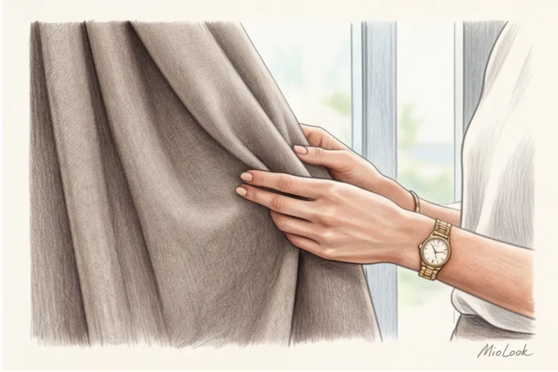
- Kink test. Squeeze the edge of the fabric in your fist for a few seconds. If this leaves sharp, shiny creases in the fabric (especially on dark items), it's due to cheap pigment and poor-quality thread.
- Button inspection. Have you noticed how premium items always have horn buttons, mother-of-pearl, or metal that match the fabric? If you find a jacket in the perfect taupe shade, but it has flimsy, shiny plastic buttons, buy it, but stop by a tailor on the way home and have the hardware replaced. It's an investment of €10-€15 that will visually add a couple hundred euros to the garment.
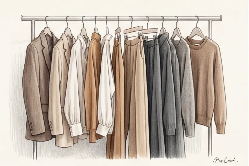
Creating a statement wardrobe isn't always a matter of huge budgets. It's a matter of discipline, observation, and an understanding of how color interacts with fabric and your complexion. To make this task easier, you can add your favorite statement pieces to a digital wardrobe database. MioLook applications , and the system itself will suggest which combinations look most harmonious and expensive every day.