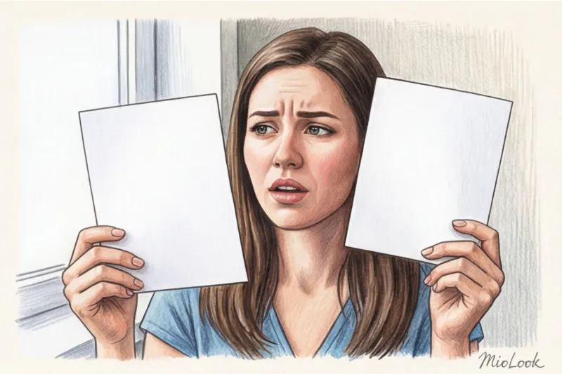
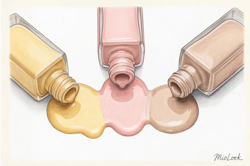
Chances are, you have one or two bottles of foundation costing €40–€60 in your makeup bag right now that you're not using. They looked perfect in the store, but in daylight, they turn your face into either a pale mask or an unnatural orange peach. In my 12 years as a colorist and image consultant, I've seen this scene hundreds of times.
The problem isn't that you're choosing bad brands. The problem is that the beauty industry has been feeding us oversimplified (and often flawed) skin tone tests for decades. Knowing how to choose a foundation based on your undertone isn't about looking at the veins on your wrist. It's about understanding the physics of color and the chemical reactions that occur on your face.
We talked about basic color theory in more detail in our The complete guide to determining your skin undertone , and today we'll go further: we'll explore the difference between overtone and undertone, decipher the mysterious letters W, C, and N on jars, and reveal one of the main secrets of makeup artists—the paradox of different brands' labels.
Why Old Vein Tests No Longer Work
"Look at your veins. If they're green, you're warm; if they're blue, you're cold." Sound familiar? Forget this advice forever.
The color of the veins on your wrist merely reflects the thickness of your skin and the optical blending of the blue pigment of your venous blood with the superficial tone of your epidermis. Trying to choose a foundation based on the inside of your arm is like buying paint for your living room by placing the palette on the hallway floor. The skin on your face has a completely different density, blood flow, and melanin level.
Another popular myth is placing a pure white sheet of paper on your face. According to the Pantone Color Institute (2023 Skin Color Report), the optical contrast of pure white instantly highlights any redness on the face. As a result, neutral skin appears "red" or "cool," leading women to mistakenly buy pink foundation.
The Munsell Color System, which professional colorists rely on, proves that perceived color is always dependent on the background. White paper distorts your skin's actual temperature, rendering the test meaningless.
Overtone vs. Undertone: The Main Mistake When Choosing Foundation
Why do we make mistakes in the store? Because we confuse two fundamentally different things: overtone and undertone. If you understand the difference between them, you'll never buy the wrong shade again.
Undertone — this is your deep shadow, a pigment given by nature. It is formed by a combination of melanin, carotene, and hemoglobin. Undertone never It doesn't change. You can get a tan, get sick, or flush in the cold—your undertone will stay the same.
Overton — this is the surface color of the skin. And it constantly changes. Tanning, rosacea, age spots, redness from cold or stress—all this is an overtone.
In my practice, one of the most common mistakes clients make is choosing a foundation that matches their overtone. For example, a woman has a naturally warm, golden undertone, but her cheeks have pronounced rosacea (a red overtone). When she goes to the store, she notices her red cheeks and buys a cream with a pink (cool) undertone. The result? Her face becomes a grayish-pink mask that clashes utterly with her yellowish neck.
What is Overton and how does it deceive us?
Our surface color is a great deceiver. If you have acne or sensitive skin prone to irritation, your overtone will appear reddish (cool). If you've just returned from vacation, a fresh tan will give you a bronze or brick-red overtone.
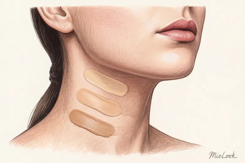
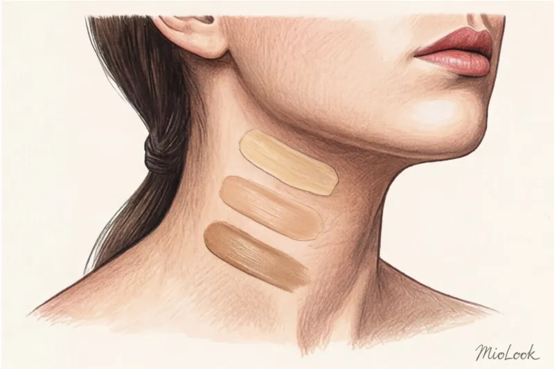
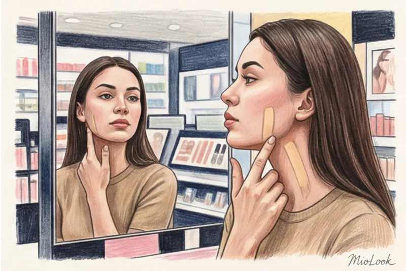
That's why professional makeup artists almost never test foundation on their cheeks. We focus on the neck, behind the ears, and collarbones—the skin there is least susceptible to overtone changes, and it's where your true undertone is hidden.
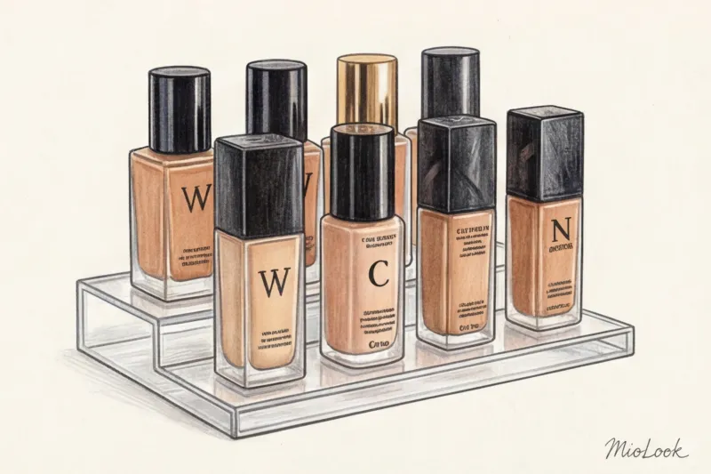
How to choose a foundation based on your skin tone: W, C, and N
So, you've figured out that you need to focus on your neck. Now let's decipher the letter codes that cosmetics manufacturers put on jars (for example, 1W, 2C, 3N). This basic international classification is your compass in the world of cosmetics.
W (Warm) — Warm undertone
The W marking indicates that the foundation base is dominated by yellow, peach, and gold pigments. Warm skin typically tans easily and evenly, acquiring a beautiful golden or bronze hue. If you wear gold jewelry, it will blend harmoniously with your skin.
C (Cool) — Cold undertone
The letter C indicates a predominance of pink, reddish, or bluish pigments. People with cool undertones often burn red in the sun before tanning. Silver appears brighter and fresher on this type of skin. A common mistake: women feel their "cool" skin looks too pale, so they try to add "life" to it with yellow (warm) cream. The result is a liver-related effect. Cool skin should be evened out with a cool or neutral tone, and "life" should be added with blush.
N (Neutral) — Neutral undertone
A neutral undertone is the perfect balance of warm and cool pigments, often with a slight beige undertone. If silver and gold look equally good on you, and your skin initially flushes slightly in the sun but then develops an even tan, you're likely an N.
Secret: If you're unsure between W and C, go with N. It's the safest choice and can be easily adjusted with powder or bronzer.
Your perfect look starts here
Having trouble matching clothing colors to your skin tone? MioLook's smart AI stylist can do it for you.
Start for freeThe Olive Undertone Trap: Why Neither W Nor C Suits You
Now it's time to talk about those who always feel like "outsiders at this party of life." According to research by the analytical agency WGSN (2024), over 30% of Eastern European and Slavic women have a complex olive undertone that doesn't fit into the basic W/C/N classification at all.
Olive undertone is a hidden green pigment created by mixing a yellow (warm) undertone with a gray/ash overtone. Because of this complexity, standard foundations perform terribly on olive skin:
- Warm (W) creams make the face look sickly orange or yellow.
- Cool (C) creams apply as a pig-pink stain.
- Neutrals (N) often look too gray.
What to do? Look for brands that have a separate olive line (often marked with the letter O, OL, or the word Olive). Or use a pro trick: take a cream in the shade N (neutral) that perfectly matches your skin tone and add a drop of green liquid primer/corrector. The green will neutralize excess redness and perfectly match your neck color.
Brand Paradox: Why One Manufacturer's W Is Another Manufacturer's C
And now we've reached the most counterintuitive point, the one that makes even seasoned beauty addicts cry. You've been using Estée Lauder foundation in the shade 2W1 for 10 years, then you walk into a MAC Cosmetics corner, confidently ask for "something warm, with a W"... and you get a pink foundation!
How did this happen?
Most brands (Dior, Estée Lauder, L'Oréal, Armani) use a straightforward logic: W = Warm = yellow pigment. C = Cool = pink pigment.
But the MAC brand (and some other professional brands) uses the logic of the artistic color wheel and color correction In their system:
- NC (Neutral Cool) — these are yellow, warm shades. Why? Because yellow is used to neutralize (cool down) overly red skin.
- NW (Neutral Warm) — these are pink and peach shades. Pink is used to "warm up" dull, sallow skin.
This knowledge will save you hundreds of euros. If you don't take this paradox into account when switching from luxury to professional products, you're guaranteed to buy the wrong shade. To avoid forgetting your ideal formulas, I recommend my clients keep a digital makeup bag. In the app MioLook You can not only save your best looks, but also record which shades and brands suit your skin tone perfectly in different seasons.
A colorist's guide to testing foundation in the store.
Knowing the theory isn't enough. You need to apply it correctly in practice. If you're choosing a foundation in the €50 price range, the margin for error is too high. Here's my proprietary testing algorithm.
1. The three-lane rule. Never apply foundation to your wrist or cheek. Choose three similar shades (for example, 2N, 2W, and 2.5N). Apply them in three vertical stripes along your jawline, extending the color down to your neck. The shade that literally melts into your neck without blending is your winner.
Limitation of the method: This advice does NOT work if you have severe age-related or sun-related hyperpigmentation on your neck. In this exceptional case, swatches should be done even lower—on your collarbones.
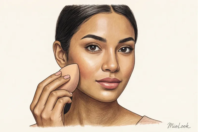
2. Daylight is essential. Store-bought lamps (especially fluorescent ones) mercilessly distort the red and yellow spectrums. After applying makeup, go outside or to a large window with natural light. What seemed perfect in the boutique may turn gray outside.
3. Oxidation test. This is a crucial step that 90% of women skip. Foundation is a chemical emulsion. When exposed to oxygen and warm sebum (sebum) on your face, the pigment undergoes an oxidation reaction. Within 15-20 minutes of application, your foundation may darken by 1-2 shades or become more reddish! Once you've applied the strips, go get some coffee. Only after 15 minutes should you see the results.
Ready to get started?
Try the MioLook plan for free—no commitments required. Organize your wardrobe and beauty arsenal smartly.
Start for freeYour perfect tone is the foundation of a harmonious image
The right foundation isn't just a way to conceal imperfections. It's the foundation upon which your entire visual image is built. If your tone clashes with your neck, even the most expensive silk dress and flawless hair won't save the situation—others will subconsciously detect a discord.
This is especially critical when you are doing quick makeup for video calls Cameras distort contrasts, and an incorrect undertone will be twice as noticeable on screen. Remember the main rule: look for your permanent undertone, not a temporary overtone. Always base your look on your neck color, and allow the cream 15 minutes to oxidize before purchasing.
Go through your makeup bag today. Take the foundations that don't suit you, swatch them on a white sheet, and compare their temperature. You'll immediately see which way you went wrong (too yellow or too pink). And your next shopping trip will be less of a confused shopper and more of a savvy beauty strategist.