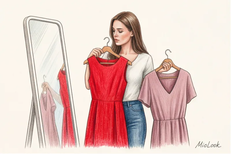
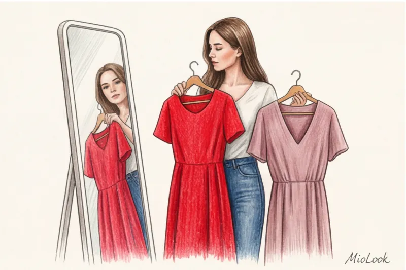
A couple of years ago, my client Anya went on a long-awaited first date with a man she was madly attracted to. After reading glossy magazines, she bought a luxurious red slip dress at Zara for about €50. In everyday life, Anya exclusively wore cozy beige knitwear and gray denim. The result of the evening? She felt like an impostor in someone else's skin, nervously adjusting her straps all evening, tense, and, finally, overwhelmed by the tension, spilling a glass of Malbec on herself.
It was then that I once again became convinced of the power of the concept I call "the psychological discomfort of color." An unfamiliar shade constricts the body and psyche as much as an itchy sweater or shoes that are a size too small. When choosing color of clothes for a date , we often forget that it should work as a supporting background for your personality, and not as a carnival costume.
We've covered the basic rules for preparing for a romantic encounter in more detail in our complete guide to Date Look: How to Dress Confidently and Without Mistakes , and today let's look at coloristics not from the perspective of magic and superstitions, but through the prism of psychology and common sense.
The Psychology of Color: How Our Brains Read Color Shades on a Date
A first impression is formed in seven seconds, and according to research by the Pantone Color Institute, color accounts for up to 60% of visual perception at this point. Your brain and the other person's brain are actively engaged in a dialogue even before you've even said hello.
From an evolutionary psychology perspective, soft, natural tones (shades of earth, foliage, and water) have historically been perceived by our subconscious as safe. They evoke a basic level of trust. However, garish, neon, or overly contrasting combinations are a natural alarm signal. In the animal kingdom, bright colors scream, "Keep away, I'm poisonous!" On a date, this translates into an inexplicable background distance between you and your partner.
The Red Dress Myth: Why the Color of Passion Doesn't Work for Everyone
"Wear red to seduce" is perhaps the most pernicious cliche, perpetuated from article to article. Yes, a famous 2008 University of Rochester study confirmed that men subconsciously find women in red more attractive. But this effect has a downside that's often overlooked.
The color red has a psychological dominance effect. It not only attracts attention, but also suppresses. If you're an introvert in everyday life, red will "shout" louder than you.
Your brain perceives the unusual bright color as a stressor. You begin to convey anxiety through micro-expressions and gestures. As a result, the other person perceives tension, not passion. If you want to know more about this, What color goes with red in clothing? To tone it down, check out our separate article. But for a first date, I recommend leaving it alone unless it's your favorite everyday color.
Try MioLook for free
A smart AI stylist will select the perfect look for any occasion based on your appearance and wardrobe.
Start for freeThe "break-in" rule: why color should be psychologically comfortable
Over 14 years of working as a personal stylist, I've come up with an ironclad rule: a new palette needs to be broken in before an important event, like new leather shoes.
More than 80% of communication on a first date is nonverbal. Your relaxed demeanor, genuine laughter, and relaxed posture are far more captivating than a trendy shade from the latest Bottega Veneta collection. If you bought a trendy butter blouse but feel pale in it, your partner will interpret your lack of confidence as coldness or aloofness.
How do you test a color before a date? Put it on and go out for coffee or to the store. If you find yourself constantly glancing at your reflection in shop windows with a slight twinge of anxiety, put that outfit aside. It won't bring you any psychological comfort.
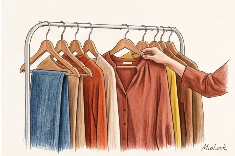
Top 4 Fail-Safe First Date Colors
If we've put red aside, what should we wear? Here's a palette that, in my experience, works flawlessly, highlighting the skin and creating the right atmosphere.
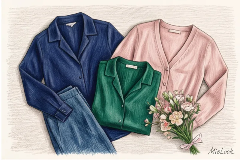
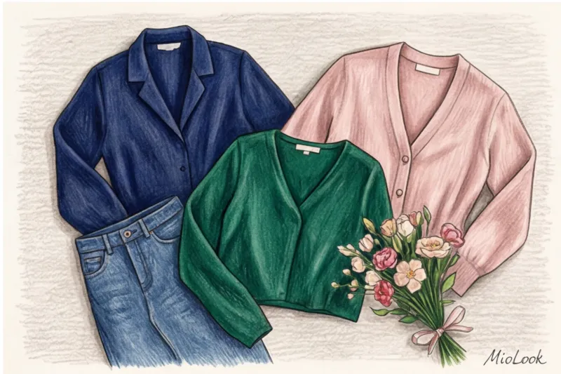
- Deep blue (Navy Blue). A great alternative to somber black, blue is the color of intelligence, calm, and mystery. It adds a touch of luxury to any look. A high-quality silk top in a deep blue (available at high-street brands like Massimo Dutti for €80–€120) elevates any look. Read also: What to wear with blue to look expensive.
- Emerald and deep green. Colors of psychological balance. They don't steal the show, but they look very elegant. Emerald beautifully complements both brown and light-colored eyes.
- Dusty rose and warm peach. These are natural shades of blush. They work like a good camera filter—softening facial features, brightening skin tone, and evoking empathy on a subconscious level. The main thing is to avoid overtly Barbie-like shades.
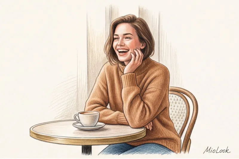
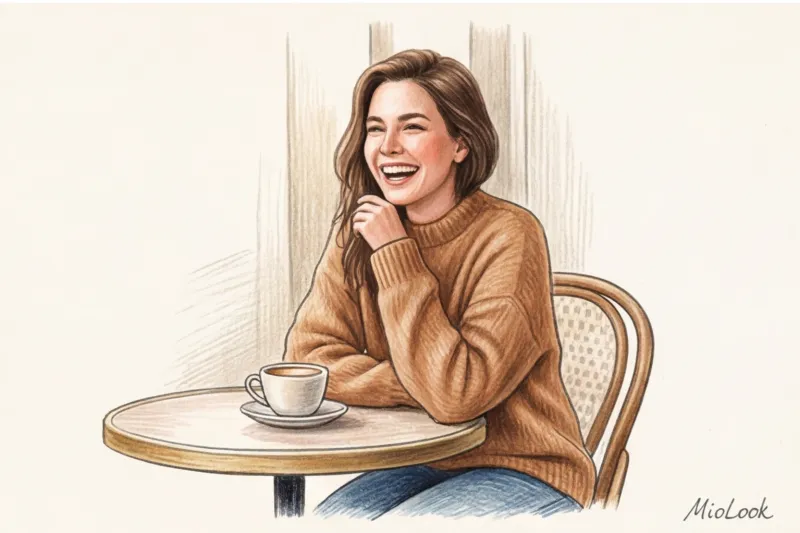
- Warm caramel and chocolate. The colors of comfort and tactility. Looking at a girl in a soft caramel cardigan (excellent cashmere-blend options can be found at COS or Uniqlo for €100–€150), you subconsciously want to come closer, touch, and trust. Brown color in clothes is currently experiencing a real renaissance.
Your perfect look starts here
Join thousands of users who look flawless every day with MioLook. Take photos of your clothes, and artificial intelligence will create stylish outfits.
Start for freeStop list: colors that stylists recommend avoiding (and it's not a superstition)
There are shades that physiologically complicate communication. And herein lies the main limitation: this list is not about fashion, but about the laws of optics.
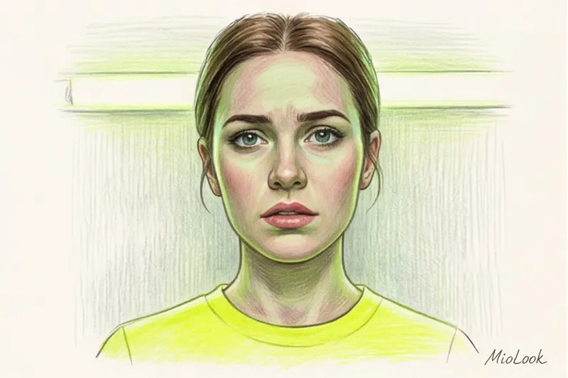
Neon shades. Lemon, fuchsia, and tart lime green. Firstly, they tire the eyes of the person you're talking to after 15 minutes of uninterrupted eye contact. Secondly, neon casts a glare on your face. Your chin and neck may take on a sickly greenish or yellowish tint.
Hard contrast (pristine white top + solid black bottom). Are you heading out for a romantic date or an HR interview? The classic office contrast prevents the brain from switching from work tasks to relaxation. Your partner might associate it with a "waiter's uniform" or a strict corporate dress code.
When this rule doesn't work (fair exception): A black and white look can be sensual if you play with soft textures. For example, a fluffy white mohair sweater and a flowing black silk skirt. Only stiff, shape-retaining fabrics (cotton shirts and wool suiting) are off-limits.
Complex earthy tones on the face. Dirty khaki, mustard, dull gray. If they don't perfectly complement your natural coloring, you'll look like you haven't slept in three days.
How to choose a color to suit your date and lighting
Do you know the secret of Hollywood costume designers? They never choose fabric colors without considering the lighting on set. The same principle applies in real life: lighting can reduce color by up to 40%.
Format 1: Day walk, exhibition or coffee.
Natural daylight reigns supreme here. Opt for pastels, denim, blues, beiges, and soft, earthy shades. In bright sunlight, deep evening colors (burgundy, heavy emerald) will look inappropriately heavy and gloomy.
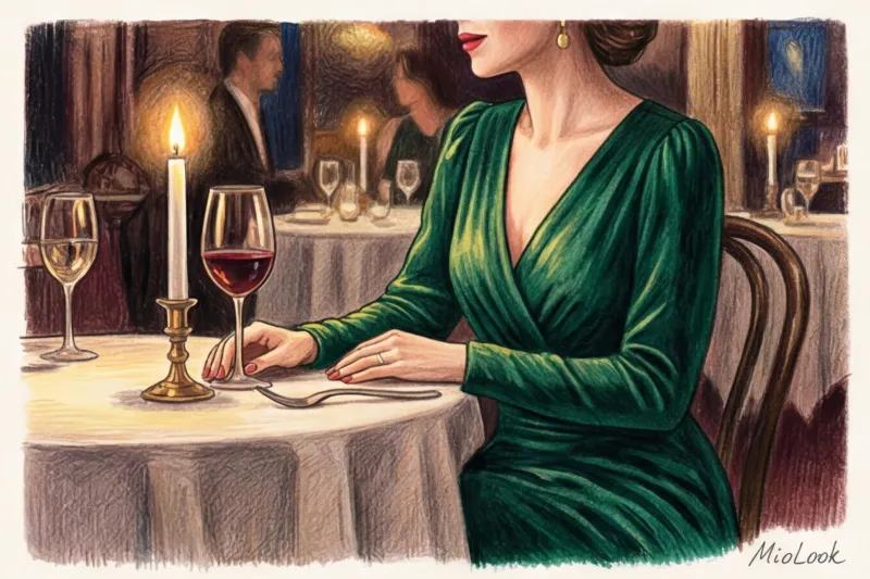
Format 2: Evening dinner at a restaurant.
The magic of candles and dim incandescent bulbs comes at a price: warm dimness "kills" complex, nuanced colors, turning a beautiful blue-gray into a dull, faded rag. What's needed here is drama: deep wine, sapphire, that emerald, or warm chocolate. They beautifully reflect the candlelight.
Life hack from a stylist: Always try out your date night look... in the bathroom! Turn off the main lights, leaving only the mirror backlight on, or light a candle. You'll immediately see how the fabric color will look in the restaurant and what shadows it will cast on your face.
Ready to get started?
Try the MioLook free plan—no commitments required. Store your wardrobe on your smartphone and get daily style recommendations.
Start for freeA practical checklist: check your look before you go out
Before you head out the door, stop in front of the mirror and ask yourself four simple questions. This will help you avoid a styling disaster.
- Does the color match my usual contrast level? If you usually wear pastels, avoid fuchsia.
- Have I worn this shade at least twice? If the item has a tag and the color is new to you, take it off. A first date is not the place to experiment with your psyche.
- What is the first thing I see in the mirror? If you see the bright color of your dress first and only then your face, the color isn't right for you. Clothes should be a frame for a painting, not the painting itself.
- How does the color react to my face? Are the dark circles under your eyes becoming more noticeable? Has your skin taken on a grayish tint? It's time to change your top.
If you are still in doubt, upload photos of several options in MioLook app Our AI stylist will analyze your appearance and suggest which shades work for you and which don't.
Ultimately, the best color for a date is the one you completely forget about exactly five minutes after leaving the house. Because the real magic happens not in the palette of your clothes, but in how free and confident you feel in them.


