One of my clients, a top manager at an IT company, once bought five identical beige cashmere sweaters, spending around €1,500. It seemed like a perfect investment in a basic outfit. But at every meeting, she looked tired, and her skin took on a sallow undertone. The problem wasn't lack of sleep, but rather that she chose a shade with a grayish undertone that clashed with her warm complexion, completely ignoring the texture of the yarn.
When we choose basic colors for a sweater , the old rules of the suiting world no longer apply. Color in knitwear isn't just a pigment; it's the façade of your "cozy architecture." I've already discussed how to build this foundation from scratch in our a complete guide to a basic knitwear wardrobe.
After 12 years of working as a stylist at European fashion weeks, I've learned one thing: the standard advice of "buy black, white, and beige" is a surefire way to a boring and cheap-looking wardrobe. Let's explore how the physics of fabric alters our perception of color and why you should immediately ditch those crisp white and jet-black sweaters.
The Physics of Texture: Why Base Colors for a Sweater Differ from those for a Suit
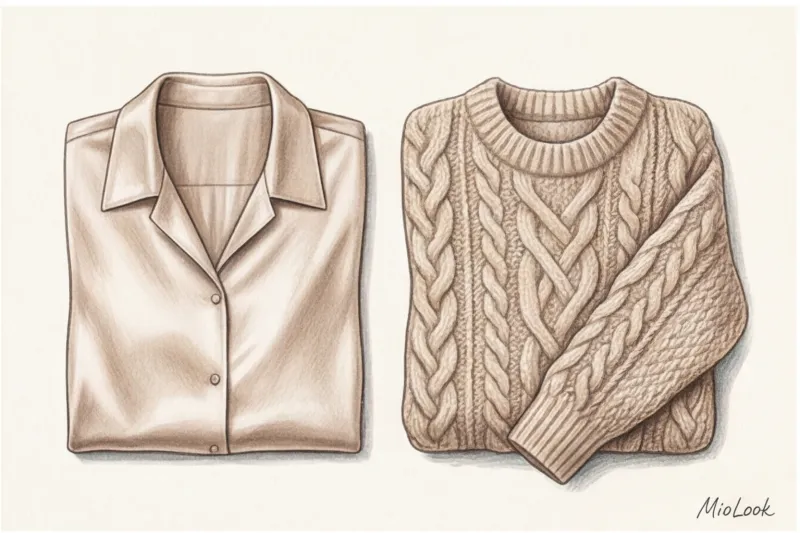
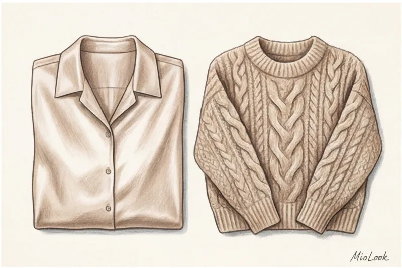
Have you ever wondered why the same shade of beige looks luxurious on a smooth silk blouse but appears "dirty" on a thick wool cardigan? The answer lies in the fabric's reflectivity.
Smooth materials (silk, polished suiting wool, satin) reflect light, making colors more vibrant and pure. Knitted fabrics, on the other hand, absorb light. According to the PANTONE Institute (2024 Textile Perception Report), bulky textured yarns can absorb up to 40% more light than smooth fabrics of the same shade. This makes any knitted color appear more matte, muted, and deep.
This is where the principle of visual weight comes into play. Light, chunky knitwear (such as a cream-colored chunky knit sweater) visually widens the silhouette, adding up to 15% in perceived volume compared to a light, smooth shirt. Therefore, if your goal is to avoid adding bulk to the upper body, basic light-colored sweaters should be either made of a fine knit (merino, cashmere from 2-ply) or have a vertical rib.
Your perfect look starts here
Join thousands of users who look flawless every day with MioLook. A smart AI stylist will analyze your wardrobe and suggest the best combinations.
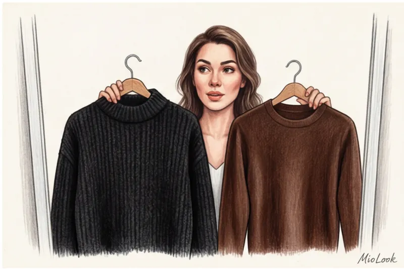
Start for freeThe Illusion of Black: The Main Mistake When Choosing Basic Knitwear
I'm ready to argue with any glossy magazine that claims a black sweater is a universal classic. In my experience, over 70% of women consider black their ultimate savior. But here's the harsh truth: pure black is the worst base color for chunky knitwear.
Firstly, black acts as a visual "black hole." It destroys any texture. If you buy a luxurious sweater with cables, Aran stitches, or complex ribbing for €300, all that texture will simply disappear in black. The garment will look flat and featureless.
Secondly, it's a magnet for sloppiness. One of my clients complained that before leaving the house, she spends 10 minutes applying a lint roller to her favorite black sweater. Every speck of dust, coat lint, or dandruff instantly shows up on black knitwear, and pilling (which inevitably appears even on expensive yarn) contrasts with the background and screams out.
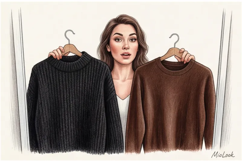
"Black knitwear only works in three situations: the finest smooth cashmere, a ribbed merino turtleneck, or a silk-blend yarn for a subtle, elegant sheen. For everything else, there are sophisticated neutrals."
Color Architecture: 4 Expensive Shades That Replace a Boring Base
True luxury lies in the halftones. In stylistics, we use the term Complex Neutrals (complex neutral shades). They always look more expensive than pure colors of the spectrum because they force the eye to "catch" and discern the undertone.
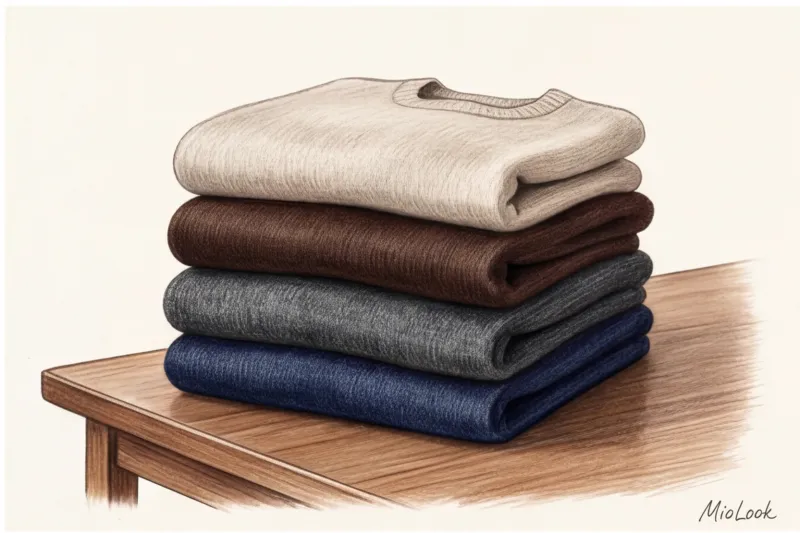
Milk, ecru, and oatmeal instead of pure white
Never buy pure white knitwear. It evokes images of either hospital scrubs or cheap synthetics. Moreover, it makes your face look pale and highlights even the slightest redness.
Replace it with an oatmeal shade—the gray-beige color of undyed wool—or ecru (the color of unbleached silk). These shades add warmth to the face, refreshingly, and look classy even in budget-friendly mass-market options (in the €40–€80 range). To avoid looking bulky in a light-colored sweater, choose a V-neck or wear it unbuttoned (if it's a cardigan) over a contrasting top.
Deep chocolate and graphite instead of black
Chocolate is an absolute favorite of recent seasons. Unlike black, dark brown retains the depth of the weave. The shadows in the folds of this sweater appear soft and enveloping.
Graphite gray (the shade of wet asphalt) is an ideal alternative for those who prefer a cool palette. It enhances facial features without creating harsh, aging shadows under the eyes and on the chin, as deep black does.
Navy blue is the new Parisian black.
If you look at the street style from Paris Fashion Week, you'll notice: French women adore navy blue knitwear. It's an absolute wardrobe staple for the "quiet luxury" aesthetic. Navy blue pairs beautifully with any denim (even the simplest cut) and looks less formal than black, yet incredibly elegant.
Try MioLook for free
Not sure which shade is right for you? Upload your photo to MioLook, and our smart AI colorist will select a palette that will make your skin glow.
Choose a palette onlineHow to choose basic colors for a sweater based on your personality
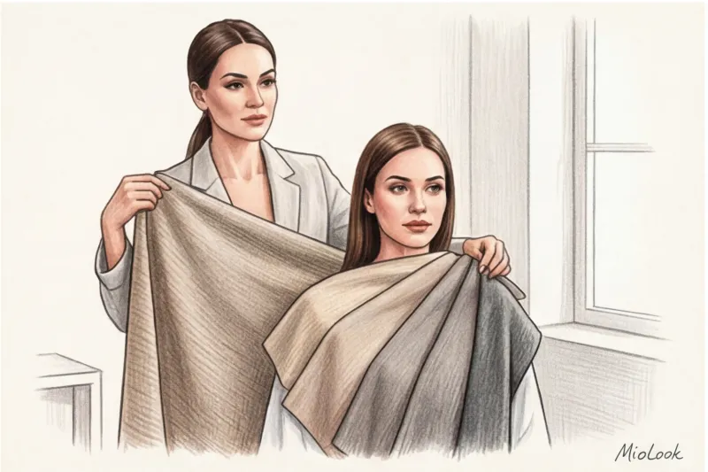
Buying a sweater in a beautiful color is half the battle. The main thing is that the color doesn't make you look ill. The undertone of knitwear (especially that worn close to your face) should match your skin tone.
Here's a simple test we often do with clients: take a sheet of crisp white A4 office paper and place it on your bare face. Please note: this only works in natural daylight, artificial lighting in stores will greatly distort the results.
- If your skin appears slightly pinkish or bluish against the sheet, you have a cool undertone. Your ideal base knits: graphite, cool taupe (gray-beige), and creamy milky pastel blue or cold Navy.
- If your skin has a peachy, golden, or yellowish tint, you have a warm undertone. Your ideal base: warm oatmeal, caramel, chocolate, or warm olive.
Also consider your contrast (the difference between your skin, eye, and hair color). For girls with low contrast (fair skin, light brown hair), monochrome, light looks—ecru and milky—look great. However, for those with high contrast (dark hair, fair skin), such combinations can wash out your face—you need deep bases: rich chocolate, dark emerald, or color block with graphite.
Melange: Stylists' Secret Weapon for Creating Expensive Comfort
If you want your knitwear wardrobe to look like a million bucks, check out mélange. Mélange yarn is created by blending yarns of different but related shades during the spinning process.
While shopping in Milan, I often observed the collections in the Loro Piana and Brunello Cucinelli showrooms. Their main secret is never using a flat color. To create a "simple gray" basic sweater, the technicians weave up to five threads: light gray, graphite, a touch of blue, a touch of beige, and white. The result is a color that vibrates and shimmers in the light.
Melange works as a wardrobe bridge. If you have a taupe melange sweater, it will perfectly tie together both gray trousers and a beige coat, creating a sophisticated, thoughtful, and cohesive look. Look for these textures in the €100+ price range, where brands can afford high-quality thread dyeing.
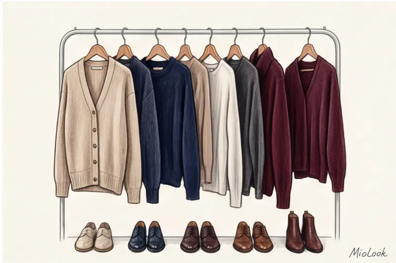
Checklist: How to Create a Knitwear Capsule Palette from Scratch
To avoid standing in front of your closet thinking, "I'm full of sweaters and have nothing to wear," I suggest assembling a knit capsule wardrobe according to a strict architectural formula. It works flawlessly.
- Step 1: Anchor dark color. Choose one deep shade to replace black. It could be Graphite, Dark Chocolate, or Navy Blue. You'll wear this sweater on cloudy days or pair it with light denim.
- Step 2: Highlighting light color. Try Oatmeal, Ecru, or Warm Almond. This shade should refresh your complexion. Perfect for cropped cardigans or thin turtlenecks under a jacket.
- Step 3: Textured melange. A turtleneck sweater in a melange yarn (like gray-blue or beige-brown). This is your go-to piece for relaxed weekends.
- Step 4: Deep accent as a base. Yes, an accent color can be a base color! Choose a sophisticated, muted shade: wine (burgundy), pine, or terracotta. It will add character to the capsule, but will also blend seamlessly with your anchor and light colors.
Color care: how to maintain the original base shade
Choosing the right color is half the battle. Maintaining it is the real challenge. According to a 2023 McKinsey report on clothing durability, over 60% of premium knitwear is discarded due to improper care, leading to color fading and deformation.
Have you ever noticed how light-colored cashmere acquires an unpleasant yellowish tint over time? This isn't due to fading, but to the oxidation of microparticles of skin lipids (fats) and deodorant that are absorbed into the fibers. To avoid this, light-colored knitwear should be washed more often than darker ones—ideally after every 3-4 wearings, even if it appears clean.
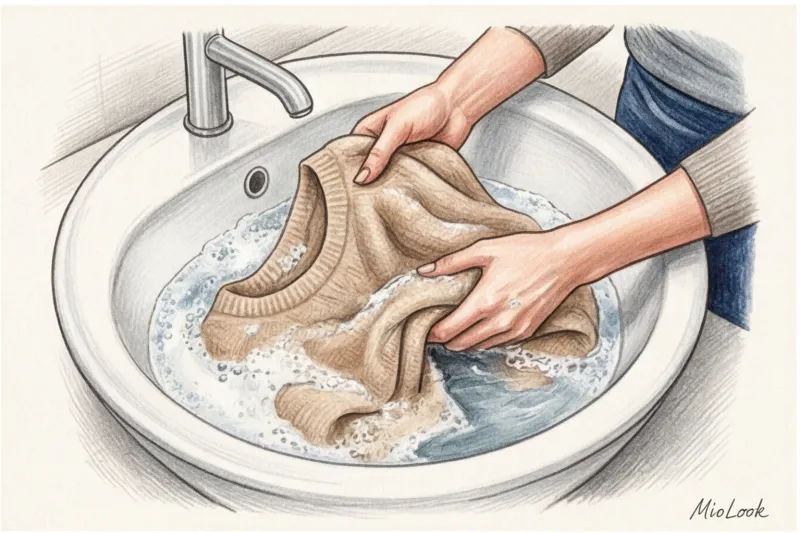
Dark knitwear (chocolate, graphite) fades in hot water and harsh alkaline detergents. Wash it only at temperatures no higher than 30°C (86°F) using liquid detergents specifically designed for wool and silk (they have a neutral pH).
And finally, the golden rule: basic sweaters should never be hung on hangers. Never. The fibers stretch under their own weight, creating gaps between the stitches, and the color appears less dense and vibrant. Store knitwear only folded and on shelves.
Ready to start creating your capsule?
Add your current items to the MioLook digital wardrobe. AI will suggest which basic shades you're missing for perfect combinations.
Try MioLook for freeA basic wardrobe isn't a collection of boring and bland pieces. It's a carefully considered palette of complex shades, where each color complements your appearance, and textures enhance the look. Forget flat black and medical white—indulge in the luxury of midtones, and your knitwear will always look impeccable.


