According to statistics from the consulting agency McKinsey (2023), 78% of women buy black, gray, or beige clothes daily. The reason is simple: the fear of looking ridiculous. "Beige wardrobe syndrome" has taken over the streets—it's safe, it fits the trend for "quiet luxury," but over time, it mercilessly erases your individuality.
Over 12 years of attending Paris and Milan Fashion Weeks, I've noticed a pattern. Truly luxurious, magnetic street style looks rarely rely on total monochrome or aggressive color blocking. The secret weapon of industry insiders is an analogous color scheme. Simply put: related colors in clothes, combination which is based on the proximity of two or three shades on the color wheel.
We have already talked in more detail about the basic color theory and stylist tools in our a complete guide to color combinations in clothing In this article, I'll show you how to apply this knowledge to an advanced level to create images you'll want to stare at for hours.
Related Colors in Clothing: Why They Look More Expensive Than Monochrome
An analogous scheme is two or three colors placed side by side on Johannes Itten's color wheel. For example: blue, blue-green, and green. Or yellow, orange, and red.
The Pantone Color Institute's 2024 report on the impact of color transitions on the psyche notes that the human eye perceives related hues as natural gradients (like a sunset or tree foliage). This combination reduces visual stress. Subconsciously, the person you're speaking to perceives your image as harmonious and you as a trustworthy person.
However, simply choosing three items in adjacent colors isn't enough. If you do it head-on, you'll look like a fan-shaped palette from a hardware store. This is where the main rule of runway stylists comes into play.
Your perfect look starts here
Join thousands of users who look flawless every day with MioLook. Its smart algorithm will help you create analog capsule wardrobes from your items.
Start for freeGradient Architecture: The Main Mistake in Creating Analog Images
Glossy magazines often write about the "60-30-10" rule (60% base color, 30% secondary, 10% accent). I'll tell you something counterintuitive: for analog circuits in real life this rule is obsolete.
I'll always remember the Hermès show at Paris Fashion Week, when Christophe Lemaire was creative director. He masterfully combined terracotta, ochre, and burgundy. His secret? A radical contrast of textures.
If you combine similar shades in similarly smooth fabrics (for example, three pieces from a regular cotton suit), you'll end up with a flat PowerPoint gradient fill. The colors will simply "clump." The real runway formula is: 50/50 proportion plus play of light reflection of materials.
- Matte absorbs light: dense merino wool, suede, cashmere, dense cotton (from 180 g/m²).
- Glossy reflects light: Flowing silk with a density of 19-22 momme, patent leather, satin, sequins.
- The relief breaks the light: fluffy mohair, corduroy, boucle.
Pair smooth navy cotton, fluffy seafoam mohair, and emerald patent leather shoes for instant depth.
Catwalk Formulas: 3 Exquisite Combinations for Real Life
Let's look at three foolproof palettes that work flawlessly. I'll use professional shade names (teal, magenta, sage) so you can clearly understand the color depth.
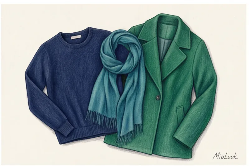
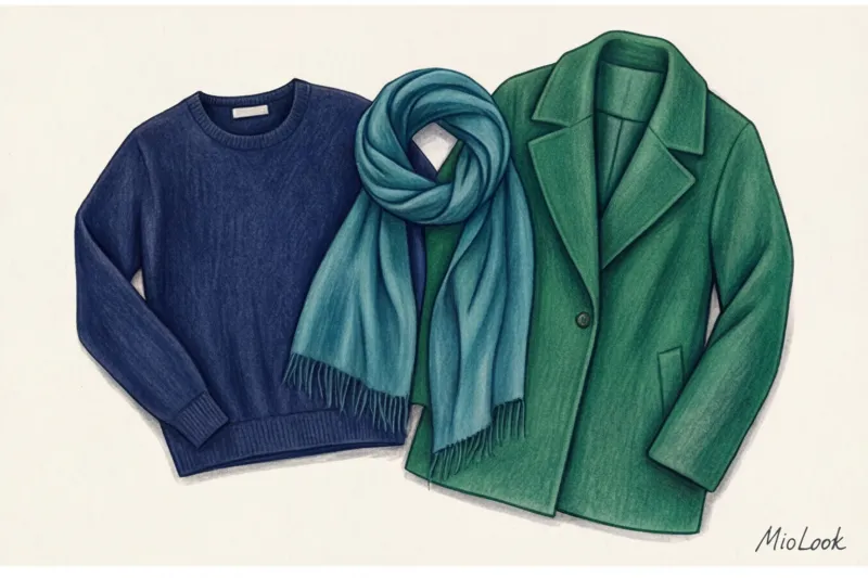
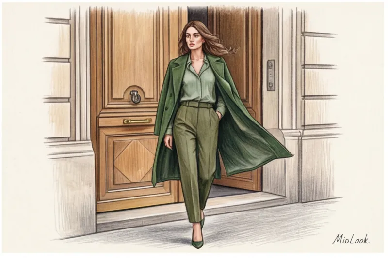
Ocean Depths (Navy - Teal - Emerald)
An ideal scheme for those who want to move away from all-black but are afraid of bold experiments. Teal (a deep sea-green) serves as the perfect bridge between austere navy and luxurious emerald.
Example from practice: Wide-leg navy wool trousers, a teal silk blouse, and a structured emerald jacket. This combination looks fantastic on both winter and summer color types, elongating the silhouette with a unified depth of tone.
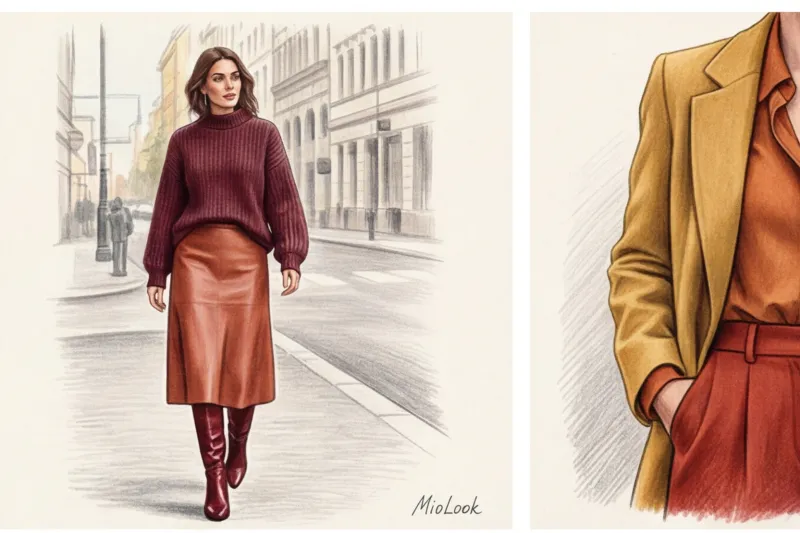
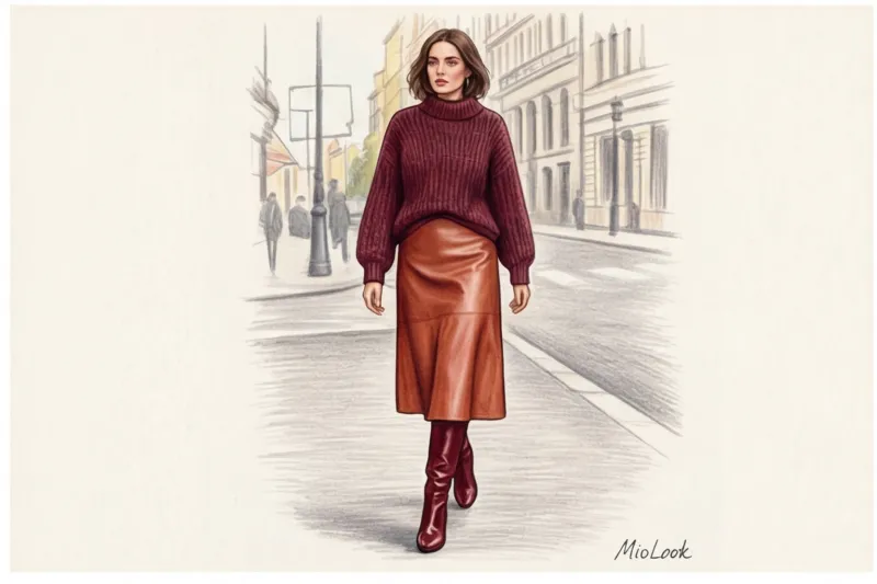
Spicy Sunset (Burgundy - Terracotta - Ochre)
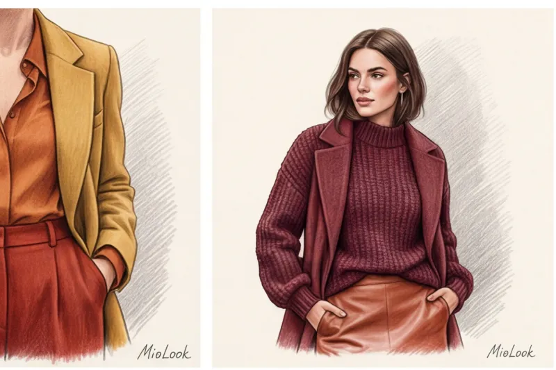
A powerful autumn palette. It radiates warmth, inner confidence, and energy. Burgundy serves as a base, terracotta warms, and ochre (a muted mustard yellow) adds light.
If you're unsure whether such a rich palette will suit you, upload your photo to the app. MioLook The AI stylist will analyze the contrast in your appearance and suggest which of these shades is best placed closer to your face and which should be relegated to the pants or skirt area.
Ice Floristics (Lavender - Dusty Rose - Carmine)
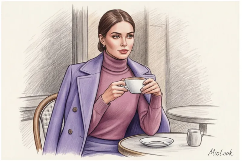
A fresh, anti-aging palette that instantly brightens the face. Many are afraid of pink, fearing the "Barbie" effect. The secret is to choose complex, muted shades with a grayish undertone (dusty rose) and mix them with cool lavender.
"A fair disclaimer: this scheme does NOT work if you have active redness, rosacea, or couperose. Carmine and pink on a face without heavy foundation will highlight any imperfections. In this case, keep these colors down (in pants and shoes), and keep a neutral lavender on your face."
Ready to get started?
Try the MioLook plan for free—no commitments required. Create your first capsule collection of related shades right on your phone.
Start for freeTemperature Conflict: How to Avoid Turning Your Look into a Blot
The most subtle pitfall of analog circuitry is temperature conflict. Colors can be adjacent on the Itten circle but belong to different temperature worlds.
Green can be cool (with a blue undertone, like emerald) or warm (with a yellow undertone, like olive). If you wear a cool purple blouse and warm olive pants, the look will fall apart. The pieces will visually "kill" each other, creating a dirty look.
Stylist life hack: how to check undertone in the fitting room. Lighting in mass-market stores (even at giants like Zara or Massimo Dutti) often distorts colors. Hold a sheet of white paper (or at least a white phone screen set to maximum brightness) next to the fabric. Against a pure white background, the warm (yellowish) or cool (bluish) undertones of the garment will immediately become apparent.
The temperature within your analog look should either strictly match (all cool / all warm), or consciously flow from a cool base to a warm accent within the same gradient.
Related Shades in an Expert's Business Wardrobe
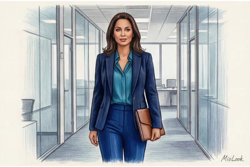
Many of my clients believe that dress codes and color are incompatible. This is a misconception. Dark, analogous color schemes are a powerful personal branding tool.
One of my clients is a brilliant lawyer. Her wardrobe consisted of 90% black suits because she wanted to appear authoritative. The problem is that all-black is often perceived as distant and reserved, and she needed to be relatable to the jury and her clients.
We replaced the black with a similar three-piece: a dark plum suit, an eggplant silk blouse, and a dark purple smooth leather bag. The formality was 100% preserved, but she now looked like a deep, thoughtful professional with refined taste. Research in the psychology of perception confirms that complex, dark colors (burgundy, sapphire, emerald) are associated with high intelligence and status.
Try MioLook for free
A smart AI stylist will select the perfect look for work, meetings, or a date based on your color type.
Start for freeChecklist: How to Build Your First Analog Image Tomorrow
You don't have to rush out to the shops to try this trick. I'm sure you already have everything you need in your closet. Here are 4 steps to putting together the look in 15 minutes:
- Find the lead singer. Pull out your favorite colorful item from your closet. It could be a classic pair of blue jeans (yes, denim is a great base for an analog scheme).
- Identify two neighbors. Look at the color wheel. Blue's neighbors are light blue, violet, and green. Take items in these shades out of your closet. For example: a light blue poplin shirt and a dark green cashmere sweater.
- Check the invoices. We have rough denim (jeans), smooth cotton (shirt), and soft fleece (sweater). Perfect match!
- Ground the look with neutral shoes. This is crucial. Avoid black shoes—they'll create a harsh contrast and ruin the subtle gradient. Opt for gray, deep chocolate, taupe, or nude.
Conclusion: The Evolution of Your Personal Style
An analogous color scheme is a graceful bridge between safe neutrals and bold, sometimes aggressive, color blocking. It allows you to make a statement without raising your voice.
Start small. Tomorrow morning, when you put on your usual beige coat, add a caramel scarf instead of a black one and a dark chocolate-colored bag. You'll be surprised how your reflection in the mirror and your inner state will change.
Color isn't just paint on fabric. It's a tool for impression management, now in your hands.


