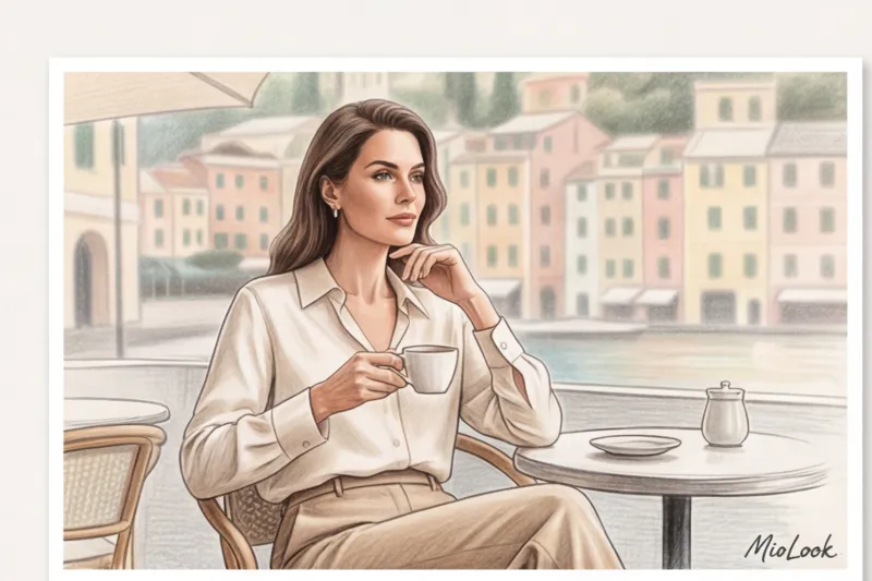
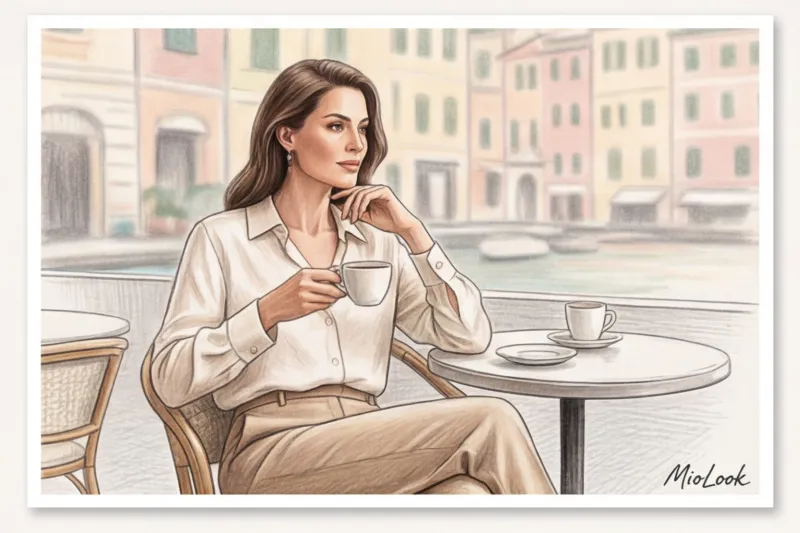
One early morning, I was people-watching on the terrace of a café in Portofino. Two women in linen suits sat at the next table. At first glance, they were identical in cut and similar in light color. But my stylist's eye made an unmistakable distinction: the suit on the left was a mass-market buy for €80, while the one on the right cost at least a thousand. The secret wasn't in the logos (they weren't there), or the hardware, but in color depth What we call today Old Mane colors , is not just a boring beige. It has a mathematically precise temperature, a complex undertone, and perfect synergy with the texture of the fabric.
We have already discussed in more detail the architecture of this direction and why it has become a global phenomenon in our The Complete Guide to Creating Old Man Style: Secrets of Quiet Luxury Today, I want to give you a master class exclusively on color. Forget those glossy magazine lists that simply advise you to "wear light colors." I'll show you how shades work in terms of optical weight and why your favorite black turtleneck might be cheapening the entire look.
The Psychology of Color: Why Old Man Colors Speak Louder Than Logos
Historically, pure, vibrant colors (neon pink, spectral blue) only emerged with the invention of cheap synthetic dyes. For centuries, the aristocracy wore clothing dyed with natural pigments—plant roots, minerals, nutshells. Such natural dyes never produce a flat, uniform color. They always contain impurities: a touch of gray, a touch of olive, a barely perceptible warm undertone.
Our brains have evolved to perceive complex, blended hues as more expensive and prestigious. Swiss artist and art theorist Johannes Itten demonstrated in his color theory that the more pigments mixed to create a hue, the deeper and more "intellectual" it appears to the human eye. When you wear a taupe sweater (gray-brown with a hint of purple), others subconsciously perceive you as more aristocratic than if you were wearing an open red sweater.
"Quiet luxury doesn't shout about money. It whispers of impeccable taste, using a language of undertones."
Try MioLook for free
A smart AI stylist will select the perfect look in a palette of quiet luxury directly from your belongings.
Start for freeA Basic Palette of Quiet Luxury: 5 Shades That Multiply Your Status
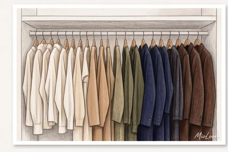
An old-mani palette is an investment. These colors are timeless, easy to combine, and serve as the perfect canvas for statement accessories. But the devil, as always, is in the details.
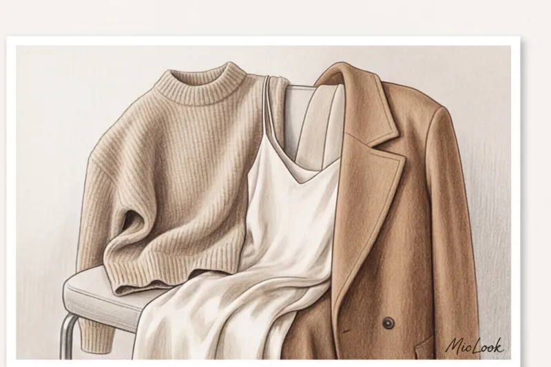
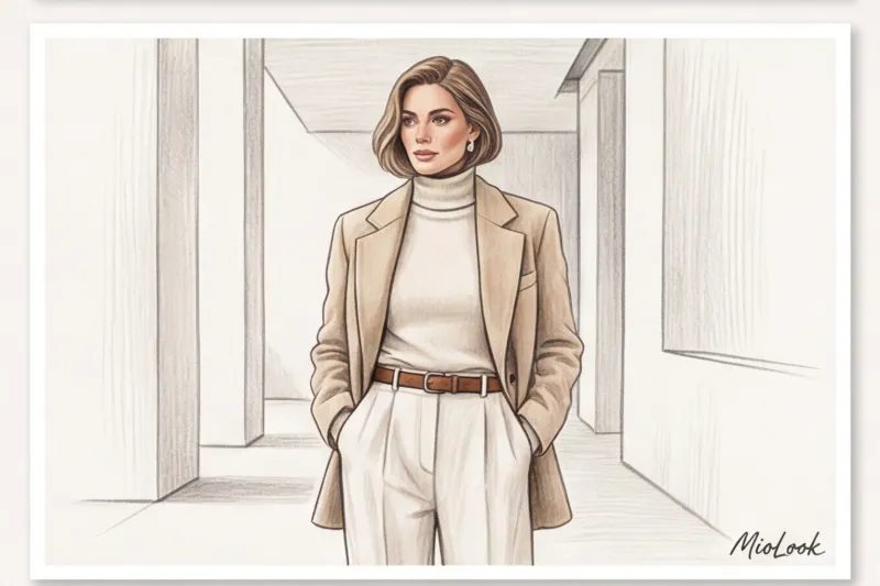
Ecru, milky and ivory (instead of snow-white)
Many believe a white shirt is the pinnacle of elegance. In fact, the optical, or "pristine white" color favored by mass-market brands doesn't exist in nature. It's achieved through aggressive chemical bleaching. When applied to the face, this color highlights every skin imperfection, dark circles under the eyes, and even the slightest hint of fatigue.
True luxury chooses ecru (unbleached silk or linen), milky, and ivory shades. They have a soft, warm glow that works like Photoshop for the face. If in doubt, How to check if this color suits you Simply place a sheet of printer paper on your face, then place an ecru-colored fabric on it. The difference will be dramatic.
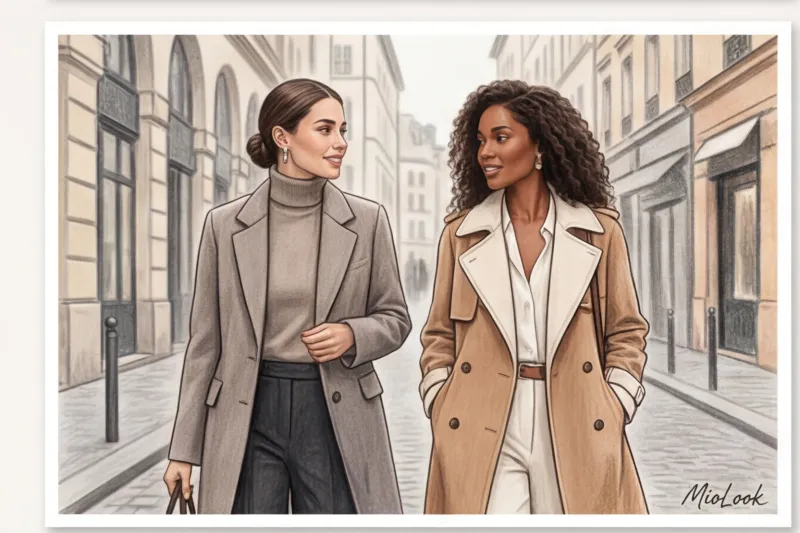
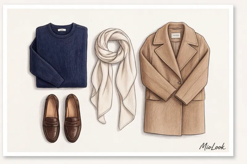
Deep Navy: The New Black for Old Money Adepts
Get ready, I'm about to bust the biggest fashion myth: Black doesn't always look expensive Over 12 years of practice, I've seen hundreds of times how total black turns beautiful women into tired shadows.
Moreover, jet-black dye on inexpensive fabrics (especially cotton and viscose) instantly fades at the seams after the third wash, collects all the lint in the world, and often looks like a waiter's uniform. My advice: replace black with a deep navy. It elongates the silhouette just as well, but looks more refined, less aggressive, and pairs luxuriously with gold jewelry. You can learn more about styling this shade in the article. What to wear with blue to look expensive.
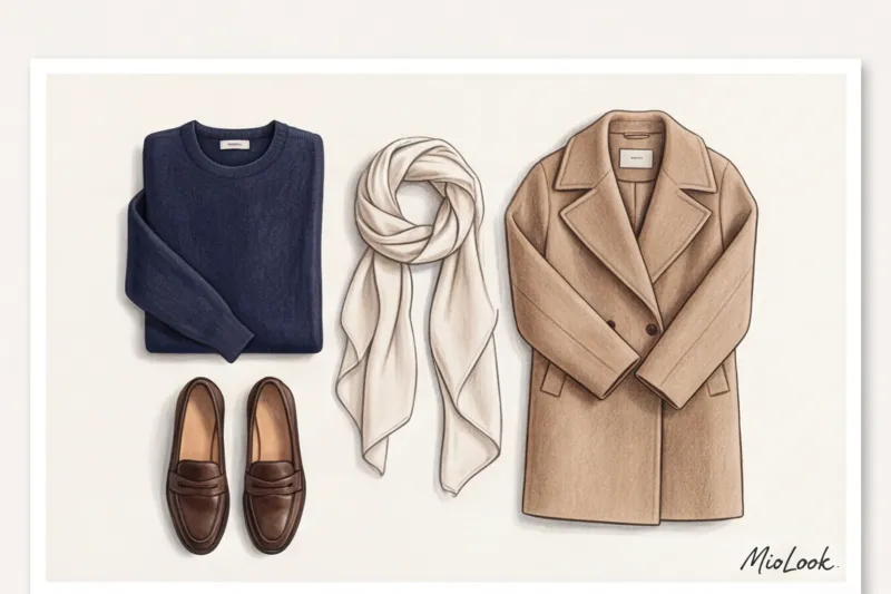
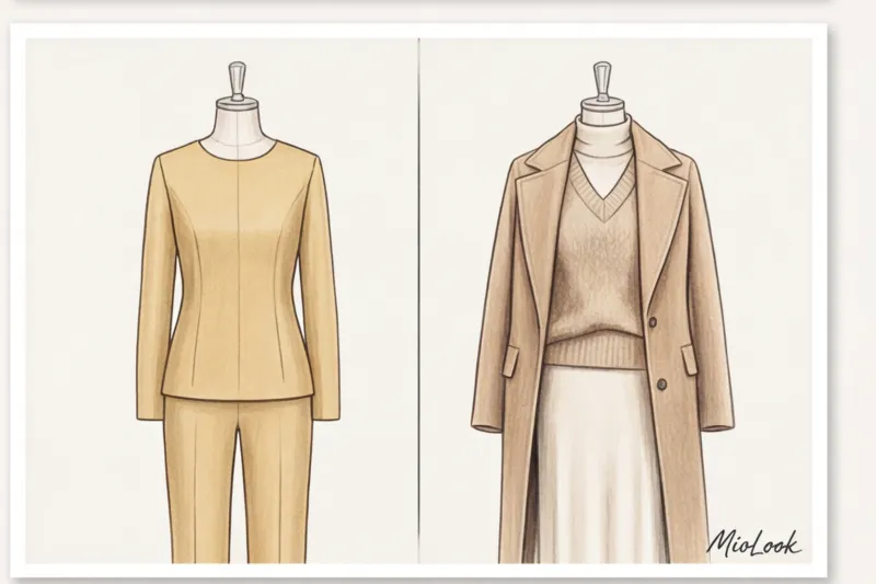
Camel and caramel shades
A wardrobe investment classic, Max Mara's camel coat has become legendary for a reason. However, there's a catch: cheap camel often takes on a decidedly reddish or yellowish cast, which instantly ruins the look.
The right camel should have a cool sandy or soft caramel undertone. This color is ideal for outerwear, rugged bags, and cashmere sweaters. It conveys calm and confidence.
Rich espresso and dark chocolate
According to a 2024 report from analytics platform Lyst, searches for dark chocolate-colored items have increased by 47%. It's the perfect fall/winter alternative for those tired of gray.
Brown has a tremendous depth. It reveals itself especially luxuriously on suede and smooth leather. A look that combines brown shades of varying saturation , always looks like it was created by a team of stylists.
Mediterranean accent: muted olive and sage
A neutral base needs a breath of fresh air. For this, we're using natural, muted shades of green. A sage-green silk top paired with an ecru jacket or light olive linen trousers are the DNA of cruise collections from brands like Loro Piana. Combine green color It is very easy to adjust to this temperature, as it acts as a kind of chameleon, adapting to the lighting.
Your perfect look starts here
Join thousands of users who look flawless every day with MioLook's AI-powered advice.
Start for freeSynergy of texture and color: why cheap polyester will kill any beige
Several years ago, I visited the historic cashmere factories in Biella (Northern Italy). The chief technologist said something I still quote to this day: "Color isn't paint. Color is how light refracts through fibers.".
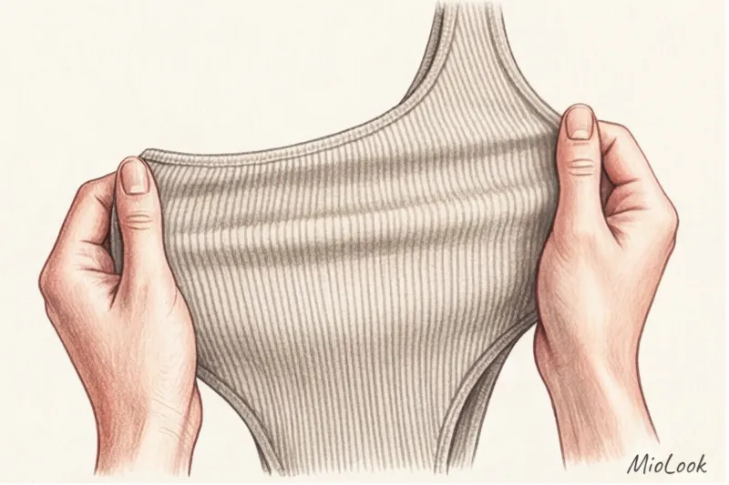
The same shade of caramel will look luxurious on fuzzy cashmere, delicate on flowing silk, and hideous on shiny polyester. Cheap synthetic fibers have a smooth, glassy structure. Light reflects off them harshly, creating a cheap, plasticky sheen. Natural fibers (wool, cotton, silk, linen) are porous, absorbing pigment deep within, creating a soft, luminous glow.
My rule of thumb for mass market: If you're on a budget (for example, you're looking for trousers in the €40-€80 range at Zara or COS), choose only matte fabrics. Viscose with a minimum weight of 200 g/m² or heavy cotton with 5% elastane will save the day. Avoid satin sheens on cheaper items—they'll give away the item's price.
How to adapt old mane colors to your color type so you don't look tired
One of my clients, in despair, said at her first consultation: "Isabella, in this vaunted beige of yours I look like a pale moth!" And she was absolutely right. A common mistake is blindly copying influencers' looks without considering your natural complexion.
Quiet luxury has a clear division into warm and cool spectrums. If you want to explore your appearance in more detail, I highly recommend our article about 12 color types of appearance.
- For cold types (Summer, Winter): Your "old mani" is taupe, icy gray, graphite, cool beige (stone color), navy blue, and wet asphalt. If you wear a classic reddish camel, your face will take on a sickly, yellowish hue.
- For warm types (Spring, Autumn): Your investment colors are oatmeal, caramel, terracotta, butter, milk chocolate, and olive. Mix warm and cool colors you need to be extremely careful.
Portrait Zone Lifehack: If you have a low-contrast appearance and a light monochrome blends into your face, you don't have to give up on the trend. Add contrast to your face: chunky tortoiseshell glasses, statement earrings (by the way, choose gold or silver according to your color type ) or bright lipstick.
Combination Formulas: How to Mix Shades for a Flawless, Status-Perfect Look
Style math helps you create luxurious looks. You can spend hours sorting through your closet, or you can use the "smart wardrobe" feature in MioLook to help the algorithm assemble the perfect capsule. Here are my three favorite fail-safe formulas.
1. Tonal monochrome (Ton sur Ton)
The most aristocratic technique. You take one color, but use three or four different shades and always use different textures. For example: off-white trousers made of thick cotton + an ivory silk blouse + an oatmeal cashmere cardigan. The difference in textures keeps the eye from getting bored and creates a 3D optical effect.
2. The 60-30-10 proportion rule
This rule from interior design works perfectly in clothing:
- 60% - the main base color (for example, a dark blue suit).
- 30% - supporting color (blue oxford shirt).
- 10% - an accent (a brown leather belt or a silk scarf on a bag).
3. Temperature contrast formula
Cool icy gray + warm caramel. For example, gray flannel palazzo pants paired with a camel cashmere turtleneck. It's a sophisticated stylistic approach that exudes a high level of fashion intelligence.
Ready to get started?
Try the MioLook plan for free—no commitments required. Digitize your wardrobe today.
Start for freeKey Mistakes: How to Avoid Turning Quiet Luxury into a Boring Uniform
I must warn you about the pitfalls. Being elegant and being boring is a fine line.
Mistake number one: monolithic texture. If you wear beige cotton trousers with a matching beige cotton shirt, you'll look like a doctor in a private clinic uniform. Always break up the monochromatic look with different textures (leather + knit, silk + wool).
Mistake two: cheap melange. Mass-market melange fabrics (when the yarns are woven from different light and dark fibers) often look dirty and quickly become covered in pilling. Pilling ruins any stylish color. If your budget is limited, choose plain-dyed fabrics.
Mistake number three: lack of grooming. The old mane style does not tolerate carelessness. Complex powdery and dusty pink colors , as well as gray-beige shades, require clean makeup, well-groomed skin, and neat hair. Otherwise, clothing will highlight any imperfections.
Isabella's Checklist: Overhaul Your Color Palette Right Now
Fashion should be practical. I don't like articles that leave you feeling inspired but with no idea "what to do next." Here's your step-by-step plan for the weekend:
- Clean the canvas. Remove all items in "clean", loud colors (neon yellow, fuchsia, caustic green) from your closet. Put them on a back shelf—they drown out the visual noise of your wardrobe.
- Find your "new black". Evaluate your outerwear and footwear. Do you have an alternative to black? Consider buying loafers or a dark chocolate-colored jacket (good leather starts at €100–€120 on a budget) or a navy coat.
- Find your perfect white. In natural light by a window, hold different light-colored items up to your face. Find a shade (milky, ecru, pearl) that makes your skin glow, and use it as a base for tops and shirts.
Remember: quiet luxury isn't about competing with price tags. It's about self-confidence. The right color palette is simply a subtle tool that highlights your inner self without overpowering your personality.