Have you ever noticed how the same expensive cashmere set, matching the coat, can make one woman a style icon, while another looks like a splash of color or an employee at an elite spa? The difference isn't in the figure or even the budget. The true aesthetic of winter layering is based on principles rarely covered in the glossy magazines: textile physics, light refraction, and cut architecture.
We talked in more detail about the basics of a basic wardrobe in a single palette in our the complete guide to a monochrome wardrobe But today I want to analyze exactly winter monochrome look — this is the very case when, due to the abundance of layers and dense fabrics, the old rules cease to apply.
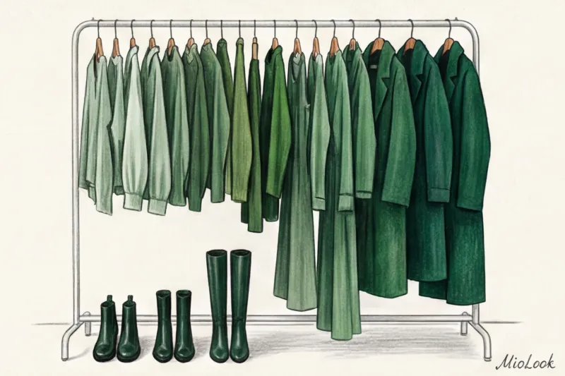
Winter Monochrome Look: Why Exactly Matching Shades Kills Style
Let's start with the hard truth. The worst thing you can do for your winter wardrobe is to go to Massimo Dutti or COS and buy a ready-made knit set: a sweater, pants, scarf, and coat, all dyed in the same vat. This is a classic mistake that leaves your silhouette completely flat.
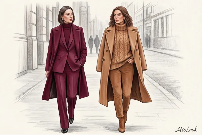
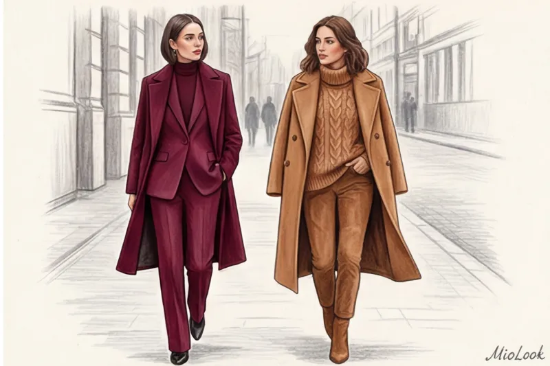
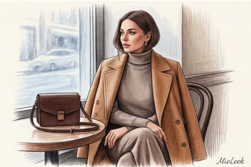
One of my clients once spent around €800 on a luxurious wine-colored trouser set. The fabric was beautiful, but in the mirror it looked like it had been wrapped in a roll of curtain fabric. We fixed the situation in five minutes: we swapped out the burgundy turtleneck for a bouclé alpaca sweater two shades lighter. The look instantly became more vibrant.
"Monochrome isn't a uniform. It's a gradient stretch within a single color sector, where each layer is read separately."
Italian luxury designers always emphasize that without prints, the cut becomes the dominant feature of the look. Any crooked stitching or poorly executed dart will be noticeable. So, instead of a "single color" approach, embrace "smart layering": take a basic dark chocolate shade and jazz it up with caramel, cappuccino, and baked milk.
Try MioLook for free
A smart AI stylist will create the perfect layered look from your clothes.
Start for freeTextile architecture: how textures replace prints in cold weather
In a winter wardrobe, the texture of the fabric takes on the role of print entirely. If you wear smooth cotton trousers with a smooth viscose shirt and a smooth wool coat in the same color, the look will be dull and lifeless.
According to a 2024 study by the Woolmark Institute, the visual perception of color is directly dependent on the fiber structure. Matte merino wool absorbs up to 80% of light, creating a deep, velvety hue. However, silk or high-quality Tencel, in the same Pantone color code, reflect up to 35% of light. This optical contrast creates the illusion of different shades without actually changing the color.
Moreover, the Textile Exchange 2023 report clearly shows that natural fibers age more beautifully in layered looks. High-quality wool acquires a refined matte finish over time, while fast-fashion acrylic begins to reveal itself with a cheap, plasticky sheen after just three washes.
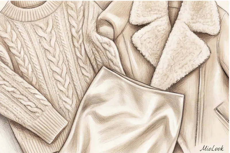
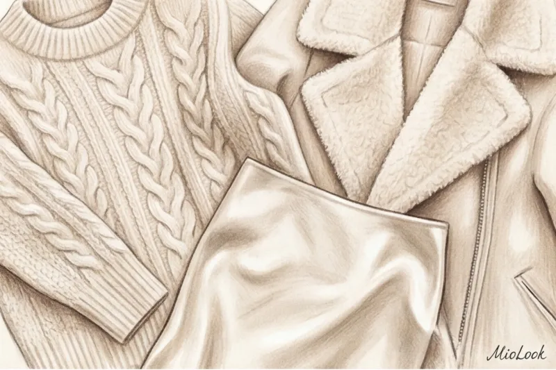
Three-texture formula for perfect layering
To make a winter monochrome look look expensive, I always use a simple rule: Matte + Shiny + Voluminous.
- Shine: silk midi skirt or viscose trousers (base layer).
- Volume: A chunky knit sweater made from recycled cashmere or fluffy mohair.
- Matteness: Smooth double-breasted coat made of thick wool.
This formula works not only for aesthetics but also for physics. The air spaces between the fundamentally different textures retain 40% more heat than a single dense, uniform layer of synthetic material.
Eco-friendly fabrics that make monochrome look expensive
There's no need to buy up every luxury item. Investing in the right fibers in the mid-range segment (€100–€300 per item) is sufficient:
- Merino wool (RWS certified): It holds its shape perfectly, does not roll and deeply absorbs eco-friendly dyes.
- High density organic cotton: Look for a weight of 180 g/m² or higher. Thin cotton looks miserable in winter and wrinkles under outerwear.
- Tencel / Lyocell: The perfect plant-based substitute for silk to create those luminous highlights in the base layer of your look.
Temperature play: mixing warm and cool tones of the same color
Many are afraid to mix, for example, warm beige (camel) and cool beige (taupe). In fact, the micro-trend of "temperature shift" is precisely what distinguishes a stylist's work from a look on a mass-market mannequin.
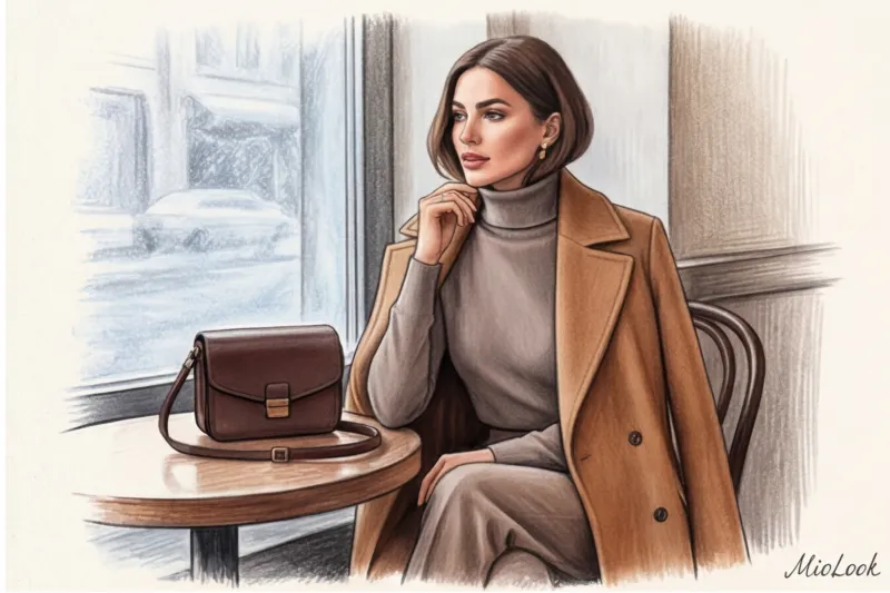
In winter, our skin naturally becomes pale, losing its summer tan. If your natural undertone is cool, a warm camel-colored sweater next to your face will make you look tired. A year ago, a client and I were trying to salvage exactly this kind of flat, tired-looking beige.
The solution? We kept the chic, warm caramel coat, but swapped out the basic turtleneck for a cool shade. taupe (taupe). The positioning rule is simple: place "your" color temperature closer to your face, and relegate the opposite color to the lower part of your look or accessories.
Your perfect look starts here
Upload photos of your items, and MioLook's artificial intelligence will create ready-made monochrome capsule wardrobes for the winter.
Start for freeThe main mistakes when creating a winter monochrome look
Even the most flawless color palette will fall apart if you ignore the details. Over 12 years of wardrobe review, I've identified three main problems with winter styling.
Mistake 1: Forgetting about statement shoes.
A black coat, black trousers, and matte black leather boots create a "heavy legs" effect. Switch up the shoes for patent leather or suede. The contrast in texture will brighten up the lower half of your silhouette.
Mistake 2: Ignoring hardware.
Buttons, zippers, and buckles are micro-accents of your monochrome look. A cheap plastic button on a jacket will ruin all the magic. A pro trick: buy a basic jacket at a mass-market store (say, for €60–€80) and take it to a tailor to replace the plastic buttons with horn or high-quality metal ones. The garment will instantly become visually premium.
Mistake 3: The fabrics in the bottom layer are too thin.
A thin viscose turtleneck, through which the texture of lace lingerie treacherously shows, looks out of place against a solid winter coat. Winter monochrome calls for solidity.
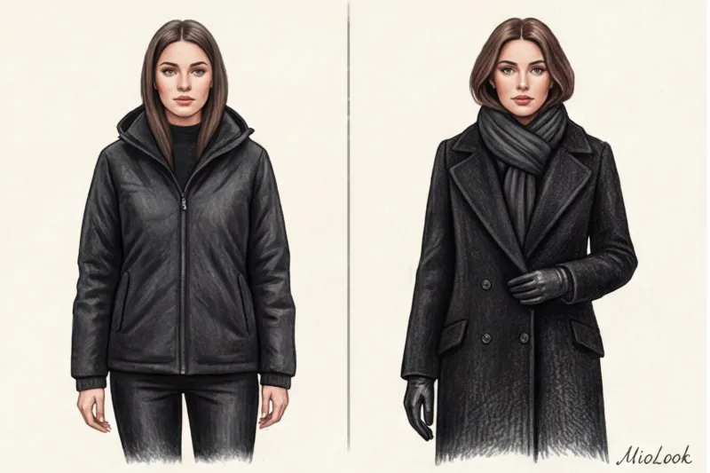
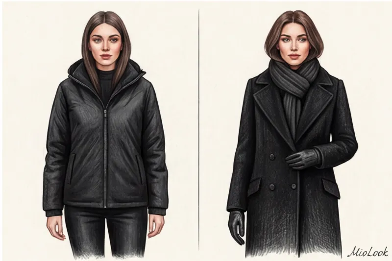
The danger of "deaf" black and gray totals
The all-black look has one major drawback: it acts as a magnet for dust and lint. A cheap drape coat paired with a black sweater will look unkempt by the end of the day. Choose tightly spun wool fibers (like gabardine) that won't attract anything.
Also, be careful with fast-fashion black. To cut production costs, mass-market brands often use green or red bases for black dye. In the winter sun, such monochrome black will suddenly take on dirty brown or swampy tones. And the popular Total Gray can visually age if you don't add contrast—for example, cool silver in jewelry or a silk scarf with a slight steel sheen.
Stylist Checklist: Layering a Monochrome Look for Winter
Theory is great, but let's get practical in front of your closet. You can use the visualization feature in MioLook to lay things out in front of you virtually, or follow this algorithm in person:
- Select base color: Don't rely on trends, but rather on your own personal palette. Wine, deep blue, chocolate, or forest green are ideal starting points.
- Select the rod: Pair pants (or a skirt) and a top in similar, but not identical, shades. A difference of 1-2 tones is just right.
- Add contrasting texture: Add a fluffy mohair cardigan, a leather belt, or a patent leather bag to your look. Break up the calm of the fabric.
- Play with outerwear: Let your coat or sheepskin coat be the darkest (or, conversely, the lightest) element of the gradient, completing the color stretch.
A winter monochrome look isn't a competition to find identical pieces in different stores. It's an architectural approach where you create a complex, warm, and visually luxurious silhouette by playing with light, wool, and tones. Invest in quality fiber, and your monochrome will never be boring.


