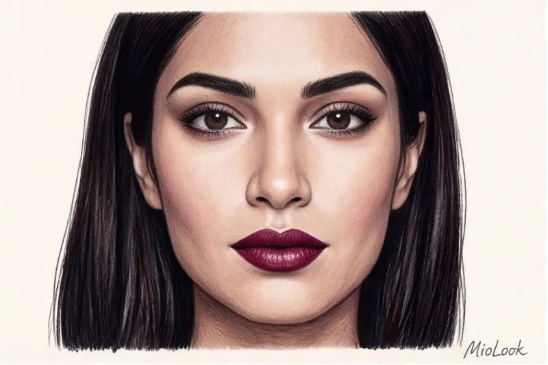
How many times have you been told that a basic black turtleneck is a wardrobe staple that "goes with everything and always makes you look slimmer"? In twelve years of personal styling, I've seen hundreds of times how this "universal" garment has mercilessly added five or even ten years to my clients' appearance. We're used to blaming a tired appearance on lack of sleep, stress, or age. But let's be honest: sometimes it's not genetics, but the laws of optics. That, What colors make you look older? , directly depends on how the fabric interacts with light.
We talked about the anti-aging approach to wardrobe in more detail in our a complete guide to flowers that make you look younger In this article, I want to debunk popular myths. We won't simply demonize certain shades. As an investment wardrobe expert, I'll show you how fabric texture can turn a luxurious color into a freshness killer, and why fashionable "dusty rose" strips mature skin of its last vestiges of radiance.
The Reflector Effect: Which Colors Age You and Why It's Pure Physics
While working on sets in Paris, I picked up a fantastic secret from professional photographers. When they light mature models (40+), they never use harsh, light-absorbing filters underneath. Clothing in your portrait area (from chest to chin) works exactly the same way—as a reflector. It literally casts colored highlights onto your face.
Physiological fact: after 40, natural melanin production decreases, hemoglobin levels and blood microcirculation change. The skin becomes slightly more translucent, prone to a sallow or grayish undertone. The loss of natural contrast makes the face incredibly vulnerable to adverse effects from clothing.
"The 'bright looks younger' rule stops working after age 35. It's not brightness that makes you look younger, but the right light reflection. You can wear the most expensive jacket, but if it absorbs light, you'll look haggard."
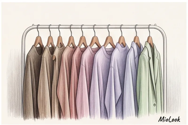
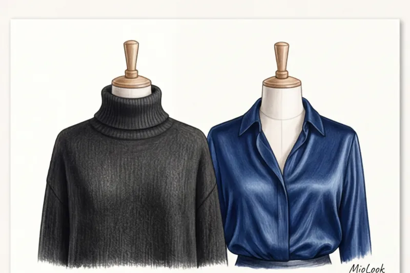
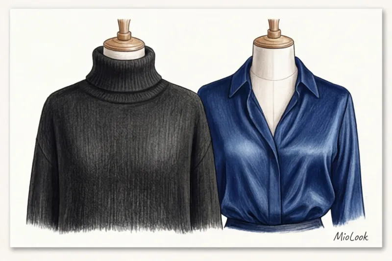
This is where the biggest mistake lies: we evaluate the color of an item on a hanger, ignoring its texture. Remember the golden rule: matte fabrics are always more dangerous than glossy ones. They act like black holes for light. The same dress in matte wool will highlight every wrinkle, while in flowing silk it will illuminate your face.
Dark Menace: Matte Black and Earthy Brown
When I review new clients' wardrobes, I always start with a tactile test of dark items. I rub the fabric between my fingers. If it's a dull, rough cotton or thick black acrylic, the item goes in the return box.
Why does dark black deepen wrinkles?
Black itself doesn't age you. It's the matte black right next to your face that does. Imagine a thick cotton turtleneck. It absorbs all the surrounding light without reflecting a single glare. What happens to your face? Micro-shadows instantly appear under your nasolabial folds, at the corners of your lips, and under your eyes. Your face doesn't look thinner; it becomes haggard and tight.
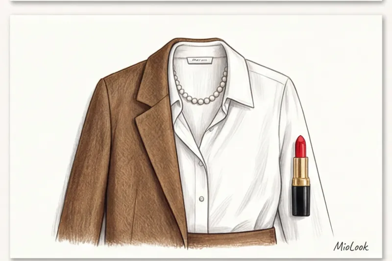
To look expensive in dark colors, you need a touch of polish. Swap black cotton for silk, satin, or cashmere with a light fuzz—the texture should play with the light. If you prefer matte fabrics, choose graphite or luxurious "midnight blue." They retain the classy feel of black without creating a mournful effect.
Earthy brown and pigmentation effect
Another tricky player is warm, muted brown (the same "muddy brown" reminiscent of damp soil). According to research by the WGSN Institute, the popularity of earthy shades cyclically returns every five years, but for mature skin, this is always a risk.
The problem with earthy brown is that it blends in with the first signs of age spots. It visually highlights any uneven skin tones, depriving the skin of its fashionable dewy glow. If you love brown, invest in a cool taupe, rich cognac, or dark chocolate. A high-quality dark chocolate sweater (premium models will cost around €150-250) looks ten times more elegant than a dirty brown base.
Not sure which colors suit you?
Upload a photo to MioLook, and our smart algorithm will analyze your color type, suggesting the perfect palette for your investment wardrobe.
Find out your colorsThe illusion of freshness: why dusty rose and melange mercilessly age
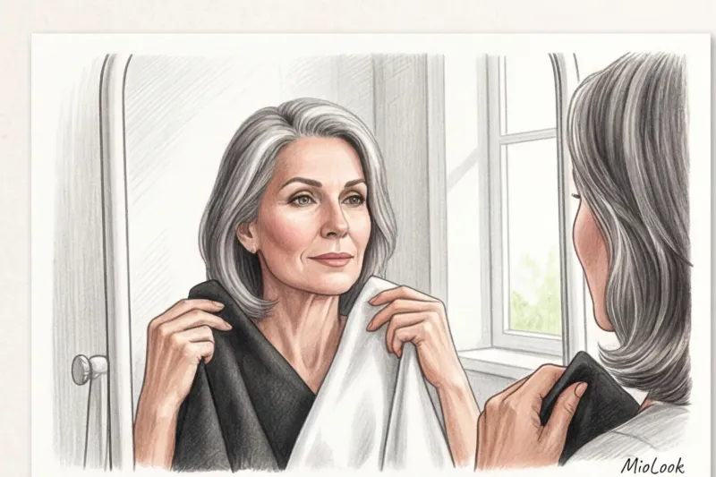
One of my clients, a 45-year-old senior partner at a law firm, came to me in utter despair. She'd bought an expensive dusty rose cashmere cardigan to soften her formal look and "refresh" her complexion. But her colleagues began delicately inquiring if she was feeling ill. As soon as we replaced the cardigan with an icy pink, her complexion literally looked younger. How does it work?
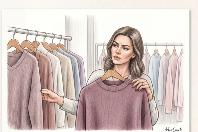
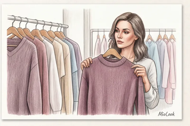
Dusty Rose Trap (Mauve)
Dusty rose is a pink with a hint of gray. Physiologically, this grayish-purple undertone mimics a lack of oxygen in the blood. Instead of giving the face a youthful glow, this color acts as a filter for fatigue, highlighting the grayness and dullness of the skin.
If you want to look classy and fresh, avoid dusty shades. Clean tones are your go-to alternative. For cool skin tones, icy pink is ideal, creating the effect of a frosty morning. For warm undertones, choose soft salmon or peach.
Gray melange: the color of chronic sleep deprivation
Light gray knitwear with white accents (melange) is synonymous with relaxed, relaxed clothing. No matter how expensive your sweatshirt, mélange blurs the contours of your face, making your appearance appear dull and indistinct.
The association with a relaxed pajama aesthetic is incompatible with the concept of luxury. Invest in monochrome shades: pearl gray with a subtle satin sheen for blouses or a crisp charcoal for structured jackets. The clarity of color creates a defined facial line.
Create a capsule that works for you
Tired of clothes that don't flatter you? Digitize your wardrobe with MioLook and create iconic looks in just a few clicks.
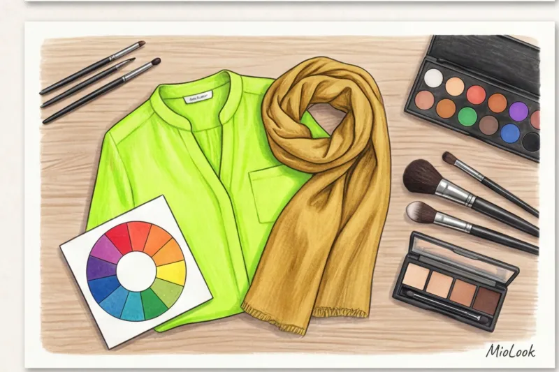
Assemble your dream wardrobeToxic Brightness: Mustard, Neon, and Magenta
Have you ever wondered why such titans of quiet luxury as Loro Piana, Brunello Cucinelli, or The Row almost never use neon or pure spectral colors in their collections? They know: expensive clothes shouldn't overpower the wearer. Toxic brightness is the enemy of mature elegance.
Let's turn to science. According to Johannes Itten's color theory (1961), hues opposite each other on the color wheel enhance each other. This law of complementarity is a makeup artist's main weapon, but it can also be your downfall when it comes to clothing:
- Mustard and Chartreuse (yellow-green): They're directly opposite blue and purple. Wearing a mustard top will visually draw out and intensify all the purple under-eye shadow and the blue veins on your neck.
- Bright magenta (fuchsia): Casts an aggressive red glow. If you have even the slightest hint of rosacea, redness, or uneven skin tone, fuchsia will illuminate them like a neon sign.
- Acid neon: It offsets the reduced natural contrast of a mature complexion. Against a neon lemon backdrop, your skin will appear sickly pale or gray.
These shades are only forgiving to 18-year-old girls with perfect blood circulation. For us, it's an unjustified risk.
Stylist Checklist: How to Wear Age-Making Colors (If You Really Want to)
What should you do if you were given a luxurious mustard-colored cashmere jumper or have a perfectly tailored matte ebony jacket hanging in your closet? I never recommend throwing away good things. There are styling techniques for isolating "toxic" colors.
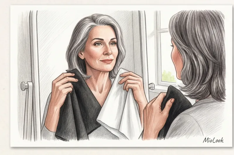
- White collar rule. Create a physical barrier between your face and the dangerous color. Wearing a crisp white or light blue shirt (with the collar turned down) under a black sweater will bring the light back into the portrait area. Important limitation: This technique won't work if you have a naturally short neck—a contrasting collar will visually "cut" it off even more.
- Shift down. The simplest and most effective solution. Do you adore dusty rose or deep brown? Wear them in the form of trousers, skirts, shoes, or bags. Anything below the waist won't affect your complexion.
- Life-saving silk. Use scarves in the right (refreshing) palette, made of 100% silk. The glossy texture of the scarf will save the day, casting the perfect highlight on the chin.
- The secret of makeup artists. If you're deliberately wearing an aging color in the portrait area, your makeup should do double duty. Double the coverage of your even-toned foundation and the brightness of your refreshing blush (a sheer pink or peach shade).
Investing in the Right Palette: Status Instead of Stereotypes
Building a wardrobe isn't about chasing a list of trends that changes every six months. It's an investment in your personal brand and self-confidence. It's time to abandon the "is this trendy/is this unfashionable color" paradigm. The only question you should be asking yourself in the fitting room is: "Does this shade work for my face or against it?"
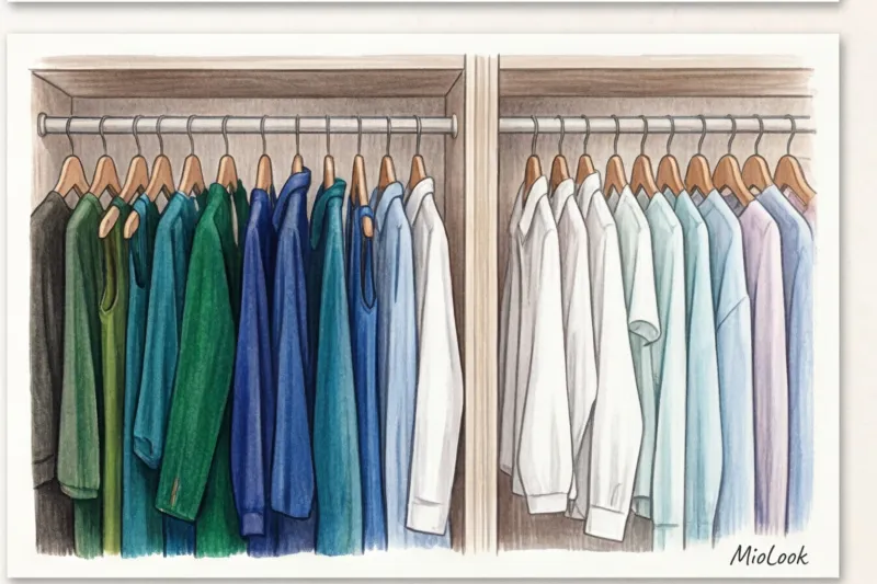
Clothes can and should serve as your personal ring light. Creating a base of deep, pure, and well-textured shades (such as pearl, midnight blue, icy pink, or dark chocolate) pays off instantly. Your face looks rested and your look luxurious.
Try this experiment today: take a few items from your closet, stand near a window in good daylight (no makeup!), and apply the cloths to your face one by one. You'll immediately see which items drain your energy and which ones return it. Invest in yourself wisely.
Your perfect look starts here
Join thousands of women who look flawless every day with MioLook. Plan your looks and analyze your palette right on your phone.
Start for free