Several years ago, a client I'll call Anna approached me. She'd failed three final interviews for a financial analyst position. Her resume was impeccable, her delivery confident. When I asked her to come to our meeting dressed the same way she'd worn to the recruiters, the problem became apparent from the very first moment. Anna had chosen what she considered a "safe" all-black suit. But under the harsh fluorescent lights of my office, the cheap synthetic material took on a greenish tint, and the high black collar accentuated the slightest shadows under her eyes. She looked not like a high-status professional, but incredibly tired and withdrawn, wearing a kind of armor.
We are used to thinking that color of clothing for an interview It's simply a matter of dress code: "wear blue, avoid red." But in reality, it's the physics of light, the quality of fabric, and the subconscious signals you transmit before you can even say "hello." Let's explore how to use palette as a tool, not a disguise.
Why the color of your clothes for an interview works at a neurobiological level
Color isn't just an aesthetic category; it's an electromagnetic wave of a specific wavelength that our brain processes. When an HR manager sees you at the door, their neural networks instantly analyze your appearance. According to the Institute for Color Research, interviewees form a basic subconscious opinion of you within the first 90 seconds of meeting you, and 62% to 90% of this assessment is based solely on color. We discussed the physiology of this process in more detail in our a complete guide to the psychology of color in clothing.
If you show up wearing too much or too aggressively bright clothing, you create visual noise. The recruiter's brain wastes energy processing this noise instead of listening to your competencies. Your appearance should work like a passport: the perfect backdrop against which your most important qualities—your professionalism and resilience—stand out.
Classic Palette: Safe Colors That Sell Your Expertise
A large-scale study by the CareerBuilder platform, which involved over 2,000 HR professionals, showed that muted, deep tones always outperform open and vibrant ones. The difference between a "boring" office worker and a "high-status" candidate lies in the depth of the hue. A bright royal blue can be irritating, while a sophisticated navy blue is calming.
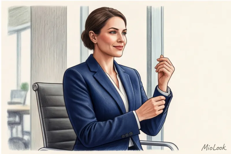
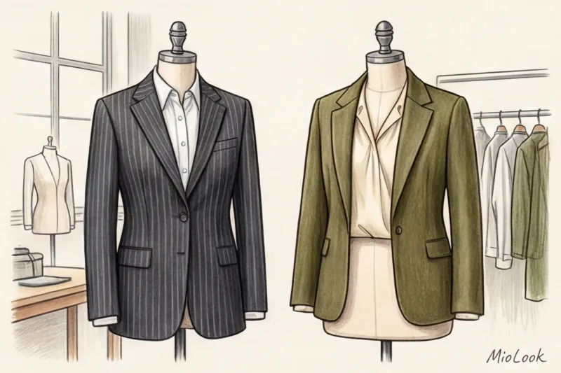
Navy is the universal trust code.
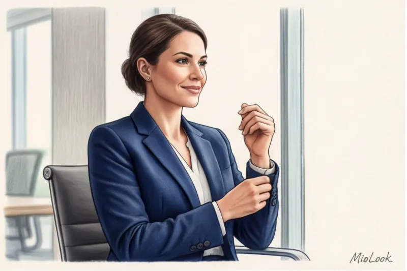
Navy is an absolute favorite in the corporate world. On a subconscious level, it evokes team spirit, reliability, and loyalty. It's the perfect choice for those who want to say, "You can rely on me; I play by the rules."
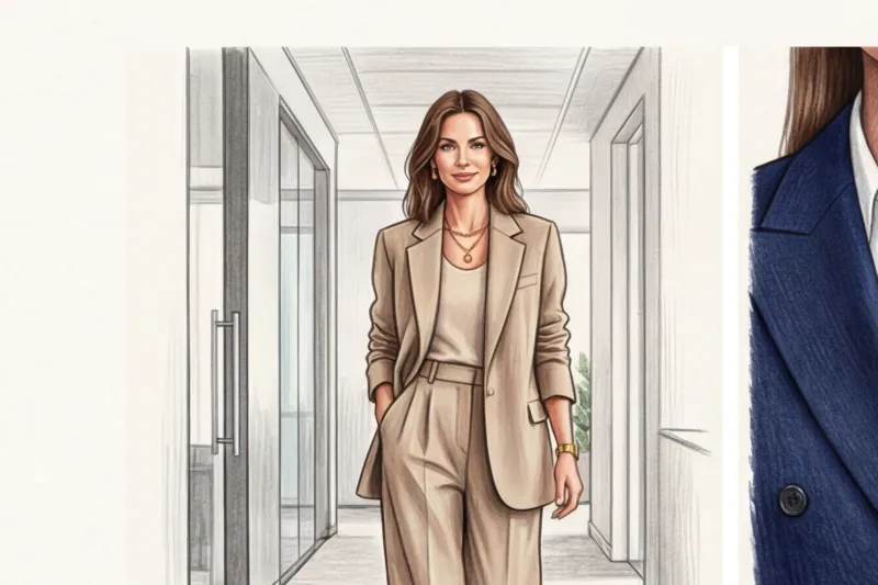
Who does it suit? Absolutely everyone, if you choose the right temperature. Cool-toned women (winter, summer) will suit inky blue shades, while warm-toned women (spring, fall) will suit blues with a slight navy tint. However, to avoid looking like an airline employee in uniform, I always recommend playing with textures. Smooth synthetics cheapen navy. Choose thick matte cotton, Super 100s suiting wool, or a Tencel-infused blend.
Your perfect look starts here
Join thousands of users who look flawless every day with a smart wardrobe.
Start for freeGray and graphite - analytics and logic
If dark blue is synonymous with teamwork, then gray is the color of independent thinking, diplomacy, and the ability to analyze deeply. According to the same CareerBuilder survey, over 70% of respondents associated gray with strong analytical skills.
"Medium gray is an ideal choice for middle and senior positions where candidates are expected to make independent decisions, not just be efficient."
Gray can look washed out when worn alone. Stylists' secret: always pair a gray jacket or jumper with a crisp white or light blue shirt. A light collar will act as a reflector, illuminating the face and counteracting fatigue.
Dangerous Shades: Why Black Doesn't Always Save, and Why Orange Kills Chances
Here we come to the main myth: many believe that black is the safest base color. After 12 years of working with clients, I can confidently say: Black is not a base for stressful situations In style psychology, all-black is often interpreted as authoritarian, closed, or even aggressive. It's as if you're building a wall between yourself and the recruiter.
Furthermore, black near the face absorbs light. If you haven't slept the night before an important interview, a black jacket without a light-colored top will mercilessly highlight your nasolabial folds and under-eye circles. The exception? If you're applying for a top management position and want to project sternness and absolute authority.
What about bright colors?
- Red: The color of dominance and passion. Wear it only if you're applying for a crisis management or tough negotiation position. In 90% of other situations, red overwhelms the interlocutor and triggers subconscious anxiety.
- Brown: Although warm chocolate is currently trending, in the traditional business world it is often associated with retrogradeness and an unwillingness to adapt to the new.
- Orange: The worst choice. 23% of employers frankly stated that orange is the least professional color. It's too playful, frivolous, and loud for a business environment.
How Office Lighting Changes Your Look (The Secret Stylists Don't Tell You)
Now, let's talk about why your perfect look from home can fall flat in the conference room. It's all about the color rendering index— Color Rendering Index (CRI).
Fitting rooms at reputable brands (think Massimo Dutti or COS) use lamps with a CRI above 90 and a warm temperature (around 3000K). You look rested, and a beige suit feels luxurious. But most commercial offices use cheap LED panels or fluorescent lamps with a cool, bluish spectrum (4000K–5000K) and a low CRI. Under this light, complex warm beige instantly takes on a dirty, greenish-yellow undertone.
Rule of thumb: Always do a "daylight try-on." Put on a suit, go to a window on a cloudy day, and take a selfie without filters. This is how HR will see you in the office. If your skin looks sallow, change the shade of your blouse.
Ready to get started?
Try the free plan—no commitments. Create your own interview success capsule with MioLook.
Start for freeHow to adapt color to different industries
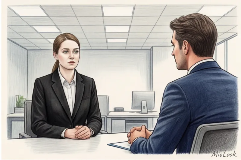
What works in IT can be a turn-off at a conservative bank. I had a client who showed up for an interview at a fintech startup wearing a formal graphite three-piece suit and a burgundy tie. The recruiters found him too "stuffy" and inflexible for their agile culture. Context is everything.
Conservative fields (Finance, Law, Public Sector)
The rule here is simple: don't reinvent the wheel. Your palette is limited: navy blue, graphite, cool beige (taupe), and crisp white. These industries value predictability and adherence to protocol. Acceptable accents are small details. For example, a silk scarf with emerald or burgundy accents, or a thin, low-contrast stripe on a shirt.
Creative and IT companies (Marketing, Design, Tech)
In creative industries, overly strict dress codes are perceived as a lack of imagination. Smart-casual palettes are appropriate here: camel, olive, terracotta, muted blue, dusty pink. You can express your individuality through a single color accent: for example, pair a basic blue blazer with a sophisticated mustard turtleneck.
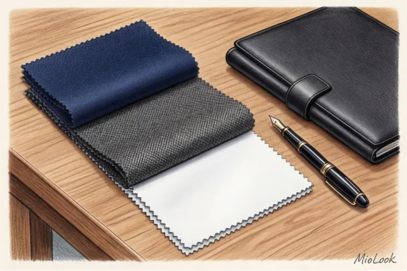
Fabric texture is more important than color: the rule of visual luxury
As a textile expert, I often repeat: no color, no matter how sophisticated, will save a garment made of shiny polyester. Color and material quality are inseparable.
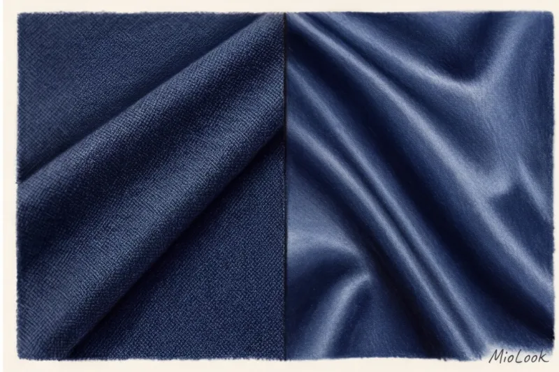
Cheap synthetics tend to reflect artificial light unevenly, creating unsightly highlights on the shoulders and elbows. As a result, your €100 suit looks like it costs €20. This is especially critical for dark shades.
Matte fabrics—heavyweight cotton (from 180 g/m²), matte silk, Tencel, high-quality viscose, and fine suiting wool—absorb light. They add depth, value, and class to any color. Moreover, natural and high-quality blended fabrics breathe better, which is crucial in stressful situations. Nothing ruins the image of a confident professional more than damp spots on a shirt due to impermeable fabric. Investing in a wool-silk jacket (in the €150–€250 range) will pay for itself many times over, as it will last for years.
Checklist: How to Choose a Color Before an Interview
To systematize your preparation, use this short algorithm:
- Learn the company's cultural code. Visit their website, look at the "About Us" section, or check out corporate event photos on social media. What colors is their logo? If the logo is blue and white, wearing a piece of clothing in those colors will subconsciously identify you as "one of them."
- Determine your base color according to your color type. Place a dark blue and dark gray fabric against your makeup-free face in daylight. The color that evens out your skin tone and doesn't highlight bruises is your base for the suit.
- Check for wrinkling. Squeeze the hem of your pants or skirt in your fist for 10 seconds. If any hard creases remain, discard them. Wrinkled fabric casts shadows and creates a sloppy appearance (this is especially true for linen items—save them for vacation).
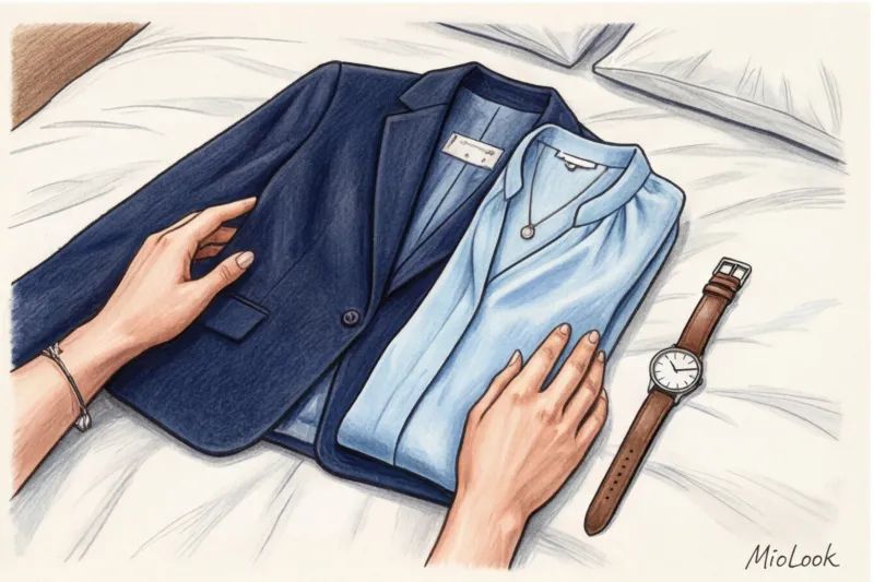
- Create a light reflex. Be sure to pair a dark jacket with a light-colored blouse, top, or shirt. White, cream, or light blue near the face acts like an Instagram filter, visually erasing traces of stress. You can upload items to MioLook wardrobe to see how different light tops pair with your base.
Summary: Color as a tool, not a mask
The color of your interview attire won't land you the job. If your skills don't match the job posting's requirements, no perfect navy jacket will fix that. However, the right palette will remove visual barriers, eliminate noise, and allow the recruiter to focus on your intellect and experience.
I'm a proponent of a mindful wardrobe. Choose colors that make you feel physically put together—it's called dopamine dressing, and it works great in a business context. When you know your gray jacket won't wrinkle, won't give off a cheap shine, and will perfectly illuminate your face, you stop thinking about your clothes and focus all your energy on the conversation. Confidence and composure are ultimately what employers "buy."